
-
Create a React Native project (I'm using the latest RN 0.61.2 and Genymotion as Android emulator), then install react-native-chart-kit and react-native-svg package.
$ npm i react-native-chart-kit react-native-svg
Then import it, so you can use it to create several charts on your React Native application.
import {
    LineChart,
    BarChart,
    PieChart,
    ProgressChart,
    ContributionGraph,
    StackedBarChart
} from "react-native-chart-kit";
-
Create a Line Chart
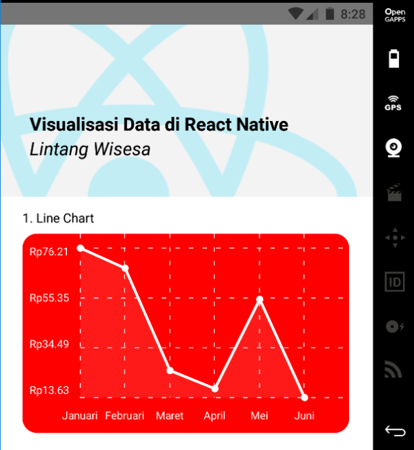
<LineChart
    data={{
    labels: ["Januari", "Februari", "Maret", "April", "Mei", "Juni"],
    datasets: [
        {
        data: [
            Math.random() * 100,
            Math.random() * 100,
            Math.random() * 100,
            Math.random() * 100,
            Math.random() * 100,
            Math.random() * 100
        ]
        }
    ]
    }}
    width={Dimensions.get("window").width - 50} // from react-native
    height={220}
    yAxisLabel={"Rp"}
    chartConfig={{
    backgroundColor: "red",
    backgroundGradientFrom: "red",
    backgroundGradientTo: "red",
    decimalPlaces: 2, // optional, defaults to 2dp
    color: (opacity = 1) => `white`,
    labelColor: (opacity = 1) => `white`,
    style: {
        borderRadius: 16
    }
    }}
    style={{
    marginVertical: 8,
    borderRadius: 16
    }}
/>

-
Create a Bezier Line Chart
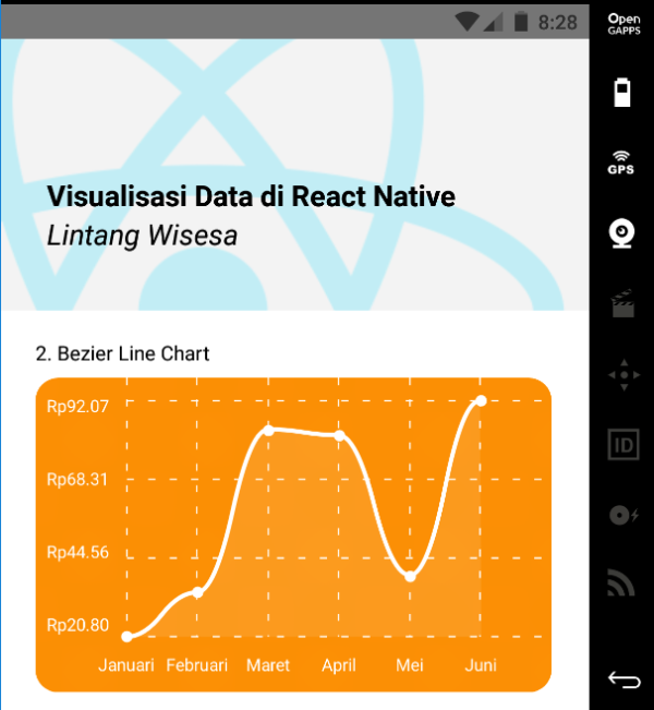
<LineChart
    data={{
    labels: ["Januari", "Februari", "Maret", "April", "Mei", "Juni"],
    datasets: [
        {
        data: [
            Math.random() * 100,
            Math.random() * 100,
            Math.random() * 100,
            Math.random() * 100,
            Math.random() * 100,
            Math.random() * 100
        ]
        }
    ]
    }}
    width={Dimensions.get("window").width - 50} // from react-native
    height={220}
    yAxisLabel={"Rp"}
    chartConfig={{
    backgroundColor: "#e26a00",
    backgroundGradientFrom: "#fb8c00",
    backgroundGradientTo: "#ffa726",
    decimalPlaces: 2, // optional, defaults to 2dp
    color: (opacity = 1) => `white`,
    labelColor: (opacity = 1) => `white`,
    style: {
        borderRadius: 16
    }
    }}
    bezier
    style={{
    marginVertical: 8,
    borderRadius: 16
    }}
/>

-
Create a Bar Chart
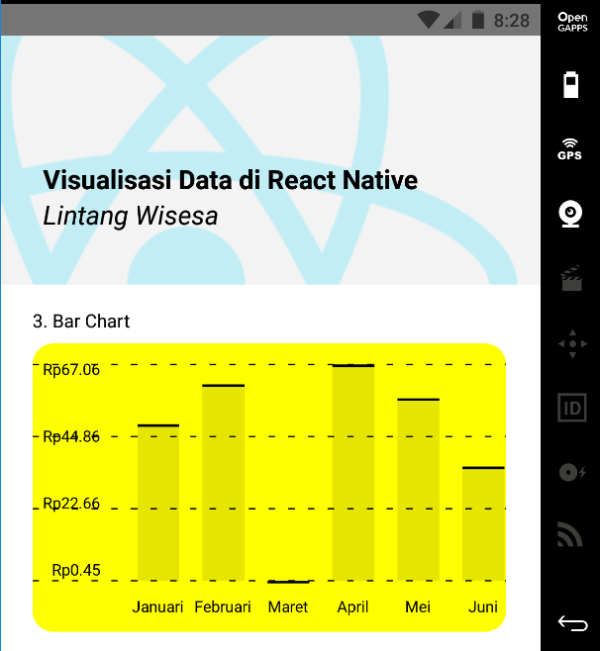
<BarChart
    data={{
    labels: ["Januari", "Februari", "Maret", "April", "Mei", "Juni"],
    datasets: [
        {
        data: [
            Math.random() * 100,
            Math.random() * 100,
            Math.random() * 100,
            Math.random() * 100,
            Math.random() * 100,
            Math.random() * 100
        ]
        }
    ]
    }}
    width={Dimensions.get("window").width - 50} // from react-native
    height={220}
    yAxisLabel={"Rp"}
    chartConfig={{
    backgroundColor: "yellow",
    backgroundGradientFrom: "yellow",
    backgroundGradientTo: "yellow",
    decimalPlaces: 2, // optional, defaults to 2dp
    color: (opacity = 1) => `black`,
    labelColor: (opacity = 1) => `black`,
    barPercentage:1,
    style: {
        borderRadius: 16
    }
    }}
    style={{
    marginVertical: 8,
    borderRadius: 16
    }}
/>

-
Create a Stacked Bar Chart
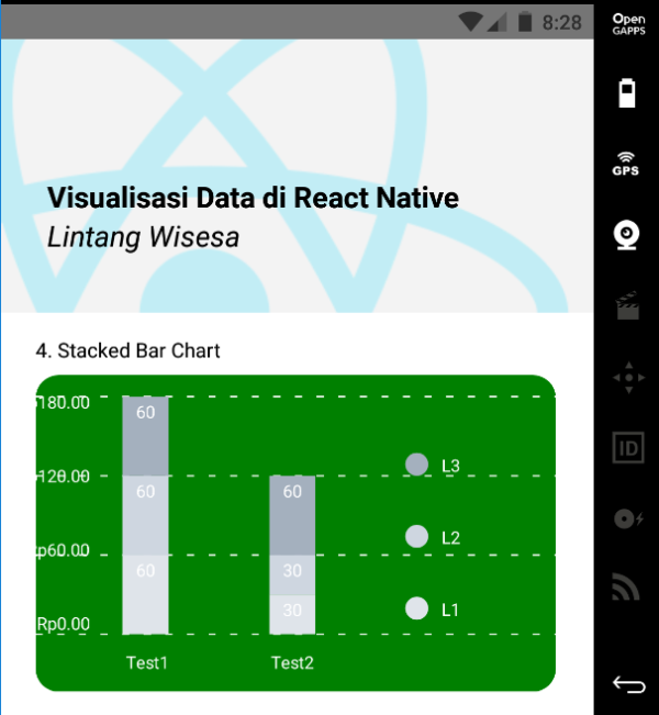
<StackedBarChart
    data={{
        labels: ["Test1", "Test2"],
        legend: ["L1", "L2", "L3"],
        data: [[60, 60, 60], [30, 30, 60]],
        barColors: ["#dfe4ea", "#ced6e0", "#a4b0be"]
    }}
    width={Dimensions.get("window").width - 50} // from react-native
    height={220}
    yAxisLabel={"Rp"}
    chartConfig={{
    backgroundColor: "green",
    backgroundGradientFrom: "green",
    backgroundGradientTo: "green",
    decimalPlaces: 2, // optional, defaults to 2dp
    color: (opacity = 1) => `white`,
    labelColor: (opacity = 1) => `white`,
    style: {
        borderRadius: 16
    }
    }}
    style={{
    marginVertical: 8,
    borderRadius: 16
    }}
/>

-
Create a Pie Chart
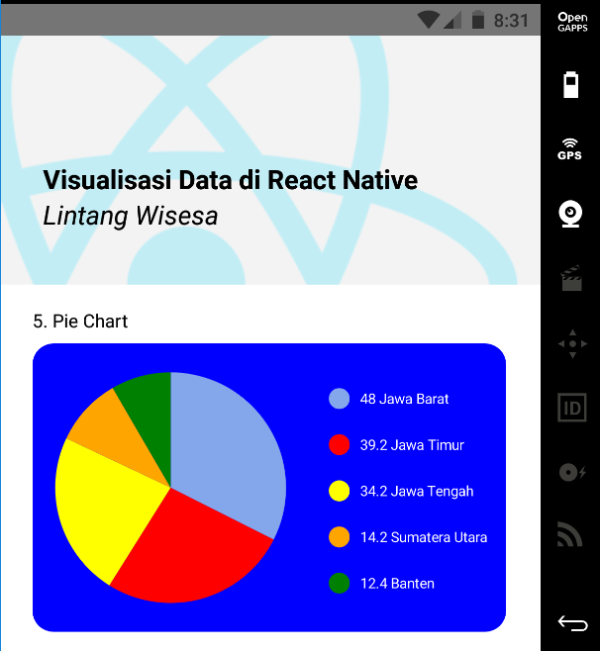
<PieChart
    data={
        [
        {
            name: "Jawa Barat",
            population: 48.0,
            color: "rgba(131, 167, 234, 1)",
            legendFontColor: "white",
            legendFontSize: 11
        },
        {
            name: "Jawa Timur",
            population: 39.2,
            color: "red",
            legendFontColor: "white",
            legendFontSize: 11
        },
        {
            name: "Jawa Tengah",
            population: 34.2,
            color: "yellow",
            legendFontColor: "white",
            legendFontSize: 11
        },
        {
            name: "Sumatera Utara",
            population: 14.2,
            color: "orange",
            legendFontColor: "white",
            legendFontSize: 11
        },
        {
            name: "Banten",
            population: 12.4,
            color: "green",
            legendFontColor: "white",
            legendFontSize: 11
        }
        ]
    }
    width={Dimensions.get("window").width - 50} // from react-native
    height={220}
    chartConfig={{
        color: (opacity = 1) => `white`,
        labelColor: (opacity = 1) => `white`,
        style: {
            borderRadius: 16
        }
    }}
    backgroundColor="blue"
    accessor="population"
    paddingLeft="15"
    absolute
    style={{
        marginVertical: 8,
        borderRadius: 16
    }}
/>

-
Create a Progress Chart
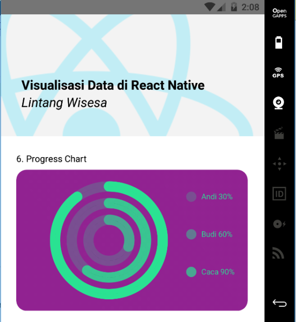
<ProgressChart
    data={
        {
        labels: ["Andi", "Budi", "Caca"],
        data: [0.3, 0.6, 0.9]
        }
    }
    width={Dimensions.get("window").width - 50} // from react-native
    height={220}
    chartConfig={
        {
        backgroundGradientFrom: 'purple',
        backgroundGradientFromOpacity: 1,
        backgroundGradientTo: 'purple',
        backgroundGradientToOpacity: 0.5,
        color: (opacity = 1) => `rgba(26, 255, 146, ${opacity})`,
        strokeWidth: 2, // optional, default 3
        }
    }
    backgroundColor="green"
    paddingLeft="15"
    absolute
    style={{
        marginVertical: 8,
        borderRadius: 16
    }}
/>

-
Create a Contribution Graph
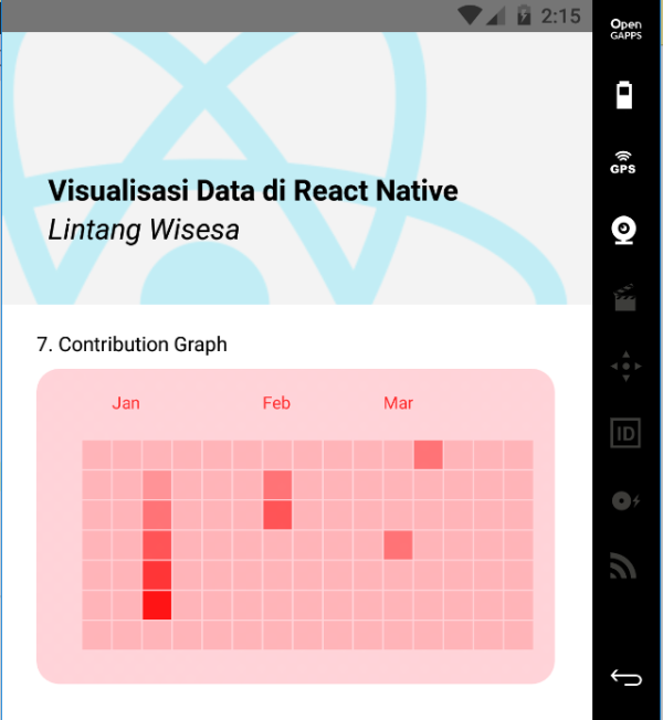
<ContributionGraph
    values={
        [
        { date: "2017-01-02", count: 1 },
        { date: "2017-01-03", count: 2 },
        { date: "2017-01-04", count: 3 },
        { date: "2017-01-05", count: 4 },
        { date: "2017-01-06", count: 5 },
        { date: "2017-01-30", count: 2 },
        { date: "2017-01-31", count: 3 },
        { date: "2017-03-01", count: 2 },
        { date: "2017-04-02", count: 4 },
        { date: "2017-03-05", count: 2 },
        { date: "2017-02-30", count: 4 }
        ]
    }
    endDate={new Date('2017-04-01')}
    numDays={105}
    width={Dimensions.get("window").width - 50} // from react-native
    height={220}
    chartConfig={
        {
        backgroundGradientFrom: 'pink',
        backgroundGradientFromOpacity: 0.5,
        backgroundGradientTo: 'red',
        backgroundGradientToOpacity: 0.5,
        color: (opacity = 1) => `rgba(255, 0, 0, ${opacity})`,
        strokeWidth: 2, // optional, default 3
        }
    }
    paddingLeft="15"
    style={{
        marginVertical: 8,
        borderRadius: 16
    }}
/>

Lintang Wisesa 💌 lintangwisesa@ymail.com
Facebook | Twitter | Google+ | Youtube | :octocat: GitHub | Hackster