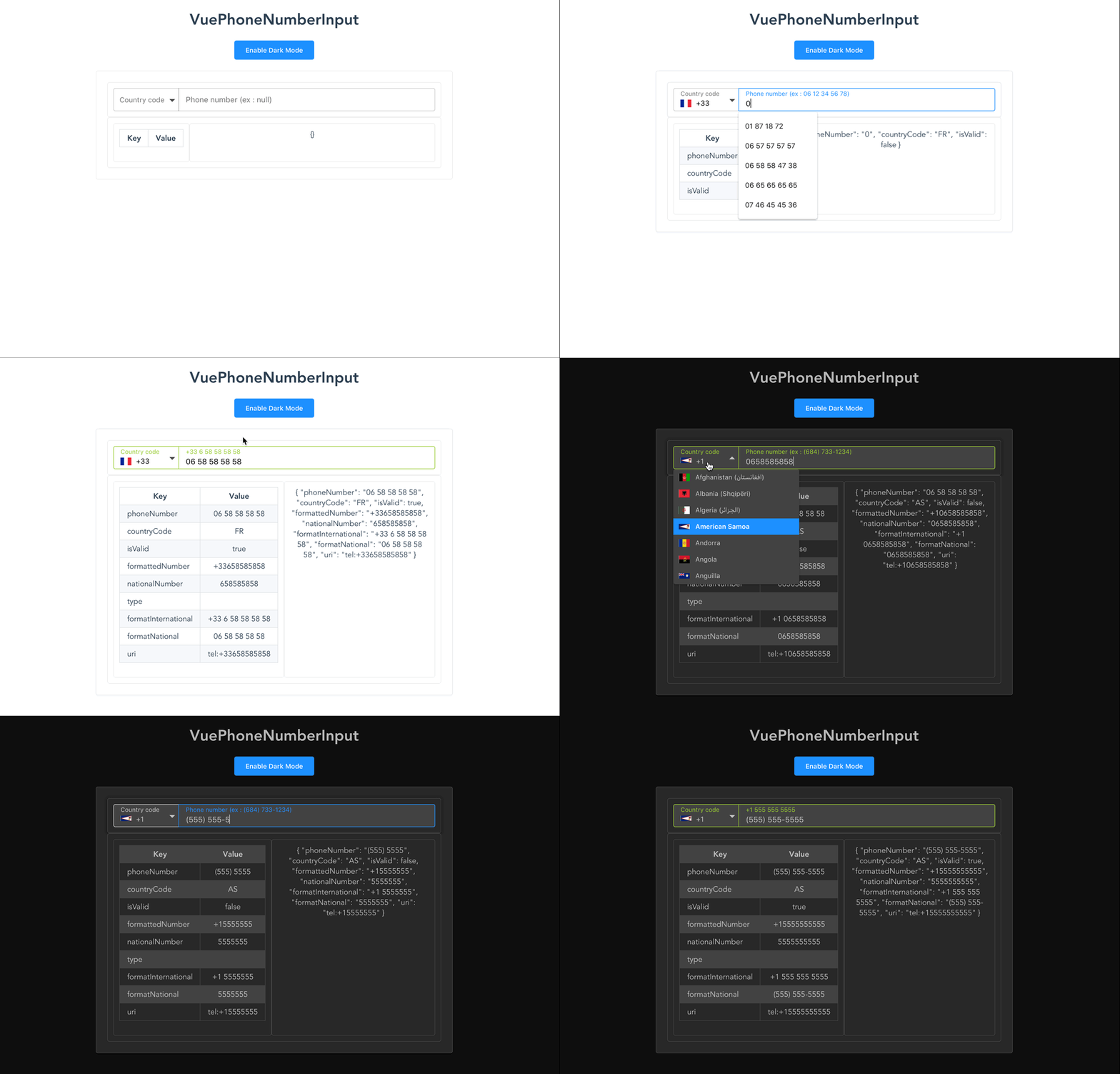
A beautiful text field to format phone numbers made with VueJS
Version for Vue 2 on maz-ui v2.x
The version for Vue 2 is available here: maz-ui v2.x - MazPhoneNumberInput
New version for Vue 3 on maz-ui v3.x
The version for Vue 3 is available here: maz-ui v3.x - MazPhoneNumberInput
yarn add vue-phone-number-input
npm i --save vue-phone-number-input
import VuePhoneNumberInput from 'vue-phone-number-input';
import 'vue-phone-number-input/dist/vue-phone-number-input.css';

Vue.component('vue-phone-number-input', VuePhoneNumberInput);<VuePhoneNumberInput v-model="yourValue" /><VuePhoneNumberInput v-model="yourValue" />
<script src="https://unpkg.com/vue" charset="utf-8"></script>
<script src="./dist/vue-phone-number-input.umd.min.js" charset="utf-8"></script>
<link rel="stylesheet" type="text/css" href="./dist/vue-phone-number-input.css">
<script type="text/javascript">
Vue.component('vue-phone-number-input', window.VuePhoneNumberInput.default);
</script>- You can set
preferred-countries,ignored-countriesor haveonly-countries - Validator State: input becomes green (you can modify this color with
valid-coloroption) when the phone number is valid (can be disabled byno-validator-stateattr) - Multi options to getting country code : By default the component get the country code via the browser (disable it with
no-use-browser-locale) or you can usefetch-countryto get the country code via https://ip2c.org/s (network needed) - you can usedefault-country-codeoption instead to set one - Phone number formatting while typing
- You can search your country in list (open countries list & type your country name)
- Keyboard accessibility (Arrow down, Arrow up: Countries list navigation - Escape: Close countries list)
- Phone number example for each country in placeholder/label
- Auto focus phone number input after selecting country
- You can disable the flags -
no-flagsprops - Set your translations
All options of VueInputUi are available
- Differents size of input (sm or lg)
size="sm|lg" - Disabled option (
disabledprop) - Dark UI option (
darkprop) - Active a clear button by the prop
clearable(cf: VueInputUi options) - Active a loader progress bar by the prop
loader(cf: VueInputUi options) - And others
| Props | Type | Required | Default |
|---|---|---|---|
| v-model | String/Int | true | - |
| id | String | false | VuePhoneNumberInput |
| color | String HEX |
no | dogderblue |
| valid-color | String HEX |
no | yellowgreen |
| error-color | String HEX |
no | orangered |
| size | String `sm | lg` | no |
| default-country-code (1) | String | no | null |
| preferred-countries (2) | Array<string> |
no | null |
| ignored-countries | Array<string> |
no | null |
| only-countries | Array<string> |
no | null |
| no-validator-state | Boolean | no | false |
| no-flags | Boolean | no | false |
| disabled | Boolean | no | false |
| dark | Boolean | no | false |
| dark-color | String (hex) | no | #424242 |
| required | Boolean | no | false |
| error | Boolean | no | false |
| clearable | Boolean | no | false |
| loader (3) | Boolean | no | false |
| translations (4) | Object | no | null |
| countries-height (5) | Number | no | 30 |
| no-use-browser-locale (6) | Boolean | no | false |
| fetch-country (7) | Boolean | no | false |
| no-country-selector (8) | Boolean | no | false |
| border-radius | Number | no | 4 |
| show-code-on-list | Boolean | no | false |
| no-example | Boolean | no | false |
(1) Ex : default-country-code="FR"
(2) Ex : preferred-countries="['FR', 'BE', 'DE']" This countries will be at the top of the list
(3) Loader progress bar has the input color (color props)
(4) translations comes to replace default texts - Ex :
translations="{
  countrySelectorLabel: 'Code pays',
  countrySelectorError: 'Choisir un pays',
  phoneNumberLabel: 'Numéro de téléphone',
  example: 'Exemple :'
}"
(5) height in px of the rows included in the dropdown. Ex: countries-height: 40
(6) By default the component get country code via browser - No network needed but not work on SSR with NuxtJS (disable it with no-use-browser-locale)
(7) Fetch country code via https://ip2c.org/s - Network needed - (Do not use it with default-country-code options)
(8) The country selector is not shown, you can validate your phone number with the country code set
| Event | Return |
|---|---|
| phone-number-focused | - (emit when phone number input is focused) |
| phone-number-blur | - (emit when phone number input is blur) |
| input | AsYouType value (emit when new value is enter on phone number input && when a country is choosed) |
| update | All values (cf values in table on demo) (emit when new value is enter on phone number input && when a country is choosed) |
| Props | Action |
|---|---|
| ArrowDown | Navigation down in countries list |
| ArrowUp | Navigation up in countries list |
| Escape | Close countries list |
| All letters characters | Searching country name in countries list (should be open) |
| Slot | Action |
|---|---|
| arrow | Override the default arrow character for toggling the list of countries |
npm installnpm run servenpm run lintThis project is licensed under MIT License


