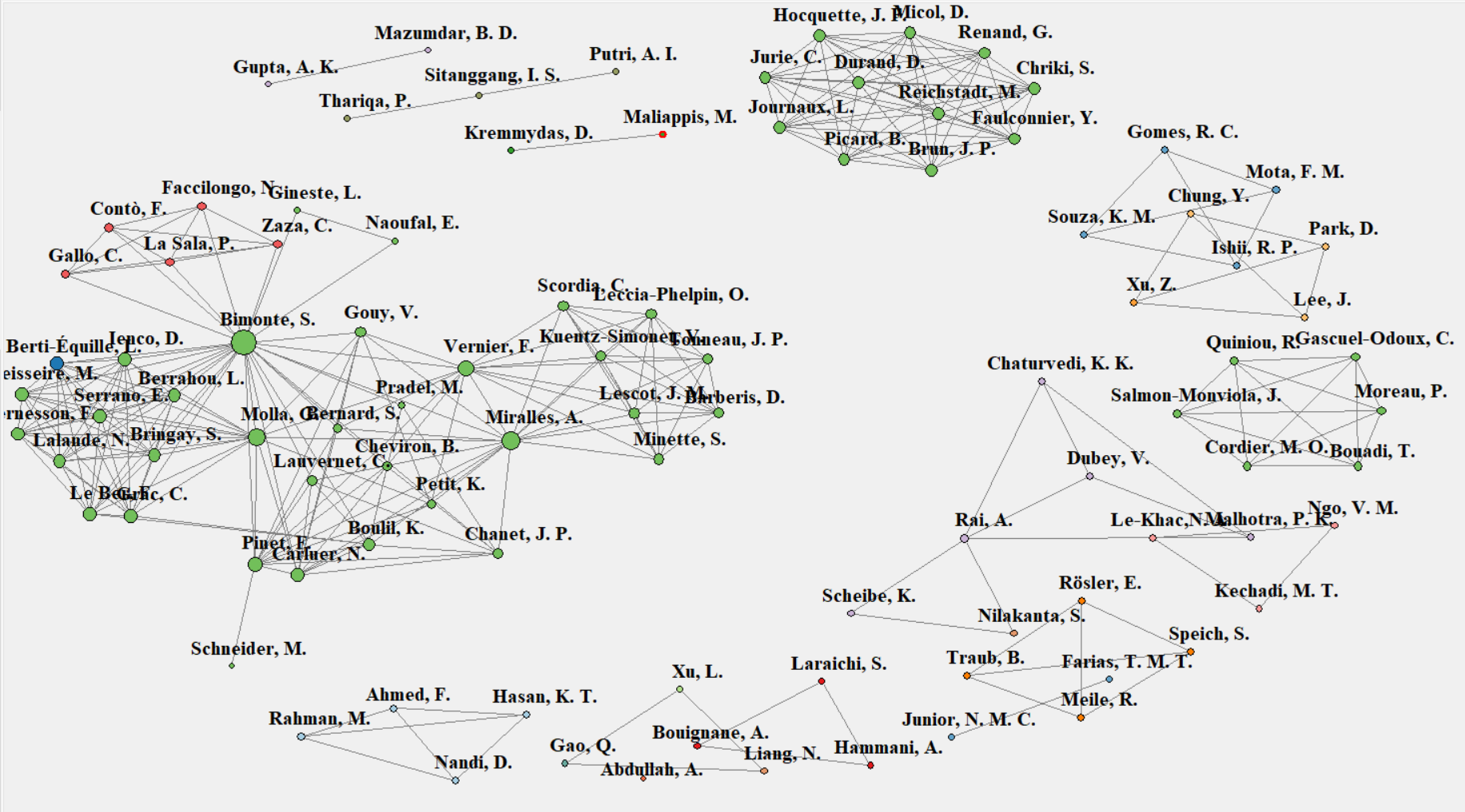
This short project aims to generate useful visualizations about authors (colaboration network) and works published in international journals and conferences about Business Intelligence and Data Warehouse applied to solve problems in agriculture and livestock. This work was developed during my graduation in Applied Computing in Federal University of Pampa, in partnership with Brazilian Agricultural Research Colorporation, also known as Embrapa. The content and theoretical explanation about this project can be found in this Paper.
First, open your RStudio or other IDE with R language. Set as the working directory the folder of your R file using:
setwd(dirname(rstudioapi::getActiveDocumentContext()$path))Now we load the data that we need to use. The way that all this data was collected and organized will not be approached in this tutorial. The first .csv has registers about the number of papers per author and the second .csv has registers about the all authors names by paper.
works_per_author <- read.csv("spreadsheet/works_per_author.csv", sep = ";", stringsAsFactors = FALSE, encoding = "latin1")
authors_per_work <- read.csv("spreadsheet/authors_per_work.csv", sep = ";", stringsAsFactors = FALSE, encoding = "latin1")
We convert works_per_author.csv to a dataframe object, set to 0 all registers and set to the row names the authors names.
works_author_df <- matrix(0, nrow = nrow(works_per_author), ncol = nrow(works_per_author))
rownames(works_author_df) <- works_per_author[, 1]
Now we need to count the colaborations between the authors.
cont <- 1

for (i in 1:nrow(works_author_df)) {
  for (j in 1:nrow(works_author_df)) {
    authors <- unlist(strsplit(authors_per_work[j, 1], ";"))

    for (k in 1:length(authors)) {
      author_name <- authors[k]
      row_index <- which(row.names(works_author_df) == author_name)

      if (length(row_index) > 0) {
        works_author_df[row_index, cont] <- works_author_df[row_index, cont] + 1
      }
    }

    cont <- cont + 1
    authors_per_work[j, 1] <- 0
  }
}
Now, we convert the dataframe to matrix, get the transposed matrix and merge with the original to get the term matrix. Finally, we create the graph adjacency. We also use simplify to remove multiple edges.
termDocMatrix <- as.matrix(works_author_df)
termDocMatrix[termDocMatrix >= 1] <- 1
termSimilarityMatrix <- termDocMatrix %*% t(termDocMatrix)

if(!require(igraph)) install.packages("igraph")
library(igraph)

graphAdjacency <- graph.adjacency(termSimilarityMatrix, weighted = T, mode = "undirected")
graphAdjacency <- simplify(graphAdjacency)
Below, we create a function to normalize the graph degree.
normalizer <- function(x) (x - min(x)) / (max(x) - min(x)) + 0.25
V(graphAdjacency)$size <- normalizer(degree(graphAdjacency)) * 10
Now we read the country of the first author of each paper, generate some colors based on the country ID (already stored in the csv file) and use them to plot an interactive graph using the function tkplot.
authors_country <- read.csv("spreadsheet/authors_country.csv", sep = ";", stringsAsFactors = FALSE, encoding = "latin1")
authors_country<-authors_country[,-3]

if(!require(RColorBrewer)) install.packages("RColorBrewer")
library(RColorBrewer)

pal <- colorRampPalette(brewer.pal(9, "Paired"))(length(unique(authors_country$Num)))

coords <- layout_with_fr(graphAdjacency, niter = 1000)

tkplot(
  graphAdjacency,
  canvas.width = 1400,
  canvas.height = 800,
  vertex.label.color = "black",
  vertex.label.cex = 1.3,
  layout = layout.kamada.kawai,
  vertex.label.font = 2,
  edge.color = "grey",
  vertex.color = pal[as.numeric(authors_country$Num)],
  vertex.label.dist = 1.5,
  vertex.frame.color = "black"
)
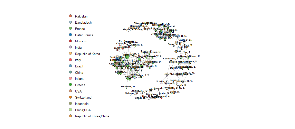
The problem is that we have not found an automatic way to add a legend. A way out is to generate a legend, like in example below, and use some "not-automatic" operations.
plot(
  graphAdjacency,
  vertex.label.color = "black",
  vertex.label.cex = 0.6,
  layout = layout.kamada.kawai,
  vertex.label.font = 2,
  edge.color = "grey",
  vertex.color = pal[as.numeric(authors_country$Num)],
  vertex.label.dist = 1,
  vertex.frame.color = "black"
)

legend(
  x = -2.3,
  y = 1.4,
  unique(authors_country$País),
  pch = 21,
  col = "#777777",
  pt.bg = pal[unique(authors_country$Num)],
  pt.cex = 1.7,
  cex = .8,
  bty = "n",
  ncol = 1
)
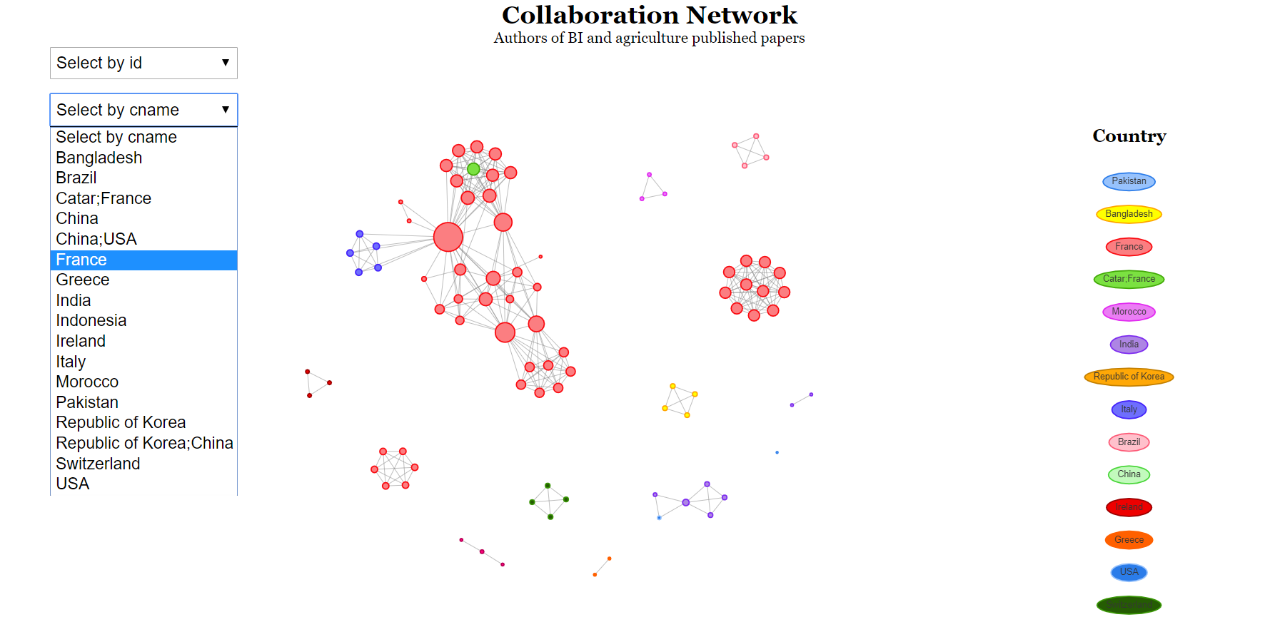
Another way to create a graph is using the visNetwork library. Check below how interesting is the visualization (bonus to interactions and menus).
graphAdjacency <- remove.vertex.attribute(graphAdjacency, "size")

if(!require(visNetwork)) install.packages("visNetwork")
library(visNetwork)

graphAdjacency_vis <- toVisNetworkData(graphAdjacency)

names <- sort(graphAdjacency_vis$nodes$id)

graphAdjacency_vis$nodes$value <- normalizer(degree(graphAdjacency)) * 10

graphAdjacency_vis$nodes$country <- authors_country$País

graphAdjacency_vis$nodes$group <- authors_country$País

vis_plot <- visNetwork(
  nodes = graphAdjacency_vis$nodes,
  edges = graphAdjacency_vis$edges,
  main = "Collaboration Network",
  submain = "Authors of BI and agriculture published papers",
) %>%
visIgraphLayout(
  layout = "layout_with_kk",
  smooth = FALSE,
  physics = TRUE
) %>%
visEdges(
  color = list(highlight = "lightgray")
) %>%
visGroups(
  groupname = graphAdjacency_vis$nodes$country
) %>%
visOptions(
  selectedBy = "country",
  highlightNearest = list(
    enabled = TRUE,
    degree = 1,
    hover = TRUE,
    labelOnly = TRUE),
    nodesIdSelection = list(
      enabled = TRUE,
      values = names
    )
) %>%
visLegend(
  position = "right",
  stepX = 51,
  stepY = 51,
  main = "Country",
  useGroups = TRUE
) %>%
visPhysics(
  repulsion = list(springlength = 50),
  maxVelocity = 0.8,
  solver = "forceAtlas2Based",
  forceAtlas2Based = list(gravitationalConstant = -1000),
  timestep = 0.25
)

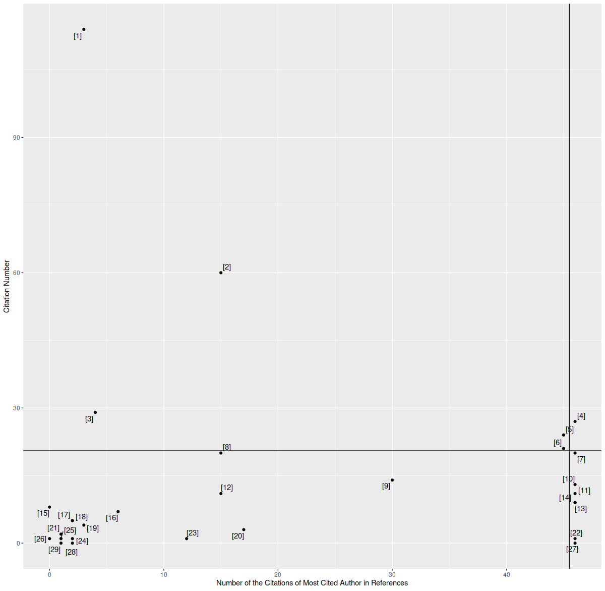
vis_plotFirst, we load the needed data. We have four attributes for each paper: the paper ID, paper title, paper citations and citations of most cited author. Then we use ggplot. We highlight the fact of using Pareto Principle in geom_vline and geom_hline. We highlight the 20% most important papers regarding to citations and citations of most cited authors.
citations_x_authors = read.csv("spreadsheet/citations_x_authors.csv", sep = ";", stringsAsFactors = FALSE, encoding = "latin1")

if(!require(ggplot2)) install.packages("ggplot2")
library(ggplot2)

if(!require(ggrepel)) install.packages("ggrepel")
library(ggrepel)

ggplot(
  citations_x_authors[,4:3],
  aes(
    citations_x_authors[,4],
    citations_x_authors[,3],
    label = citations_x_authors[,1]
  )
) +
labs(
  x = gsub("\\.", " ", colnames(citations_x_authors[4])),
  y = gsub("\\.", " ", colnames(citations_x_authors[3]))
) +
geom_vline(
  xintercept = sort(citations_x_authors$Number.of.the.Citations.of.Most.Cited.Author.in.References, decreasing = TRUE)[round(nrow(citations_x_authors)*0.2)] - 0.5) +
  geom_hline(yintercept = sort(citations_x_authors$Citation.Number, decreasing = TRUE)[round(nrow(citations_x_authors)*0.2)] - 0.5) +
  geom_text_repel(max.overlaps = 20) +
  scale_shape_identity() +
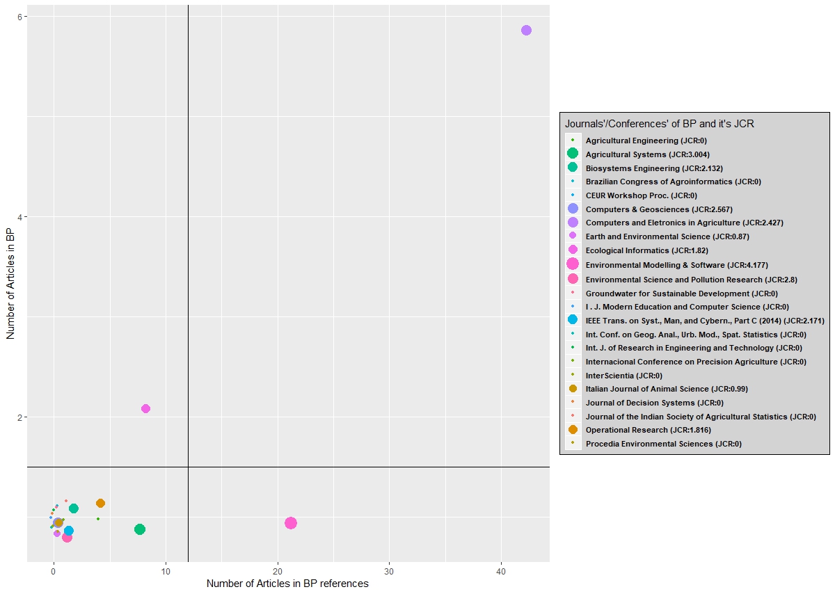
geom_point() First, we load the needed data. We have four attributes for each journal/conference: journal or conference name, number of papers in the portfolio, number of papers in bibliographic references of the portfolio and the Journal Citation Report (JCR) value (only to scientific journals). Then we use geom_vline and geom_hline to separate different groups of journals.
periodicals = read.csv("spreadsheet/periodicals.csv", sep = ";", stringsAsFactors = FALSE, encoding = "latin1")

label <- paste(periodicals[,1],"(JCR:", periodicals[,4], ")")
label <- gsub(" )", ")", label)

ggplot( periodicals,
        aes(x = jitter(periodicals[,3],2), y = jitter(periodicals[,2]))) +
        labs(x = gsub("\\.", " ", colnames(periodicals[3])), y = gsub("\\.", " ", colnames(periodicals[2]))) +
        geom_point(aes(colour = colorRampPalette(brewer.pal(11, "Spectral"))(23), size = periodicals[,4])) +
        geom_vline(xintercept = 12) +
        geom_hline(yintercept = 1.5) +
        scale_size_continuous(  name = "Journals'/Conferences' of BP and it's JCR",
                                breaks = periodicals[,4], labels = label) +
        theme(  legend.key.height = unit(0.52, "cm"),
                legend.text = element_text(colour = "black", size = 8.5, face = "bold"),
                legend.position = "right",
                legend.background = element_rect(   fill = "lightgray",
                                                    size = 0.5,
                                                    linetype = "solid",
                                                    colour ="black")) +
        guides(size = guide_legend(ncol=1)) +
        scale_color_discrete(   name = "Journals'/Conferences' of BP and it's JCR",
                                breaks = colorRampPalette(brewer.pal(11, "Spectral"))(23),
                                labels = label)


