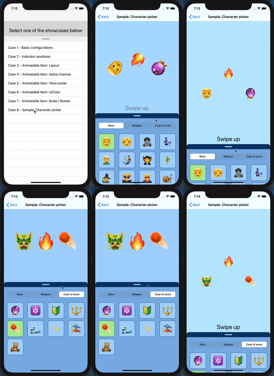
In order to use the SwipeableView, all you need to do is adding the view to your view controller or another view which need to contain it, and then "plug" the layout which will make the SwipeableView able to be expanded or collapsed, with or without user gestures (pan gesture recognizer).
The example below will show how to do this, assuming the view has been plugged in a view controller, where we want it to be expandable from the top, up to fullfilling the view controller view (Case 1) or expanding up to double the size (Case 2):
Here the code for the case 1 (where the flexible layout will be the top margin constraint to the super view):
/// The swipeable view which can expand and collapse
@IBOutlet weak var swipeableView: SwipeableView!
/// The reference to the layout constraint connected to the SwipeableView, which will be affected by the expand/collapse
@IBOutlet weak var flexLayout: NSLayoutConstraint!

override func viewDidLoad() {
  super.viewDidLoad()
  // Set the flexible layout to the SwipeableView. This will let the layout constant value change from his current value to 0
  // You can customize the 'start' and 'end' values which the layout can assume, see the init method of SwipeableItemLayout
  self.swipeView.flexibleLayout = SwipeableItemLayout(with: self.flexLayout)
}
Here the code for the case 2 (where the flexible layout will the actual height constraints of the SwipeableView):
/// The swipeable view which can expand and collapse
@IBOutlet weak var swipeableView: SwipeableView!
/// The reference to the layout constraint connected to the SwipeableView, which will be affected by the expand/collapse
@IBOutlet weak var flexLayout: NSLayoutConstraint!

override func viewDidLoad() {
  super.viewDidLoad()
  // Indicates the SwipeableView that the gesture should be considered inverted. This fit this case, where we want the flexLayout to move from
  // his current value, not to 0 like case 1, but instead to the double of his current value
  self.swipeableView.isPanGestureInverted = true
  // Set the flexible layout to the SwipeableView. This will let the layout constant value change from his current value to his double
  self.swipeView.flexibleLayout = SwipeableItemLayout(with: self.flexLayout, end: self.flexLayout.constant * 2)
}It provides support for delegation with SwipeableViewProtocol, by providing 3 simple methods:
swipeableViewDidExpand(...): called when the view is fully expandedswipeableViewDidCollapse(...): called when the view is fully collapsedswipeableViewDidPan(...): called while user pan over the view, for manually expanding and collapsing
Refer to the show case 1 (Basic configurations) in the project for more details
This component can be configured for using both vertical and horizontal axis and, together with the actual layout constraint you will plug as flexible layuout, will expand/collapse accordingly. Along with it, you can therefore customize the position of the swipe indicator bar, to be at the top, bottom, left or right. Refer to the show case 2 (Indicator positions) in the project for the full view on this
Here an example for achieving this:
  // Swipe from top to bottom. Set the swip indicator bar to be shown at the bottom of the view, and plug the layout as usual
  swipeView.indicatorPosition = .bottom
  swipeView.flexibleLayout = SwipeableItemLayout(with: flexSwipeTopToBottom, end: view.frame.height / 3)

  // Swipe from left to right. Indicate the axis are not vertical (so, horizontal) and set the swip indicator bar to
  // be shown on the right side of the view, so finally plug the layout as usual
  swipeView.indicatorPosition = .right
swipeView.flexibleLayout = SwipeableItemLayout(with: flexSwipeLeftToRight, verticalAxis:false, end: view.frame.width / 2)The SwipeableView comes along with a small set of configurable parameters and features, such as:
- hide/show the swipe indicator bar
- hide the swipe indicator bar when the view is expanded
- swipe indicator bar position
- enable or disable rounded corners according with the current swipe indicator bar position
- customizing the swipe indicator bar colors
- customize the notch threshold value
- add or remove a child view controller
- interaction with any child view controller based on the expanded or collapsed state
- expand or collapse the SwipeableView programmatically
- returning the current expanding/collapsing percentage
- coordinating the Swipeable pan gesture along with an designated child view which is a subclass of
UIScrollView, such asUITableVieworUICollectionView(such coordinated scroll view can be detected automatically or assigned manually if needed)
Refer to the show case (1) (Basic configurations) in the project for the full example on those aspects
The SwipeableItem is a protocol at which an object can conforms in order to be interpolated and animated, along with the SwipeableView. It comes already with a small set of SwipeableItem objects, which are:
SwipeableItemLayout: Representation of a layout constraint in the context of the swipeable view. Allows to animate and interpolate a layout constraint along with the SwipeableViewSwipeableItemAlpha: Representation of the view.alpha channel in the context of the swipeable view. Allows to animate and interpolate the view alpha channel along with the SwipeableViewSwipeableItemColor: Representation of the view color in the context of the swipeable view. Allows to animate and interpolate the viewbackgroundColorortintColoralong with the SwipeableViewSwipeableItemCenter: Representation of the view.center in the context of the swipeable view. Allows to animate and interpolate the view center along with the SwipeableViewSwipeableItemTransform: Representation of the view.transform in the context of the swipeable view. Allows to animate and interpolate the view.transfrom along with the SwipeableView over theCGAffineTransform
You can go through the show cases in the sample project to see how they work individually and along with other SwipeableItem items

