AiForms.Effects is the effects library that provides you with more flexible functions than default by targetting only Android and iOS in a Xamarin.Forms project.
- Gradient
- set a gradient background.
- Floating
- arrange some floating views (e.g. FAB) at any place over a page.
- Feedback
- add touch feedback effect (color and sound) without command.
- AddTouch
- add touch event ( begin, move, end, cancel ).
- SizeToFit
- make font size adjusted to fit the Label size.
- Border
- add border to a view.
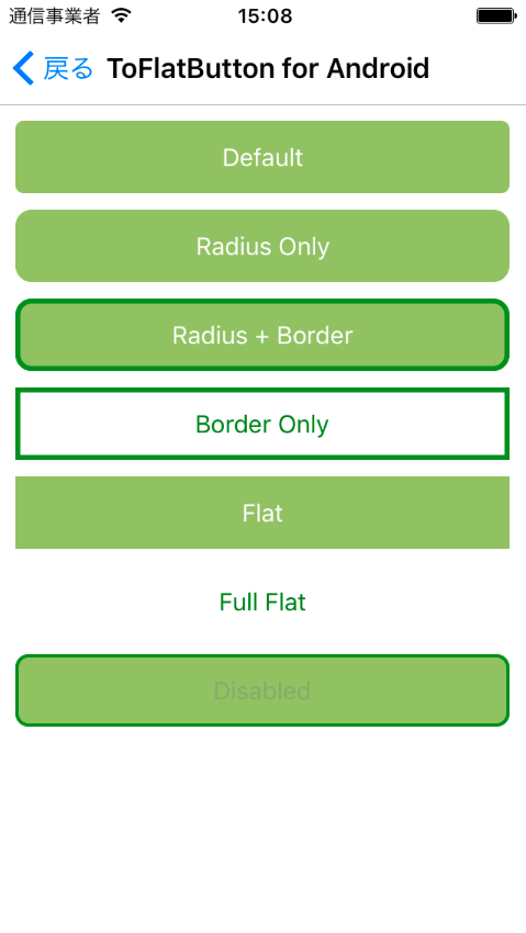
- ToFlatButton
- alter Button to flat (for Android)
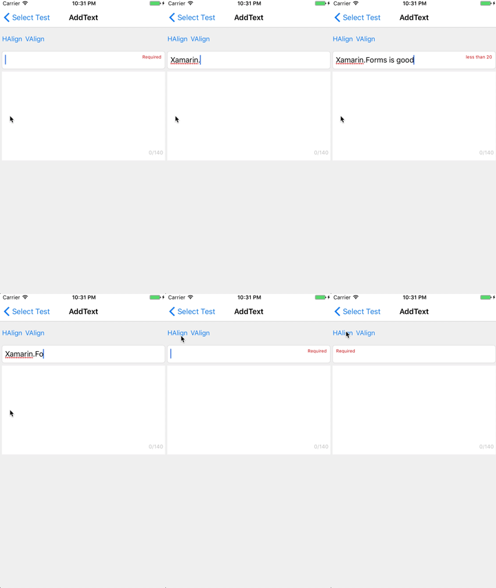
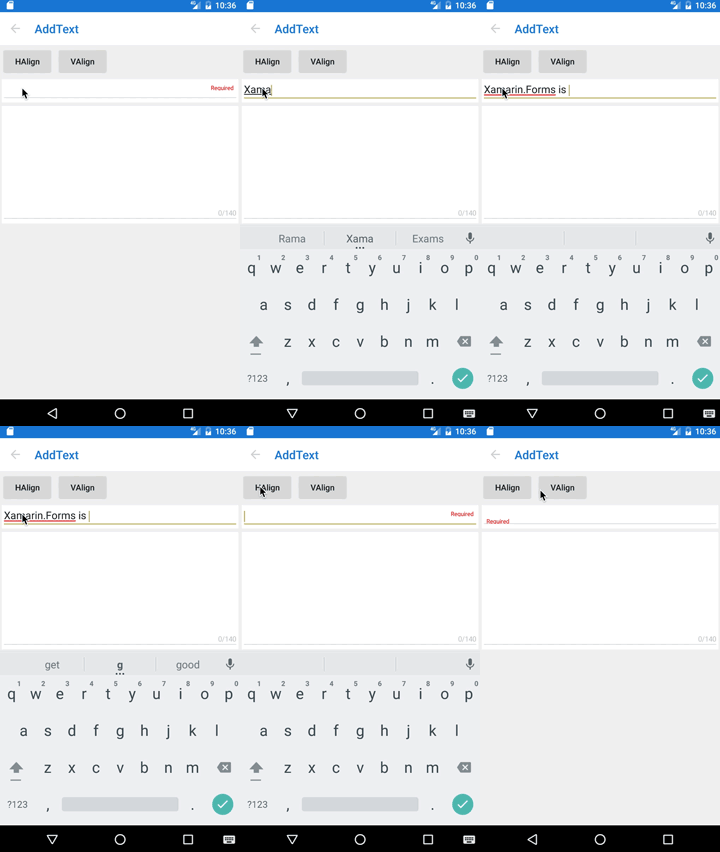
- AddText
- add one line Text to a view.
- AddCommand
- add Command function to a view.
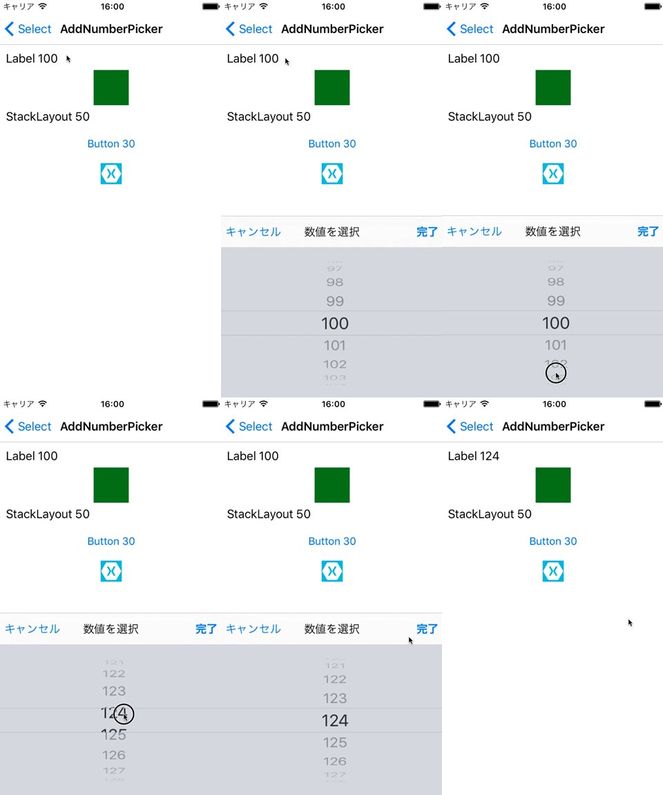
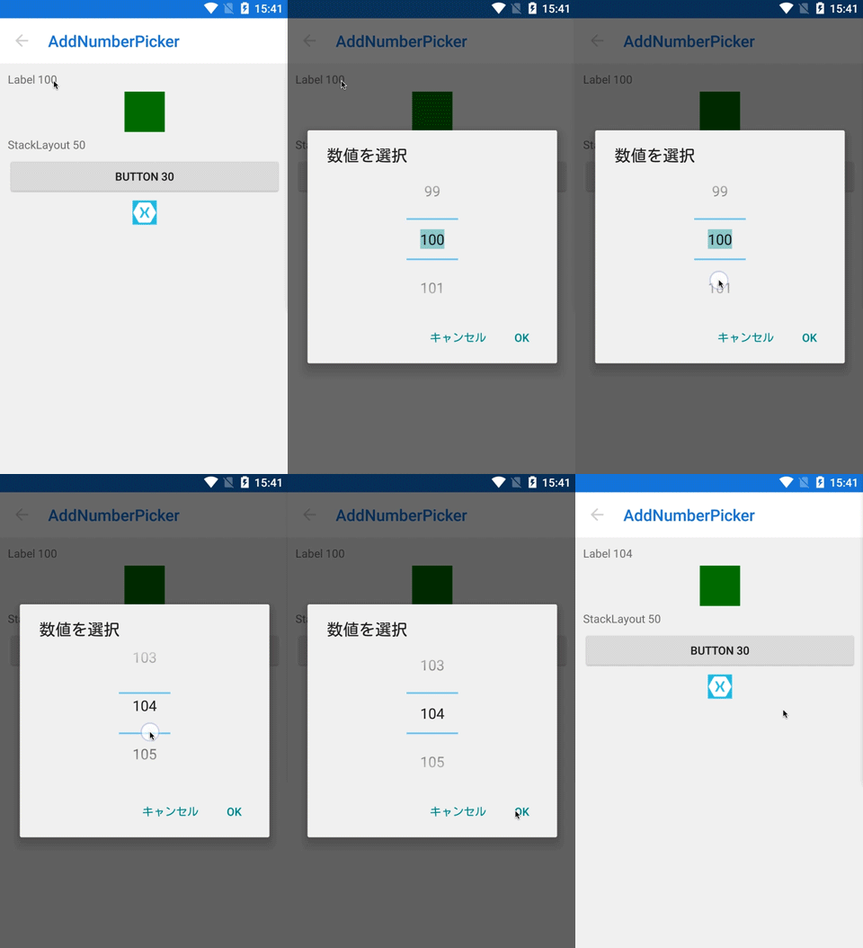
- AddNumberPicker
- add NumberPicker function to a view.
- AddTimePicker
- add TimePicker function to a view.
- AddDatePicker
- add DatePicker function to a view.
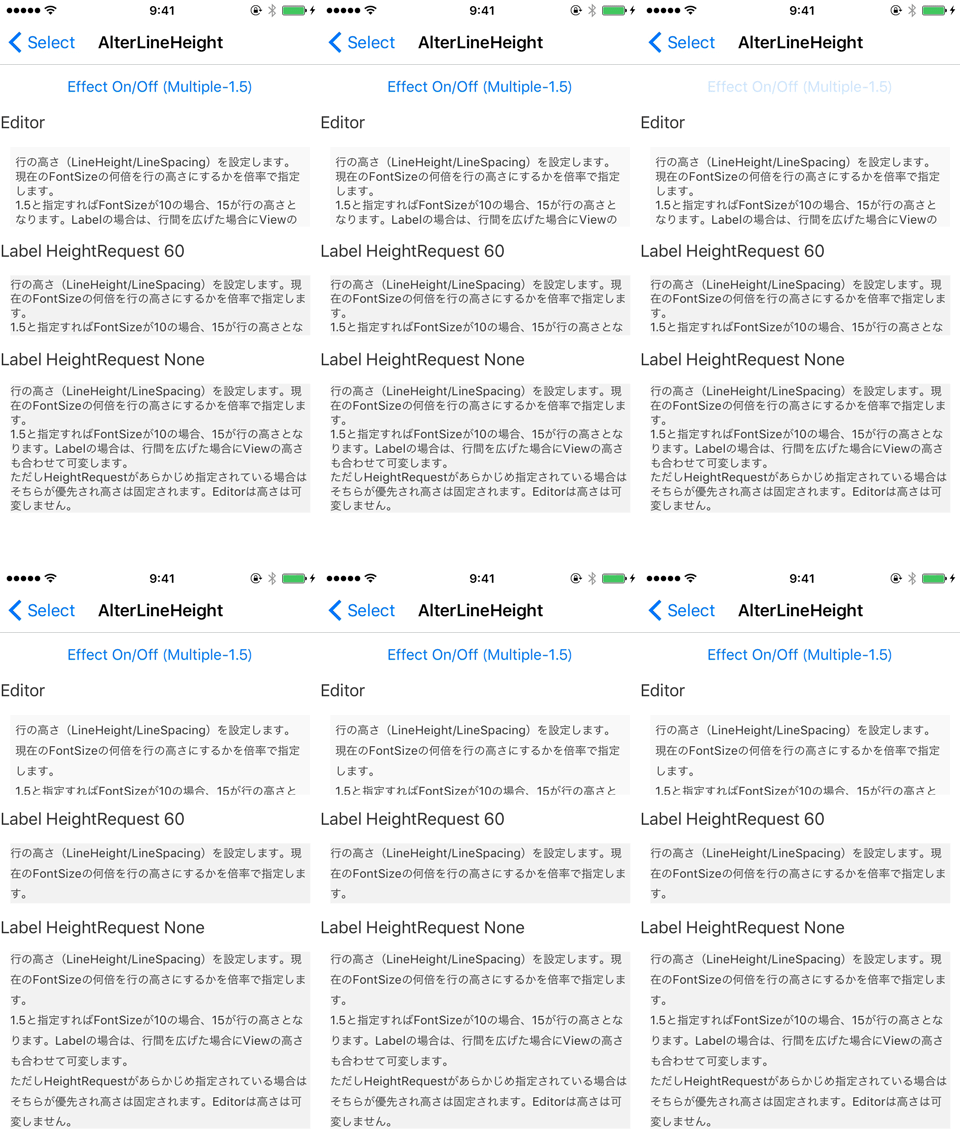
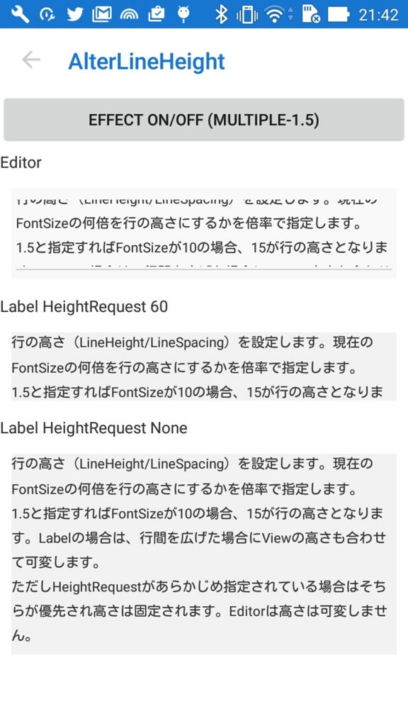
- AlterLineHeight
- alter LineHeight of Label and Editor.
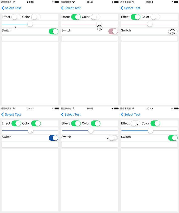
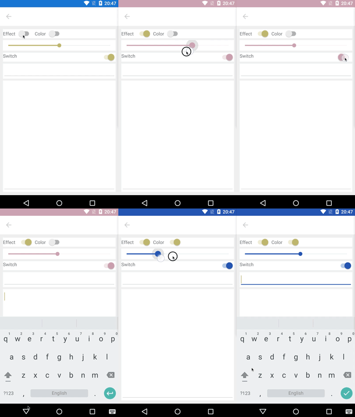
- AlterColor
- alter Color of an element which it cannot change color.
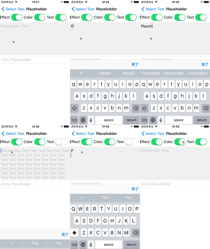
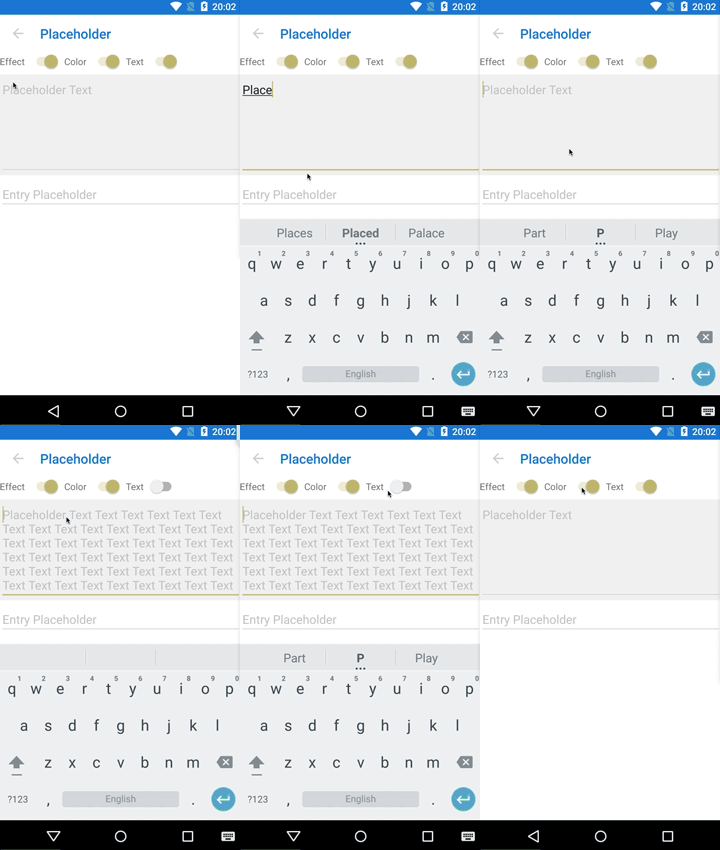
- Placeholder
- show placeholder on Editor.
Though toggling an effect had used On property in less than ver.1.4.0, As of ver.1.4.0, an effect can be enabled by setting one or more main properties of the effect. These properties are named "Trigger Properties".
Trigger properties correspond to main properties such as Command and LongCommand in case of AddCommand Effect.
In this document, trigger properties are written "trigger".
<Label Text="Text" ef:AddCommand.On="true" ef:AddCommand.Command="{Binding GoCommand}" />Always needs On property.
<Label Text="Text" ef:AddCommand.Command="{Binding GoCommand}" />Need not On property when specified Trigger Property.
If an effect had been used to dynamically toggle to with the On property specified, it may not correctly work on the trigger properties mode. To keep traditional mode, you can disable trigger properties by specifying the static config property at any place in .NETStandard project as the following code.
AiForms.Effects.EffectConfig.EnableTriggerProperty = false;iOS:iPhone5s,iPod touch6,iOS9.3
Android:version 5.1.1 (only FormsAppcompatActivity) / API22
Install-Package AiForms.EffectsYou need to install this nuget package to .NETStandard project and each platform project.
You need to write the following code in AppDelegate.cs:
public override bool FinishedLaunching(UIApplication app, NSDictionary options) {

    global::Xamarin.Forms.Forms.Init();
    AiForms.Effects.iOS.Effects.Init();  //need to write here

    ...
    return base.FinishedLaunching(app, options);
}You need to write the following code in MainActivity.cs:
protected override void OnCreate(Bundle bundle) {

    base.OnCreate(bundle);

    global::Xamarin.Forms.Forms.Init(this, bundle);
    AiForms.Effects.Droid.Effects.Init(); //need to write here
    ...
}This is the effect that the gradient background is set to a Layout Element. Although It can be set to the controls except with Layouts, its implementation is not complete.
- On
- Effect On/Off (true is On)
- Colors (trigger)
- The colors of gradient.
- Can set multiple colors with comma-separated in Xaml.
- Specify the instance of the GradientColors class in c#.
- Orientation
- Specify the direction for the gradient.
- Can select from 8 directions.
<ContentView
    ef:Gradient.Colors="Red,Yellow,#800000FF"
    ef:Gradient.Orientation="RightLeft"	>
    <Label Text="Abc" />
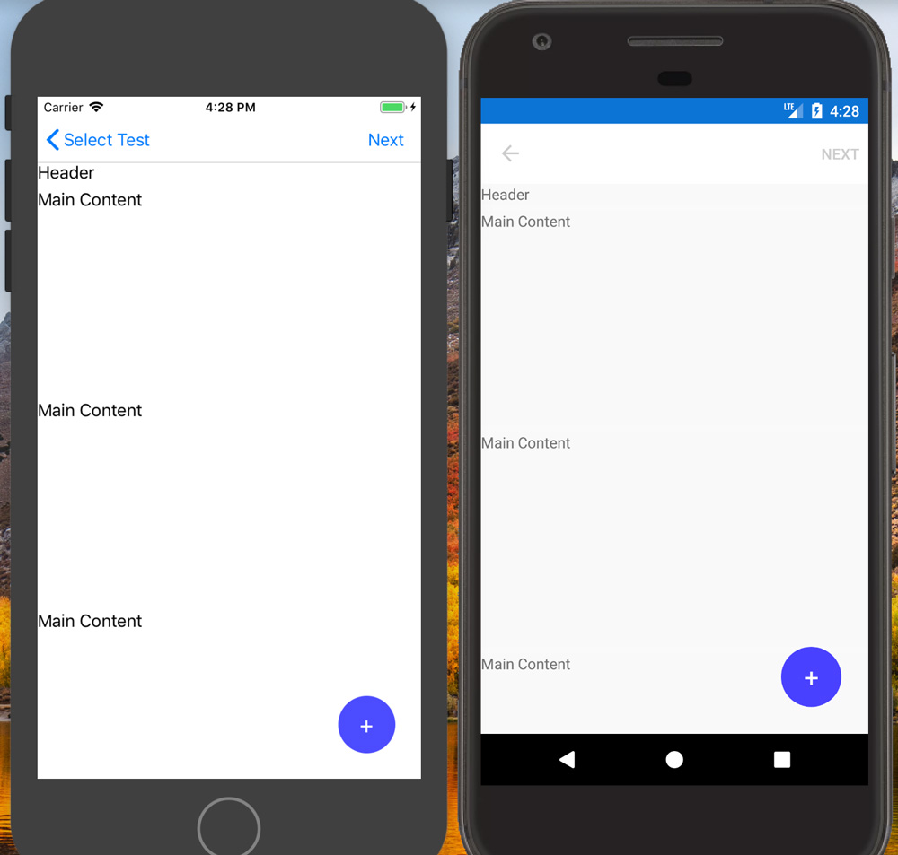
</ContentView>This is the effect that arranges some floating views (e.g. FAB) at any place on a page. The arranged elements are displayed more front than a ContentPage and are not affected a ContentPage scrolling.
This sample is that an element is arranged at above 25dp from the vertical end and left 25dp from the horizontal end.
<ContentPage xmlns:ef="clr-namespace:AiForms.Effects;assembly=AiForms.Effects">

    <ef:Floating.Content>
        <ef:FloatingLayout>
            <!-- This element is arranged at above 25dp from the vertical end and left 25dp from the horizontal end. -->
            <ef:FloatingView
                VerticalLayoutAlignment="End"
                HorizontalLayoutAlignment="End"
                OffsetX="-25" OffsetY="-25" >
                 <!-- Code behind handling / ViewModel binding OK -->
                 <Button Clicked="BlueTap" BackgroundColor="{Binding ButtonColor}"
                         BorderRadius="28" WidthRequest="56" HeightRequest="56"
                         Text="+" FontSize="24"
                         TextColor="White" Padding="0" />
            </ef:FloatingView>
        </ef:FloatingLayout>
    </ef:Floating.Content>

    <StackLayout>
        <Label Text="MainContents" />
    </StackLayout>
</ContentPage>- Content (trigger)
- The root element to arrange floating views.
- This property is of type FloatingLayout.
Note that this effect doesn't work without trigger property because it hasn't an On property.
This is the Layout that can freely arrange several FloatingView's over a page.
It is a view that FloatingLayout arranges. This view is used to specify HorizontalLayoutAlignment, VerticalLayoutAlignment, OffsetX, OffsetX and determine itself position. This view can be set any VisualElements.
- HorizontalLayoutAlignment (defalut: Center)
- The horizontal position enumeration value (Start / Center / End / Fill)
- VerticalLayoutAlignment (default: Center)
- The vertical position enumeration value (Start / Center / End / Fill)
- OffsetX
- The adjustment relative value from the horizontal layout position. (without Fill)
- OffsetY
- The adjustment relative value from the vertical layout position. (without Fill)
- Hidden
- The bool value whether a view is hidden or shown.
- On Android, If IsVisible is false when a page is rendered, there is the issue that views are never displayed. This method is used to avoid the issue. If there is some problem using IsVisible, use this instead of.
- In internal, this property uses Opacity and InputTransparent properties.
This is the effect that adds touch feedback effects (color and sound) to a view. This effect can be made use of with others effect (for example, AddNumberPicker and AddDatePicker) simultaneously. However, AddCommand can't be used along with this effect because AddCommand contains this functions.
- EffectColor (trigger)
- Touch feedback color. (default: transparent)
- EnableSound (trigger)
- Touch feedback system sound. (default: false)
This is the effect that adds touch events (begin, move, end, cancel) to a view. Each touch events provides location property and can be taken X and Y position.
- On
- Effect On / Off
Since this effect hasn't any trriger property, control by On property.
- TouchBegin
- TouchMove
- TouchEnd
- TouchCancel
This effect usage is a little different from the other effects. First of all, set On attached property to a target control and set the value to true in XAML.
<?xml version="1.0" encoding="UTF-8"?>
<ContentPage
    ...
    xmlns:ef="clr-namespace:AiForms.Effects;assembly=AiForms.Effects">
    <StackLayout HeightRequest="300" ef:AddTouch.On="true" x:Name="container" />
</ContentPage>
In turn, use AddTouch.GetRecognizer method, get a TouchRecognizer in code. This recognizer can be used to handle each touch events.
var recognizer = AddTouch.GetRecognizer(container);

recognizer.TouchBegin += (sender, e) => {
    Debug.WriteLine("TouchBegin");
};

recognizer.TouchMove += (sender, e) =>  {
    Debug.WriteLine("TouchMove");
    Debug.WriteLine($"X: {e.Location.X} Y:{e.Location.Y}");
};

recognizer.TouchEnd += (sender, e) => {
    Debug.WriteLine("TouchEnd");
};

recognizer.TouchCancel += (sender, e) => {
    Debug.WriteLine("TouchCancel");
};This is the effect that make font size adjusted to fit the Label size. This can be used only Label.
- On
- Effect On/Off (true is On)
- CanExpand
- Whether font size is expanded when making it fit. (Default true)
- If false, font size won't be expanded and only shrinked.
Since this effect hasn't any trriger property, control by On property.
<ContentPage
	xmlns="http://xamarin.com/schemas/2014/forms"
	xmlns:x="http://schemas.microsoft.com/winfx/2009/xaml"
	xmlns:ef="clr-namespace:AiForms.Effects;assembly=AiForms.Effects"
	x:Class="AiEffects.TestApp.Views.BorderPage">
	<Label Text="LongText..." ef:SizeToFit.On="true" ef.SizeToFit.CanExpand="false"
			HeightRequest="50" Width="200"  />
</ContentPage>This is the effect that add border to a view.
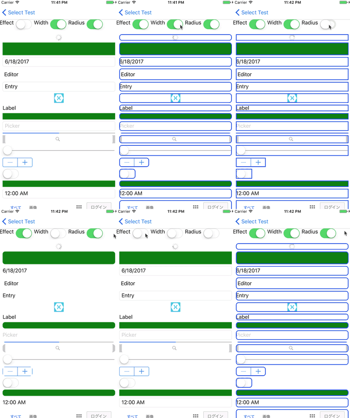
Entry, Picker, DatePicker and TimePicker on iOS have a border by default.
When specifying their width 0, it is possible that hide border.
- On
- Effect On/Off (true is On)
- Width (trigger)
- Border width (default 0)
- Color
- Border color (default transparent)
- Radius (trigger)
- Border radius (default 0)
<ContentPage
	xmlns="http://xamarin.com/schemas/2014/forms"
	xmlns:x="http://schemas.microsoft.com/winfx/2009/xaml"
	xmlns:ef="clr-namespace:AiForms.Effects;assembly=AiForms.Effects"
	x:Class="AiEffects.TestApp.Views.BorderPage">
	<StackLayout Margin="4"
        ef:Border.Width="2" ef:Border.Radius="6" ef:Border.Color="Red">
		<Label Text="hoge" />
        <Label Text="fuga" />
	</StackLayout>
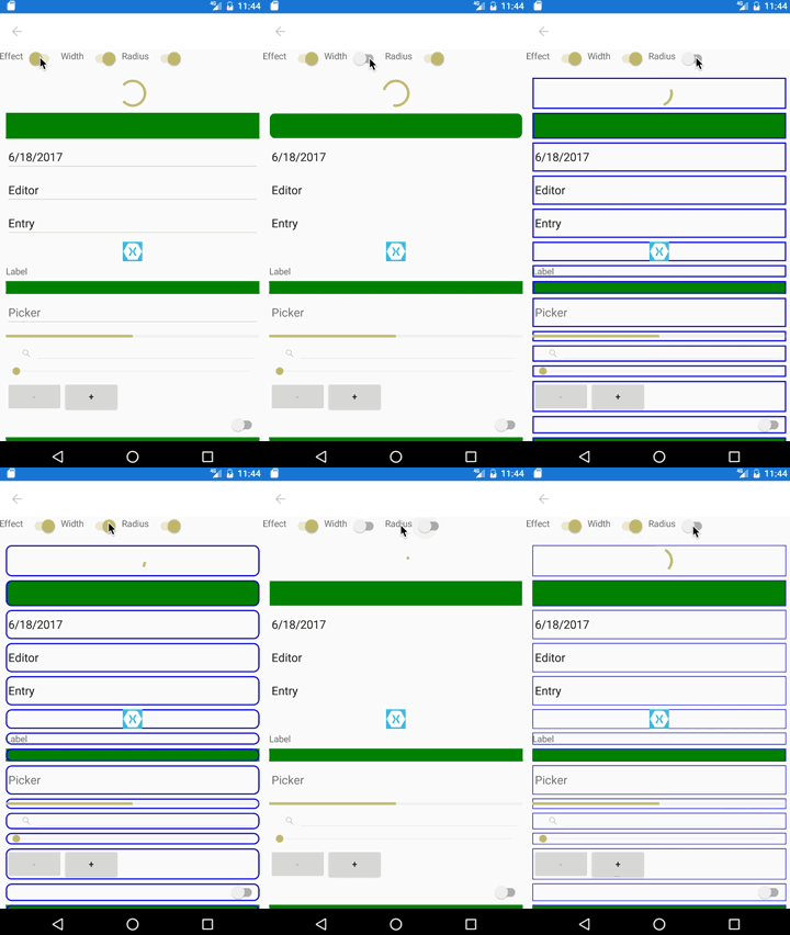
</ContentPage>- On Android Entry, Picker, DatePicker, TimePicker's input underline is hidden if this effect attached.
- On Android, Button is not displayed correctly. Use ToFlatButton for button.
- On Android WebView, Frame, ScrollView are not supported.
- On Android ListView and TableView overflow background from border.
- Using AddCommand simultaneously is not supported.
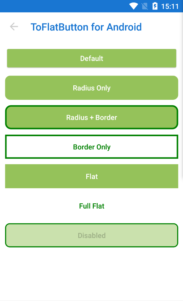
This is the effect that alter Button to flat(only Android).
If this effect is used, you will be able to design like iOS's Button.
And also this effect will enable BorderRadius, BorderWidth and BorderColor of default button properties to use by Android.
- Button (Android)
- On
- Effect On/Off (true is On)
- RippleColor (trigger)
- Ripple effect color.(default none)
<Button Text="ButtonText"
	ef:ToFlatButton.On="true"
	ef:ToFlatButton.RippleColor="Red"
	BorderWidth="4" BorderColor="Green" BorderRadius="10"
/>This is the effect that add one line text into a view.
If you use this effect, for example you will be able to show a information that validations or character count etc.
You will be able to change text position(top-left,top-right,bottom-left,bottom-right), text color,font size and margin by specifying property.
- Label
- Entry
- Editor
- StackLayout
- AbsoluteLayout
and more.
- On
- Effect On/Off (true is On)
- Text (trigger)
- added text
- TextColor
- Default Red
- BackgroundColor
- BackgroundColor of inner text view.
- Default Transparent
- FontSize
- Default 8
- Margin
- Distance from a side of target view to inner text view.
- Default 0,0,0,0
- Padding
- Padding of inner text view.
- Default 0,0,0,0
- HorizontalAlign
- horizontal text position(Start or End). Default End.
- VerticalAlign
- vertical text position(Start or End). Default Start.
<ContentPage
	xmlns="http://xamarin.com/schemas/2014/forms"
	xmlns:x="http://schemas.microsoft.com/winfx/2009/xaml"
	xmlns:ef="clr-namespace:AiForms.Effects;assembly=AiForms.Effects"
	x:Class="AiEffects.TestApp.Views.AddTextPage">
	<StackLayout Margin="4">
		<Entry HorizontalOptions="FillAndExpand" Text="{Binding Title}"
			ef:AddText.On="true" ef:AddText.TextColor="Red"
			ef:AddText.FontSize="10" ef:AddText.Margin="4,8,4,8"
			ef:AddText.Padding="2,4,2,4" ef:AddText.BackgroundColor="#A0F0F0E0"
			ef:AddText.HorizontalAlign="End"
			ef:AddText.VerticalAlign="Start"
			ef:AddText.Text="{Binding TitleMessage}" />
	</StackLayout>
</ContentPage>When device rotates, text position will not be right in case android.
This Effect add Command function to a view.
There are properties of Command and Parameter for tap and long tap.
| iOS | Android | |
|---|---|---|
| ActivityIndicator | ✅ | ✅ |
| BoxView | ✅ | ✅ |
| Button | ✅ | ✅ |
| DatePicker | ❌ | ✅ |
| Editor | ❌ | ❌ |
| Entry | ❌ | ❌ |
| Image | ✅ | ✅ |
| Label | ✅ | ✅ |
| ListView | ✅ | ❌ |
| Picker | ❌ | ✅ |
| ProgressBar | ✅ | ✅ |
| SearchBar | ❌ | ❌ |
| Slider | ✅ | ❌ |
| Stepper | ✅ | ❌ |
| Switch | ❌ | ❌ |
| TableView | ❌ | ❌ |
| TimePicker | ❌ | ✅ |
| WebView | ❌ | ❌ |
| ContentPresenter | ✅ | ✅ |
| ContentView | ✅ | ✅ |
| Frame | ✅ | ❌ |
| ScrollView | ❌ | ❌ |
| TemplatedView | ✅ | ✅ |
| AbsoluteLayout | ✅ | ✅ |
| Grid | ✅ | ✅ |
| RelativeLayout | ✅ | ✅ |
| StackLayout | ✅ | ✅ |
- On
- Effect On/Off (true is On)
- Command (trigger)
- Tap Command
- CommandParameter
- Tap Command Parameter
- LongCommand (trigger)
- Long Tap Command
- LongCommandParameter
- Long Tap Command Parameter
- EffectColor
- foreground color when tapped. (default: transparent)
EnableRippleRipple Effect On/Off (default true,android only) If you don't have to use ripple effect, it make EnableRipple false.- This property is obsolete as of version 1.4.0.
- EnableSound
- When tapped, whether play system sound effect.(Default false)
- SyncCanExecute
- Whether synchronize Command's CanExecute to xamarin.forms.view's IsEnabled.(Default false)
- If true, a view become opacity when disabled.
<ContentPage xmlns="http://xamarin.com/schemas/2014/forms"
		xmlns:x="http://schemas.microsoft.com/winfx/2009/xaml"
		xmlns:ef="clr-namespace:AiForms.Effects;assembly=AiForms.Effects"
		x:Class="AiEffects.Sample.Views.AddCommandPage">

        <StackLayout>
    		<Label Text="Label"
    			ef:AddCommand.On="true"
    			ef:AddCommand.EffectColor="#50FFFF00"
    			ef:AddCommand.Command="{Binding EffectCommand}"
    			ef:AddCommand.CommandParameter="Label"
                ef:AddCommand.LongCommand="{Binding LongTapCommand}"
                ef:AddCommand.LongCommandParameter="LongTap" />
        </StackLayout>
</ContentPage>On Android
- If the version is more than or equal 1.1.0 and RippleEffect is applied to a Element which is a kind of Layout, the InputTransparent of the children become not to work.
AppDelegate
public override bool FinishedLaunching(UIApplication app, NSDictionary options) {
    global::Xamarin.Forms.Forms.Init();

    AiForms.Effects.iOS.Effects.Init();
    //here specify sound number
    AiForms.Effects.iOS.FeedbackPlatformEffect.PlaySoundNo = 1104;
    ...
}
MainActivity
protected override void OnCreate(Bundle bundle) {

    base.OnCreate(bundle);
    ...

    global::Xamarin.Forms.Forms.Init(this, bundle);

    //here specify SE
    AiForms.Effects.Droid.FeedbackPlatformEffect.PlaySoundEffect = Android.Media.SoundEffect.Spacebar;

    ...
}Ripple Effect will not occur foreground. In that case wrap by a layout view.
<StackLayout ef:AddCommand.On="{Binding EffectOn}"
			 ef:AddCommand.EffectColor="{Binding EffectColor}">
    <Image Source="image" />
</StackLayout>This Effect add NumberPicker function to a view.
When you tap the view ,Picker is shown. And when you select a number,it reflects to Number property.If you set Command property,it executes.
- Label
- BoxView
- Button
- Image
- StackLayout
- AbsoluteLayout
and more. same with AddCommand.
- On
- Effect On/Off (true is On)
- Min
- minimum number(positive integer)
- Max
- maximum number(positive integer)
- Number (trigger)
- current number(default twoway binding)
- Title
- Picker Title(optional)
- In case iOS, if this is so long, it will be not beautiful.
- Command
- command invoked when a number was picked(optional)
<ContentPage xmlns="http://xamarin.com/schemas/2014/forms"
		xmlns:x="http://schemas.microsoft.com/winfx/2009/xaml"
		xmlns:ef="clr-namespace:AiForms.Effects;assembly=AiForms.Effects"
		xmlns:prism="clr-namespace:Prism.Mvvm;assembly=Prism.Forms"
		prism:ViewModelLocator.AutowireViewModel="True"
		x:Class="AiEffects.Sample.Views.AddNumberPickerPage"
		Title="AddNumberPicker">
	<StackLayout>
		<Label Text="Text"
			ef:AddNumberPicker.On="true"
			ef:AddNumberPicker.Min="10"
			ef:AddNumberPicker.Max="999"
			ef:AddNumberPicker.Number="{Binding Number}"
			ef:AddNumberPicker.Title="Select your number"
            ef:AddNumberPicker.Command="{Binding SomeCommand}" />
    </StackLayout>
</ContentPage>This is the effect that add TimePicker to a view.
When you tap the view, Picker is shown. And when a time is selected, that time will be reflected to Time property. If Command property is set, the command will be executed.
This effect supports views same with AddCommand.
- On
- Effect On/Off (true is On)
- Time (trigger)
- current time(default twoway binding)
- Title
- Picker Title(optional)
- In case iOS, if this is so long, it will be not beautiful.
- Command
- command invoked when a time was picked(optional)
This is the effect that add DatePicker to a view.
When you tap the view, Picker is shown. And when a date is selected, that date will be reflected to Date property. If Command property is set, the command will be executed.
This effect supports views same with AddCommand.
- On
- Effect On/Off (true is On)
- MinDate
- minimum date(optional)
- MaxDate
- maximum date(optional)
- Date (trigger)
- current date(default twoway binding)
- TodayText
- button text to select today(optional / only iOS)
- If this property is set, today's button will be shown. If that button is tapped, today will be selected.
- Command
- command invoked when a date was picked(optional)
This Effect alter LineHeight of Label and Editor.
- Label
- Editor
- On
- Effect On/Off (true is On)
- Multiple (trigger)
- Multiple to the font height.
- The font height * this multiple will become line height.
<ContentPage xmlns="http://xamarin.com/schemas/2014/forms"
		xmlns:x="http://schemas.microsoft.com/winfx/2009/xaml"
		xmlns:ef="clr-namespace:AiForms.Effects;assembly=AiForms.Effects"
		xmlns:prism="clr-namespace:Prism.Mvvm;assembly=Prism.Forms"
		prism:ViewModelLocator.AutowireViewModel="True"
		x:Class="AiEffects.Sample.Views.AlterLineHeightPage"
		Title="AlterLineHeight">
	<StackLayout BackgroundColor="White" Spacing="4">
		<Label Text="{Binding LabelText}" VerticalOptions="Start" FontSize="12"
			ef:AlterLineHeight.On="true"
			ef:AlterLineHeight.Multiple="1.5"  />
	</StackLayout>
</ContentPage>This is the effect that alter the color of an element which it cannot change color normally.
| iOS | Android | which part | |
|---|---|---|---|
| Page | ✅ | Statusbar | |
| Slider | ✅ | ✅ | Trackbar |
| Switch | ✅ | ✅ | Trackbar |
| Entry | ✅ | Under line | |
| Editor | ✅ | Under line |
- On
- Effect On/Off (true is On)
- Accent (trigger)
- changed color.
<Slider Minimum="0" Maximum="1" Value="0.5"
ef:AlterColor.On="true" ef:AlterColor.Accent="Red" />** This feature was implemented in Xamarin.Forms 3.2.0. **
In case you use version less than 3.2.0, this effect can be made use of.
This is the effect that show placeholder on Editor.
This effect supports Editor only.
- On
- Effect On/Off (true is On)
- Text (trigger)
- Placeholder text.
- Color
- Placeholder color.
<ContentPage
	xmlns="http://xamarin.com/schemas/2014/forms"
	xmlns:x="http://schemas.microsoft.com/winfx/2009/xaml"
	xmlns:ef="clr-namespace:AiForms.Effects;assembly=AiForms.Effects"
	x:Class="AiEffects.TestApp.Views.BorderPage">
	<Editor HeightRequest="150"
		ef:Placeholder.On="true"
		ef:Placeholder.Text="placeholder text"
		ef:Placeholder.Color="#E0E0E0"
	/>
</ContentPage>I am asking for your donation for continuous development🙇
Your donation will allow me to work harder and harder.
I am asking for sponsors too. This is a subscription.
MIT Licensed.
