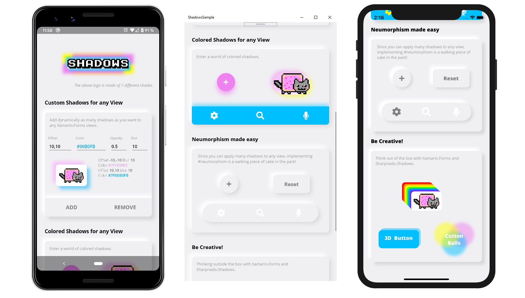
Get it from NuGet:
| Supported platforms |
|---|
| ✔️ Android |
| ✔️ iOS |
| ✔️ UWP |
| ✔️ Tizen |
On iOS add this line after Xamarin.Forms.Forms.Init() and before LoadApplication(new App()).
Sharpnado.Shades.iOS.iOSShadowsRenderer.Initialize();
On Tizen add this line after Xamarin.Forms.Forms.Init() and before LoadApplication(new App()).
Sharpnado.Shades.Tizen.TizenShadowsRenderer.Initialize();
Add as many custom shadows as you like to any Xamarin.Forms view (Android, iOS, UWP, Tizen).
- You can specify each shadow
Color,Opacity,BlurRadius, andOffset - Simply implement
Neumorphism - You can add one shadow, 3 shadows, 99 shadows, to any
Xamarin.Formselement - Animate any of these property and make the shadows dance around your elements
- No
AndroidXorSkiaSharpdependency required (except Tizen), onlyXamarin.Forms
Shadows is a container for any Xamarin.Forms view.
Just wrap your view in it and start adding shadows:
XAML
<sh:Shadows x:Name="CatShadows"
            CornerRadius="10">
    <sh:Shadows.Shades>
        <sh:ImmutableShades>
            <sh:Shade BlurRadius="10"
                      Opacity="0.5"
                      Offset="-10,-10"
                      Color="#FE99FE" />
            <sh:Shade BlurRadius="10"
                      Opacity="0.5"
                      Offset="10,10"
                      Color="#00B0FB" />
        </sh:ImmutableShades>
    </sh:Shadows.Shades>
    <Frame WidthRequest="80"
           Padding="10"
           HorizontalOptions="Center"
           VerticalOptions="Center"
           BackgroundColor="White"
           CornerRadius="10">
        <Image Source="{images:ImageResource nyan_cat.png}" />
    </Frame>
</sh:Shadows>
OUTPUT
Thanks to the CornerRadius property you can match your target corner to achieve a perfect shadow.
For example, you can add a shadow to a rounded button:
XAML
<sh:Shadows CornerRadius="30"
            Shades="{sh:SingleShade Offset='0, 10',
                                    Opacity=0.7,
                                    Color=Violet}">
    <ImageButton WidthRequest="60"
                 HeightRequest="60"
                 Padding="20"
                 HorizontalOptions="Center"
                 VerticalOptions="Center"
                 BackgroundColor="Violet"
                 CornerRadius="30"
                 Source="{StaticResource IconPlusWhite}" />
</sh:Shadows>
OUTPUT
The Shadows component has only 2 properties:
int CornerRadiuswhich should be equal to the component's child viewCornerRadiusto achieve a good shadow effect,IEnumerable<Shade> Shadeswhich is the enumeration of all the shades this shadow is made of.
A shade is what you could call a "sub-shadow".
Each shade has 4 properties:
Point Offset: the offset of the shadeColor Color: the color of the shadedouble Opacity: the opacity of the shadedouble BlurRadius: the amount of blur your want for this shade
Logo.xaml
<?xml version="1.0" encoding="UTF-8" ?>
<sh:Shadows x:Class="ShadowsSample.Views.Logo"
            xmlns="http://xamarin.com/schemas/2014/forms"
            xmlns:sh="http://sharpnado.com/schemas/shadows"
            CornerRadius="3">
    <sh:Shadows.Shades>
        <sh:ImmutableShades>
            <sh:Shade BlurRadius="10"
                      Opacity="1"
                      Offset="-15,-15"
                      Color="Yellow" />
            <sh:Shade BlurRadius="10"
                      Opacity="1"
                      Offset="15,15"
                      Color="Yellow" />
            <sh:Shade BlurRadius="10"
                      Opacity="1"
                      Offset="-15,15"
                      Color="Violet" />
            <sh:Shade BlurRadius="10"
                      Opacity="1"
                      Offset="15,-15"
                      Color="Violet" />
            <sh:Shade BlurRadius="5"
                      Opacity="1"
                      Offset="-5,-5"
                      Color="DeepSkyBlue" />
            <sh:Shade BlurRadius="5"
                      Opacity="1"
                      Offset="5,5"
                      Color="DeepSkyBlue" />
            <sh:Shade BlurRadius="5"
                      Opacity="1"
                      Offset="0,0"
                      Color="White" />
        </sh:ImmutableShades>
    </sh:Shadows.Shades>
    <Label Style="{StaticResource TextHuge}"
           VerticalOptions="Center"
           FontFamily="{StaticResource FontKarmatic}"
           Text="Shadows" />
</sh:Shadows>
OUTPUT
To have a nice Neumorphism effect we need to choose a background color.
I found that #F0F0F3 was quite good, so I will stick to it for our content and our page background color.
Since Neumorphism implementation is made of 2 shadows, one bright at the top left, one dark at the bottom right, achieving a Neumorphism style with Shadows for all the views is really easy:
<Style ApplyToDerivedTypes="True" TargetType="sh:Shadows">
    <Setter Property="CornerRadius" Value="10" />
    <Setter Property="Shades">
        <sh:ImmutableShades>
            <sh:Shade BlurRadius="10"
                      Opacity="1"
                      Offset="-10,-10"
                      Color="White" />
            <sh:Shade BlurRadius="10"
                      Opacity="1"
                      Offset="6, 6"
                      Color="#19000000" />
        </sh:ImmutableShades>
    </Setter>
</Style>
If you want to add Neumorphism to specific elements a NeumorphismShades markup extension will help you with that:
XAML
<sh:Shadows Grid.Row="1"
            Grid.Column="0"
            CornerRadius="40"
            Shades="{sh:NeumorphismShades}">
    <ImageButton WidthRequest="60"
                 HeightRequest="60"
                 Padding="20"
                 HorizontalOptions="Center"
                 VerticalOptions="Center"
                 BackgroundColor="#F0F0F3"
                 CornerRadius="30"
                 Source="{StaticResource IconPlusGray}" />
</sh:Shadows>

<sh:Shadows Grid.Row="1"
            Grid.Column="1"
            CornerRadius="10"
            Shades="{sh:NeumorphismShades}">
    <Button Style="{StaticResource TextHeadline}"
            WidthRequest="120"
            HeightRequest="60"
            HorizontalOptions="Center"
            VerticalOptions="Center"
            BackgroundColor="#F0F0F3"
            CornerRadius="10"
            Text="Reset"
            TextColor="Gray" />
</sh:Shadows>
OUTPUT
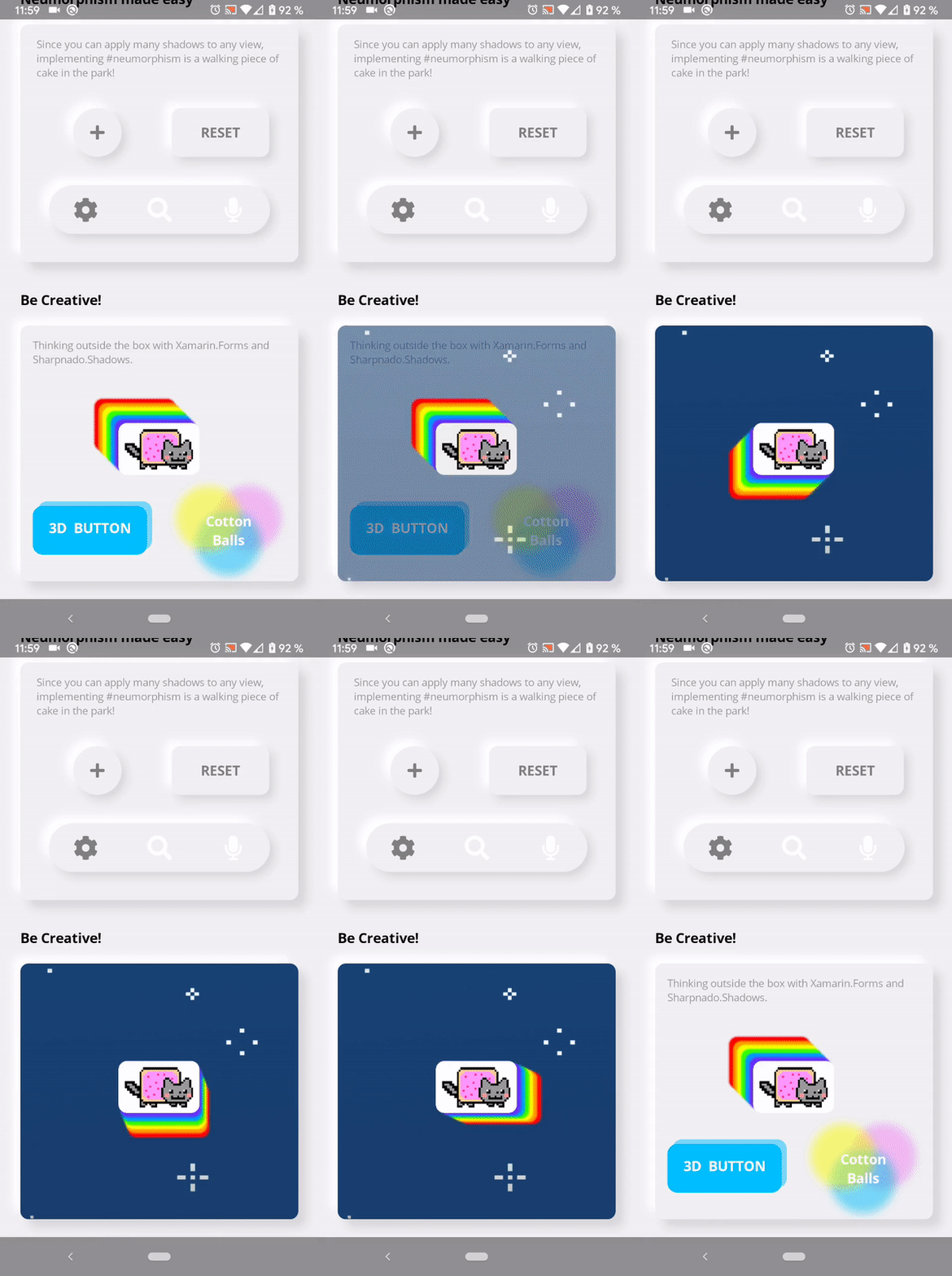
One last thing: all properties of a Shade are animatable.
You can achieve nice effects thinking outside the box!
Have a look at the BeCreative.xaml file and its code-behind.
To have a better control of your shades, Shadows provides 2 kinds of MarkupExtension:
- One immutable collection of shades:
ImmutableShades - One mutable collection:
ShadesStack
Use the first one if the shade collection will not change and the second one if you want to dynamically add or remove shades.
Dynamic shades starting with 0 shade.
<sh:Shadows CornerRadius="10">
    <sh:Shadows.Shades>
        <sh:ShadeStack />
    </sh:Shadows.Shades>
    <Frame WidthRequest="80"
           Padding="10"
           HorizontalOptions="Center"
           VerticalOptions="Center"
           BackgroundColor="White"
           CornerRadius="10">
        <Image Source="{images:ImageResource nyan_cat.png}" />
    </Frame>
</sh:Shadows>You can also use the SingleShade markup extension if you just have one shadow.
It will remove some xaml elements:
<sh:Shadows CornerRadius="30"
            Shades="{sh:SingleShade Offset='0, 10',
                                    Opacity=0.7,
                                    Color=Violet}">
    <ImageButton WidthRequest="60"
                 HeightRequest="60"
                 Padding="20"
                 HorizontalOptions="Center"
                 VerticalOptions="Center"
                 BackgroundColor="Violet"
                 CornerRadius="30"
                 Source="{StaticResource IconPlusWhite}" />
</sh:Shadows>- On
Android, shadows are created thanks toRenderScript. Bitmaps are cached and only recreated when needed - On
iOS, aShadeis implemented with a simpleCALayer - On
UWP,Shadeis implemented withSpriteVisualdrop shadows. - On
Tizen,Shadeis implemented withSkiaSharp.


