FluentUI-for-Teams theme
Building Power Apps canvas apps for Microsoft Teams can include some tedious tasks, as there is no theme included in the Power Apps studio and even Microsoft's new Creator kit doesn't offer Microsoft Teams specific Fluent UI components.
This sample
-
provides you with a reference Power Apps canvas app that includes a customized
themes.jsonto manipulate the default style of controls to blend into the look & feel of Microsoft Teams. It includes -
exemplifies canvas components for
-
gives you examples on how screens could look like
-
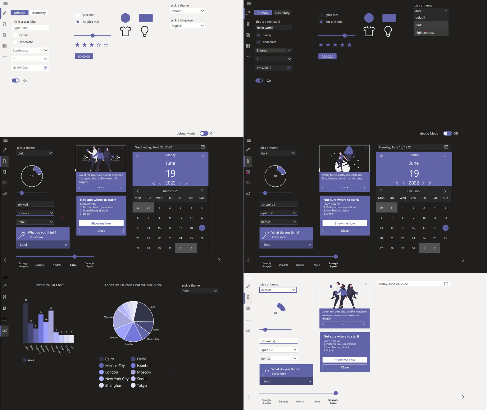
reflects all styles in 3 modes: default, dark, and high-contrast.
Demo
Context
The app is context aware in terms of language (example in navigation, works in English and German) and Teams theme. Users can override the context by selecting a different language and theme in the app. (This also serves development and debugging purposes.)
Microsoft Teams themes
Teams' Desktop and Web client support default, dark and high contrast theme, the mobile client supports default and dark theme. The app reacts dynamically on a theme change as all colors as gblAppColors and the styles as gblAppStyles for or all controls are stored in the App's OnStart property.
Controls
This is an overview of all controls how they are now defined in the themes.json file. This work is based on the Teams UI toolkit, which is based on Fluent UI and also guides developers to more likely pass the App source validation of their Microsoft Teams applications.
All controls respect the font and color schema regarding the states rest, hover, pressed, and disabled.
However, styling these controls even in the
themes.jsonhas its limits, for example you can't manipulate the background color of the calendar in the DatePicker control. This is why I also created canvas components and included these in the sample. You can find information on what ist not stylable neither out-of-the-box in Power Apps Studio nor with manipulation ofthemes.jsonin each section below.
I tried to get as close as possible to achieve that Teams native look, still not every desirable modification is supported.
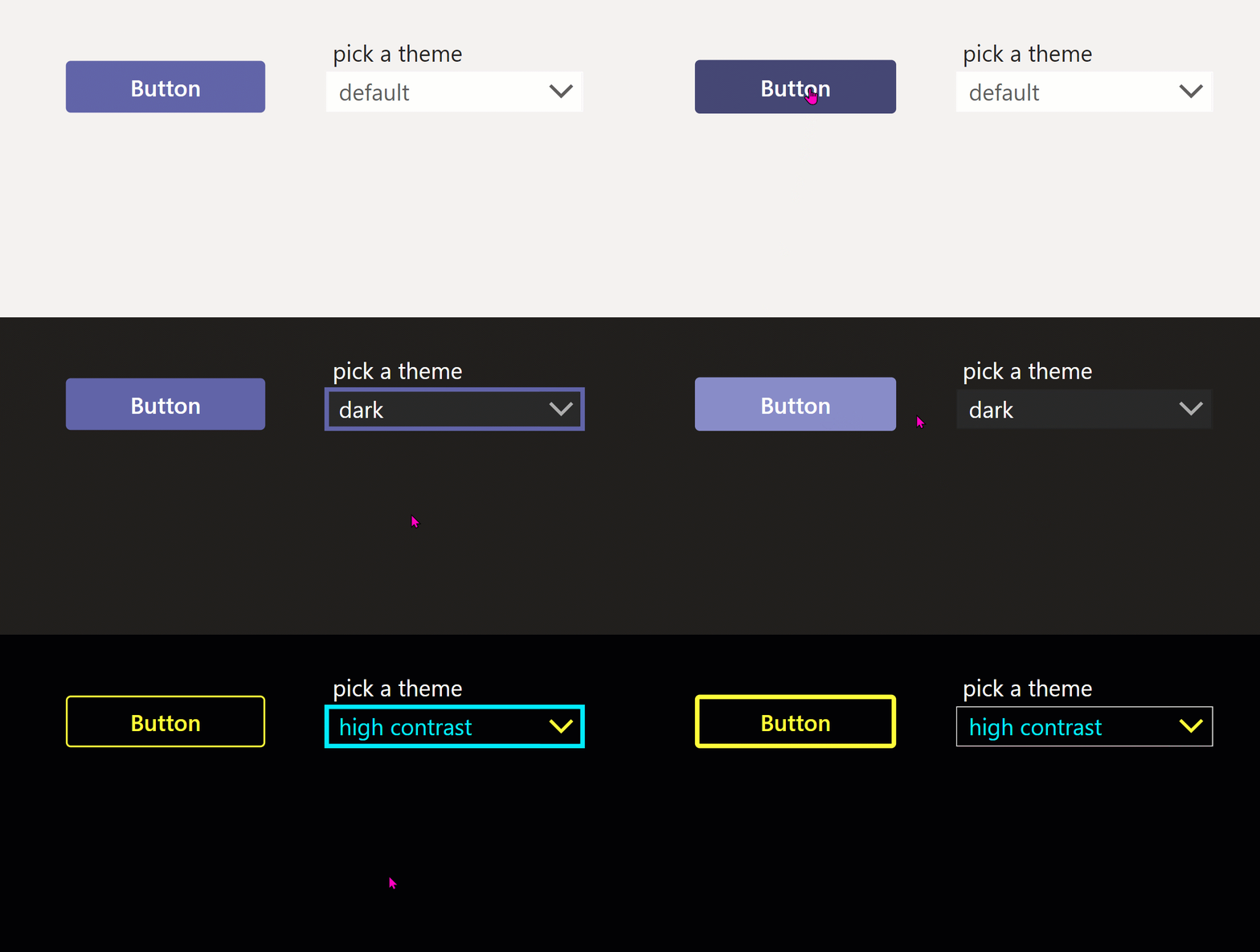
Button
A drop shadow is not stylable for the button control, however you can achieve it with an HTML control in inject CSS inline:
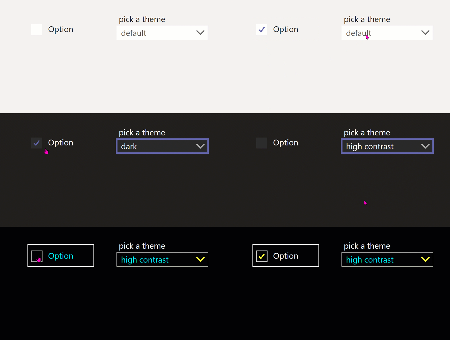
"<div style='margin:10px;width:"&btn_1.Width&"px;height:"&btn_1.Height &"px;background-color:#;box-shadow:3px 3px 6px 3px rgba(0,0,0,0.14); border-radius:4px'></div>"Checkbox
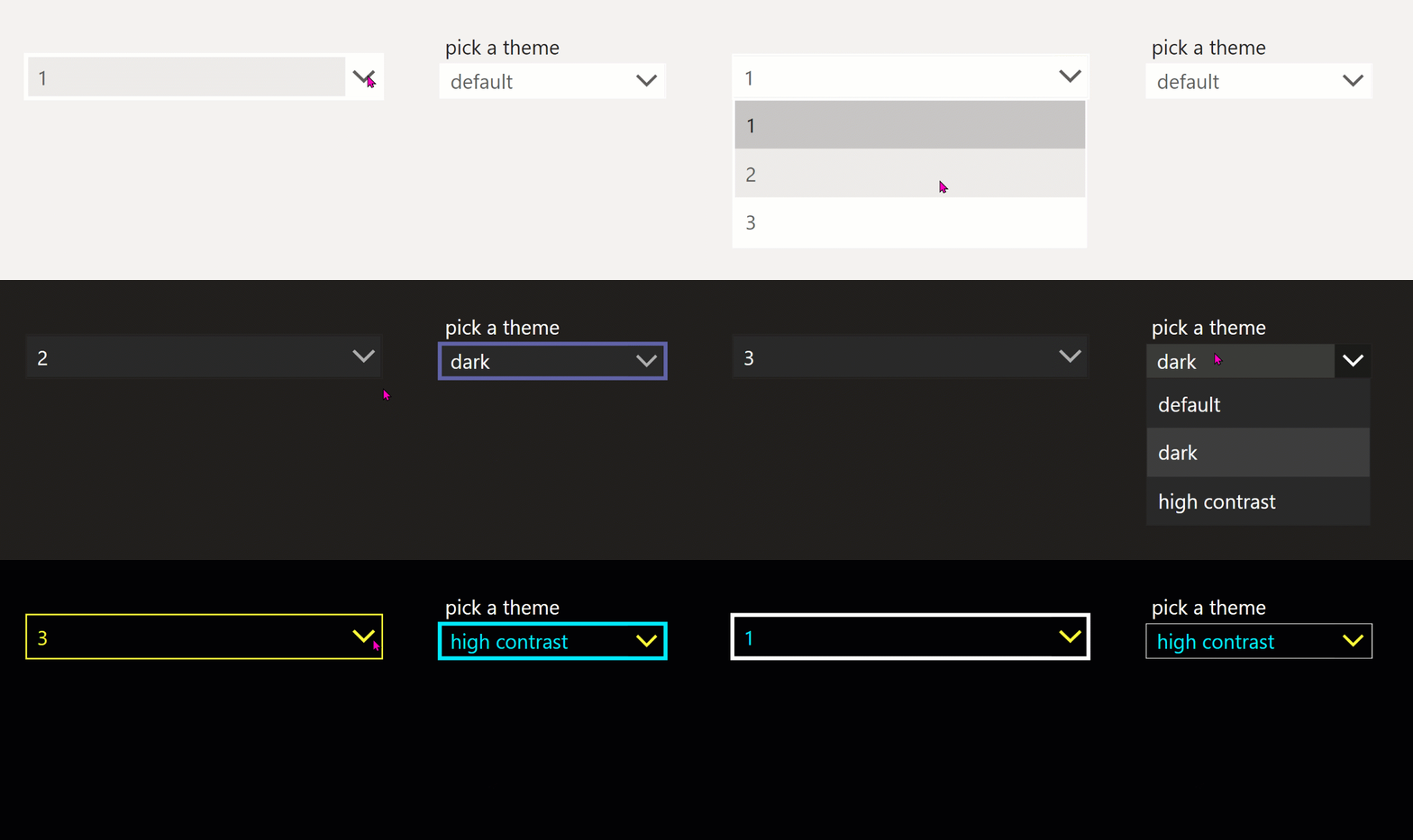
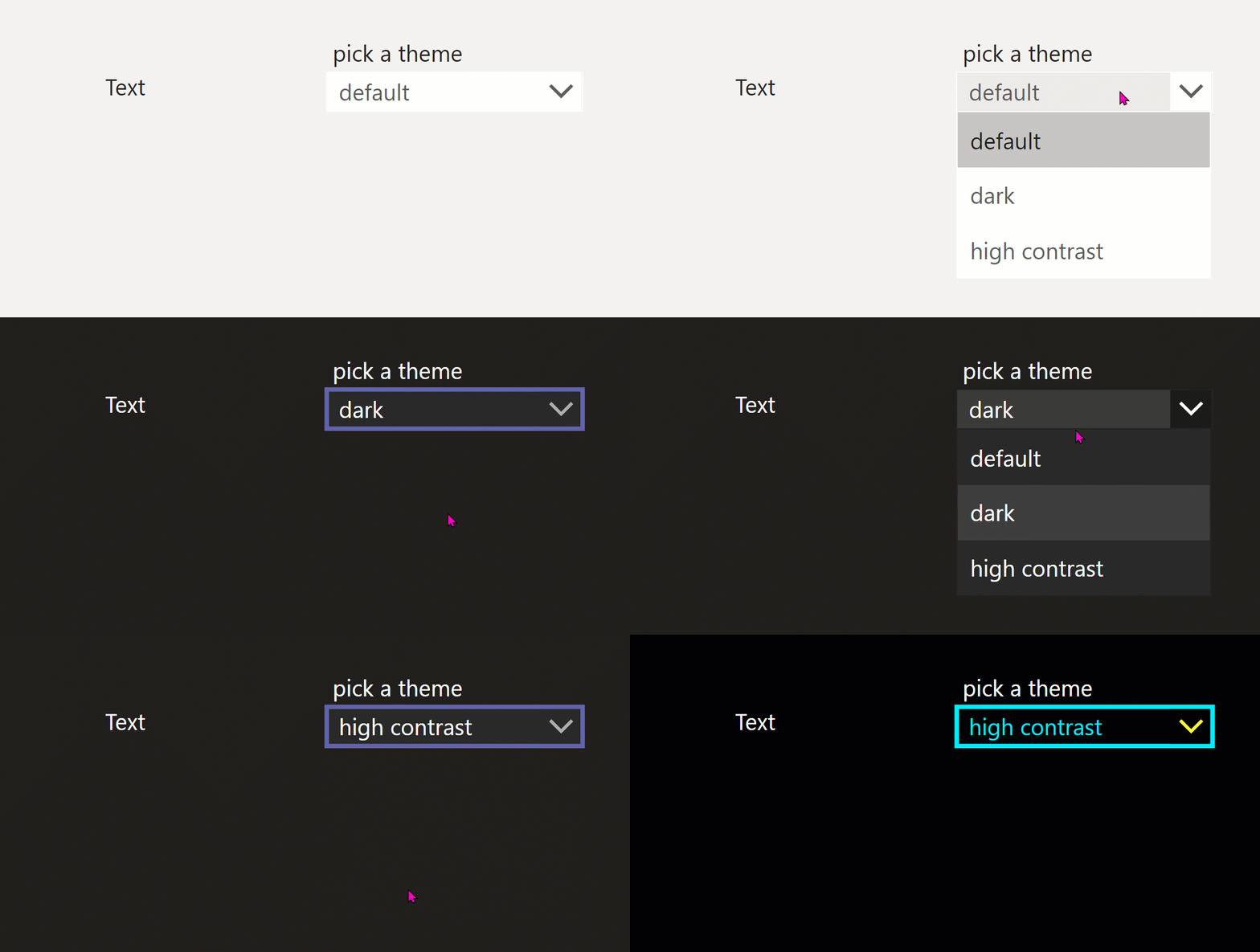
Dropdown
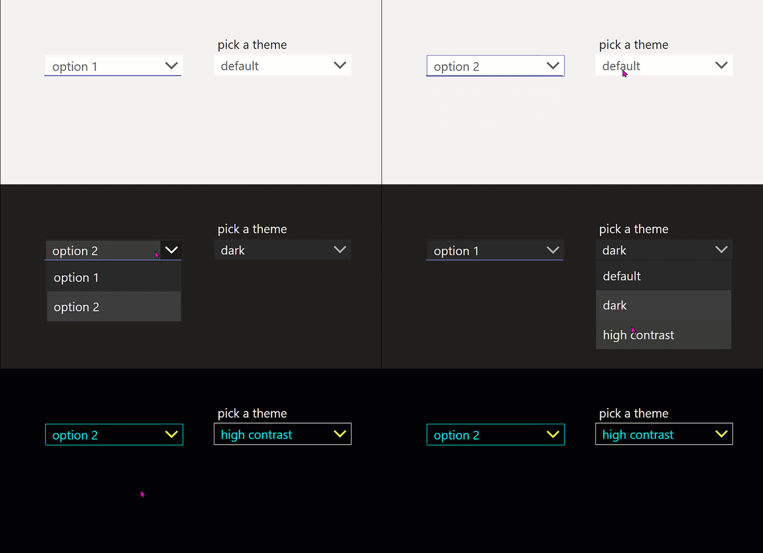
The Dropdown should have a primary-colored line at the bottom, this is not achievable out-of-the box, I created a Dropdown component for this design requirement.
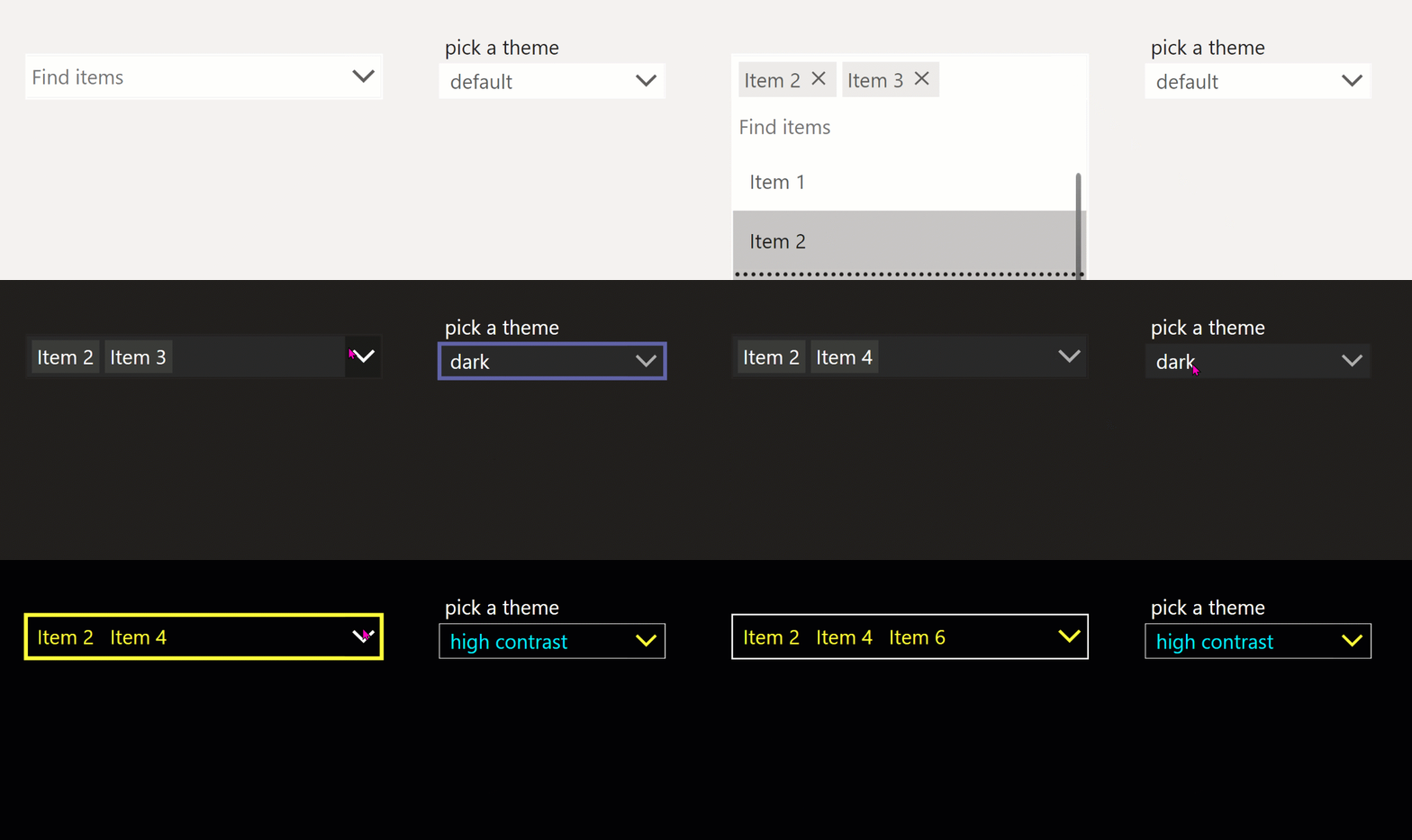
Combobox
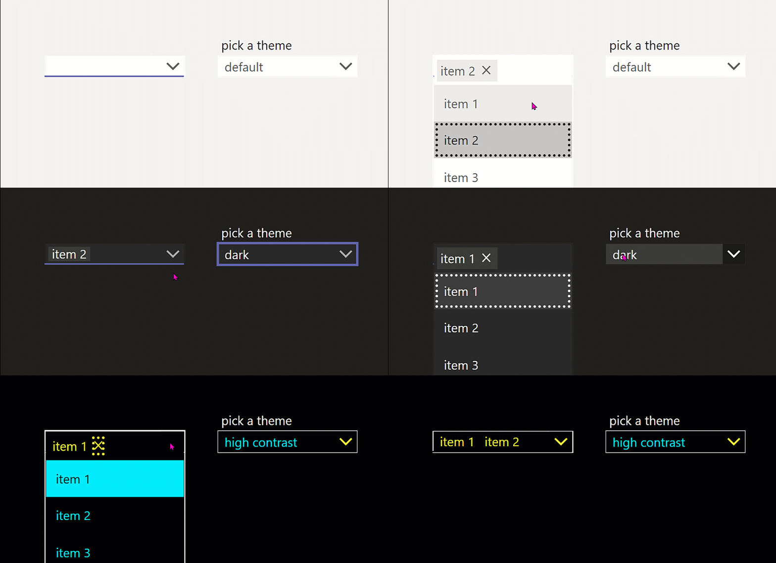
The Combobox should have a primary-colored line at the bottom, this is not achievable out-of-the box, I created a Combobox component for this design requirement.
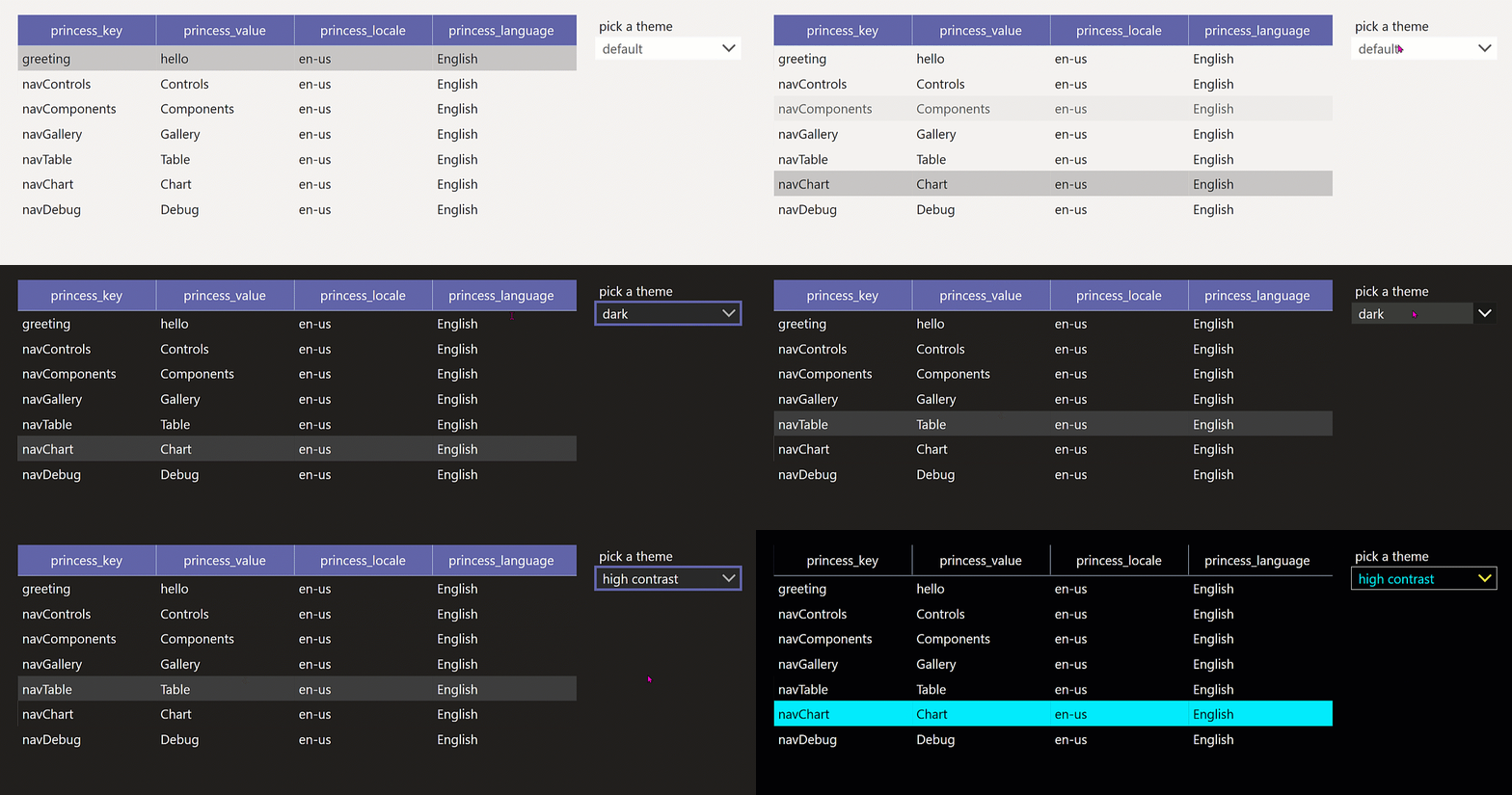
Datatable
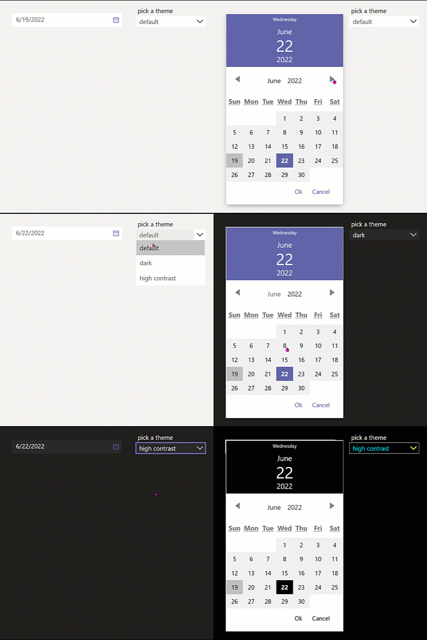
Datepicker
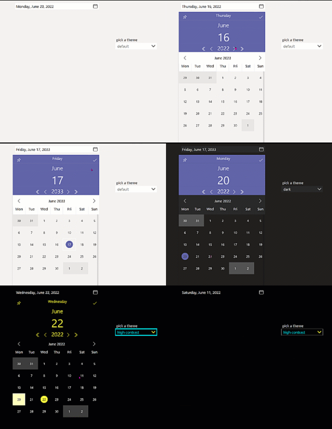
The DatePicker is a bit stylable, however the background color of the calendar can't be changed, which doesn't look good in dark mode or high contrast mode. I built a Datepicker component to tackle this.
Icons
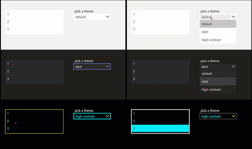
Listbox
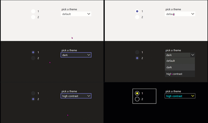
Radiobutton
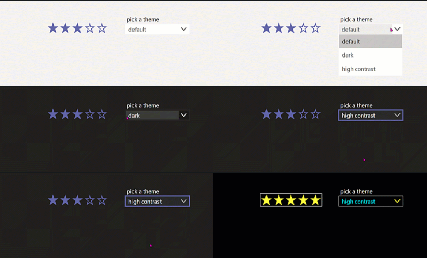
Rating
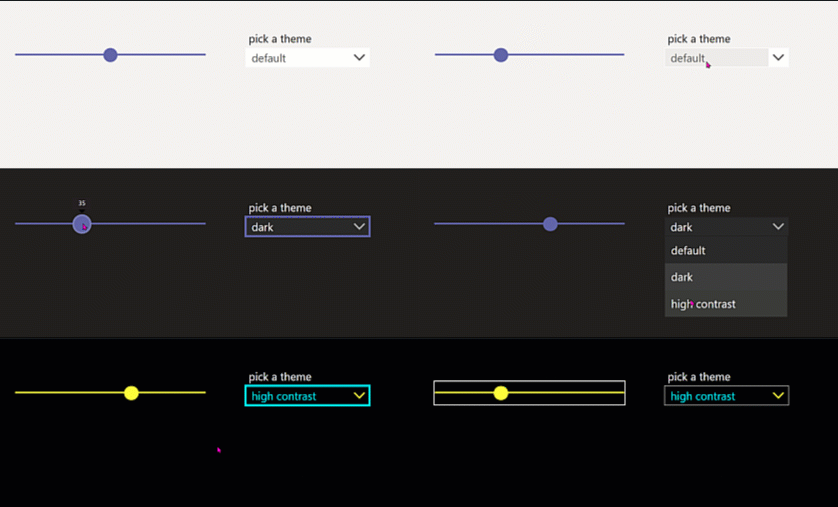
Slider
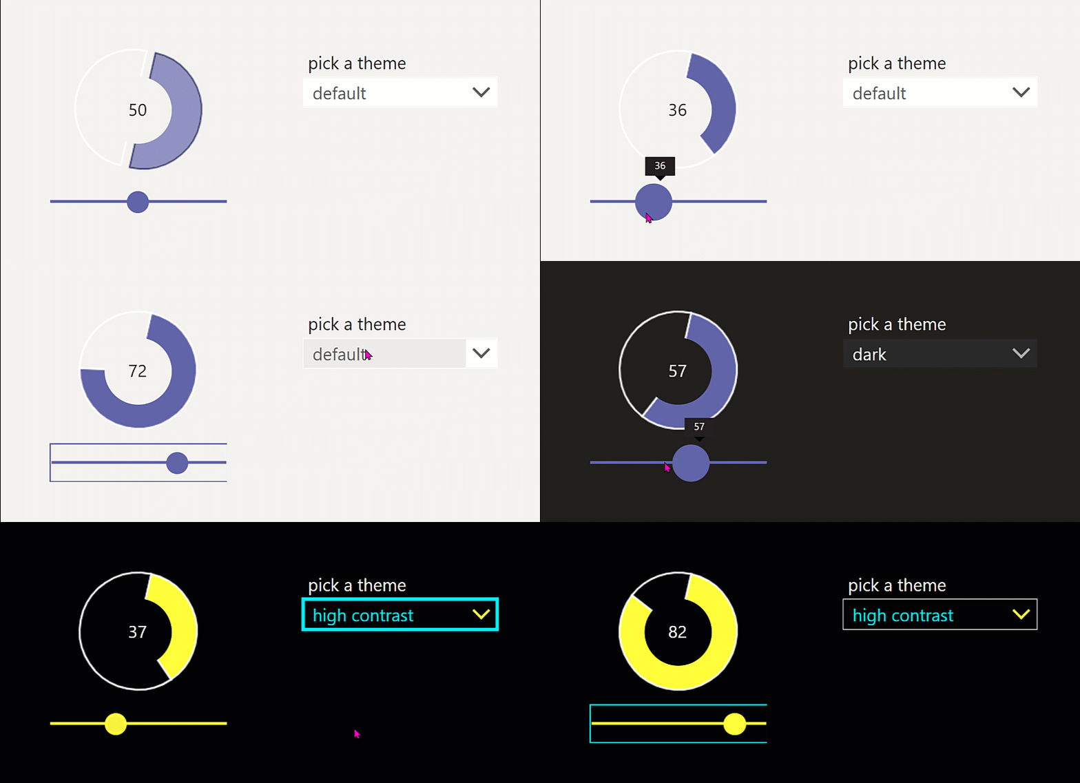
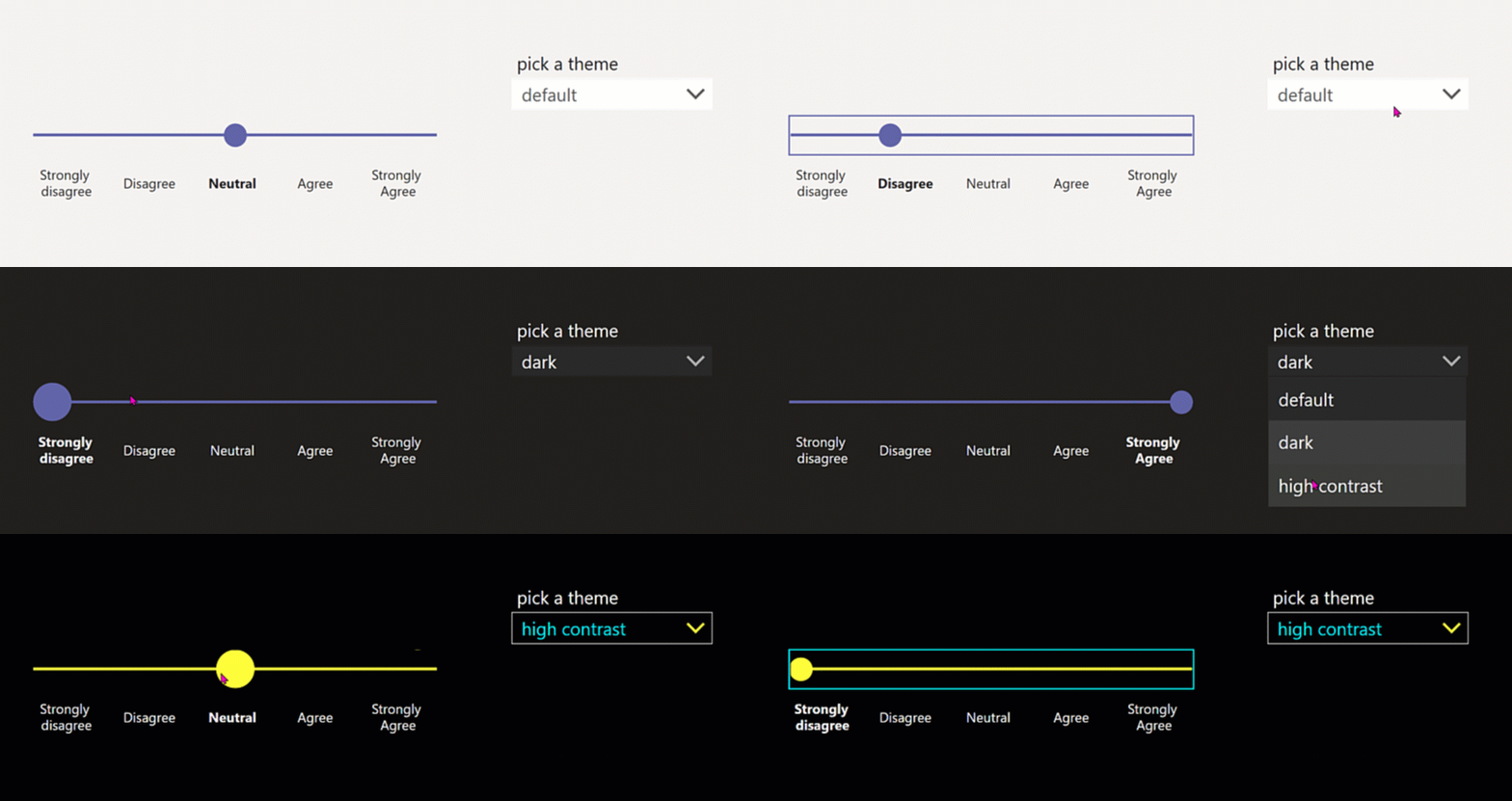
The slider looks as it should, still I created some components that make use of it: Check out Likert component and Donut chart component
Textlabel
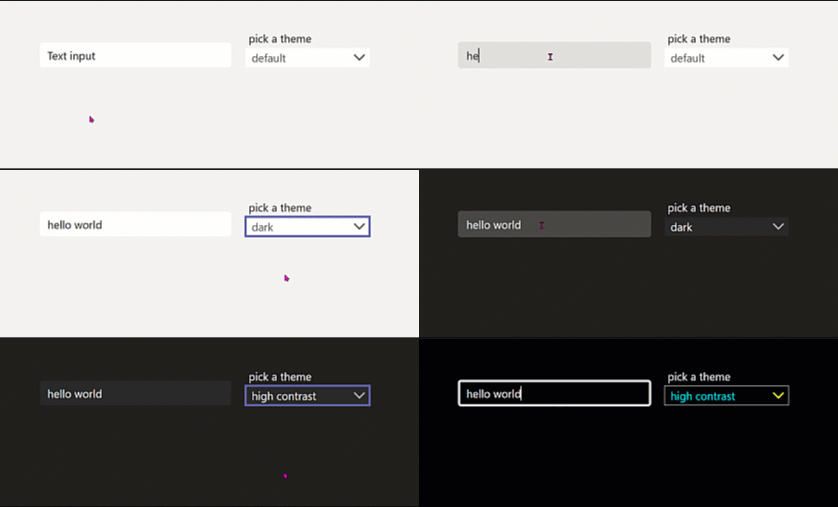
TextInput
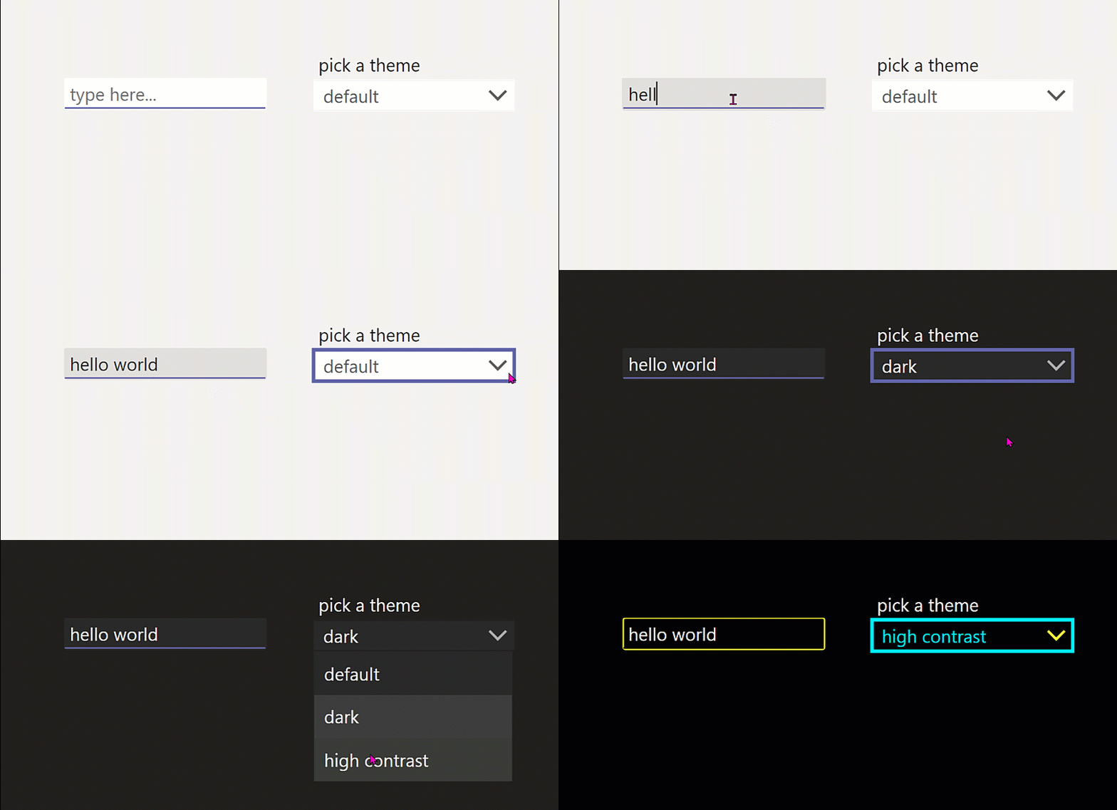
The Textinput should have a primarycolored line at the bottom, this is not achievable out-of-the box, I created a Textinput component for this design requirement.
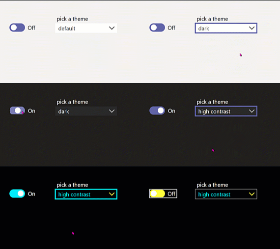
Toggle
Components
The provided components refer to the custom theme with custom properties.
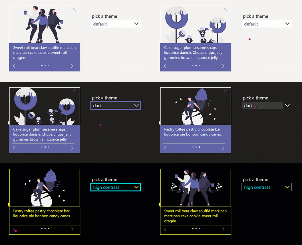
Carousel component
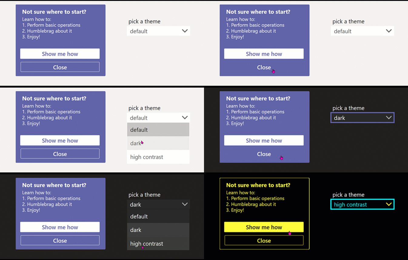
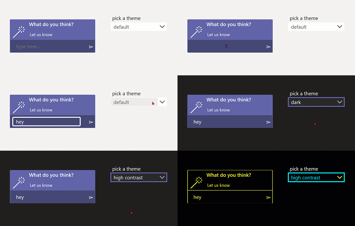
Coachmark component
Combobox component
Donut chart component
Datepicker component
Dropdown component
Likert component
Textinput component
Toast component
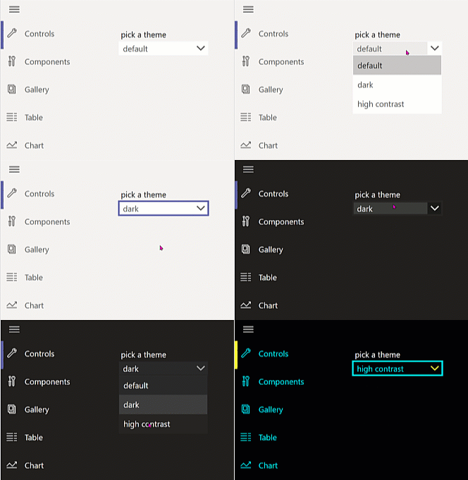
Sidebar navigation component
Screens
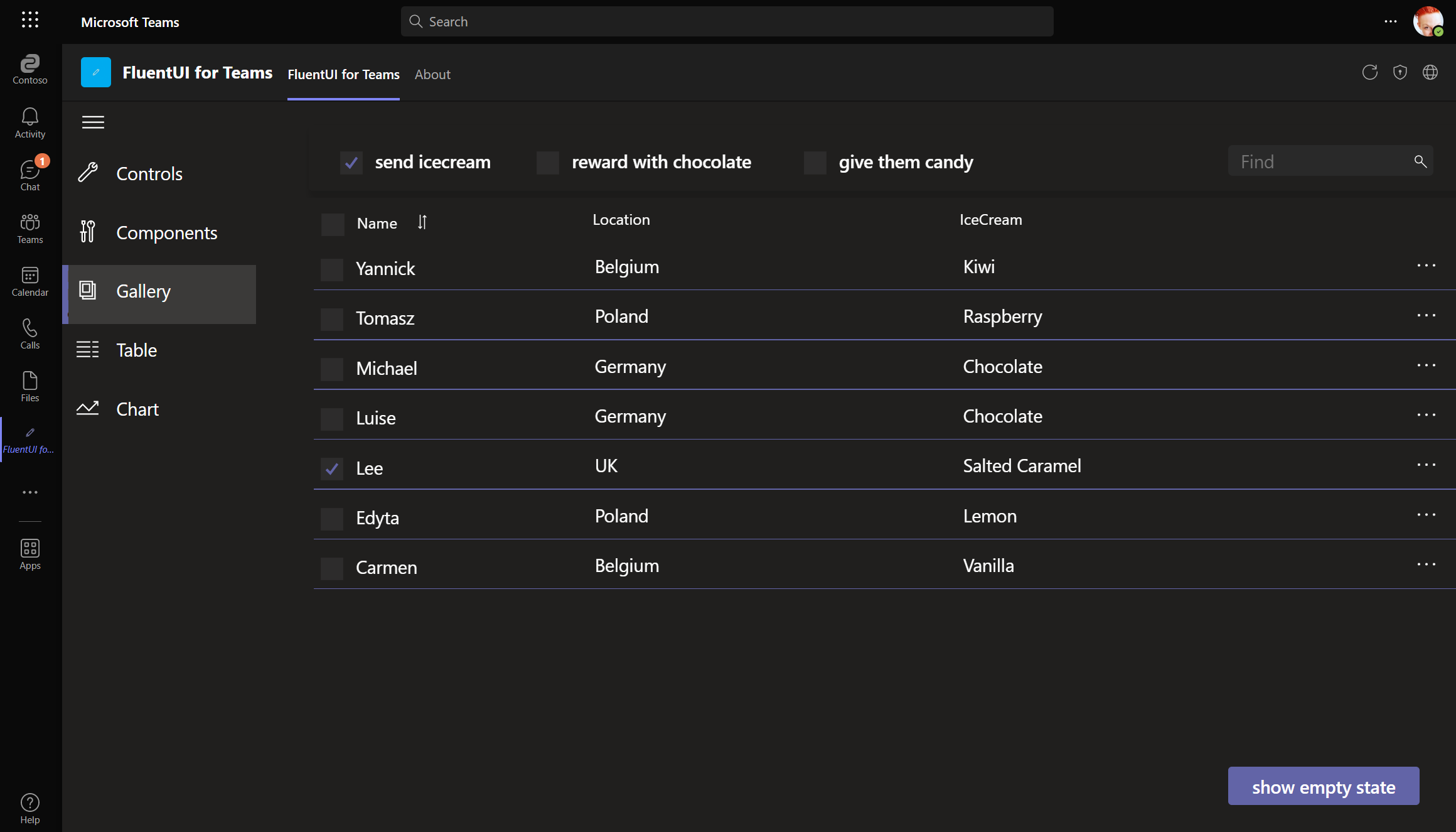
List screen
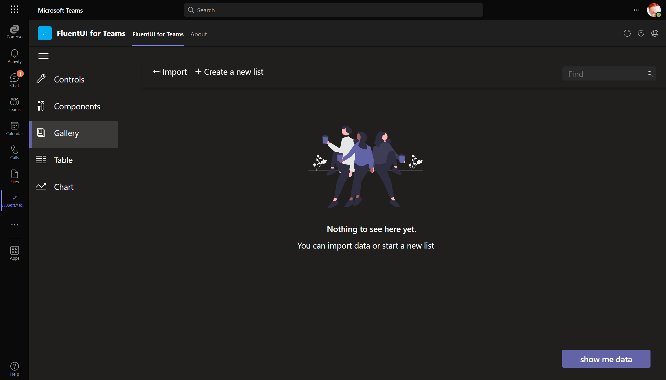
Empty list screen
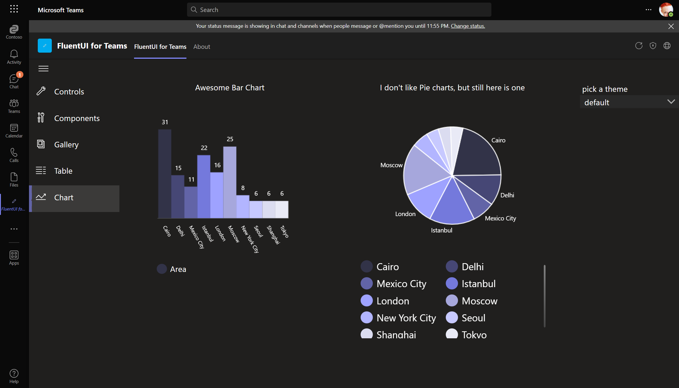
Chart screen
I also manipulated the primary palette which determines which colors are shown in charts.
