
-
This comprehensive website was designed for my friend´s company called Tomas&Byggservice i Skåne. The main goal of the site is to show work examples, progress of the company and to be contacted easily by filling up a form about customers project.
-
Tomas&Byggservice is a building company whcih is based in south Sweden. The company is started in 2016 and by doing quality job is very succesfull. This company is capable to make many individual projects. It is very important to share different expierence they had been working on to find potcial customers.
-
Tomas&Byggservise is my fisrt Milestone project and this is 1 of 4 projects during the Software Developer Program at The Code institute.
- HTML, CSS
- Static front end project: Write custom HTML5 and CSS3 code to create a website of at least 3 pages.
- Information Architecture: Incorporate a main navigation menu and structured layout.
- Documentation: Write a README.md file for your project that explains what the project does and the value that it provides to its users.
- Version Control: Use Git & GitHub for version control.
- ttribution: Maintain clear separation between code written by you and code from external sources (e.g. libraries or tutorials). Attribute any code from external sources to its source via comments above the code and (for larger dependencies) in the README.
- Deployment: Deploy the final version of your code to a hosting platform such as GitHub Pages.
The potential user of this website:
- New and old customers
What custmers are wwilling to find:
- As a new customer I would like to find easilly full comtact information.
- As new customer I want to be contacted deppend on my project.
- As new customer I would like to have a chance to write about my project directly in the webpage.
- As an old customer I would like to see the progress of the company.
- As an old customer I would like to recomend company thru the webpage.
To get the best results I worked together with the client, Tomas&Byggservice i Skåne owner, for informative, functional and comprehensive website.
Content Requirements
The user will be looking for:
- Information about the company.
- Done projects images and descriptions.
- Contacts.
- Social Media.
The user will be able to:
- Navigate on the different screen sizes comfortably.
- Get estimate of the future project.
- Get the information about the done projects.
- Easily contact the company.
- Connect with the company thru the social media.
Website information was projected in a ranked data structure to be sure that users can navigate the website easily:

Wireframe mockups were created in a Figma Workspace fr the positive expierence:
Index Page:

About-us Page:

Gallery Page:

Contact-us Page:

The main idea was to create a stylish website with easy readable fonts and colours. The main fonts are "Exo" and "Exo""Open Sans". As a back up font going to be "Sans Serif". Colours was chosed to get fit in all pages and the main colour was brown as a main Hero image in the Home page.
The selected images are realtive to the company specialization and gives one more information of what services has company. All images has alternative text to describe the images if something happens with the network.
Back to top ⇧
Responsive design on a navigation:
- Company name in the Header is the way to get back to the home page in all resolutions.
- Footer and Header is fixed on all devices to have a very simple design on each resolution.
- For the best user expierence smaller screen has toggler icon as collapsible sidebar menu to get full expierennce of the webpage.
- Home and About Us pages has Call to action buttons and redirects user to cotact page to fill up the form.
The Home Page has two columns and smaller screens has one column.
- Hero image used as the full width background image and it covers entire webpage on all devices to make a strong first impression.
- Middle container divided by two columns on Desktop Home page, taking 50% each column. On a smaller screens left column is taking the top position and the right column goes under it to have best clarity. Left column has information about possible projects and the right column has company motto.
About Us page
The About Us page is a little bit different from Home Page but it is still two collumns wide on Desktop and one column on the smaller screens.
- Hero image occupying 50% of the page on the right side. When resolution became smaller and responsive design turn on, Hero image take "under" position and filling full width of the screen.
- Middle container on the left side shows company's history and it takes another half of the page. On smaller screens text is talking top position.
Gallery page
- For this page I chosed similar background colour to be matching whole page but not too bright.
- For the images I chosed carousel template from Bootstrap too show good size images on all screens. It takes up to 70% screen width.
Conatact Page
- Hero image is used like in the Home page, to make a nice full size background of the webpage on all screen sizes.
- Middle container is divided to two columns on the desktop. On the left collumn has the form to be filled up. The form is simple, but makes easy to request information from the building company. The right side column has all the contact details. Smaller resolutions makes this page only one column. The form takes top position and the contact details is under it.
Further Testing
- The Website was tested on Google Chrome, Internet Explorer (there is some bugs), Microsoft Edge and Safari browsers.
- The website was viewed on a variety of devices such as Desktop, Laptop, iPhone7, iPhone 8 & iPhoneX.
- A large amount of testing was done to ensure that all pages were linking correctly.
- Friends and family members were asked to review the site and documentation to point out any bugs and/or user experience issues.
- Known Bugs
- On some mobile devices the Hero Image pushes the size of screen out more than any of the other content on the page.
- A white gap can be seen to the right of the footer and navigation bar as a result.
- On Internet Explorer Browser gallery page has big gap below gallery images.
- Contact-us page conainers are too high on IE.
- Contact-us button is too wide on IE in contact-us page.
- Navigation spaces between nav menu items where too narrow.
- There was bad contrast on nav menu items in "Active" mode, so developer changerd to bigger font size with the same colour. Works much better.
- There was missing "Target='_blank'" on all the social media links, as well on submit button.
- The biggest issue was with bootsraps container and container fluid. It was hard to get in to position on 50% shered screen to one column. The solution where to change 50/50 ratio or 6/6 columns to 9 columns of 12. Developer got plenty place to move arround with the columns.
- Footer wasn't sticky on smaller devices. Fixed with "justify-content-around".
- Underline hover had the line on all the buttons. Removed by "text-decoration: none;"
The W3C Markup Validator service was used to validate the HTML code used.
Results:
-
Index Page
-
About us Page
-
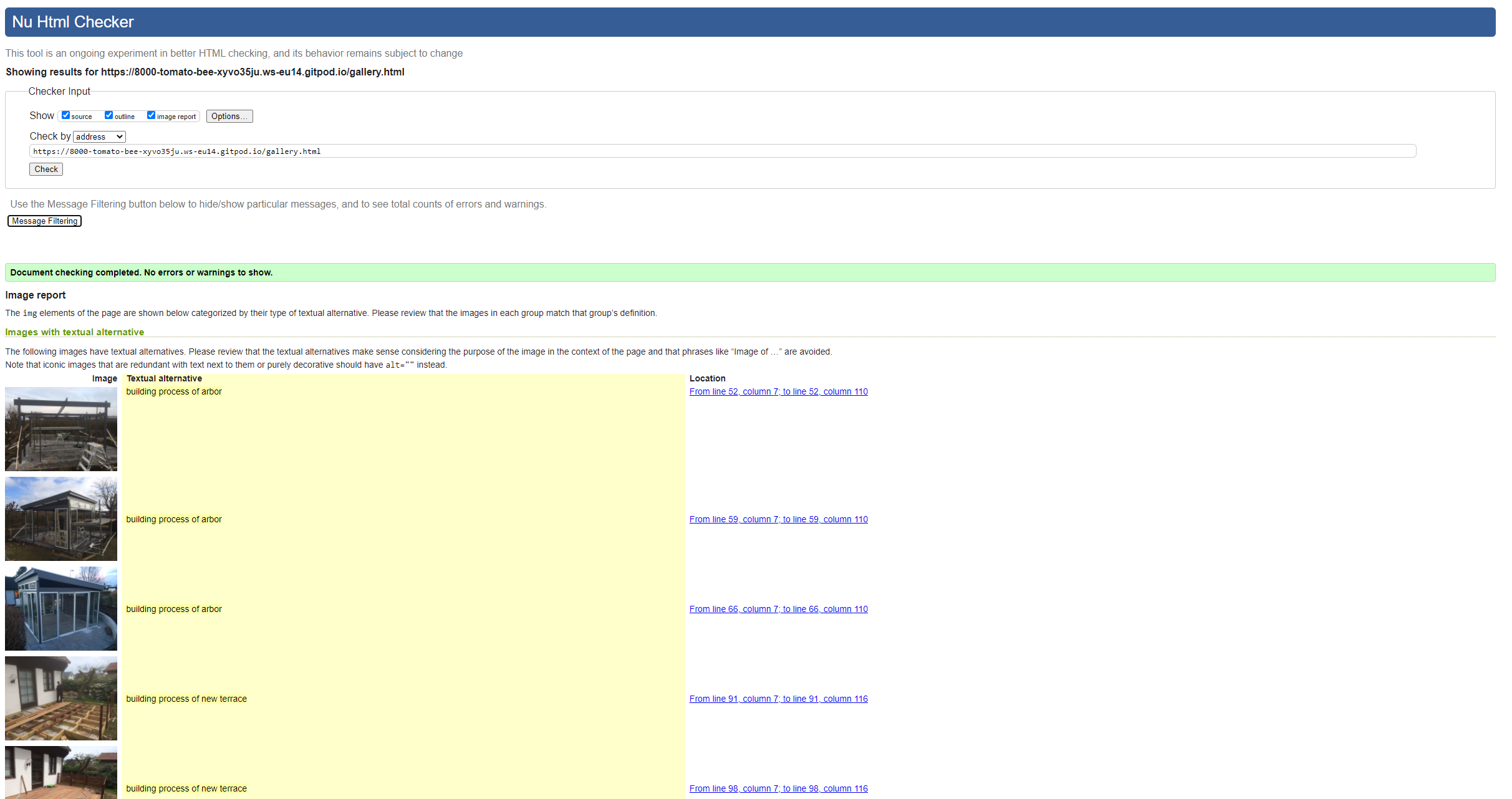
Gallery Page
-
Contact us Page


The W3C CSS Validator service was used to validate the CSS coded used.
Results:

-
GitHub Pages The project was deployed to GitHub Pages using the following steps...
-
Log in to GitHub and locate the GitHub Repository
-
At the top of the Repository (not top of page), locate the "Settings" Button on the menu.
-
Alternatively Click Here for a GIF demonstrating the process starting from Step 2.
-
Scroll down the Settings page until you locate the "GitHub Pages" Section.
-
Under "Source", click the dropdown called "None" and select "Master Branch".
-
The page will automatically refresh.
-
Scroll back down through the page to locate the now published site link in the "GitHub Pages" section.
-
Forking the GitHub Repository
-
By forking the GitHub Repository we make a copy of the original repository on our GitHub account to view and/or make changes without affecting the original repository by using * the following steps...
Log in to GitHub and locate the GitHub Repository At the top of the Repository (not top of page) just above the "Settings" Button on the menu, locate the "Fork" Button. You should now have a copy of the original repository in your GitHub account. Making a Local Clone Log in to GitHub and locate the GitHub Repository Under the repository name, click "Clone or download". To clone the repository using HTTPS, under "Clone with HTTPS", copy the link. Open Git Bash Change the current working directory to the location where you want the cloned directory to be made. Type git clone, and then paste the URL you copied in Step 3. $ git clone https://github.com/YOUR-USERNAME/YOUR-REPOSITORY Press Enter. Your local clone will be created. $ git clone https://github.com/YOUR-USERNAME/YOUR-REPOSITORY
Cloning into
CI-Clone... remote: Counting objects: 10, done. remote: Compressing objects: 100% (8/8), done. remove: Total 10 (delta 1), reused 10 (delta 1) Unpacking objects: 100% (10/10), done. Click Here to retrieve pictures for some of the buttons and more detailed explanations of the above process.
- All images were sourced from the Unsplash
- The text used in the 404 error page was sourced from CopyAndPasteFonts and edited by the developer.
- Bootstrap
- Bootstrap was used to implement the responsiveness of the site, using bootstrap classes.
- Google Fonts
- Google fonts was used to import the fonts "Roboto", "Lato" and "Montserrat" into the style.css file. These fonts were used throughout the project.
- Font Awesome
- Font Awesome was used on all pages throughout the website to import icons (e.g. social media icons) for UX purposes.
- Git
- Git was used for version control by utilizing the GitPod terminal to commit to Git and push to GitHub.
- GitHub
- GitHub was used to store the project after pushing
- Figma
- Figma was used to create the wireframes during the design phase of the project.
- Am I Responsive?
- Am I Responsive was used in order to see responsive design throughout the process and to generate mockup imagery to be used.
- I would like to thank my friends and family for their valued opinions and critic during the process of design and development.
- I would like to thank my mentor, Seun, for her invaluable help and guidance throughout the process.