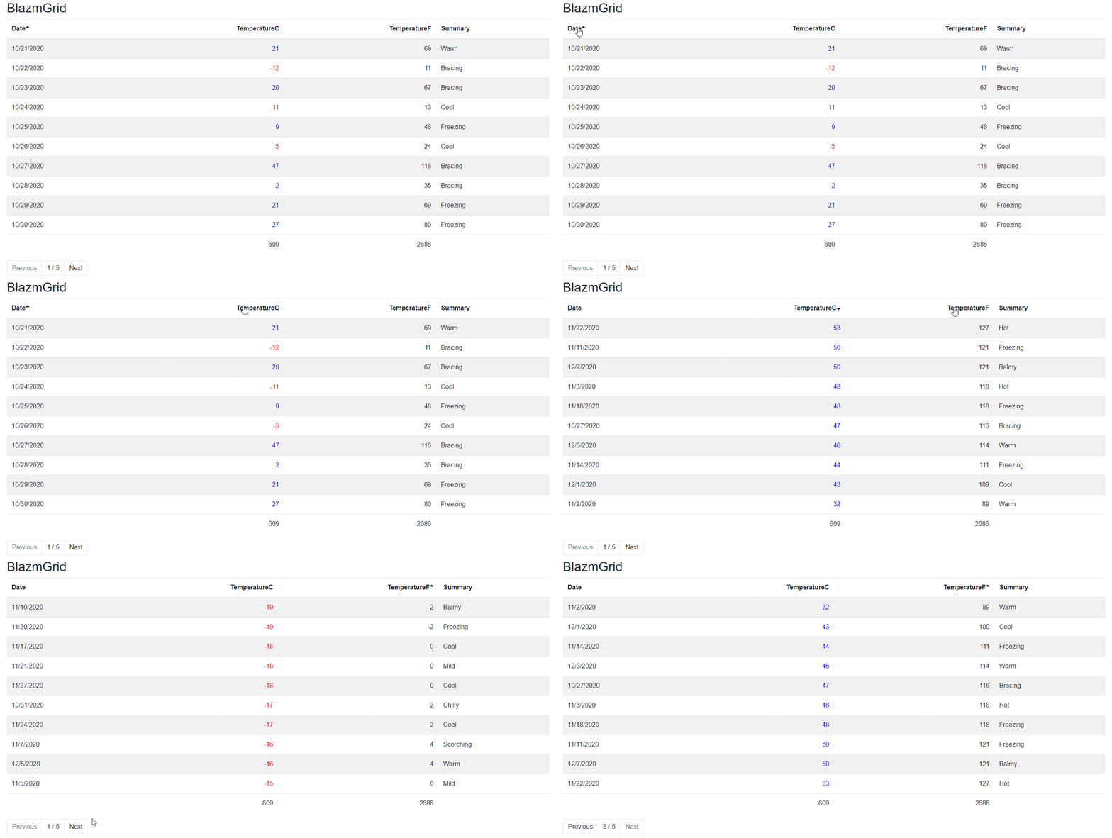
I promised myself that I wouldn't build another component library. But for different reasons I had to build a Grid component (and some other components), and why not share that with others? So here it is, my component library.
The company me and my wife run is called Azm Dev (Awesome dev). Blazor + Azm == Blazm and it will make you site blazm (blossom). I know.. I like puns.
BlazmGrid
Forecast sample using Blazm
<BlazmGrid Data="forecasts" PageSize="10" Sortable="true" SortField="@nameof(WeatherForecast.Date)">
    <GridColumns>
        <GridColumn Field="@nameof(WeatherForecast.Date)" Format="{0:d}"  Priority="3"/>
        <GridColumn Field="@nameof(WeatherForecast.TemperatureC)" HighlightSign="true" Priority="1" Class="alignRight" />
        <GridColumn Field="@nameof(WeatherForecast.TemperatureF)" Priority="2" Class="alignRight"/>
        <GridColumn Field="@nameof(WeatherForecast.Summary)"  Priority="0"/>
    </GridColumns>
</BlazmGrid>Thanks you to much to my sponsors!

Telerik UI for Blazor – Increase productivity and cut cost in half! Use the Telerik truly native Blazor UI components to cover any app scenario. Give it a try.
At this point the library is using Bootstrap.
This might change in the future but for now you will need Bootstrap.
It is also using FontAwesome so make sure you reference that as well.
- Add
services.AddBlazm();
This adds the necessary things for the grid to be responsive.
- Add
using Blazm.Components - Add your grid
<BlazmGrid Data="TestData" PageSize="10">
    <GridColumns>
        <GridColumn Field="@nameof(TestClass.String)" Title="A string from property"></GridColumn>
        <GridColumn Field="@nameof(TestClass.Double)"></GridColumn>
        <GridColumn Field="@nameof(TestClass.Date)"></GridColumn>
    </GridColumns>
</BlazmGrid>In Pages/_Host.cshtml
- Inside the head tag add:
<link href="_content/Blazm.Components/css/styles.min.css" rel="stylesheet" /> - After the script tag (towards the bottom of the page) referring to blazor.server.js. Add:
<script src="_content/BlazorPro.BlazorSize/blazorSize.min.js"></script>In program.cs
- Add
webBuilder.UseStaticWebAssets();
By specifying a number in the PageSize property the grid will add next and previous buttons and page the data.
To sort the grid use
SortField="@nameof(TestClass.Double)" to sort your grid.
If you want to enable the user to sort the grid use Sortable="true".
Set the default sort direction by setting the SortDirection parameter
This works with grouped lists as well.
To sort the grouping you can use GroupSortField="@nameof(TestClass.Double)"
Use ShowCheckbox="true" to show checkboxes on every row.
Use @bind-SelectedData="SelectedTestData" to get the selected items.
To add grouping set the data as usual (without grouping) and set the GroupBy-parameter.
GroupBy="d=>d.Group"If you group your grid you can add a group header. It will add a table row with the content in the template. Context is the group key.
<GroupHeader>
    <h5>@context</h5>
<GroupHeader>Footers are available in grouped segments and for the whole table.
In the GroupFooterTemplate the context-variable is a List containing all the data in that group.
<GroupFooterTemplate>
    var h = context as List<TestClass>;
    @h.Sum(r => r.Double).ToString("N0")
</GroupFooterTemplate>
Will sum all the Double-field in that group.
FooterTemplate will get a List containing all the rows in the table.
<FooterTemplate>
    var h = context as List<TestClass>;
    @h.Sum(r => r.Double).ToString("N0")
</FooterTemplate>
Will sum ALL the double-fields in the entire table.
<GridColumn Field="@nameof(TestClass.Double)" Format="{0:N2}">
    <GroupFooterTemplate>
        @{
            var h = context as List<TestClass>;
            @h.Sum(r => r.Double).ToString("N0")
        }
    </GroupFooterTemplate>
    <FooterTemplate>
        @{
            var h = context as List<TestClass>;
            @h.Sum(r => r.Double).ToString("N0")
        }
    </FooterTemplate>
</GridColumn>By supplying an EmptyGridTemplate you can specify if there should be any text shown it the grid is empty.
<EmptyGridTemplate>
    No data found
</EmptyGridTemplate>By supplying an NullGridTemplate you can specify if there should be any text shown it the grid has no data (typically while you load data).
<NullGridTemplate>
    Loading....
</NullGridTemplate>The title of the column can be specified by using the title property but can also be specified using the Display-attribute
public class TestClass
{
    public string String { get; set; }
    [Display(Name = "Comes from attribute")]
    public double Double { get; set; }
    public DateTime Date { get; set; }
}To format the data, use the Format-property.
<GridColumn Field="@nameof(TestClass.Double)" Format="{0:N2}"></GridColumn>There are two ways of styling content.
Class will set the class attribute on the header and data.
HeaderClass will set the class attribute on the header.
DataClass will set the class attribute on the data.
If you want to align both data and header to the right add the class property.
<GridColumn ... Class="alignRight" ... />To highlight the sign on a column set the HighlightSign to true.
This will set the class .negative if the value is negative.
It will set the class .positive if the value is positive and leave it alone of the value is zero.
Use ValueNegativeClass and ValuePositiveClass to specify the classes used (if you want to).
By adding Priority to the columns the grid will become responsive and hide columns in the order of priority.
Priority 0 is the highest priority which means the column will always be visible.
It uses BlazorPro.BlazorSize by Ed Charbeneau to detect resize on the client.
If a column is hidden, an icon will appear and the row will become expandable (to show the removed columns).
The icon is customizable using ExpandTemplate and CollapseTemplate
To add a column that is not connected to any field (like command buttons for example) just add a GridColumn without the Field-property.
<GridColumn>
    <Template>
        @{
            var item = context as WeatherForecast;
        }
        <button class="btn btn-danger" @onclick="@(async () => { await Delete(item); })"><i class="far fa-trash-alt"></i></button>
    </Template>
</GridColumn>The build-in support for exporting data to Excel will not us templated columns (it will render the value not the template).
All columns will be exported by default.
Add Exportable=false to exclude columns from the export.
<button class="btn btn-success" @onclick="@(async ()=> { await MyGrid.ExportDataAsync("Weather.xlsx","Export","yyyy-mm-dd"); })">Export data to Excel</button>

<BlazmGrid @ref="MyGrid" .......>
//Code removed for brevity
and in the code section add
private BlazmGrid<WeatherForecast> MyGrid;WeatherForecast is the type of data you have in the grid.
If you want to auto generate columns you can do that by setting AutoGenerateColumns="true"
The grid will then create columns for all the properties on your data object.
<BlazmGrid Data="forecasts" AutoGenerateColumns="true">
</BlazmGrid>You can use dynamic (ExpandoObject) with the grid. If you for example have a DataTable, convert it to dynamic and it will work with the grid.
By adding a DetailTemplate you can show details about the row.
The details will show up as a row beneath the original row.
The context is the row data of the row you expand.
<DetailTemplate>
    Details! @context.Summary
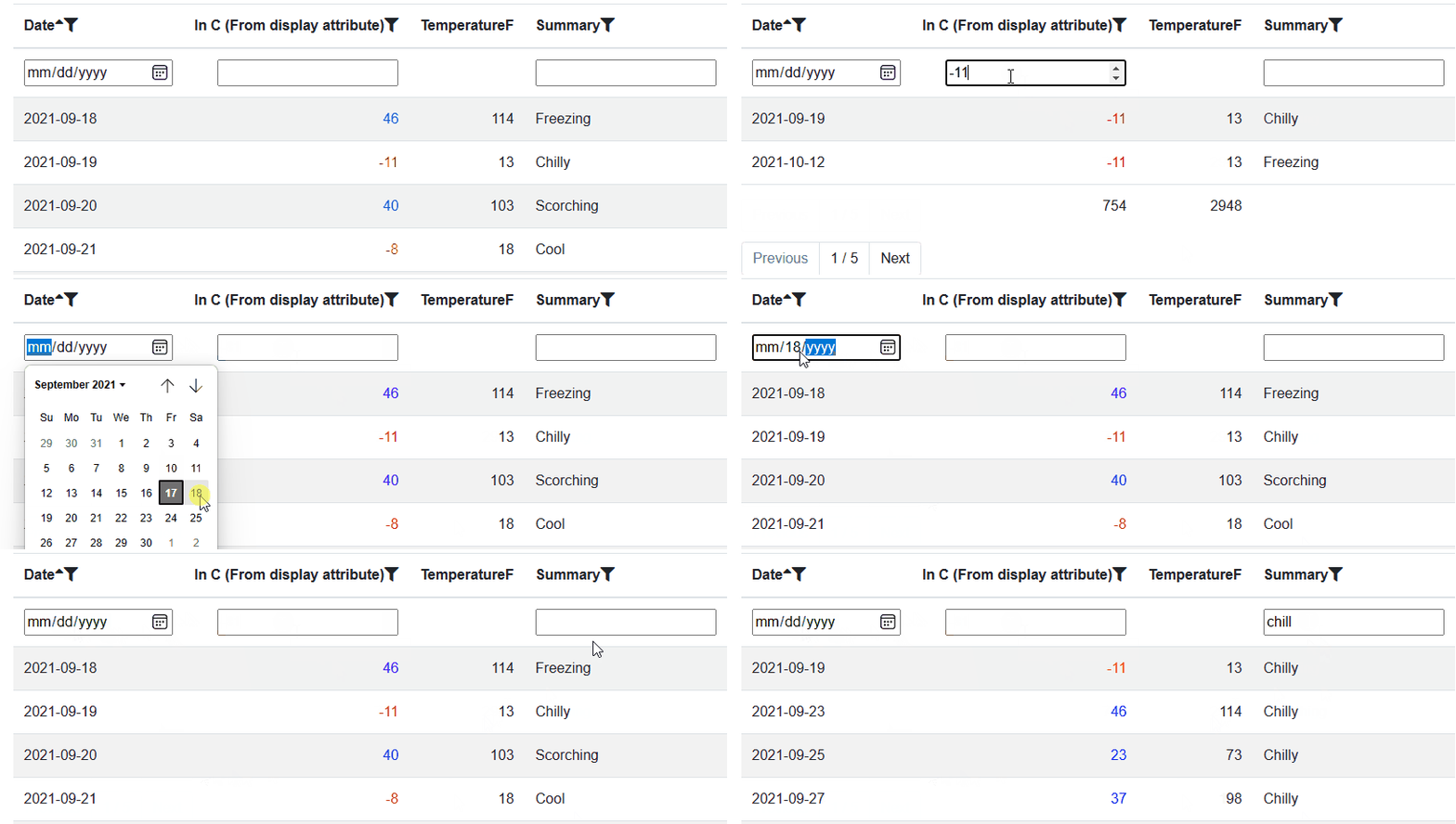
</DetailTemplate>There are built-in filtering that we can activate by adding the CanFilter attribute.
It will add a filter box near the header and will make sure that if the data is a number the output vill be a number input, a datetime will be a date input and so on.
The default behaviour is equals, we can also add ShowAdvancedFilter to the GridColumn to get more options.
ShowAdvancedFilter is note currently styled in the best possible way.
<GridColumn CanFilter="true" .... />Use the parameter UseVirtualize="false" to turn off virtualization, the grid will then display the content using a foreach loop.


