Responsive Images
Responsive Images for Statamic 3.
This Addon provides responsive images inspired by Our Medialibrary Package.
Support us
We invest a lot of resources into creating best in class open source packages. You can support us by buying one of our paid products.
We highly appreciate you sending us a postcard from your hometown, mentioning which of our package(s) you are using. You'll find our address on our contact page. We publish all received postcards on our virtual postcard wall.
Installation
Require it using Composer.
composer require spatie/statamic-responsive-images
Fieldtype
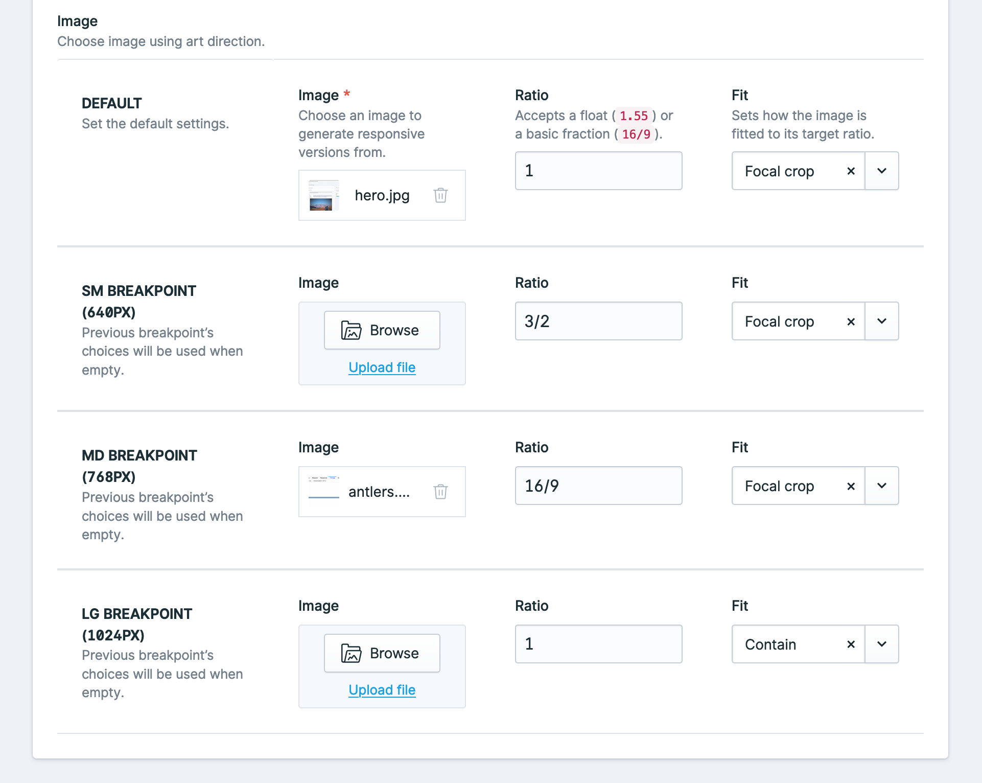
This addon includes a fieldtype that allows for full Art direction with responsive images.
This fieldtype is configured with the following yaml configuration:
-
    handle: image
    field:
      use_breakpoints: true
      allow_ratio: true
      allow_fit: true
      breakpoints:
        - sm
        - md
        - lg
      display: Image
      instructions: 'Choose image using art direction.'
      type: responsive
      icon: assets
      listable: hidden
      container: assets
      restrict: false
      allow_uploads: true
The configuration above can be used within Antlers using the responsive tag:
{{ responsive:image }}The breakpoints are configured in the breakpoints array of the config file.
Using Responsive Images
Responsive Images will generate responsive versions of the images whenever a new asset is uploaded. These presets are determined by this package and not by your own Glide presets. If you need to regenerate the responsive images for a reason, you can use the regenerate command which will clear the Glide cache and regenerate the versions:
php please responsive:regenerateIf you are using a service, like Horizon, for queues then jobs will be queued to handle the image resizing.
By default, the job is queued under the 'default' queue. This can be changed via the queue config key under responsive-images.php
Templating
Pass an image to the responsive tag.
{{ responsive:image_field }}This will render an image tag with the default srcsets. The tag uses JS to define the value of the sizes attribute. This way the browser will always download the correct image.
Image ratio
You can make sure images are a certain ratio by passing a ratio parameter, either as a string 16/10 or as a float 1.6.
{{ responsive:image_field ratio="16/9" }}Responsive placeholder
By default, responsive images generates a small base64 encoded placeholder to show while your image loads. If you want to disable this you can pass placeholder="false" to the tag.
{{ responsive:image_field placeholder="false" }}Webp image generation
By default, responsive images generates webp variants in addition to jpg or png versions of your image, these are usually smaller. If you want to disable this functionality you can pass webp="false" to your tag.
{{ responsive:image_field webp="false" }}Glide parameters
You can still pass any parameters from the Glide tag that you would want to, just make sure to prefix them with glide:.
Passing glide:width will consider the width as a max width, which can prevent unnecessary large images from being generated.
{{ responsive:image_field glide:blur="20" glide:width="1600" }}HTML Attributes
If you want to add additional attributes (for example a title attribute) to your image, you can add them as parameters to the tag, any attributes will be added to the image.
{{ responsive:image_field alt="{title}" class="my-class" }}Breakpoints & Art direction
You can define breakpoints in the config file, by default the breakpoints of TailwindCSS are used.
Breakpoints allow you to use, for example, different ratios:
{{ responsive:image_field ratio="1/1" lg:ratio="16/9" 2xl:ratio="2/1" }}This will apply a default ratio of 1/1. From breakpoint lg up to 2xl, the ratio will be 16/9. From 2xl up, the ratio will be 2/1.
The breakpoints can be configured in the config and default to the breakpoints of Tailwind CSS.
Or different assets:
{{ responsive:image_field :lg:src="image_field_lg" :2xl:src="image_field_2xl" }}Breakpoints support the ratio, src and glide parameters.
Customizing the generated html
If you want to customize the generated html, you can publish the views using
php artisan vendor:publishand choosing Spatie\ResponsiveImages\ServiceProvider
Changelog
Please see CHANGELOG for more information what has changed recently.
Contributing
Please see CONTRIBUTING for details.
Security
If you discover any security related issues, please email freek@spatie.be instead of using the issue tracker.
Credits
License
The MIT License (MIT). Please see License File for more information.


