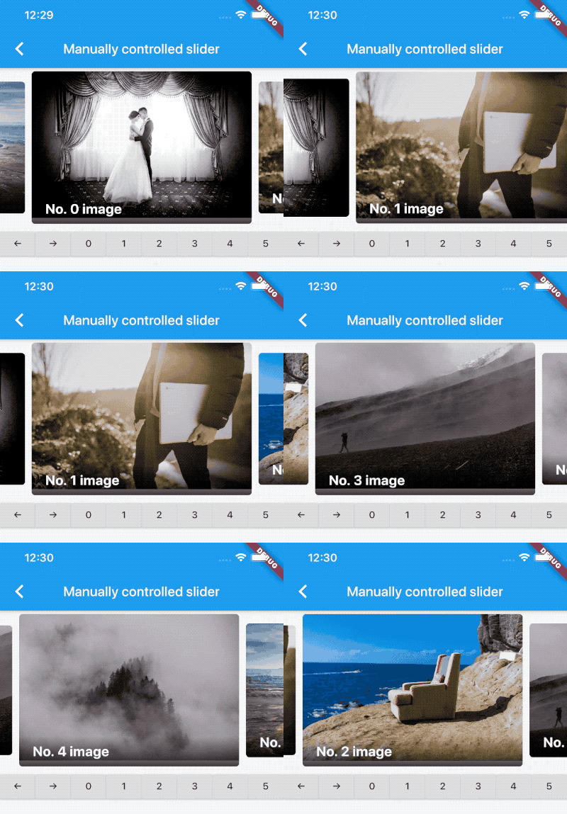
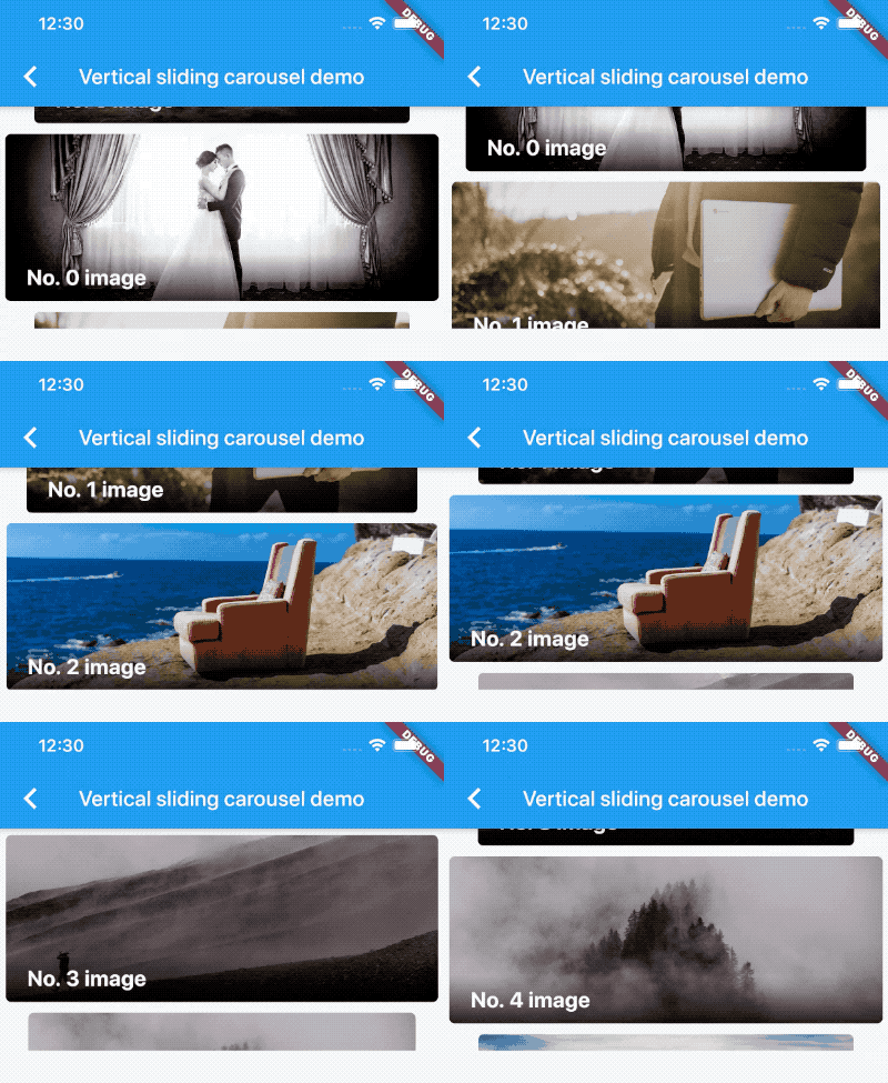
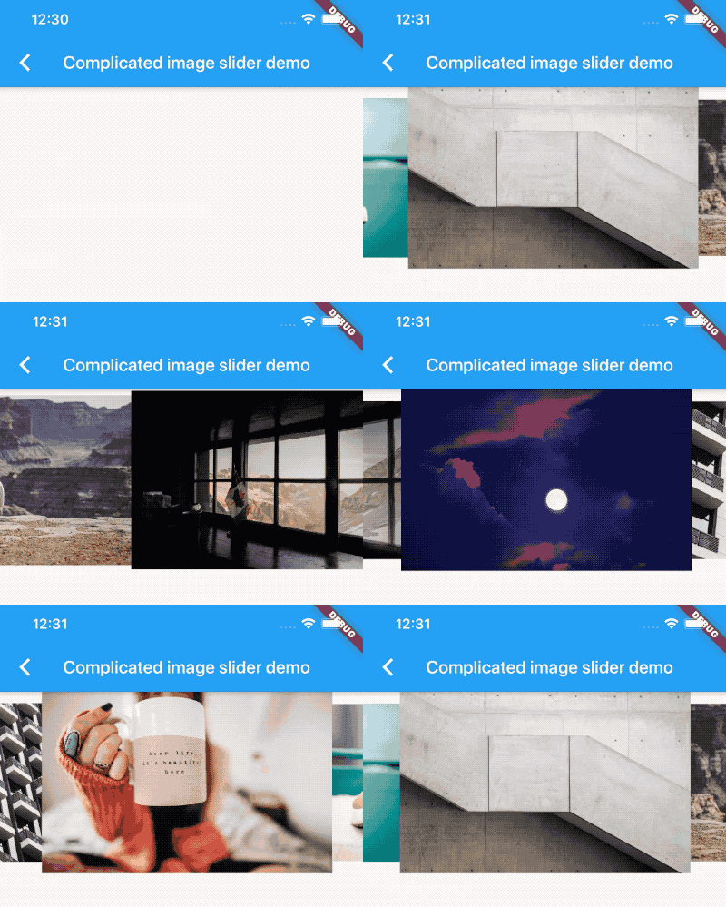
A carousel slider widget.
- Infinite scroll
- Custom child widgets
- Auto play
- Flutter Android
- Flutter iOS
- Flutter web
- Flutter desktop
https://serenader2014.github.io/flutter_carousel_slider/#/
Note: this page is built with flutter-web. For a better user experience, please use a mobile device to open this link.
Add carousel_slider: ^4.2.1 to your pubspec.yaml dependencies. And import it:
import 'package:carousel_slider/carousel_slider.dart';Simply create a CarouselSlider widget, and pass the required params:
CarouselSlider(
  options: CarouselOptions(height: 400.0),
  items: [1,2,3,4,5].map((i) {
    return Builder(
      builder: (BuildContext context) {
        return Container(
          width: MediaQuery.of(context).size.width,
          margin: EdgeInsets.symmetric(horizontal: 5.0),
          decoration: BoxDecoration(
            color: Colors.amber
          ),
          child: Text('text $i', style: TextStyle(fontSize: 16.0),)
        );
      },
    );
  }).toList(),
)CarouselSlider(
items: items,
options: CarouselOptions(
height: 400,
aspectRatio: 16/9,
viewportFraction: 0.8,
initialPage: 0,
enableInfiniteScroll: true,
reverse: false,
autoPlay: true,
autoPlayInterval: Duration(seconds: 3),
autoPlayAnimationDuration: Duration(milliseconds: 800),
autoPlayCurve: Curves.fastOutSlowIn,
enlargeCenterPage: true,
enlargeFactor: 0.3,
onPageChanged: callbackFunction,
scrollDirection: Axis.horizontal,
)
)Since v2.0.0, you'll need to pass the options to CarouselOptions. For each option's usage you can refer to carousel_options.dart.
If you pass the height parameter, the aspectRatio parameter will be ignored.
This method will save memory by building items once it becomes necessary. This way they won't be built if they're not currently meant to be visible on screen. It can be used to build different child item widgets related to content or by item index.
CarouselSlider.builder(
  itemCount: 15,
  itemBuilder: (BuildContext context, int itemIndex, int pageViewIndex) =>
    Container(
      child: Text(itemIndex.toString()),
    ),
)In order to manually control the pageview's position, you can create your own CarouselController, and pass it to CarouselSlider. Then you can use the CarouselController instance to manipulate the position.
class CarouselDemo extends StatelessWidget {
  CarouselController buttonCarouselController = CarouselController();

 @override
  Widget build(BuildContext context) => Column(
    children: <Widget>[
      CarouselSlider(
        items: child,
        carouselController: buttonCarouselController,
        options: CarouselOptions(
          autoPlay: false,
          enlargeCenterPage: true,
          viewportFraction: 0.9,
          aspectRatio: 2.0,
          initialPage: 2,
        ),
      ),
      RaisedButton(
        onPressed: () => buttonCarouselController.nextPage(
            duration: Duration(milliseconds: 300), curve: Curves.linear),
        child: Text('→'),
      )
    ]
  );
}Animate to the next page
Animate to the previous page
Jump to the given page.
Animate to the given page.
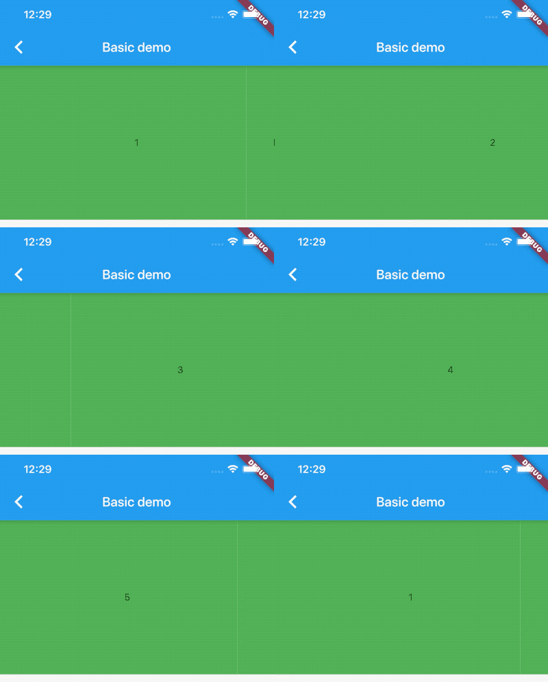
Basic text carousel demo:
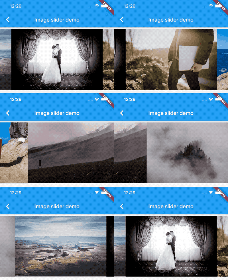
Basic image carousel demo:
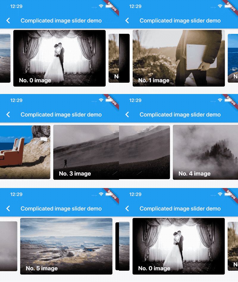
A more complicated image carousel slider demo:
Fullscreen image carousel slider demo:
Image carousel slider with custom indicator demo:
Custom CarouselController and manually control the pageview position demo:
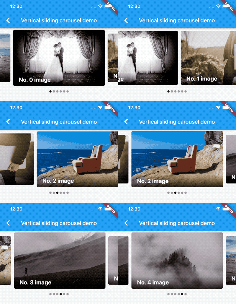
Vertical carousel slider demo:
Simple on-demand image carousel slider, with image auto prefetch demo:
No infinite scroll demo:
All screenshots above can be found at the example project.
MIT
