This is a work in progress. Please submit any issues via GitHub.
This an extension for the MagicMirror² with an interface for Home Assistant.
The modules adds graphs to your mirror using sensor data from Home Assistant.
In your terminal, go to your MagicMirror's Module folder:
cd ~/MagicMirror/modules
Clone this repository:
git clone https://github.com/MariusHerget/MMM-HASS-Chart
Run npm install:
cd MMM-HASS-Chart
npm install
See some examples below.
There are ALOT of configuration options for this module. See below.
OBS: You have to set the width of the graph (with your graph name) in the custom.css file, otherwise you will not see anything!
Like so:
.my-chart {
	width: 355px;
}Enter your Home Assistant configuration:
host: "localhost",
port: "8123",
https: false,
Save the Home Assistant Long-Lived Access Token (see Profile) in environment process.env.HASSIO_TOKEN.
For testing purposes it is possible to save the token in the config as well (token: "hass-token")
Enter the options which data should be requested from Home Assistant history API endpoint.
Start and end days can be used to dynamicly calculate the timestamps.
- start_days: today - x*days
- end_days: today - x*days
You can enter manually timestamps in the ISO format with. Days are overriting timestamps.
start_days: "31",
start_timestamp:  "2021-05-07T08:29:00.339473+00:00",
end_days: "0",
end_timestamp: "2021-05-07T10:59:00.339473+00:00",
Since Home Assitant historical data from sensors are difficult to display directly in a chart there are some options on how to group them:
groupBy:
- byHour
- byMinute
- bySecond
- bySixHours (0-5, 6-11, 12-17, 17-23)
- byDay
- byMonth
- byWeek
- byYear
- custom:
- Define a custom function to be applied by lo_dash (
_.groupBy(data, customFunction);) - e.g.
customGroupBy: (item) => { return moment(item.x).format('MM-YYYY'); }
- Define a custom function to be applied by lo_dash (
Since there can be multiple data entries in a group, those must be aggregated.
aggregateFunc:
- mean
- max
- min
- sum
- median
- custom:
- Define a custom function to aggreagte the states of a group
- e.g.
customAggregateFunc: (data) => { return _.sumBy(data, (item) => item.y)/data.length*2; } - // TODO: Better example necessary //
- minMeanMax:
- Automaticly generates three lines for min, mean, and max.
- Color is defined by
backgroundColor. If this is not defined it usesborderColorwith an opacity of0.2.
groupBy: "byHour",
customGroupBy: () => { ... }, // only used when groupBy is set to custom

aggregateFunc: "mean",
customAggregateFunc: () => { ... } , // only used when aggregateFunc is set to custom
Currently this module is only tested for line charts.
fadeSpeed: 1000,
chartType: "line",
updateInterval: 60 * 1000, // every 60 seconds
This module supports the ChartJs framework completly. In chartOptions you can set up the general chart options (see ChartJS documentation).
chartOptions: {
    responsive: true,
    maintainAspectRatio: true,
    legend: {
        display: true,
        position: "top",
        labels: {
            boxWidth: 2,
            fontColor: "rgba(153, 153, 153, 0.6)"
        }
    },
}
Each Home Assistant sensor is displayed as a single line within the graph. In charts you can define those.
entity: is the Sensors entity_id from Home Assistant.aggregateFunc: optional aggregation function for this lineattribute: Do not use the state value, instead use an attribute of the sensor- All other options are used to describe the resulting line for the sensor. It supports all ChartJS line options (see ChartJS line documentation).
charts: [
    {
        entity: "sensor.name",
        aggregateFunc: "mean",
        attribute: "name",
        // ChartJs line options
    }
]
For example:
{
    entity: "sensor.name",
    label: "Friendly Name for Legend",
    borderColor: "rgba(100, 100, 100, 1)",
    graphTickColor: "rgba(100, 100, 100, 0.8)",
    xAxisID: "1",
    fill: false,
    ...
}
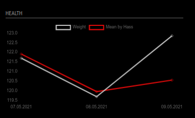
This gives me a simple chart of my weight.
{
    module: "MMM-HASS-Chart",
    position: "bottom_left",
    header: "Health",
    config: {
        host: "192.168.1.2",
        port: "8123",
        https: true,

        start_days: "31",
        end_days: "0",
        groupBy: "byDay",

        chartType: "line",
        charts: [
            {
                entity: "sensor.weight",
                label: "Weight",
                borderColor: "rgba(200, 200, 200, 1)",
                graphTickColor: "rgba(200, 200, 200, 0.8)",
                graphFill: false,
                yAxisID: 'y',
            },
            {
                entity: "sensor.average_weight_3",
                label: "Mean by Hass",
                borderColor: "rgba(230, 10, 10, 1)",
                graphTickColor: "rgba(230, 10, 10, 0.8)",
                fill: false,
                yAxisID: 'y',
            },
        ],
        chartOptions: {
            responsive: true,
            interaction: {
                mode: 'index',
                intersect: false,
            },
            stacked: false,
            scales: {
                y: {
                    type: 'linear',
                    display: true,
                    position: 'left',
                },
            }
        },
    }
}
This gives mit this (fake data from Home Assistant):
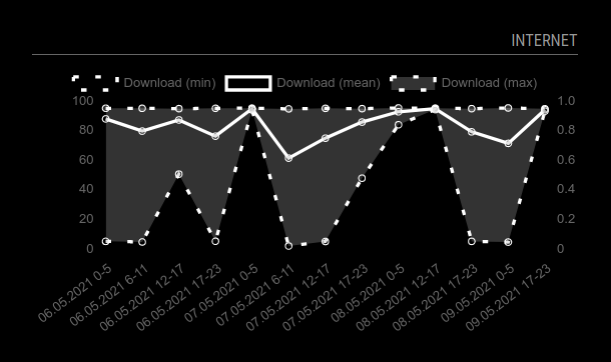
This gives me a simple chart of my internet speed.
{
    module: "MMM-HASS-Chart",
    position: "bottom_right",
    header: "Inter",
    config: {
        host: "192.168.1.2",
        port: "8123",
        https: true,

        start_days: "3",
        end_days: "0",
        groupBy: "bySixHours",
        aggregateFunc: "minMeanMax",

        chartType: "line",
        charts: [
            {
                entity: "sensor.speedtest_download",
                label: "Download",
                borderColor: "rgba(200, 200, 200, 1)",
                graphTickColor: "rgba(200, 200, 200, 0.8)",
            },
        ],
        chartOptions: {
            responsive: true,
            interaction: {
                mode: 'index',
                intersect: false,
            },
            stacked: false,
            scales: {
                y: {
                    type: 'linear',
                    display: true,
                    position: 'left',
                },
            }
        },
    }
}
This gives mit his (fake data from Home Assistant):
- An installation of MagicMirror²
- An installation of Home Assistant
axioschart.jslodashmoment
Some since this is freshly coded. Will add some with time.
Please open issues when you recognized a problem.
This module is partly based and inspired by
This project is created and maintaned by Marius Herget.


