📈 NVWM Dashboard
The NVWM Dashboard is a project created for the front-end data course of the Amsterdam University of Applied Sciences
In frontend data (fd) you create an interactive visualisation, use data joins, apply motion, and additionally apply learning outcomes attained in previous courses. You additionally learn about programming principles like debugging and refactoring code.
Concept
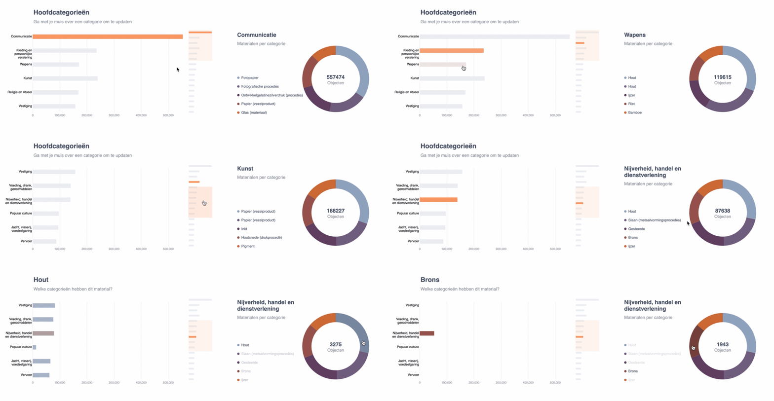
This project is created for the NMVW organisation. They are also the target audience. This tool visuliazes their data. It makes reading the dataset more easy by providing an interactive dashboard. The dashboard show the most common materials from the main categories. Then to make things more interesting, it also reverses the dataset by showing the material within each cateogory.
See the the live demo here
Showing the most populair materials for each category
The first chart is a horizontal bar chart which, in this case, updates the data of the donut chart. You can see the bar chart as a fancy alternative to a dropdown. Once the user hovers over a bar in the graph, the donut-chart will update.
What categories contain the selected material
The donut chart shows the top 5 materials for each category. To make the prototype more interesting, we also update the bar chart based on those materials. Once the user hovers over a slice of the donut, it shows which categories contain that material. The width of the bars now indicates how much of the selected material each category has.
Next to the examples
Here you briefly see the examples that were used and how I transformed them. The process of adapting these examples can be found in the wiki.
| Bar chart | Donut chart | Result |
|---|---|---|
 |
 |
Here is what I changed from these examples:
Bar chart
- Changed the orientation of the bars to horizontal.
- Added labels to the side and wrapped it with a max-width
- Added a scale
- Added the x-axis
- Added gridlines
- Styling - styled the graph according to the design
Donut chart
- Meta data - the title and sub-title which update once the user hovers over a bar in the bar chart See update pattern here
- Data input - the data inside the donut chart now updates with real data. This process is now triggered by hovering over a bar inside the bar-chart See update pattern here
- Legend - the legend shows which materials there currently are displayed. It's also interactive to give feedback to the user of what the current material is.
- Inner value - inside the the donut chart you see the amount of objects total and when hovered of a specific material
Install
Parcel is used as the application bundler for this project. The main goal of using Parcel was to use ES6 imports. This allows for the code to be more modular and easier to work with.
First install dependencies:
npm installTo create a production build:
npm run build-prodTo create a development build:
npm run build-devWiki
The wiki documents the progress of this project. It goes over the process through the stages of the concept, technical research, visual design and prototype.
Data
The data that is used comes from the database of the NMVW collection. For the assignment we are asked to use SPARQL to retrieve the data.
Data being used in the app regards the main categories and their respective most-used materials. The process of gaining this data is explained on the quest for the query page.
Data usage
There are 19 main categories in total, but for this example, I'll show 2. This is how the objects are structured. They contain a name, value and material array. The value refers to the amount of objects within the category.
0: {name: "communicatie", value: 557474, materials: Array(5)}
1: {name: "kunst", value: 188227, materials: Array(5)}
Each category shows the 5 most common materials. The materials have a name(string) and value(number) which is the number of objects of said material.
0: {name: "papier (vezelproduct)", value: 12411}
1: {name: "papier (vezelproduct)", value: 7792}
2: {name: "inkt", value: 7473}
3: {name: "houtsnede (drukprocedé)", value: 6640}
4: {name: "pigment", value: 6378}
Data cleaning
Since the data that is being retrieved doesn't need much cleaning, I decided to clean the survey data from another project. This is explained on the data cleaning page.
Acknowledgments
- The NMVW org., for hosting us and prodiving the data
- D3 dashboard
- Sketch template
- Nadieh Bremer Skillshare course
- @dandevri for recommending the course
- Brushable bar chart
- Color palette inspiration
- FreeCodeCamp, data visualization
- Donut chart in D3v4
- Donut chart 'w update
Reviews
Uitstekende documentatie, ik heb hier niets meer aan toe te voegen, veel succes morgen! @roberrrt-s
pro review: jeetje.... super man. lekker gewerkt - Marc "swagmeister" Kunst

