Telerik UI for Blazor enables you to develop new Blazor applications and modernize legacy web projects in half the time with a high-performing Blazor Data Grid and 100+ truly native, easy-to-customize UI components to cover any requirement.
This repository contains examples related to Telerik UI for Blazor components that can be used in addition to the existing documentation or demos. They provide scenarios and answers to common how-to questions related to:
The included code examples are applicable for both Blazor WebAssembly and Blazor Server projects. For most of them, a component and some classes are provided to illustrate a specific use case can be achieved.
NOTE: This repository does not contain the actual source code of the components, or the demos application available at the official UI for Blazor demos. The demos application is available as an offline project from your Telerik UI for Blazor installation.
- Common Support Questions
- Blazor UI Components
- Design to development
- Sample Applications
- Package References
- Contribution
- Licensing
- Useful Links
- For community support, we recommend asking questions on Stack Overflow using the telerik-blazor tag.
- If you have an active trial or license, you can use the official support channel for questions, technical assistance, bug reports or problem resolutions.
Check the Telerik UI for Blazor Roadmap to see a list of components, features and tooling we have planned.
If your feature isn’t listed in the product roadmap, check our dedicated feedback portal. You can upvote existing requested items or If you don’t see your feature on our portal, you can request the feature there.
| Blazor DataGrid Component | Gird Features | Data Grid Documentation | Data Grid Demos |
| Blazor ListView Component | List View Features | ListView Documentation | ListView Demos |
| Blazor TreeList Component | Tree List Features | TreeList Documentation | TreeList Demos |
| Blazor Filter Component | Filter Features | Filter Documentation | Filter Demos |
| Blazor Pager Component | Pager Features | Pager Documentation | Pager Demos |
| Blazor File Manager | FileManager Features | FileManager Documentation | FileManager Demos |
| Blazor FileUpload Component | File Upload Features | FileUpload Documentation | FileUpload Demos |
| Blazor FileSelect Component | File Select Features | FileSelect Documentation | FileSelect Demos |
| Blazor Map Component | Map Features | Map Documentation | Map Demos |
| Blazor Calendar Component | Calendar Features | Calendar Documentation | Calendar Demos |
| Blazor Gantt Component | Gantt Features | Gantt Documentation | Gantt Demos |
| Blazor Scheduler Component | Scheduler Features | Scheduler Documentation | Scheduler Demos |
| Blazor Barcode Component | Barcode Features | Barcode Documentation | Barcode Demos |
| Blazor QR Code Component | QR Code Features | QRCode Documentation | QRCode Demos |
| Blazor ArcGauge Component | ArcGauge Features | ArcGauge Documentation | ArcGauge Demos |
| Blazor CircularGauge Component | CircularGauge Features | CircularGauge Documentation | CircularGauge Demos |
| Blazor LinearGauge Component | LinearGauge Features | LinearGauge Documentation | LinearGauge Demos |
| Blazor RadialGauge Component | RadialGauge Features | RadialGauge Documentation | RadialGauge Demos |
| Blazor ProgressBar Component | ProgressBar Features | ProgressBar Documentation | ProgressBar Demos |
| Blazor ChunkProgressBar Component | ChunkProgressBar Features | ChunkProgressBar Documentation | ChunkProgressBar Demos |
| Blazor Loader Component | Loader Features | Loader Documentation | Loader Demos |
| Blazor LoaderContainer Component | LoaderContainer Features | LoaderContainer Documentation | LoaderContainer Demos |
| Blazor Notification Component | Notification Features | Notification Documentation | Notification Demos |
| Blazor Tooltip Component | Tooltip Features | Tooltip Documentation | Tooltip Demos |
| Blazor Skeleton Component | Skeleton Features | Skeleton Documentation | Skeleton Demos |
| Blazor Avatar Component | Avatar Features | Avatar Documentation | Avatar Demos |
| Blazor Carousel Component | Carousel Features | Carousel Documentation | Carousel Demos |
| Blazor Card Component | Card Features | Card Documentation | Card Demos |
| Blazor Animation Container | Animation Features | Animation Documentation | Animation Demos |
| Blazor Dialog Component | Dialog Features | Dialog Documentation | Dialog Demos |
| Blazor Form Component | Form Features | Form Documentation | Form Demos |
| Blazor GridLayout Component | GridLayout Features | GridLayout Documentation | GridLayout Demos |
| Blazor StackLayout Component | StackLayout Features | StackLayout Documentation | StackLayout Demos |
| Blazor MediaQuery Component | MediaQuery Features | MediaQuery Documentation | MediaQuery Demos |
| Blazor Splitter Component | Splitter Features | Splitter Documentation | Splitter Demos |
| Blazor TileLayout Component | TileLayout Features | TileLayout Documentation | TileLayout Demos |
| Blazor Window Component | Window Features | Window Documentation | Window Demos |
| Blazor FontIcon Component | FontIcon Features | FontIcon Documentation | FontIcon Demos |
| Blazor SvgIcon Component | SvgIcon Features | SvgIcon Documentation | SvgIcon Demos |
| Blazor FloatingLabel Component | FloatingLabel Features | FloatingLabel Documentation | FloatingLabel Demos |
| Blazor PDF Viewer Component | PDF Viewer Features | PDF Viewer Documentation | PDF Viewer Demos |
As part of your Telerik UI for Blazor trial or licensed copy you get access to several document processing libraries that allow you to convert, manage and export data to different file formats.
| Blazor PDF Processing Library | PDF Processing Features | PDF Processing Documentation | PDF Processing Demos |
| Blazor Spread Processing Library | Spread Processing Features | Spread Processing Documentation | Spread Processing Demos |
| Blazor SpreadStream Processing Library | SpreadStream Processing Features | SpreadStream Processing Documentation | SpreadStream Processing Demos |
| Blazor Words Processing Library | Words Processing Features | Words Processing Documentation | Words Processing Demos |
| Blazor Zip Library | Zip Library Features | Zip Library Documentation | Zip Library Demos |
Telerik Ui for Blazor includes three built-in themes: Blazor Default Theme, Material and Bootstrap Themes, as well as multiple color swatches including "Ocean Blue" targeting accessibility compliance.
| 3 Telerik UI Design Kits for Figma | Telerik UI Figma Design Kits | Documentation |
| Blazor ThemeBuilder | Apply Your Brand Colors | Telerik UI for Blazor ThemeBuilder App |
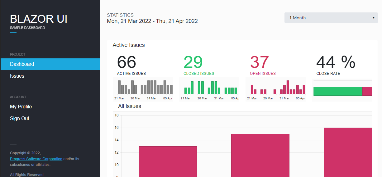
We created the Blazor Dashboard Application following the best practices of building UI with Telerik UI for Blazor components, which makes it a fantastic learning resource. You can see a complete task tracking application and how easy it is to set up complex components such as the Data Grid (Table), Charts, or Forms.
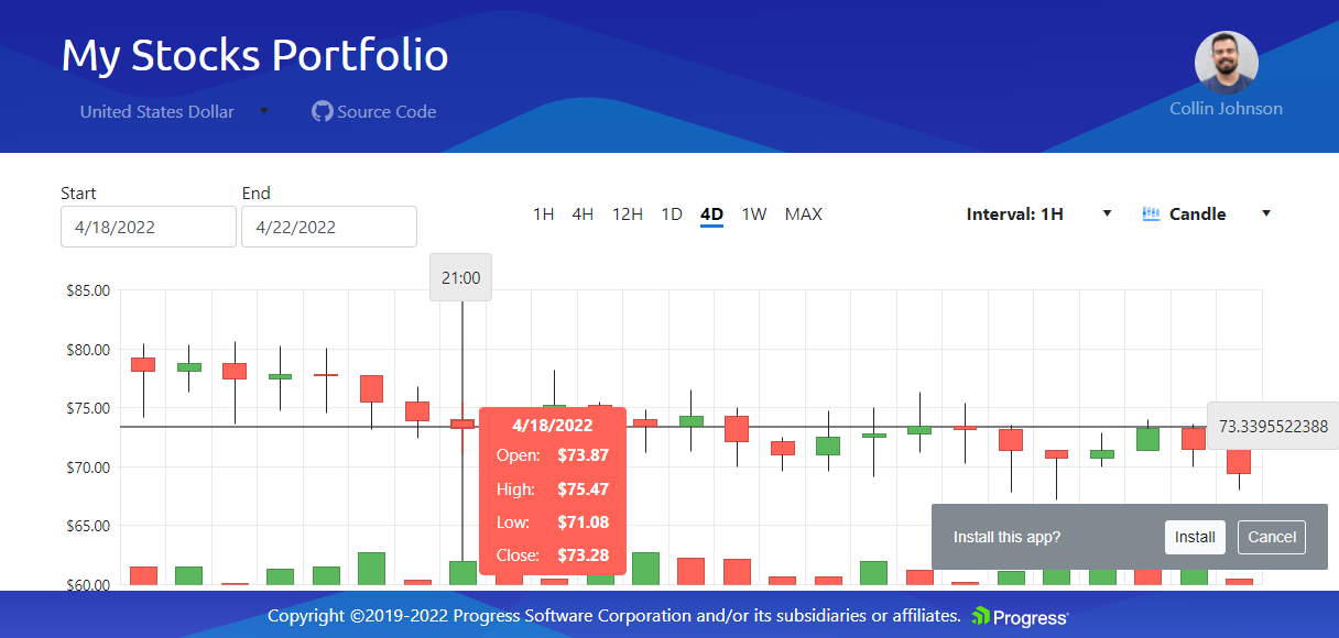
The Blazor Financial Portfolio Application is a progressive web app (PWA) which shows how to create fast, beautiful and dynamic financial dashboards. It takes full advantage of Blazor's fast rendering and shows dynamic data updates in real time which allows monitoring data with no visible delay.
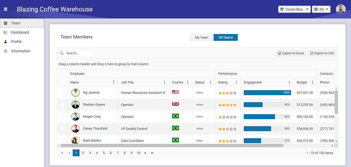
The Blazor Coffee Warehouse Application is a coffee warehouse management application that shows CRUD operations over various data grids and other components, visualizations with Charts and everything else you would need for a warehouse.
The projects usually reference a commercial version of UI for Blazor components. If you only have a trial license, replace the reference to the NuGet package and to the JS Interop file and/or Theme accordingly.
The references (both to Telerik UI for Blazor, and the .NET framework) are usually up-to-date for the time of creation. You may need to update to their latest versions and make any necessary changes. The Blazor framework is evolving rapidly and these examples may not get their references updated all the time. Nevertheless, the general approaches should remain valid, barring breaking changes in the framework.
Issues and Pull Requests are welcome.
To submit a pull request, you should first fork the repo.
Telerik UI for Blazor is a commercial UI library. To use the components, you need to either register for a free trial or purchase a license.
The 30-day free trial can be obtained from Telerik UI for Blazor product page and gives you access to all Telerik UI for Blazor components and their full functionality. For more infromation regarding the available license and budnle options you can review the product pricing page.
For both active trialist and license holders you get access to our legendary technical support provided directly by the UI for Blazor dev team!
- Browse all UI for Blazor component demos live
- Browse the Telerik UI for Blazor documentation
- Follow this link to report bugs and add feature requests
- Browse or contribute to localization texts used in the samples
- Create, run, share and test Blazor code snippets directly in the browser in our Blazor REPL code runner


