Opinionated starter template for Nuxt 3 using Directus 9 as a backend. Develop internal or client applications faster with this batteries-included starter.
Features
- Built-in Directus 9 support to use as your backend, API, headless CMS - whatever your use case
- Tailwind CSS with all plugins, HeadlessUI, and Heroicons (Now Using V2) icon support
- Authentication and user store already configured for you
- Ready to use common components like modals, dropdowns, and file upload input
- Common utilities like relative time and currency formatting so you don't need to include yet another package
- ESLint and Prettier already configured
- Dark mode support
The leading Vue framework that handles routing, server side rendering, and more.
Be sure to keep your eye on their roadmap for the latest information.
If you're not familiar - Directus is an open data platform backed by a SQL database that allows you to quickly created a ready-to-use backend / API to power your application without writing any code.
For a smooth experience, the Directus SDK is already integrated for you and availably globally as a Nuxt plugin.
<script setup>
// Get the $directus plugin from Nuxt App composable
const { $directus } = useNuxtApp()

// Fetch content from Directus
const { data } = await $directus.items('your_collection_name').readByQuery({
      filter: {
        status: { _eq: 'published' },
      },
      limit: 5,
    })
</script>
There is also an included composable for getting the asset urls for your Directus files. Nuxt 3 auto-imports all your composables within the /composables directory so calling this helper is super simple.
<template>
<img :src="fileUrl(file.id)" />
</template>
<script setup>
const { fileUrl } = useFiles()

const file = {
	id: 'lkerwfdafaddfgglk3242'
}
</script>
There are ready to go examples for:
- Authentication
- Fetching content from your Directus instance
- Protecting content with Nuxt Middleware
- Uploading files
All the base components included in the starter use a primary class like class="text-primary-600 bg-primary-500" for colors to make it simple to change your preferred base color.
Just adjust it within your tailwind.config.js
// tailwind.config.js
...
theme: {
    extend: {
      colors: {
        primary: colors.violet, // Change this to your preferred Tailwind shade ie colors.yourShade
        gray: colors.slate,
      },
    },
  },
...
Dark mode is already enabled in the tailwind.config.js and all the base components included have full support.
Dark mode toggling is provided by VueUse useDark composable. And there is an example toggle component you can use.
If you don't wish to use dark mode, you can simply remove the composable and the dark: classes from the components.
All the official Tailwind Plugins are installed and ready to use as well.
Headless UI makes it so simple to implement custom components like dropdowns, modals, and select boxes.
And there's two include examples that you can use right away.
<template>
  <VButton @click="isModalOpen = true" class="mt-2" variant="primary">
    Open Modal
  </VButton>
  <VModal
    title="Sample Modal"
    :is-open="isModalOpen"
    @close="isModalOpen = false"
  >
    <div class="prose dark:prose-invert">
      <p>{{ modalContent }}</p>
    </div>
  </VModal>
</template>
<script setup>
const isModalOpen = ref(false)
</script><template>
<VDropdown
button-label="Dropdown Menu"
variant="primary"
:menu-items="dropdownItems"
/>
</template>
<script setup>
const dropdownItems = [
{
label: 'Console Log',
action: () => {
console.log('Dropdown button clicked!')
},
},
{
label: 'Visit Protected Page',
action: () => {
router.push('/protected-page')
},
},
]
</script>Icon support is provided by Heroicons. The @heroicons/vue package is installed and configured to work correctly with Vite.
Just import the icon you want in your <script setup> and then call the Icon in your template.
<template>
<CloudArrowUpIcon class="w-5 h-5 text-primary"
</template>

<script setup>
import { CloudArrowUpIcon } from '@heroicons/vue/24/outline'
// use '@heroicons/vue/24/solid' for the solid versions
</script>The template uses Pinia for stores instead of Vuex. It's much easier to use and less verbose.
The auth store is all setup and ready to go. Using it is also super easy.
<template>
  <p>The logged-in user is: {{ auth.user }}</p>
</template>
<script setup>
  import { useAuth } from '~~/store/auth'
  const auth = useAuth()
</script>
If you like destructuring, make sure you use the storeToRefs helper from Pinia.
<script setup>
  import {storeToRefs} from 'pinia' import {useAuth} from '~~/store/auth' const
  auth = useAuth() const {(isLoggedIn, user)} = storeToRefs(auth)
</script>
VueUse is already installed and configured so you can just import any of the composables in their library straight away.
I always end up using these in most of my projects so I've chosen to include them in this starter.
Time
/utils/time.js
getRelativeTime(date)
Takes a date string and returns the relative time ie 3 days ago or 5 minutes ago
Defaults to time from now, but you can pass in a second date getRelativeTime(date, date2) if you want to get the relative difference between the two.
getFriendlyDate(date)
Takes a date string and returns a nice readable format like: Sat April 2nd, 2022
greetUser()
Returns Good Morning , Good Afternoon, or Good Evening based on the time of day
Currency
/utils/currency.js
formatCurrency(number, {hideZeros: false})
Takes a number and outputs a string with the currency symbol and rounded to two decimals. If you want to round to the whole number just pass hideZeros: true in the options.
centsToDollars(cents)
dollarsToCents(dollars)
These two are helpful when you are working with third party ecommerce or billing APIs like Stripe.
Math
/utils/math.js
formatPercent(number)
percentChange(num1, num2)
roundToDecimal(value, decimals)
Strings
/utils/strings.js
stripHTML(string)
truncateString(string)
https://directus.cloud/register
If you're prefer the self-hosted version, you can find install instructions here.
Directus has a free Community Cloud tier that's perfect for tinkering or their Standard version has a bit more power if you're ready to start a live project.
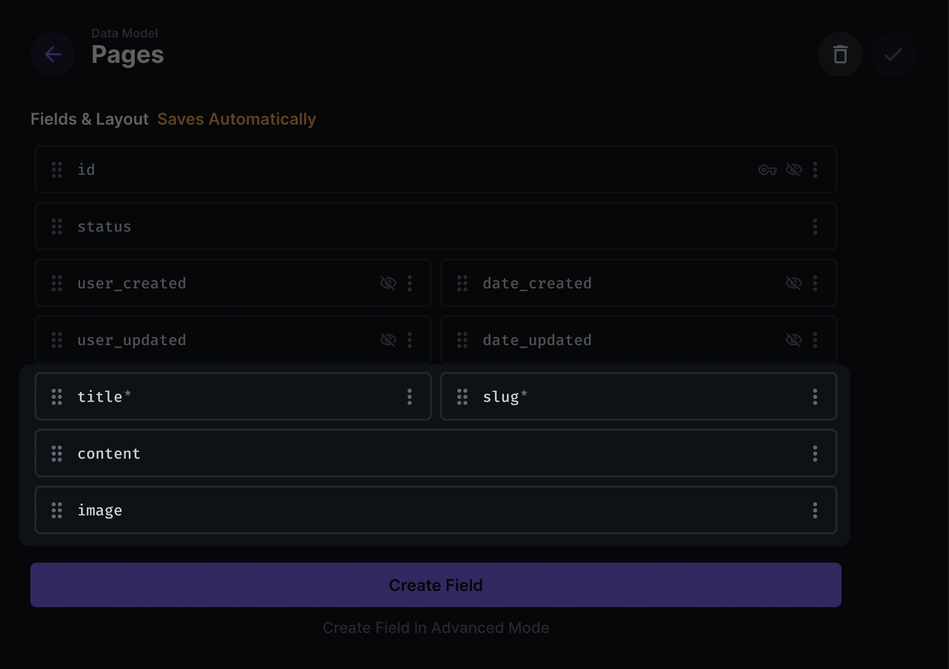
ℹ Note: If you want to re-create the pages functionality from the demo site, follow the next 2 steps. If you're ready get cracking on your own thing, just skip the next two steps and start building out your own collections in Directus.
With the following fields:
- title
- slug
- content
- image
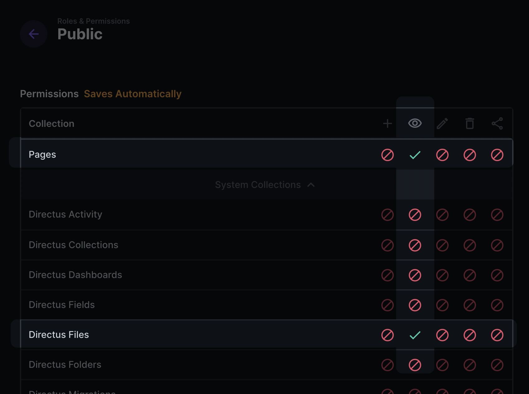
- Files
- Pages
Or from the terminal
git clone https://github.com/bryantgillespie/nuxt3-directus-starter.git your-project- Change the filename
env.exampleto.env - Add the url to your Directus instance
If you're using Directus Cloud, it should look something like this.
DIRECTUS_URL="https://youruniquedomain.directus.app"
yarn installyarn devWhen you're ready to tackle your own project instead of the example, just delete the following directories
/examples/components/Examples/public/logos
yarn buildBe sure to check out the Nuxt 3 official deployment documentation.
Netlify
Vercel
If you're using a Mac and you have Alfred check out my Directus Docs Search workflow for it so that you can quickly and easily search their documentation.


