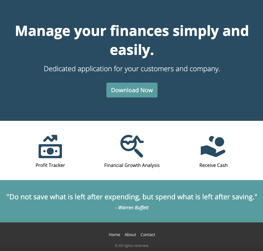
This is a solution to a basic Finance App landing page. In the process of building this single page I managed to gain a greater understanding of responsive web design and making websites that can adapt to every device and every screen size.
Users should be able to:
View the optimal layout depending on their device's screen size
Above is what you should see when you click on the link below.
- Semantic HTML5 markup
- CSS custom properties
- jQuery 3.6.0
- Flexbox
- Animations
- I learnt how to build modern, responsive websites using HTML and CSS.
- How to add some functionality using JavaScript to make a sliding submenu button, which improve the user experience and aesthetics.
- Use relative units (such as percentages) for the sizes of the elements and fonts.
- Use CSS media queries to define breakpoints and layout changes.
- Define the viewport to adapt to mobile screens.
- Use CSS Flexbox to make it easier to create flexible layouts.
- Styling for both desktop and mobile devices.
Here are some code snippets I am proud of:
.feature {
		width: 100%;
		display: flex;
		flex-direction: column;
		align-items: center;
		justify-content: center;
		text-align: left;
		margin: 0 0 15px 0;
		font-size: 16px;
}$(function() {
$('.btn').click(function() {
$('.submenu').slideToggle(500);
});
});- CSS-TRICKS Flexbox -This helped me learn about all the different properties of flexbox and about the parent (flex container) and the children (flex items).
- YESVIZ Screen Dimensions for Devices - A useful website for finding out about different screen sizes, viewport sizes, css media queries and resolution for all kinds of devices including phones, tablets, smart watches and laptops.
- Website - Max Lockwood
