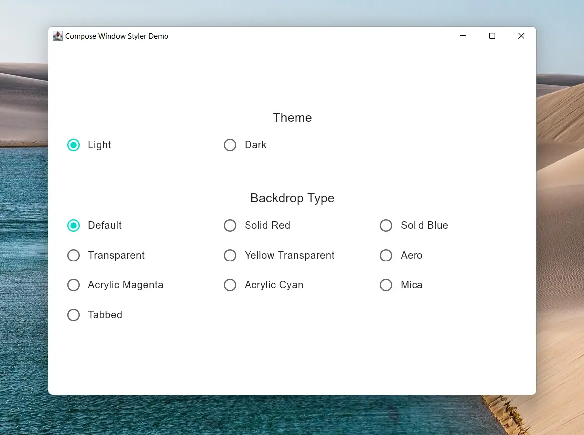
Compose Window Styler is a library that lets you style your Compose for Desktop window to have more native and modern UI. This includes styling the window to use acrylic, mica ...etc.
Kotlin DSL:
repositories {
    mavenCentral()

    // Add only if you're using snapshot version
    maven("https://s01.oss.sonatype.org/content/repositories/snapshots/")
}

dependencies {
    implementation("com.mayakapps.compose:window-styler:<version>")
}
Groovy DSL:
repositories {
    mavenCentral()

    // Add only if you're using snapshot version
    maven { url "https://s01.oss.sonatype.org/content/repositories/snapshots/" }
}

dependencies {
    implementation "com.mayakapps.compose:window-styler:<version>"
}
Don't forget to replace <version> with the latest/desired version found on the badges above.
You can apply the desired to your window by using WindowStyle inside the WindowScope of Window or similar
composable calls. It can be placed anywhere inside them.
Sample Code:
Window(onCloseRequest = ::exitApplication) {
    WindowStyle(
        isDarkTheme = isDarkTheme,
        backdropType = backdropType,
        frameStyle = WindowFrameStyle(cornerPreference = WindowCornerPreference.NOT_ROUNDED),
    )

    App()
}See documentation here
This property should match the theming system used in your application. It's effect depends on the used backdrop as follows:
- If the
backdropTypeisWindowBackdrop.MicaorWindowBackdrop.Tabbed, it is used to manage the color of the background whether it is light or dark. - Otherwise, it is used to control the color of the title bar of the window white/black.
WindowBackdrop.Default: Though its name may imply that the window will be left unchanged, this is not the case as once the transparency is hacked into the window, it can't be reverted. So, This effect provides a simple solid backdrop colored as white or black according toisDarkTheme. This allows the backdrop to blend with the title bar as well.WindowBackdrop.Solid(val color: Color): This applies the color as a solid background which means that any alpha component is ignored and the color is rendered as opaque.WindowBackdrop.Transparent: This makes the window fully transparent.WindowBackdrop.Transparent(val color: Color): Same asSolidbut allows transparency taking into account the alpha value. If the passed color is fully opaque, the alpha is set to0.5F.WindowBackdrop.Aero: This applies Aero backdrop which is Windows Vista and Windows 7 version of blur. This effect doesn't allow any customization.WindowBackdrop.Acrylic(val color: Color): This applies Acrylic backdrop blended with the supplied color. If the backdrop is rendered opaque, double check thatcolorhas a reasonable alpha value. Supported on Windows 10 version 1803 or greater.WindowBackdrop.Mica: This applies Mica backdrop themed according toisDarkThemevalue. Supported on Windows 11 21H2 or greater.WindowBackdrop.Tabbed: This applies Tabbed backdrop themed according toisDarkThemevalue. This is a backdrop that is similar toMicabut targeted at tabbed windows. Supported on Windows 11 22H2 or greater.
In case of unsupported effect the library tries to fall back to the nearest supported effect as follows (If an effect is not supported, check for the next):
Tabbed -> Mica -> Acrylic -> Transparent
Aero is dropped as it is much more transparent than Tabbed or Mica and not customizable as Acrylic. If Tabbed
or Mica falls back to Acrylic or Transparent, high alpha is used with white or black color according
to isDarkTheme to emulate these effects.
All the following properties are only supported on Windows 11 or greater and has no effect on other OSes.
borderColor: specifies the color of the window border that is running around the window if the window is decorated. This property doesn't support transparency.titleBarColor: specifies the color of the window title bar (caption bar) if the window is decorated. This property doesn't support transparency.captionColor: specifies the color of the window caption (title) text if the window is decorated. This property doesn't support transparency.cornerPreference: specifies the shape of the corners you want. For example, you can use this property to avoid rounded corners in a decorated window or get the corners rounded in an undecorated window.
This library is distributed under the MIT license.
All contributions are welcome. If you are reporting an issue, please use the provided template. If you're planning to contribute to the code, please open an issue first describing what feature you're planning to add or what issue you're planning to fix. This allows better discussion and coordination of efforts. You can also check open issues for bugs/features that needs to be fixed/implemented.
- flutter_acrylic: This library is heavily based on flutter_acrylic
- Swing Acrylic: as a reference for the Java implementation of required APIs


