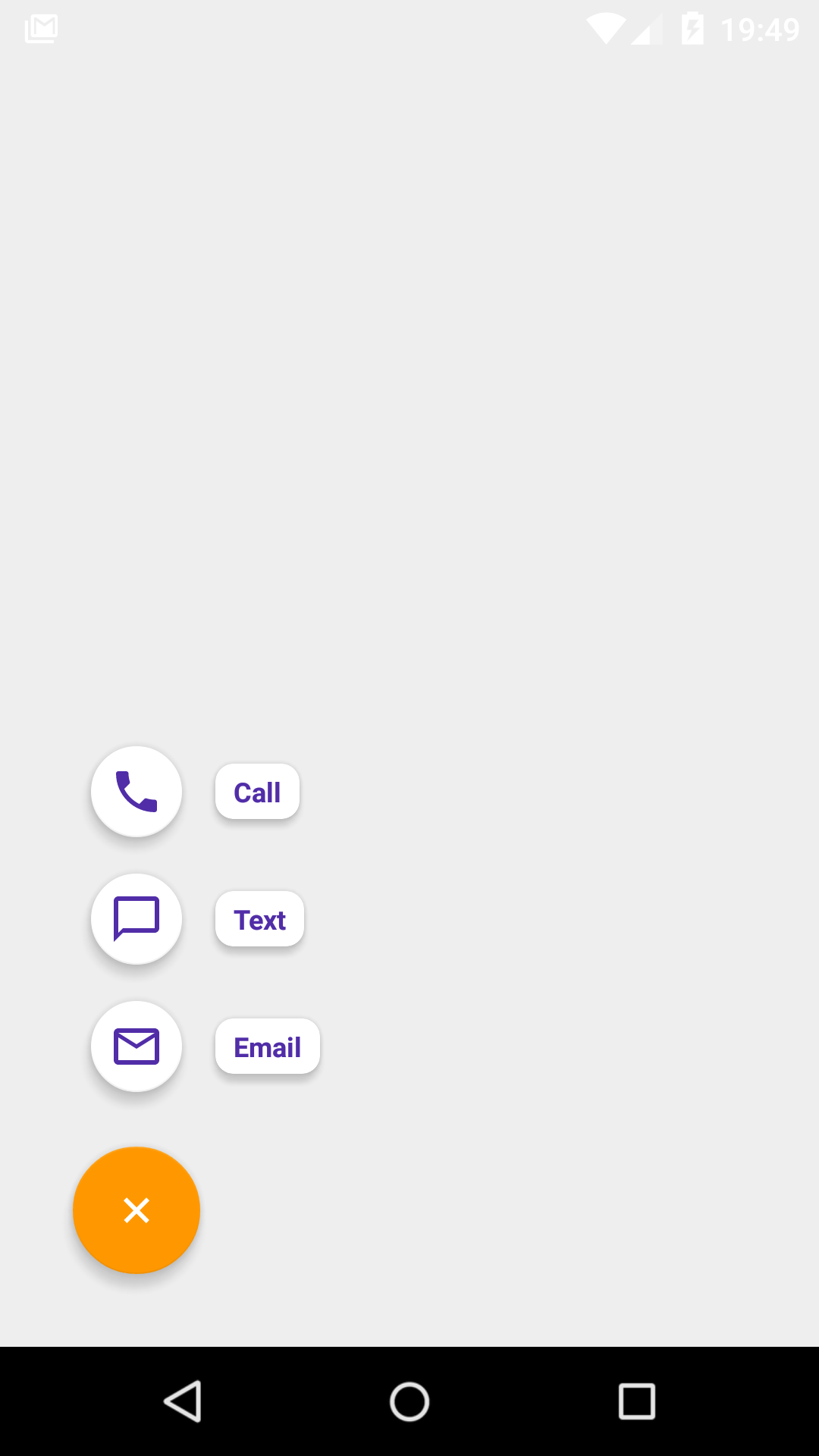
A simple library marrying together [FAB] (http://developer.android.com/reference/android/support/design/widget/FloatingActionButton.html) + [menu resources] (http://developer.android.com/guide/topics/resources/menu-resource.html) + [Speed dial metaphor from Material Design] (https://www.google.com/design/spec/components/buttons-floating-action-button.html#buttons-floating-action-button-transitions).
Similarly tо [NavigationView] (http://developer.android.com/reference/android/support/design/widget/NavigationView.html?utm_campaign=io15&utm_source=dac&utm_medium=blog) and [ActionBar] (http://developer.android.com/reference/android/app/ActionBar.html), [FabSpeedDial] (https://github.com/yavski/fab-speed-dial/blob/master/library/src/main/java/io/github/yavski/fabspeeddial/FabSpeedDial.java) makes use of [menu resources] (http://developer.android.com/guide/topics/resources/menu-resource.html) in order to present a list of actionable buttons. This makes the library somewhat familiar to use and easy to integrate. The library runs on Android 2.2 (API 8) onwards.
dependencies {
    compile 'io.github.yavski:fab-speed-dial:1.0.4'
}
<menu xmlns:android="http://schemas.android.com/apk/res/android"
    xmlns:app="http://schemas.android.com/apk/res-auto">
    <item
        android:id="@+id/action_call"
        android:icon="@drawable/ic_call_black_24px"
        android:title="@string/menu_item_call" />
    <item
        android:id="@+id/action_text"
        android:icon="@drawable/ic_chat_bubble_outline_black_24px"
        android:title="@string/menu_item_text"/>
    <item
        android:id="@+id/action_email"
        android:icon="@drawable/ic_mail_outline_black_24px"
        android:title="@string/menu_item_email" />
</menu>
<FrameLayout xmlns:android="http://schemas.android.com/apk/res/android"
    xmlns:app="http://schemas.android.com/apk/res-auto"
    android:layout_width="match_parent"
    android:layout_height="match_parent"
    android:padding="16dp">

    <io.github.yavski.fabspeeddial.FabSpeedDial
        android:layout_width="wrap_content"
        android:layout_height="wrap_content"
        android:layout_gravity="bottom|end"
        app:fabGravity="bottom_end"
        app:fabMenu="@menu/menu_main"
        app:miniFabBackgroundTint="@android:color/white"
        app:miniFabDrawableTint="?attr/colorPrimaryDark"
        app:miniFabTitleTextColor="?attr/colorPrimaryDark" />

</FrameLayout>
As with all menus, you have a callback just before the list of actionable items are presented. The callback allows you to update your menu items, or not show the menu altogether.
        FabSpeedDial fabSpeedDial = (FabSpeedDial) findViewById(R.id.fab_speed_dial);
        fabSpeedDial.setMenuListener(new SimpleMenuListenerAdapter() {
            @Override
            public boolean onPrepareMenu(NavigationMenu navigationMenu) {
                // TODO: Do something with yout menu items, or return false if you don't want to show them
                return true;
            }
        });
Similarly, in order to be notified about a selection:
        FabSpeedDial fabSpeedDial = (FabSpeedDial) findViewById(R.id.fab_speed_dial);
        fabSpeedDial.setMenuListener(new SimpleMenuListenerAdapter() {
            @Override
            public boolean onMenuItemSelected(MenuItem menuItem) {
               //TODO: Start some activity
              return false;
            }
        });
In order to change the position of the view, use the standard android APIs to position FabSpeedDial within your ViewGroup and be sure to assign fabGravity a relevant value.
As a rule of thumb, attributes prepended with fab, i.e. fabDrawable, refer to the normsal-sized FAB view; attribtues prepended with miniFab refer to the mini-sized FAB views in the list.
The following attribtues are supported:
| FabSpeedDial | Android | Desscription |
|---|---|---|
| app:fabDrawable | android:src | Sets the icon drawable of the main FAB |
| app:fabDrawableTint | android:tint | Tints the icon drawable of the main FAB |
| app:fabBackgroundTint | android:backgroundTint | Tints the background colour of the main FAB |
| app:miniFabDrawableTint | android:tint | Tints the icon drawable of the mini FAB(s) |
| app:miniFabBackgroundTint | android:backgroundTint | Tints the background colour of the mini FAB(s) |
| app:miniFabTitleBackgroundTint | android:backgroundTint | Tints the background colour of the title(s) of the mini FAB(s) |
| app:miniFabTitlesEnabled | Convinience for hiding the tilte(s) of the mini FAB(s) | |
| app:touchGuard | Hide FAB when touching out of its bounds | |
| app:touchGuardDrawable | android:background | Sets background to the container of FAB |
If you have used FloatingActionButton, CoordinatorLayout, and both combined, you are most probably aware that:
- Internally, FAB has two main implementations: one for SDK >= 21, one for earlier versions; the one for older versions uses extra padding in order to draw shadows; you don't need to account for the extra padding as the library takes care of it however do check your layouts/dimensions to avoid mis-positioned views.
- When used in a CoordinatorLayout, FAB is known to have its margin values ignored / misused under certain circumstances; as a workaround the library always adds left or right margin values (depending on gravity), taking into account the SDK version too.
<!--
  ~ Copyright 2016 Yavor Ivanov
  ~
  ~ Licensed under the Apache License, Version 2.0 (the "License");
  ~ you may not use this file except in compliance with the License.
  ~ You may obtain a copy of the License at
  ~
  ~     http://www.apache.org/licenses/LICENSE-2.0
  ~
  ~ Unless required by applicable law or agreed to in writing, software
  ~ distributed under the License is distributed on an "AS IS" BASIS,
  ~ WITHOUT WARRANTIES OR CONDITIONS OF ANY KIND, either express or implied.
  ~ See the License for the specific language governing permissions and
  ~ limitations under the License.
  -->


