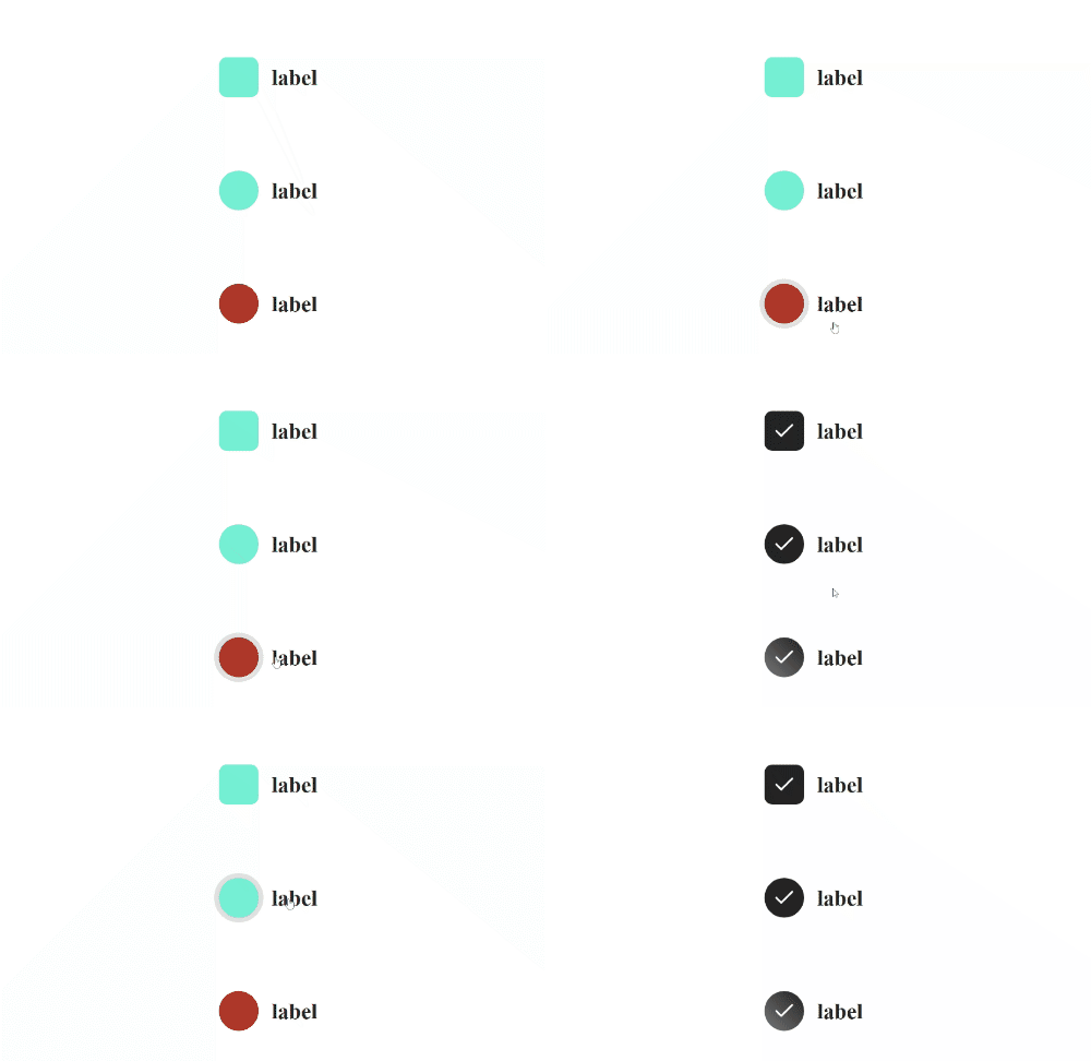
react-radio-css
A radio button based on react thats easy to customize
Example
Usage
import React from "react";
import Radio from "react-radio-css";

function App() {
  const [isSelected, setIsSelected] = React.useState(false);
  return (
    <Radio
      value={isSelected}
      label="label"
      labelColor="#242424"
      checkedColor="#242424"
      unCheckedColor="#7fffd4"
      iconColor="#ffffff"
      onChange={() => {
        isSelected ? setIsSelected(false) : setIsSelected(true);
      }}
    />
  );
}
Props
Common props you may want to specify include:
value- value of radiolabel- set label of radiolabelColor- set color of label of radiocheckedColor- set background color of radio when checkedunCheckedColor- set background color of radio when uncheckediconColor- set color of check icononChange- onchange function of radiostyle- can do custom styling
Available Scripts
In the project directory, you can run:
npm start
Runs the app in the development mode.
Open http://localhost:3000 to view it in your browser.
This has a starter project using this package you can test it there
npm run build
Builds the package for production to the dist folder.\
