The idea behind this project was to demonstrate my understanding of Sass/Scss.
Scss is a CSS preprocessor. It is fantastic for responsive design and writing dry code thanks to its Mixins and Variables. As a result it is easier to read (once the basics are understood) and much easier to maintain than standard CSS.
This was my first full website built using SCSS. I got to grips with Scss variables and mixins and some rather clever responsive design. Throw in some applied jQuery and JSON objects for good measure, a lot of photoshop cropping and whalla! The Digimon, and their Digidestined - Pokémon's long held rival, finally have a simple site to call their own!
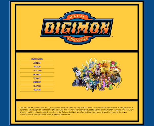
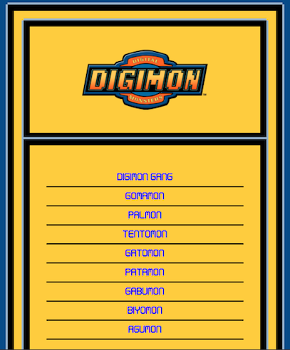
| Desktop View | Mobile View |
|---|---|
 |
 |
The idea behind this project was to teach myself how to use and understand CSS preprocessors. After some research, and since Less has fallen out of favour within the community, I concentrated my efforts on Sass, or more specifically Scss.
Scss is popular and commonly used in development, but can be challenging if the basics are misunderstood. This is why when choosing to build my web site in Scss, I deliberately stayed away from using any 'Sass frameworks' such as Compass or Bourbon. I also chose Scss over the original Sass, because I felt it would help me read the code more clearly and maintain good habits when I go back to writing in CSS after my experiment.
And of course building this site meant I could further the Digimons cause...
- SCSS
- HTML
- jQuery
- JSON
With thanks to Kezz Bracey
Scss's use of Variables and Mixins reminded me of Ruby again, or rather back end languages. They made my style sheet look extremely dry and much easier to alter, but I did use them when they were not needed on occasion.
For example: by trying to create a bulletproof Font Mixin (like those used in Compass etc) I ended up making something that was rather big and simply not needed for my Site. Just using font-family correctly was enough, as my web page has only 2 font styles to choose from anyway. However should I ever increase the complexity of this page, and need more font options, it is good to know I can recreate a more complex Font Mixin again.
My favourite part of the learning curve was understanding the maths behind the Scss Mixin that generates the responsive design:
@media #{$breakpoint-medium} {
  .wrapper {
    width: 95%;
    max-width: $grid-max-width;
  }
  @for $x from 1 through $grid-columns {
    .column-#{$x} {
      width: 100% / $grid-columns * $x;
    }
  }
}
This led to a much easier design process.
I grossly underestimated the Photoshop part of the project. It took up a lot more time than expected considering all that was needed was a simple cut out of each character image - easy to do, but took aaaages: cut, layer, crop, repeat, cut, layer, crop, repeat...
I found that by trying to extract my JSON objects into their own separate file - which I was keen to do for the sake of directory cleanliness - leaned towards the unnecessary and led to a lot of complications, I so ended up keeping my JSON and jQuery code in the same script.
Getting any coherent images or information on my favourite childhood TV series was difficult. I truly am the only Digimon fan on the entire planet...
Scss is amazing and makes for highly productive code, I would love to use it again in another project, possibly with a framework next time.
