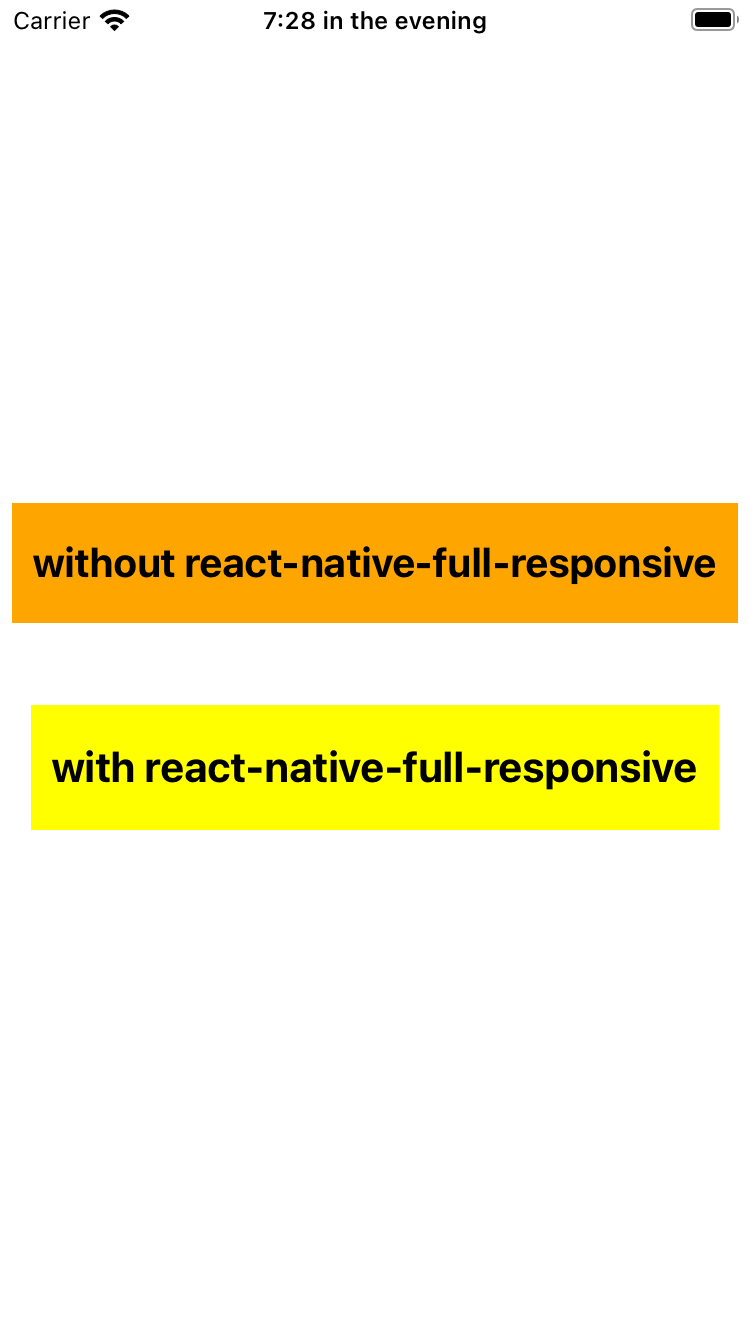
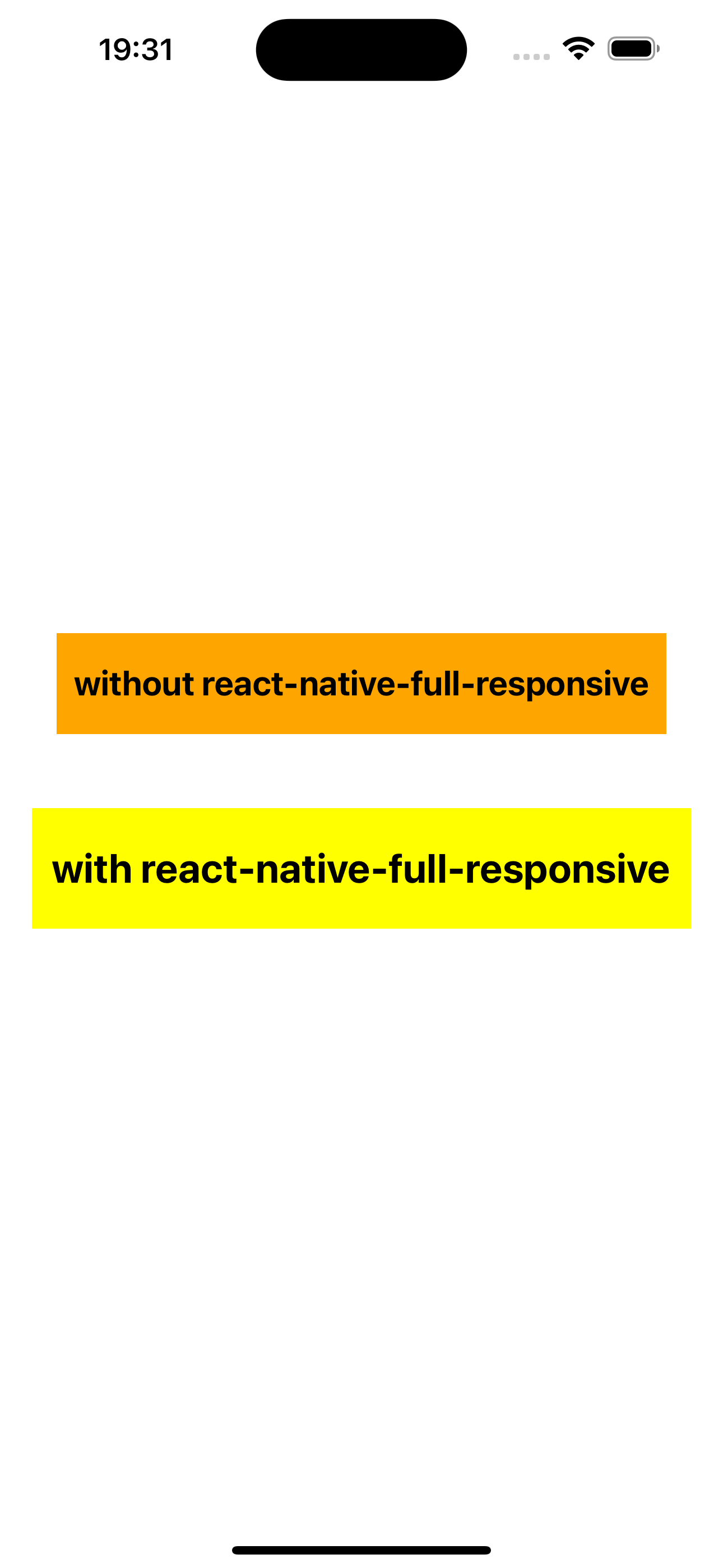
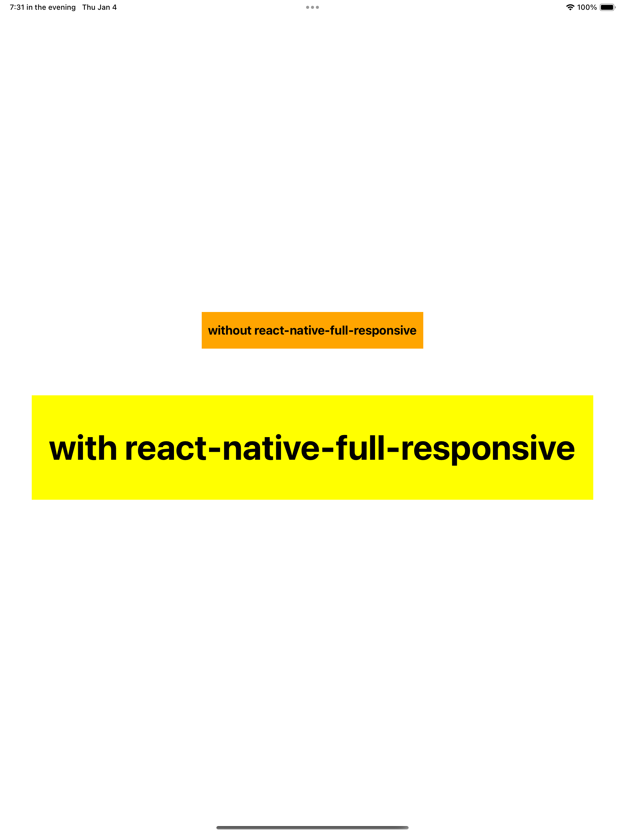
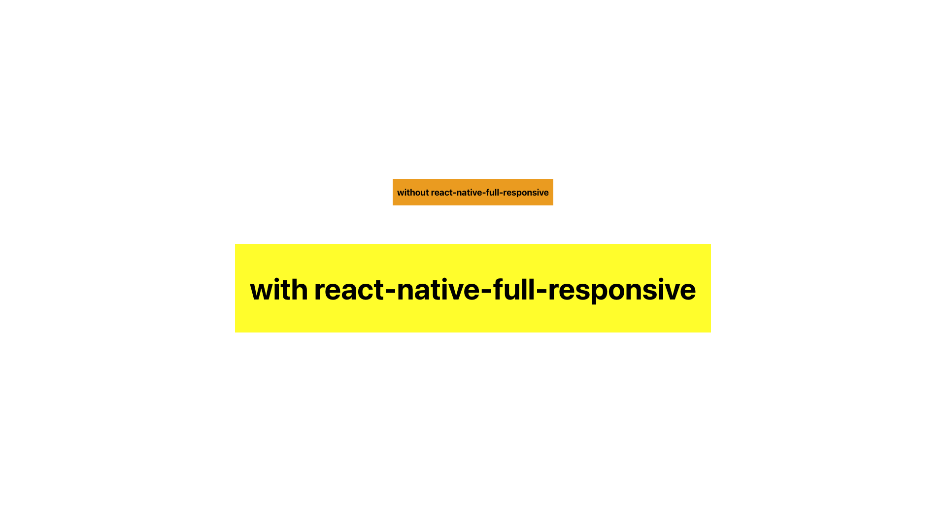
This package makes it super easy to create apps responsive that work perfectly on all different screen sizes in React Native (like font size, width, height, and more), making sure everything looks great on any device, from extra small to extra large. You can also tweak how things scale and adjust settings to make everything just the way you want it.
- Easy to use: Effortlessly implement size scaling and responsive design.
- Cross-platform: Works seamlessly across multiple platforms and devices.
- createRStyle method and useRStyle hook as alternatives to using
StyleSheet.createfor create stylesheets. - Various responsive hooks provided: Use these hooks based on your specific use cases.
- Customizable scaling: Define base widths for specific dimension types
(xs, sm, ... 2xl)for precise control. - Responsive percentage-based sizing: Adjust sizing based on width or height by
PixelRatio. - Media query hook: Detect dimension types by using the useMediaQuery hook. You can also override default thresholds as needed. This hook can be used in the provider to automatically detect and respond based on the configurations.
- Various responsive Higher-Order Components (HOCs) provided: Utilize these methods in your class components.
- Written in TypeScript and fully typed.
Supported for React Native >= 0.60
yarn add react-native-full-responsive

//or

npm install react-native-full-responsive --saveStarting from v2, you can easily create your styles using the createRStyle or useRStyle hooks
Use createRStyle in a similar way to when you use StyleSheet.create:
import * as React from 'react';
import { View, Text } from 'react-native';
import { createRStyle } from 'react-native-full-responsive';

const SIZE = 20;

export default function App() {
  return (
    <View style={styles.container}>
      <View style={styles.box}>
        <Text style={styles.textBold}>My awesome responsive text!</Text>
      </View>
    </View>
  );
}

const styles = createRStyle({
  container: {
    flex: 1,
    alignItems: 'center',
    justifyContent: 'center',
  },
  box: {
    height: `${SIZE * 3}rs`,
    justifyContent: 'center',
    backgroundColor: 'yellow',
    marginVertical: `${SIZE}rs`,
    paddingHorizontal: `${SIZE / 2}rs`,
  },
  textBold: {
    fontWeight: 'bold',
    fontSize: `${SIZE}rs`,
  },
});
Alternatively, use useRStyle to create dynamic styles that change when dimensions, bases, or types are modified:
import * as React from 'react';
import { View, Text } from 'react-native';
import { FRProvider, useRStyle } from 'react-native-full-responsive';

const SIZE = 20;

const ResponsiveBox: React.FC = () => {
  const styles = useRStyle({
    container: {
      flex: 1,
      alignItems: 'center',
      justifyContent: 'center',
    },
    box: {
      height: `${SIZE * 3}rs`,
      justifyContent: 'center',
      backgroundColor: 'yellow',
      marginVertical: `${SIZE}rs`,
      paddingHorizontal: `${SIZE / 2}rs`,
    },
    textBold: {
      fontWeight: 'bold',
      fontSize: `${SIZE}rs`,
    },
  });

  return (
    <View style={styles.container}>
      <View style={styles.box}>
        <Text style={styles.textBold}>My awesome responsive text!</Text>
      </View>
    </View>
  );
};

export default function App() {
  return (
    <FRProvider type="sm">
      <ResponsiveBox />
    </FRProvider>
  );
}
Alternatively, make use of the responsive methods and hooks that are available from v1:
import * as React from 'react';
import { Text } from 'react-native';
import { useRM, FRProvider } from 'react-native-full-responsive';
//...

const MyComponent = () => {
  const { rs } = useRM();

  const scaledValue = rs(20);

  return (
    <Text style={{ fontSize: scaledValue }}>My awesome responsive text!</Text>
  );
};

export default function App() {
  return (
    <FRProvider>
      <MyComponent />
    </FRProvider>
  );
}
To become more familiar with how to use methods within your function or class components, check out the provided examples.
Explore the usage documentation to discover how to leverage the methods, hooks, and other features.
See the contributing guide to learn how to contribute to the repository and the development workflow.
MIT


