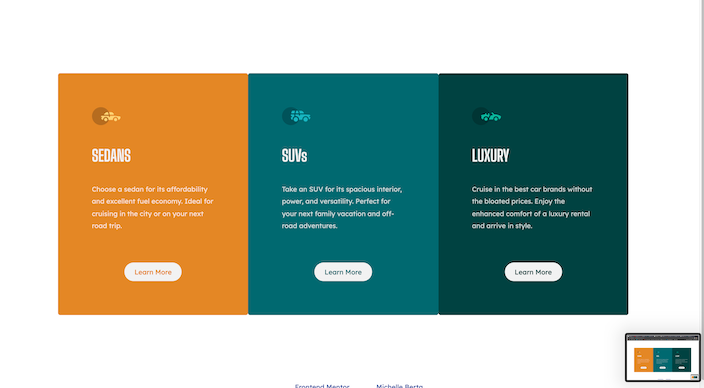
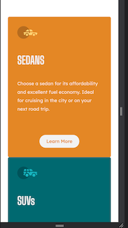
This is a solution to the 3-column preview card component challenge on Frontend Mentor. Frontend Mentor challenges help you improve your coding skills by building realistic projects.
The challenge is to build out this 3-column preview card component and get it looking as close to the design as possible.
Users should be able to:
- View the optimal layout depending on their device's screen size
- See hover states for interactive elements
- Solution URL: 3 Column Preview Card
- Semantic HTML5 markup
- CSS custom properties
- Flexbox
- CSS Grid
I wanted to build this using Flexbox and CSS Grid because those are not as familiar to me as using Bootstrap or Materialize. I was very pleased with the way it turned out. I still have a lot to learn.
- Website - Michelle Berta
- Frontend Mentor - @MichelleBerta
- LinkedIn - Michelle Berta


