SitecoreBlazorUI
The repository contains the source code for SitecoreBlazorUI which is an experimental and community-driven project.
The purpose of this module to have Sitecore SPEAK3 components on Blazor.
This is a work in progress application, You can use it, but its at your own risk. Stylesheets and icons have been reused from Sitecore's official npm feed.
Please feel free to contribute or raise an issue if you have any!
Prerequisites
- You need to have a Visual Studio 2019 installed
- You need to have the .NET 5 installed
Setting up the project
- Clone this repository
- navigate into the src folder and type in the command prompt the following command: 'dotnet run'
- Open the application in your preferred browser on http://localhost:5000
Running in Docker
- Clone this repository
- Call .\init.ps1 with LicenseXmlPath parameter
- Run .\up.ps1 script (It will push sitecore items to Sitecore (shortcut item)
- Open the cm site and login to sitecore (https://cm.blazorui.localhost/sitecore/login/)
- Open the https://cm.blazorui.localhost/sitecore/shell/client/Applications/sitecoreblazorui/ and browse the application
- After modifing the code, call .\deploy.ps1. This script will deploy your latest changes into the container
Publishing to Sitecore (In case of non containerized environment)
- Find index.aspx and check
<base href="/sitecore/shell/client/Applications/sitecoreblazorui/">tag in the head section - Create the same folder structure under your Sitecore Instance. e.g c:<sitecoreWebRoot>\sitecore\shell\client\applications\sitecoreblazorui
- In Visual Studio, right-click on the project name and select Publish. Let’s pick the folder option and click Next/Finish
- Visual Studio publishes the files by default to c:<pathToProjectFolder>\bin\Release\net5.0\browser-wasm\publish.
- Find the wwwroot folder within this folder. c:<pathToProjectFolder>\bin\Release\net5.0\browser-wasm\publish\wwwroot\
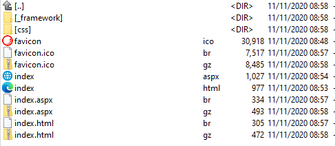
- Your folder should look like this:
- Copy the content to the previously created folder under your Sitecore instance
- Add the following mimetypes to your site in IIS
- FileExtension = .wasm Mime Type "application/wasm"
- FileExtension = .dat Mime Type "application/octet-stream"
- FileExtension = .blat Mime Type "application/octet-stream"
- Open the https://{sitecoreInstanceUrl}/sitecore/shell/client/Applications/sitecoreblazorui/ and enjoy it

Re-written components
Note: The following components may not have the full functionality from SPEAK3
ScIcon
ScIcon can display any icons which exists in the icon library.
Sample Page http://localhost:5000/samples/iconpage
<ScIcon Icon="about" Title="about" Size="xl" />
ScActionBar
ScActionBar creates an action bar on the page. It has a left aligned and right aligned placeholder to place controls.
Sample Page: http://localhost:5000/samples/actionbarpage
   <ScActionBar>
        <ScActionBarLeft>
            <ScBackButton/>
            <ScButton ButtonType="primary" Text="Action Bar Left"/>
        </ScActionBarLeft>
        <ScActionBarRight>
            <ScButton ButtonType="secondary" Text="Action Bar Right"/>
        </ScActionBarRight>
    </ScActionBar>

ScButton
ScButton creates a button in different variants.
Sample Page: http://localhost:5000/samples/buttonpage
<ScButton ButtonType="primary" Text="Primary" OnClickCallback="ClickTest" />
<ScButton ButtonType="secondary" Text="Secondary" />
<ScButton ButtonType="info" Text="Info" />
<ScButton ButtonType="link" Text="Link" />
<ScButton ButtonType="chromeless" Text="Chromeless" />

ScBackButton
ScBackbutton is a special button which allows you navigate back in browser history;
Sample Page: http://localhost:5000/samples/buttonpage
<ScBackButton/>

ScButtonGroup
It allows you to group the buttons
<ScButtonGroup>
    <ScButton ButtonType="primary" Text="Primary 1" OnClickCallback="ClickTest" />
    <ScButton ButtonType="primary" Text="Primary 2" OnClickCallback="ClickTest" />
    <ScButton ButtonType="primary" Text="Primary 3" OnClickCallback="ClickTest" />
</ScButtonGroup>

ScExpander
ScExpander allows you to add collapsible content to your page
Sample Page: http://localhost:5000/samples/expanderpage
 <ScExpander HeaderTitle="Closed by Default" IsOpened="false">
    <h2>closed</h2>
</ScExpander>

ScApplicationHeader
ScApplication header can add the red colored header to each page with title and subtitle
 <ScApplicationHeader Text="SPEAK components in Blazor">
    <h5 class="basic-white">Buttons</h5>
</ScApplicationHeader>

ScGlobalHeader and ScGlobalLogo
ScGlobalHeader and ScGlobalLogo defines the global header for application which can be shared across each pages.
<ScGlobalHeader PageTitle="This is the page title" ApplicationTitle="SitecoreBlazorUI">
    <ScGlobalLogo RedirectUrl="/home/" />
</ScGlobalHeader>

ScMenu, ScMenuCategory, ScMenuItem
By using these controls you can build Sitecore themed navigation easily and you can group the different menu items.
<ScMenu>
    <ScMenuCategory CategoryTitle="First" IsOpened="true" Icon="cake_slice">
        <ScMenuItem Href="/"> Home</ScMenuItem>
        <ScMenuItem Href="samples/textpage">Headings</ScMenuItem>
        <ScMenuItem Href="samples/tabpage">Tabs</ScMenuItem>
    </ScMenuCategory>
    <ScMenuCategory CategoryTitle="Closed by Default" IsOpened="false" Icon="about">
        <ScMenuItem Href="samples/textcolorspage">Text Colors</ScMenuItem>
    </ScMenuCategory>
</ScMenu>

ScMessageBar and ScAlert
You can define alert message in different variants.
http://localhost:5000/samples/messagepage
<ScMessageBar>
    <ScAlert Variant="danger" Text="Hello" />
</ScMessageBar>
<ScMessageBar>
    <ScAlert Variant="warning" Text="Hello" />
</ScMessageBar>
<ScMessageBar>
    <ScAlert Variant="info" Text="Hello" />
</ScMessageBar>
<ScMessageBar>
    <ScAlert Variant="success" Text="Hello" />
</ScMessageBar>

ScProgressBar and ScProgressIndicator
Sample Page: http://localhost:5000/samples/progresspage
  <ScProgressIndicator Show="true"/>
  <ScProgressBar Value="40" />

ScTab
You can seperate your content into tabs. Tabs control supports multiple variants(switch, progressive, sub) and support disabling a given tab.
Sample Page: http://localhost:5000/samples/tabpage
 <ScTabGroup Variant="switch">
    <ScTab Text="Tab 1">
        <h1>The first tab</h1>
    </ScTab>
    <ScTab Text="Tab 2">
        <h1>The second tab</h1>
    </ScTab>
    <ScTab Text="Tab 3" IsDisabled="true">
        <h1>Disabled by default</h1>
    </ScTab>
</ScTabGroup>

ScTable
ScTable creates Sitecore SPEAK themed tables.
Sample Page: http://localhost:5000/samples/tablepage
<ScTable>
    <thead>
        <tr>
            <th>#</th>
            <th>First Name</th>
            <th>Last Name</th>
        </tr>
    </thead>
    <tbody>
        <tr>
            <td>1</td>
            <td>Mark</td>
            <td>Otto</td>
        </tr>
        <tr>
            <td>2</td>
            <td>Jacob</td>
            <td>Thornton</td>
        </tr>
    </tbody>
</ScTable>

ScModal
ScModal allows to create and display modal dialogs in different tyles
Sample Page: http://localhost:5000/samples/modalpage
<ScModal @ref="Modal7"
    DialogType="ScModal.ModalType.Error"
    ModalTitle="Click modal"
    DialogSize="ScModal.ModalSize.Large"
    ShowBackdrop="true"
    CloseBtnText="Cancel"
    BtnText="Save"
    OnBtnClickCallback="ClickTest">
        <h4>Lorem ipsum</h4>
        Modal with backdrop.
</ScModal>

ScBreadcrumbs
ScBreadcrumbs allows to create and display static and dynamic (based on the request path) breadcrumbs on the page
Sample Page (dynamic): http://localhost:5000/samples/breadcrumbpage/dynamic
Sample Page (static): http://localhost:5000/samples/breadcrumbpage
Static Sample
(Note: You have to ScBreadcrumb component within the ScApplicationHeader component)
<ScApplicationHeader Text="SPEAK components in Blazor">
    <h5 class="basic-white">Static Breadcrumb</h5>
    <ScBreadcrumb>
        <ScBreadcrumbItem Href="/">Home</ScBreadcrumbItem>
        <ScBreadcrumbItem Href="/">Level1</ScBreadcrumbItem>
        <ScBreadcrumbItem Href="/">Level2</ScBreadcrumbItem>
    </ScBreadcrumb>
</ScApplicationHeader>
Dynamic Sample
(Note: If IsDynamic property set to 'true', any child element of ScBreadcrum component will be ignored and wont be rendered)
<ScApplicationHeader Text="SPEAK components in Blazor">
    <h5 class="basic-white">Dynamic Breadcrumb</h5>
    <ScBreadcrumb IsDynamic="true" RootItemTitle="Index">
    </ScBreadcrumb>
</ScApplicationHeader>
