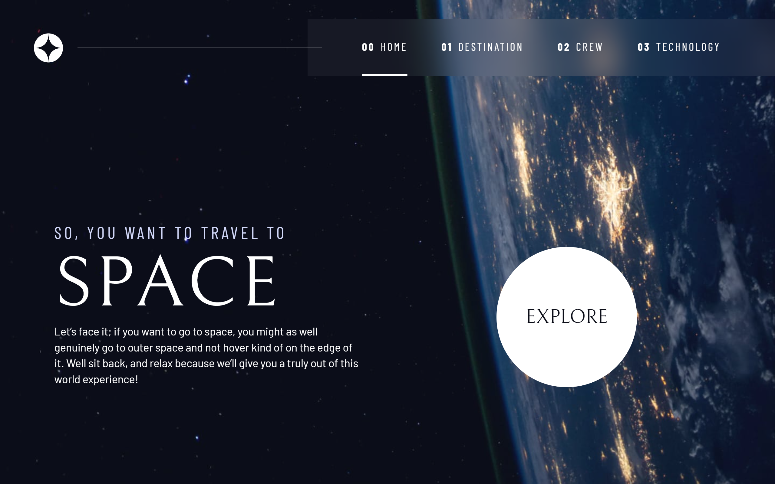
This is a solution to the Space tourism website challenge on Frontend Mentor. Frontend Mentor challenges help you improve your coding skills by building realistic projects.
Note: Delete this note and update the table of contents based on what sections you keep.
Users should be able to:
- View the optimal layout for each of the website's pages depending on their device's screen size
- See hover states for all interactive elements on the page
- View each page and be able to toggle between the tabs to see new information
- Solution URL: Github repo
- Live Site URL: Space Tourism
- Semantic HTML5 markup
- CSS custom properties
- Flexbox
- CSS Grid
- Mobile-first workflow
I have learned a lot regarding using css grid and flex to posision the elements the way I want on the page, and also regarding the JS usage on how to comunicate with a server and GET the data that populate your site
the course provided by Scrimba and Kevin is just amazing and it helped me a lot during the process of making this site
