- About the project
- Built with
- What I learned
- What you can do?!
- Useful resources
- Acknowledgments
- Follow me
This is my 10th Frontend Mentor challenge.
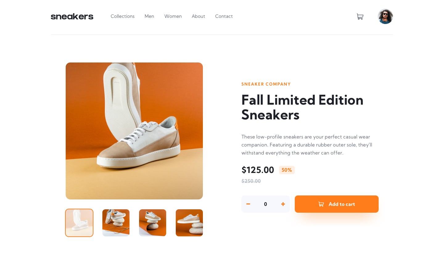
This is my solution to the E-commerce product page challenge on Frontend Mentor. The goal of this challenge is to build out this e-commerce product page and get it looking as close to the design as possible.
Users should be able to:
- View the optimal layout for the site depending on their device's screen size
- See hover states for all interactive elements on the page
- Open a lightbox gallery by clicking on the large product image
- Switch the large product image by clicking on the small thumbnail images
- Add items to the cart
- View the cart and remove items from it
For this project i used:
- Semantic HTML5 markup
- SCSS
- CSS custom properties
- Flexbox
- Mobile-first workflow
This challenge was very tough. it contains alot of small details i should take care of. I tried to make my solution simple as possible. The good thing about this challenge that i 've learned alot from it. you can see live website from the links above.☝
I need your opinions, feedbacks , how do you find my code structure? or any suggestions i can do to make my projects better. Also if you guys like my content, follow me this makes me happy❤👍.
- Adobe Xd - I use adobe xd to check the size of elements.
- I don't have sketch or figma files. So the final result isn't pixel perfect.
- I want to say Thanks to anyone who see my work and react with it, give me his feedback and helped me to improve myself. So thank you❤.
- My website - Well I haven't made my portfolio yet, but gonna make it soon.
Github - @FedLover
Codepen - @FedLover
 Frontend Mentor - @mo
See you in another project! 👋👩💻
