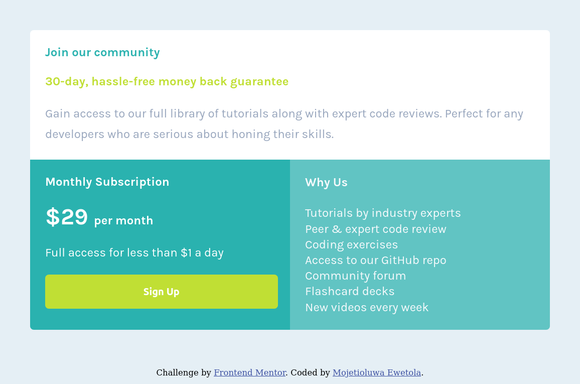
This is a solution to the Single price grid component challenge on Frontend Mentor. Frontend Mentor challenges help you improve your coding skills by building realistic projects.
Users should be able to:
- View the optimal layout for the component depending on their device's screen size
- See a hover state on desktop for the Sign Up call-to-action
- Solution URL: Add solution URL here
- Live Site URL: Add live site URL here
- Semantic HTML5 markup
- CSS custom properties
- Flexbox
- Mobile-first workflow
I learned how to use Semantics element in HTML. I also learnt CSS flex property, media queries, min and max values, etc. I learnt the use of GIT version control system and markdown.
I will like to improve on my use of semantic element in HTML and use of CSS properties like flex_box, grid_systems, media_queries and so on.
- W3SCHOOLS - This helped me for FLEX property
- MDN Web Docs - This is an amazing article which helped me finally understand CSS min and max property
- Kevin Powell Video - This also help me to understand CSS min and max property
- Website - Mojetioluwa Dave Ewetola
- Frontend Mentor - @Mojetioluwa
- Twitter - @I_amDM7
I want to acknowledge Kevin Powell video on min(), max() and clamp() property which help me understand those CSS properties
