
A 60fps animated tab bar to be used with React Navigation v4 & v5 with a variety of cool animation presets 😎.
yarn add @gorhom/animated-tabbar
# or
npm install @gorhom/animated-tabbar
Also, you need to install react-native-reanimated, react-native-gesture-handler & react-native-svg, and follow theirs installation instructions.
React Navigation v5
import React from 'react';
import { NavigationContainer } from '@react-navigation/native';
import { createBottomTabNavigator } from '@react-navigation/bottom-tabs';
import AnimatedTabBar, {TabsConfig, BubbleTabConfig} from '@gorhom/animated-tabbar';

const tabs: TabsConfig<BubbleTabConfig> = {
  Home: {
    labelStyle: {
      color: '#5B37B7',
    },
    icon: {
      component: /* ICON COMPONENT */,
      activeColor: 'rgba(91,55,183,1)',
      inactiveColor: 'rgba(0,0,0,1)',
    },
    background: {
      activeColor: 'rgba(223,215,243,1)',
      inactiveColor: 'rgba(223,215,243,0)',
    },
  },
  Profile: {
    labelStyle: {
      color: '#1194AA',
    },
    icon: {
      component: /* ICON COMPONENT */,
      activeColor: 'rgba(17,148,170,1)',
      inactiveColor: 'rgba(0,0,0,1)',
    },
    background: {
      activeColor: 'rgba(207,235,239,1)',
      inactiveColor: 'rgba(207,235,239,0)',
    },
  },
};

const Tab = createBottomTabNavigator();

export default function App() {
  return (
    <NavigationContainer>
      <Tab.Navigator
        tabBar={props => (
          <AnimatedTabBar tabs={tabs} {...props} />
        )}
      >
        <Tab.Screen
          name="Home"
          component={HomeScreen}
        />
        <Tab.Screen
          name="Profile"
          component={ProfileScreen}
        />
      </Tab.Navigator>
    </NavigationContainer>
  )
}
React Navigation v4
import React from 'react';
import {createAppContainer} from 'react-navigation';
import {createBottomTabNavigator} from 'react-navigation-tabs';
import {createStackNavigator} from 'react-navigation-stack';
import {SafeAreaProvider} from 'react-native-safe-area-context';
import AnimatedTabBar, {TabsConfig, BubbleTabConfig} from '@gorhom/animated-tabbar';

const tabs: TabsConfig<BubbleTabConfig> = {
  Home: {
    labelStyle: {
      color: '#5B37B7',
    },
    icon: {
      component: /* ICON COMPONENT */,
      activeColor: 'rgba(91,55,183,1)',
      inactiveColor: 'rgba(0,0,0,1)',
    },
    background: {
      activeColor: 'rgba(223,215,243,1)',
      inactiveColor: 'rgba(223,215,243,0)',
    },
  },
  Profile: {
    labelStyle: {
      color: '#1194AA',
    },
    icon: {
      component: /* ICON COMPONENT */,
      activeColor: 'rgba(17,148,170,1)',
      inactiveColor: 'rgba(0,0,0,1)',
    },
    background: {
      activeColor: 'rgba(207,235,239,1)',
      inactiveColor: 'rgba(207,235,239,0)',
    },
  },
};

const TabNavigator = createBottomTabNavigator(
  {
    Home: HomeScreen,
    Profile: ProfileScreen,
  },
  {
    tabBarComponent: props => <AnimatedTabBar tabs={tabs} {...props} />,
  },
);

const AppContainer = createAppContainer(TabNavigator);

export default () => (
  <SafeAreaProvider>
    <AppContainer />
  </SafeAreaProvider>
);
To configure animated icons, please have a look at Animated Icons.
| name | description | required | type | default |
|---|---|---|---|---|
preset |
Animation preset, currently options are ['bubble', 'flashy']. |
NO | PresetEnum |
'bubble' |
tabs |
Tabs configurations. A generic dictionary of selected preset tab config. | YES | TabsConfig<T> |
|
style |
View style to be applied to tab bar container, default value will be based on selected preset. | NO |
| name | description | required | type | default |
|---|---|---|---|---|
duration |
Animation duration, default value will be based on selected preset. | NO | number | 500 |
easing |
Reanimated easing function, default value will be based on selected preset. |
NO | EasingFunction |
Easing.out(Easing.exp) |
| name | description | required | type | default |
|---|---|---|---|---|
itemInnerSpace |
Inner space to be added to the tab item, this may not be applied on some presets. | NO | number | Space |
12 |
itemOuterSpace |
Outer space to be added to the tab item, this may not be applied on some presets. | NO | number | Space |
12 |
iconSize |
Tab item icon size. | NO | number | 24 |
isRTL |
Tab bar layout and animation direction. | NO | boolean | false |
Originally Animated TabBar started with Bubble as the only animation preset embedded. However, I felt the library structure could include many other variety of animation presets.
| Bubble Preset | Flashy Preset |
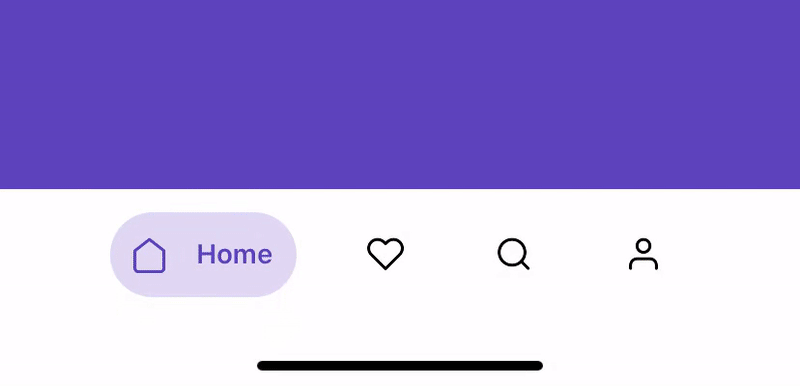 | 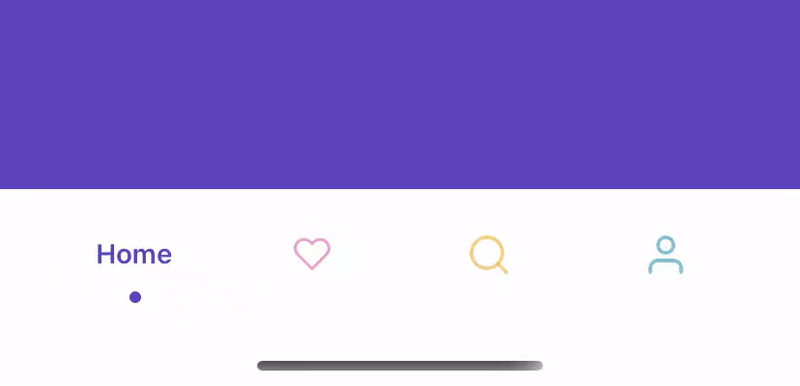 |
- Add accessibility support.
- react-native-reanimated
- react-native-gesture-handler
- react-native-redash
- react-native-svg
- react-navigation
- @react-native-community/bob
MIT
Liked the library? 😇
