This readme.md will serve as your guide to putting our instruction into practice. Each commit to this repository will add new instructions to this readme.md file. Each commit corresponds with a portion of the workshop that you will build.
Every portion of this workshop is started and indicated in this document by a level 2 heading. A new lesson and instruction for each phase of the workshop is added with each commit to this repository. We will start with “Hello React” below.
Welcome to the 2019 DevReach: “Let’s Build an App With React” workshop. We'll get started building our React toolchain.
mkdir space-x-appcd space-x-appnpm initmkdir appcode .We now have a package.json and app directory, let's also create the following files in the root directory:
.gitignorewebpack.config.babel.js
And inside the app directory create the following files:
index.jsindex.htmlApp.jsApp.scss
I created three separate commands for installing our dev-dependencies grouped by which ones are related. Let's install each all of them!
npm i --save-dev webpack webpack-cli webpack-dev-server html-webpack-plugin
npm i --save-dev @babel/core @babel/preset-env @babel/preset-react
npm i --save-dev babel-loader node-sass file-loader sass-loader style-loader css-loader url-loader
We need to add a build and start command in our package.json's scripts right next to the existing test script:
    "test": "echo \"No test script\"",
    "build": "webpack",
"start": "webpack-dev-server --open"Article about preset-env:What is babel-preset-env and why do I need it?. K
now that each plugin is its own npm library and this one allows transpiling ES6 to legacy JS code. preset-react is just a bundle of other libraries:
@babel/plugin-syntax-jsx@babel/plugin-transform-react-jsx@babel/plugin-transform-react-display-name
preset-react allows us to use JSX in conjunction with Webpack, Babel and React.
Even in our most simple “Hello React” exanmple, we will need JSX, so let's add the following code to our package.json just above our scripts:
"babel": {
  "presets": [
    "@babel/preset-env",
    "@babel/preset-react"
  ]
},Articles on Normalize(normalize.css):
Normalize is a modern CSS reset for cross-browser consistency considering the styling of HTML elements.
npm i --save react react-dom react-router-dom normalize.cssBelow we walk through the steps to bootstrap our Index.html file and get our React app working with our initial App component.
<!DOCTYPE html>
<html lang="en" dir="ltr">
<head>
  <title>SpaceX Events Home</title>
  <link href="http://fonts.googleapis.com/css?family=Lato:200,300,400" rel="stylesheet">
  <meta name="viewport" content="width=device-width, initial-scale=1">
  <meta name="Description" content="Author: Your Name">
</head>
<body>
  <div id="root"></div>
</body>
</html>import React from 'react';
import ReactDOM from 'react-dom';
import App from './App';
ReactDOM.render(<App />, document.getElementById("root"));import React from 'react';
import 'normalize.css';
import './App.scss';
const App = () => <h1>Hello React</h1>;
export default App;An Article on Sass: Why Sass
Why Sass(SCSS) over CSS? This is something we utilize in our project and without Sass we would not be able to easily create our light and dark theme (later on). If you would like to learn more about Sass/SCSS, check out this article.
body {
  background-color: #222;
}
h1 {
  padding: 0 0 0 1em;
  color: #61dafb;
  font-family: Lato;
}For more information on creating a .gitignore file and why we need them, see this article for more info.
# dependencies
/node_modules

# testing
/coverage

# production
/build

# distribution
/dist
/public

# misc
.DS_Store
.env.local
.env.development.local
.env.test.local
.env.production.local

npm-debug.log*
yarn-debug.log*
yarn-error.log*
var path = require("path");
var HtmlWebpackPlugin = require("html-webpack-plugin");

module.exports = {
  entry: "./app/index.js",
  output: {
    path: path.resolve(__dirname, "dist"),
    filename: "index_bundle.js",
    publicPath: "/"
  },
  module: {
    rules: [
      {
        test: /\.(js)$/,
        use: "babel-loader"
      },
      {
        test: /\.css$/,
        loaders: ["style-loader", "css-loader"]
      },
      {
        test: /\.scss$/,
        use: [
          "style-loader", // creates style nodes from JS strings
          "css-loader", // translates CSS into CommonJS
          "sass-loader" // compiles Sass to CSS, using Node Sass by default
        ]
      },
      {
        test: /\.(jpe?g|png|gif|woff|woff2|eot|ttf|svg)(\?[a-z0-9=.]+)?$/,
        loader: "url-loader?limit=100000"
      }
    ]
  },
  mode: "development",
  resolve: {
    extensions: [".js", ".jsx"]
  },
  devServer: {
    historyApiFallback: true
  },
  plugins: [
    new HtmlWebpackPlugin({
      template: "app/index.html"
    })
  ]
};
With these files in place, run the project for the first time.
npm run startYou should get a page running on http://localhost:8080 with a dark background and“Hello React” heading with no errors. This indicates that all of our configuration and styles are working and React is rendering an application for us!
Let's stop here and save our changes.
From the root of our project, initialize git:
git initWe should notice our .gitignore working and hiding not tracking our npm_modules directory 😉!
We need an empty repository on GitHub to push this project and its first commit to. Next, we will stage, commit and push to our origin's master:
git add .git commit -m "Hello React (Webpack, Babel and React)"git remote add origin https://github.com/httpJunkie/2019-devreach-react-workshop.gitgit push -u origin masterWe created our own Webpack, Babel & React build ourselves, without using something like Create React App (CRA) to and because of this we are smarter about our application and have a better understanding of how a minimal React application works under the hood and how to build and run that application from a basic standpoint.
We will tackle linting in the next section.
Article on ESLint: Getting Started
We need to install and initialize ESLint.
npm i --save-dev eslint babel-eslint eslint-watch eslint-plugin-reactCreate our ESLint configuration file in the root directory of our project:
{
  "plugins": [
    "react"
  ],
  "parser": "babel-eslint",
  "parserOptions": {
    "ecmaVersion": 6,
    "sourceType": "module",
    "ecmaFeatures": {
      "jsx": true
    }
  },
  "env": {
    "es6": true,
    "browser": true,
    "node": true
  },
  "extends": [],
  "rules": {
    "semi": ["error", "always"],
    "quotes": ["error", "double"]
  },
  "settings": {
    "react": {
      "version": "16.9"
    }
  }
}
Before we can run our linter, let's add a lint and lint:fix script to our package.json just above the test script:
    "lint": "eslint app --ext .js,.jsx",
    "lint:fix": "eslint --fix app --ext .js,.jsx",
Again, they are made to work specifically with React hence the .js and .jsx file extensions. Now let's run our linter.
npm run lintRight away we get some errors:
✖ 6 problems (6 errors, 0 warnings)
  6 errors and 0 warnings potentially fixable with the `--fix` option.
This is great, it means our linter is working. But as a team, let's assume that we do not want to follow the double quote rule and we only want to follow the semi-colon rule. Let's make the following changes to the .eslintrc file:
    "semi": ["warn", "always"],
    "quotes": ["off", "double"]
At this point we should not get any errors. We can turn off the quotes as shown above, or completely remove it. If you would like to test the linter one more time, try removing some semi-colons and running it again.
Some rules that we may want to apply are not built into ESLint because they are framework specific and we are working in React. If we want to apply the suggested rules for using Hooks in React, we need to add a new package that can be used as a plugin, we already have one plugin added and set up for JSX, but let's show how to add another one.
Let's install the package we need:
npm i --save-dev eslint-plugin-react-hooksFirst we will add react-hooks to the plugin section the .eslintrc file:
    "react",
    "react-hooks"
then, we will add the rule to the rules section the .eslintrc file:
    "react-hooks/rules-of-hooks": "error",
    "react-hooks/exhaustive-deps": "warn",
    "semi": ["warn", "always"],
    "quotes": ["off", "double"]
To check the plugin is working, replace the first line in App.js with:
import React, { useEffect } from 'react';
useEffect(() => {
  console.log("This should trigger our Hooks rule");
});
Run our linter again and you should get a warning, appended to the end is the rule responsible for this error react-hooks/rules-of-hooks:
C:\dev\workshops\2019-devreach-react-workshop\app\App.js
  2:1  error  React Hook "useEffect" cannot be called at the top level. React Hooks must be called in a React function component or a custom React Hook function  react-hooks/rules-of-hooks
Discard our changes in App.js Our Hooks linting is working.
Let's use a rule that will work with our react plugin!
In the JSX-specific-rules section of their documentation we can see a rule for no duplicate props.
Add the following to the .eslintrc file's rule's section:
"react/jsx-no-duplicate-props": "error",We could then go into our index.js file and add duplicate props:
ReactDOM.render(<App isTrue={true} isTrue={false} />, document.getElementById("root"));And we get the following error:
C:\dev\workshops\2019-devreach-react-workshop\app\index.js
  6:36  error  No duplicate props allowed  react/jsx-no-duplicate-props
Again, the rule that triggered this error is listed at the end of the error.
This next change will probably have no effect, but let's update the React version in our .eslintrc file, ensure that it matches the version of React you have installed:
 "settings": {
    "react": {
      "version": "16.10"
    }
  }
Great, linting is working and I can leave exploring new rules up to you! This concludes the linting section of the workshop. Next up is some prep work needed to create a responsive frame for our application.
Our app will live in this frame. Since we will lean on KendoReact in this app, lets add the package and style we need for that.
npm i @progress/kendo-theme-material@3.3.3That package gives us a stylesheet we can use and we need to put it into the App.js file, right between our normalize.css import and our App.scss imports. The order is important, we want our App.scss to override it if needed:
import 'normalize.css';
import '@progress/kendo-theme-material/dist/all.css';
import './App.scss';
We need a component Frame.js. It's going to contain the shell of our application consisting of an outer div tag called app-container and inside of that, a semantic HTML structure:
<div className={`app-container`}>
  <main>
    <header></header>
    <section></section>
    <footer></footer>
  </main>
</div>- The app-container
<div>contains the main andSidenavcomponent. <main>contains header, section and footer.<header>will contain aLogoandTopnavcomponent.<section>will house our React Router.<footer>will contain one component namedFooter.
We can see the semantic tags mixed with our React Components below:
<div className={`app-container`}>
  <main>
    <header>
      <Logo />
      <Topnav />
    </header>
    <section>
      {/* Routes Load Here */}
    </section>
    <footer>
      <Foot />
    </footer>
  </main>
  <Sidenav />
</div>
We will use a combination of Flexbox and CSS Grid styles in conjunction with these semantic HTML tags to create a solid layout. Before we add those styles, let's get the files we need set up, and the navigation working and switching routes.
Create a new file in the app directory called Frame.js.
Inside app directory, create two sub-directories: partial-components and view-components.
Inside the view-components directory create two files: Home.js and Events.js.
Inside the partial-components directory create seven files: Logo.js, Menu.js, Foot.js, Sidenav.js, Sidenav.scss, Topnav.js, and Topnav.scss.
Below is the code for each file we created:
import React, { useEffect } from 'react';
const Home = () => {
  useEffect(() => {document.title = `Home Page`},[])
  return (
    <div className="view-home">
      <h3>Next Launch</h3>
      {/* Launch Component */}
    </div>
  )
}
export default Home;import React, { useEffect } from 'react';
const Events = () => {
useEffect(() => {document.title = `SpaceX Historical Events`});
return (
<div className="view-events">
<h3>Historical Events</h3>
</div>
)
}
export default Events;import React from 'react';
const Logo = () => {
return (
<div className={`logo`}>
<span className="k-icon k-i-play"style={
{ marginTop: `-2px`, transform:`rotate(-90deg)` }
}></span> <span>SpaceX</span>
</div>
)
}
export default Logo;import React from 'react';
import { NavLink } from 'react-router-dom';
const Menu = () => {
return (
<ul style={{userSelect: 'none'}}>
<li className="link">
<NavLink tabIndex="2" exact activeClassName="active" to="/">Home</NavLink>
</li>
<li className="link">
<NavLink tabIndex="3" activeClassName="active" to="/todos">To Do's</NavLink>
</li>
<li className="link">
<a tabIndex="4" href="https://github.com/httpJunkie/2019-devreach-react-workshop">
Source Code <span className="k-icon k-i-hyperlink-open-sm"></span>
</a>
</li>
<li className="menu"><span className="k-icon k-i-menu"></span></li>
</ul>
)
}
export default Menu;Notice how the Topnav.js and Sidenav.js files below are nearly identical. They both simply import the menu (component reuse). Their styles (SCSS) will make them different laying out horizontally (Topnav) vs vertically (Sidenav).
import React from 'react';
import './Topnav.scss';
import Menu from './Menu';
const Topnav = () => {
  return (
    <div className={`topnav`}>
      <Menu />
    </div>
  )
}
export default Topnav;.topnav {
width: 70%;
display: flex;
justify-content: flex-end;
}
.topnav ul { padding: 0; }
.topnav ul { display: flex; margin: 0; }
.topnav ul li { list-style-type: none; }
.topnav ul > li:not(:last-child) { margin-right: 15px; }
.topnav ul > li a { color: #212529; }
.topnav ul > li.menu { cursor: pointer; cursor: hand; }import React from 'react';
import './Sidenav.scss';
import Menu from './Menu';
const Sidenav = () => {
return (
<div className={`sidenav`}>
<Menu />
</div>
)
}
export default Sidenav;.sidenav ul {
display: flex;
flex-direction: column;
margin-block-start: 0;
margin-block-end: 0;
margin-inline-start: 0;
margin-inline-end: 0;
padding-inline-start: 0;
}
.sidenav li {
display: flex;
justify-content: flex-start;
align-items: center;
min-height: 60px;
}
.sidenav li > a {
margin-left: 1em;
}
.sidenav li:last-child {
display: none;
}
.active {
font-weight: bold;
}
.sidenav {
background-color: #EFEFEF;
color: #222222;
}
.sidenav li {
border-bottom: 1px solid #555555;
}import React from 'react';
const Foot = () => {
return (
<div className="foot">
🌌 The Boldly Go Company
</div>
);
}
export default Foot;Now that we have each of those files created, let's put it all together in our Frame.js and include our routing and everything we need to lazy load our view-components, etc...
Video: Code Splitting with React and React Router v4
At it's most basic, Lazily loading your Events component means that the data that is a part of that page does not get fetched and loaded if you visit that route.
import React, { lazy, Suspense } from "react";
import { BrowserRouter, Route, Switch } from "react-router-dom";
const Home = lazy(() => import('./view-components/Home'));
const Events = lazy(() => import('./view-components/Events'));
const LoadingMessage = () => `loading...`;
import Logo from "./partial-components/Logo";
import Sidenav from "./partial-components/Sidenav";
import Topnav from "./partial-components/Topnav";
import Foot from "./partial-components/Foot";
const Frame = () => {
  return (
    <BrowserRouter>
      <div className={`app-container`}>
        <main>
          <header>
            <Logo />
            <Topnav />
          </header>
          <section>
            <Switch>
              <Suspense fallback={<LoadingMessage />}>
                <Route exact path="/" component={Home} />
                <Route exact path="/events" component={Events} />
              </Suspense>
              <Route render={() => <h2>404 Page Not Found</h2>} />
            </Switch>
          </section>
          <footer>
            <Foot />
          </footer>
        </main>
        <Sidenav />
      </div>
    </BrowserRouter>
  );
};
export default Frame;
We will now need to add the Frame component to our App component:
import React from 'react';
import 'normalize.css';
import '@progress/kendo-theme-material/dist/all.css';
import './App.scss';
import Frame from './Frame';
const App = () => <Frame />;
export default App;
At this point our app is working, we have the classes and styles for our imported components, but we need to add styles to our App.scss page that use flexbox and CSS Grid to position our header, section, footer and logo, navigation and some basic text and link styles. Replace what is in the App.scss page with the following:
.app-container {
  display: flex;
  height: 100vh;
  font-family: "Lato", sans-serif;
  text-rendering: optimizeLegibility !important;
  -webkit-font-smoothing: antialiased !important;
}
p {
  font-size: 1em;
  max-width: 80%;
}
a {
  color: inherit;
  text-decoration: none;
  margin-bottom: 0.25em;
}
a {
  background-image: linear-gradient(currentColor, currentColor);
  background-position: 0% 100%;
  background-repeat: no-repeat;
  background-size: 0% 4px;
  background-position-y: 1.1em;
  transition: background-size cubic-bezier(0, 0.5, 0, 1) 0.3s;
}
a:hover,
a:visited:hover,
a:active:hover {
  text-decoration: none;
  background-size: 100% 4px;
}
a:focus,
a:visited {
  text-decoration: none;
  background-size: 0% 4px;
}
.k-grid-header-wrap a {
  background-image: none;
  background-position: 0;
  background-repeat: no-repeat;
  background-size: auto;
  background-position-y: auto;
  transition: none;
}
a:active {
  background-color: 555;
}
main {
  width: 100%;
  display: grid;
  grid-template-rows: 60px auto 50px;
}
/* Side Navigation */
.sidenav {
  min-width: 150px;
  height: 100vh;
}
/* Top Navigation */
header {
  display: flex;
  height: 60px;
  font-size: 18px;
}
.logo {
  width: 20%;
  margin: 1em;
  font-size: 20px;
}
.topnav {
  width: 80%;
  margin: 1.2em;
}
/* Content Section */
section {
  border-top: 1px solid #010101;
  background-color: #fff;
  height: calc(100% - 2em);
  padding: 1em;
}
/* Footer */
footer {
  height: 50px;
}
footer div {
  margin-left: 1em;
  margin-top: 1em;
}I know that we have added a lot of styles blindly, so we'll take time in our workshop to go over the structure and what exactly is going on.
This concludes building our App Frame section.
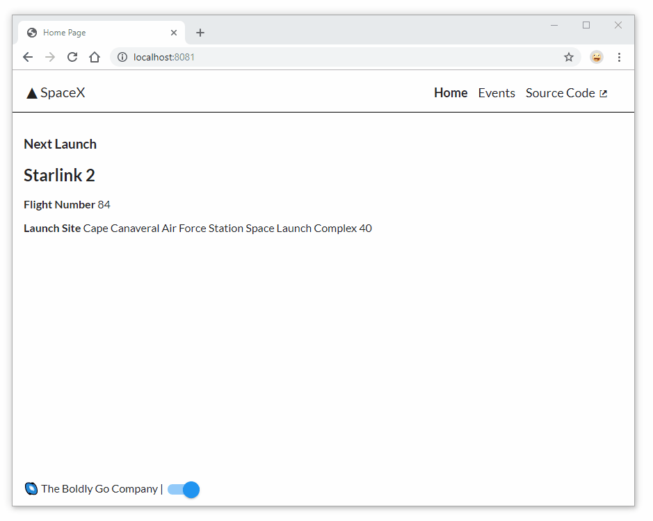
Run npm start and your app should look similar to this:

In our next section, we will make the frame responsive and get a crash course in React Hooks and Context API.
Let's install and use our first React Hook in this project called react-media-hook:
npm i react-media-hookIt has two APIs we can try: useMedia('(min-width: 600px)') will recieve an object similar to using matchMedia() in JavaScript:
import { useMedia } from "react-media-hook";
const matchMediaObject = useMedia('(min-width: 600px)');
In this case, matchMediaObject could equal something like:
{
  matches: true
  media: "(min-width: 600px)"
}
This is a bit overkill and we just need a boolean. We can instead try useMediaPredicate('(min-width: 600px)') which will return a boolean based on our media query that we passed in matching. So we can do something this:
import { useMediaPredicate } from "react-media-hook";
const isMedium = useMediaPredicate('(min-width: 600px)');
Now, isMedium will be true when our browser is at least 600 pixels or greater and false when less than 600 pixels.
We'll use that true or false value to add a 'small' or 'medium' class to our app-container div inside Frame.js.
let's import useMediaPredicate into Frame.js just below our react-router import:
import { useMediaPredicate } from "react-media-hook";Then, above our return statement in the same file, add:
const isMedium = useMediaPredicate("(min-width: 600px)");
const breakpoint = isMedium ? "medium" : "small";
Next, add a class to the app-container div using ${breakpoint} inside our string interpolation:
<div className={`app-container ${breakpoint}`}>To see this working, run the project and inspect the app-container div with F12 (dev tools). Watch the class name change as we resize the browser encountering that 600-pixel threshold.

With that in place, let's hide the top navigation links and show the menu button on small and visa versa on medium. To do this, replace the last line of Topnav.scss:
.topnav ul > li.menu { cursor: pointer; cursor: hand; }With the following:
.app-container.small .topnav ul > li.link { display: none; }
.app-container.medium .topnav ul > li.link { display: auto; }
.app-container .topnav ul > li.menu { cursor: pointer; cursor: hand; }
.app-container.small .topnav ul > li.menu { display: auto; }
.app-container.medium .topnav ul > li.menu { display: none; }
Next, append the following code to the end of the Sidenav.scss file:
.app-container.small .sidenav { display: auto; }
.app-container.medium .sidenav { display: none; }
We will also enable a default ensuring the Sidenav is closed initially (even on small). To do that we create a global state object with Context API and Hooks, specifically useState(a built in React Hook).
Create a file that will house our Context Provider by creating a folder called context inside the app directory. Then, inside create the file: AppContext.js using the following code:
import React, { useState, createContext } from 'react';
const AppContext = createContext();
const AppProvider = props => {
  const [appData, setApp] = useState({
    navOpen: false,
    toggleSidenav: value => setApp(data => (
      { ...data, navOpen: value }
    )),
  });

  return <AppContext.Provider value={appData}>{props.children}</AppContext.Provider>
}
export { AppContext, AppProvider };
Here we import useState and createContext. Next, we create a context instance named AppContext. We then set up an AppProvider using the render props pattern. We declare a Hook with useState, pass in an object with properties, defaults and methods. In this case, the object has a property named navOpen, and a method called toggleSidenav() which can be used to update the value of the navOpen property.
Our AppProvider works by returning an <AppContext.Provider> component with access to our appData which we pased in. It receives that state as props, and gives its children access to it.
Next, we need to have access to this state in many places in our app. We want any component to be able to have access to its data, so we need to place the <AppProvider> component at the highest level in our component tree. To wrap all components, we must place it in the App.js file.
Add the following import to the App.js file:
import { AppProvider } from './context/AppContext';And replace the line:
const App = () => <Frame />;With the following:
const App = () => {
  return(
    <AppProvider>
      <Frame />
    </AppProvider>
  )
};
This will give any component in our application access to our context by wrapping the <Frame> component with the <AppProvider> component by way of render props.
We want to import our AppContext into our Menu.js file and our Sidenav.js file and consume it with useContext.
Import useContext and the AppContext from the provider:
import React, { useContext } from 'react';
import { NavLink } from 'react-router-dom';
import { AppContext } from "../context/AppContext";
Just above the return statement, we will add our context with a call to useContext:
const context = useContext(AppContext);We tap into that context and change the state of navOpen when clicking the menu icon or pressing Enter upon focus.
Replace the last <li></li> with:
      <li className="menu">
        <i className="k-icon k-i-menu"
          onKeyPress={event => {
            if (event.key === "Enter") {
              context.toggleSidenav(!context.navOpen);
            }
          }}
          onClick={() => {
            context.toggleSidenav(!context.navOpen);
          }}
        ></i>
</li>Import useContext and the AppContext from the provider:
import React, { useContext } from 'react';
import { AppContext } from "../context/AppContext";
Just above the return statement, we will add our context with a call to useContext:
const context = useContext(AppContext);Last, we alter the className of the parent div with 'show' or 'hide' based on the value of the context.navOpen:
    <div className={`sidenav ${context.navOpen ? 'show' : 'hide'}`}>
      <Menu />
</div>We also need to update a section of App.scss. Look for a comment: /* Side navigation */ and replace it and it's following style with:
/* Side Navigation */
.sidenav,
.sidenav.show {
  min-width: 150px;
  height: 100vh;
}
.sidenav.hide {
  display: none;
}
Now when we click on the menu icon, it will set the state to it's oposite value, and our Sidenav component will re-render the new class and the CSS will hide or show the sidenav panel.

This concludes our "Creating a Semantic and Responsive Frame (Part 2)" section. Next, we will round out our frame by adding a theme toggle using the Kendo UI Sass Theme Builder, another piece of global state to track 'light' and 'dark' and add a KendoReact Switch component in the footer to toggle on the fly between light and dark mode.
Having a dark theme is typically a good option to add to your site, having a light vs dark theme can help the experience and accessibility if done right.
We need to think about our custom styles like background and text color, how they change for each theme. We also have a suite of components we will be using from KendoReact, which are themeable (common for CSS frameworks and component libraries).
The first step is to get the custom stuff matching with our component theme.
We already have a light theme going on, so we will start there. KendoReact has a Default, Bootstrap and Material Design theme that I can choose from many light themes and can get us started using the Kendo UI Sass Theme Builder.
Once downloaded, unpack the compressed files in place. We will put the files for each theme in a new directory called app\sass\.

We will name the package blue-pink-light and once downloaded and unpacked we will have two files inside: all.css and variables.scss. Rename all.css to all.scss.
We are going to import these two files into our existing App.scss through a nested Sass selector and this will namespace (scope) our theme to app-container.light.
Inside our App.js, we have stylesheets loading in order:
import 'normalize.css';
import '@progress/kendo-theme-material/dist/all.css';
import './App.scss';
We want to inject these files after the kendo-theme-material/dist/all.css file. Inside App.scss is perfect.
Add a class to our app-container div in Frame.js. We will hard-code it to be just 'light' for now. Eventually this class wil be bound to our themeMode property in our global state.
<div className={`app-container ${breakpoint} light`}>We make our application more flexible with a two theme setup. With this class, we can now create a nested SCSS selector to encapsulate the light vs dark theme through namespacing.
Replace App.scss with:
.app-container {
  display: flex;
  height: 100vh;
  font-family: "Lato", sans-serif;
  text-rendering: optimizeLegibility !important;
  -webkit-font-smoothing: antialiased !important;
}

p {
  font-size: 1em;
  max-width: 80%;
}

a {
  color: inherit;
  text-decoration: none;
  margin-bottom: 0.25em;
}
a {
  background-image: linear-gradient(currentColor, currentColor);
  background-position: 0% 100%;
  background-repeat: no-repeat;
  background-size: 0% 4px;
  background-position-y: 1.1em;
  transition: background-size cubic-bezier(0, 0.5, 0, 1) 0.3s;
}
a:hover,
a:visited:hover,
a:active:hover {
  text-decoration: none;
  background-size: 100% 4px;
}
a:focus,
a:visited {
  text-decoration: none;
  background-size: 0% 4px;
}
.k-grid-header-wrap a {
  background-image: none;
  background-position: 0;
  background-repeat: no-repeat;
  background-size: auto;
  background-position-y: auto;
  transition: none;
}
a:active {
  background-color: 555;
}

main {
  width: 100%;
  display: grid;
  grid-template-rows: 60px auto 50px;
}

/* Side Navigation */
.sidenav,
.sidenav.show {
  min-width: 150px;
  height: 100vh;
}
.sidenav.hide {
  display: none;
}

/* Top Navigation */
header {
  display: flex;
  height: 60px;
  font-size: 18px;
}
.logo {
  width: 50%;
  margin: 1em;
  font-size: 20px;
}
.topnav {
  width: 50%;
  margin: 1.2em;
}

/* Content Section */
section {
  height: calc(100% - 2em);
  padding: 1em;
}

/* Footer */
footer {
  height: 50px;
}
footer div {
  margin-left: 1em;
  margin-top: 1em;
}

/* Light Theme */
.app-container.light {
  header {
    background-color: #FFFFFF;
    color: #222222;
  }
  section {
    border-top: 1px solid #010101;
    background-color: #FFFFFF;
    color: #222222;
  }
  section a {
    background-color: #EEEEEE;
  }
  footer {
    background-color: #FFFFFF;
    color: #222222;
  }
  input {
    color: #222222;
  }

  /* Kendo material Light*/
  @import "/sass/blue-pink-light/all.scss";
  @import "/sass/blue-pink-light/variables.scss";
}
Our new "Light Theme" has a nested @import. Understand how this works, and how namespacing is being applied. We moved some properties from the old code into this new specific SCSS selector mathcing: app-container.light.
The only modification I did to the originall was that I moved the following properties:
  section {
    border-top: 1px solid #010101;
    background-color: #FFFFFF;
    color: #222222;
  }
Into a new selector giving it more specificity.
.app-container.light {
  section {
    border-top: 1px solid #010101;
    background-color: #FFFFFF;
    color: #222222;
  }
}
Now styles like size and position that need to be consistent over both themes are all at the root level of the document. Colors and text, things that are specific to each theme are extracted into the namespace of light.
For changing the theme from light to dark in the UI we will use a KendoReact Switch.
The KendoReact Switch is part of the KendoReact Inputs documentation which shows us what to npm install and what to import into the component and it's JSX. So let's install it.
npm i @progress/kendo-react-inputs @progress/kendo-react-intl @progress/kendo-drawingWith that installed, let's update our Foot.js page with an import and add the component to the JSX:
import React from 'react';
import { Switch } from '@progress/kendo-react-inputs';
const Foot = () => {
return (
<div className="foot">
🌌 The Boldly Go Company |
<Switch
onLabel={"light theme"}
offLabel={"dark theme"}
/>
</div>
);
}
export default Foot;Great, our Switch is on the page, it has a blue highlight when turned on, your page should look and behave like the animation below:

What we now need to do is wire this switch up to toggle the theme. If we visit the KendoReact Switch documentation we would find that it has an onChange() we tap into.
The Switch component is setup, and we will need to create another propety in our global state that we can affect when this Switch is turned on and off, but first I want to show you how we can possibly tell the users preferred theme.
We will take advantage of a media query named refers-color-scheme. Normally you could call this in CSS and do something like:
@media (prefers-color-scheme: dark) {
  body {
    background: #111;
    color: #eee;
  }
}
We just used react-media-hook to check a minimum width on the browser, and everytime it changes, we can react to those changes in our component and display the correct breakpoint:
import { useMediaPredicate } from "react-media-hook";
let breakpoint = useMediaPredicate("(min-width: 600px)") ? "medium" : "small";
We can do the same thing for prefers-color-scheme, but first we need to import useMediaPredicate into our AppContext.js file:
import { useMediaPredicate } from "react-media-hook";Then we can add a constant named preferredTheme to the AppProvider component inside the context/AppContext.js file. Drop this line of code, just above the appData state:
const preferredTheme = useMediaPredicate("(prefers-color-scheme: dark)") ? "dark" : "light";This gives me an easy way to know if the user prefers 'dark' vs 'light' on their device. It returns true if it matches.
Next, we will add the following code to our AppProvider's appData default object, put this just after toggleSidenav() method:
    themeMode: localStorage.getItem('kr_todo_theme') || preferredTheme,
    changeTheme: mode => setApp(data => (
      {...data, themeMode: mode }
    ))
This checks localStorage first, because if the user has a saved theme preference with us, we prioritize that. Otherwise we fallback to preferredTheme. The values I can expect to get back are: ['dark','light','no-preference'], as found in the docs on mozilla.org: Mozilla page for prefers-color-scheme.
We check for 'dark' first because if they don't have that as prefers-color-scheme, we know that we want to fall back to 'light' because they either prefer 'light' or they have 'no-preference' meaning we still default to light mode.
We should know a little about useEffect(), enough to understand that it is the mechanism used in conjunction with hooks and state to set our localStorgage each time we change it with the Switch. So we will add a useEffect right here inside the AppProvider, and it will run anytime that appData.themeMode get's changed.
Let's first import useEffect:
import React, { useState, useEffect, createContext } from "react";We can useEffect just below where we setup our AppProvider's useState hook and simply setItem on our localStorage. This thing fires on first render and depends on the [app.Data.themeMode] in it's dependency array meaning that it will only rerender when themeMode receives changes.
  useEffect(() => {
    localStorage.setItem('kr_todo_theme', appData.themeMode)
    }, [appData.themeMode]
);Let's get back to the partial-components/Foot.js file and import useContext from 'react' and AppContext:
import React, { useContext } from 'react';
import { AppContext } from "../context/AppContext";
Create a constant named context to make our global state available in the Foot component at the top level along with a value that we can reference to check if the current mode isLight:
const context = useContext(AppContext);
const isLight = context.themeMode === 'light';
We can now add a handler for our Switch component, just above the return statement we need to handle the switches onChange and set the new value for themeMode by passing the opposite theme state as the next value:
  const handleSwitch = () => {
    context.changeTheme(isLight ? 'dark' : 'light');
  }
Finally we just need to update the Switch component. Add an onChange() handler that calls our handleSwitch() function. And we also check to see what the current value is for context.themeMode and make sure the Switch is flipped to the right position:
      <Switch
        onChange={handleSwitch}
        checked={isLight}
        onLabel={"light theme"}
        offLabel={"dark theme"}
/>Now that the Switch works and changes the context.themeMode when we click it, we need our app-container div inside of Frame.js to reflect this class. First we will import useContext and AppContext into the Frame.js page:
import React, { useContext, lazy, Suspense } from "react";
import { AppContext } from "./context/AppContext";
Next we need to create a const named context at the top level of our Frame component, just above our isMedium constant:
const context = useContext(AppContext);Now we can bind one of our classes on the app-container div to this context.themeMode:
<div className={`app-container ${breakpoint} ${context.themeMode}`}>We should be able to see the class changing if we run the project and inspect the app-container div:
Although our Switch is functional, we need to add the dark theme from the Kendo UI Sass Theme Builder and have the CSS respond and switch to a dark theme, we will need to add code to the App.scss, Sidenav.scss and Topnav.scss to achieve this.
We need to get a dark Material Design theme from the Kendo UI Sass Theme Builder. I'm getting the theme named 'cyan-amber-dark'.

Once downloaded, unpack the compressed files in place, you should now have an app\sass\cyan-amber-dark folder with two files inside: all.css and variables.scss. Rename all.css to all.scss.
We will import these files into our App.scss file and nest them inside of an SCSS selector and this will scope certain styles to the CSS namespace of app-container.light.
We want to inject these files after the kendo-material-theme, just like we did with the light theme earlier in App.scss. We need to create another nested SCSS set of styles for the dark theme. It will have a comment above it, just as the light mode version, let's paste this one right under the light theme code in the App.scss file:
/* Dark Theme */
.app-container.dark {
  header {
    background-color: #010101;
    color: #FFFFFF;
  }
  section {
    border-top: 1px solid #EFEFEF;
    background-color: #010101;
    color: #FFFFFF;
  }
  section a {
    background-color: #333333;
  }
  footer {
    background-color: #010101;
    color: #FFFFFF;
  }
  input {
    color: #FFFFFF;
  }

  /* Kendo material dark*/
  @import "./sass/cyan-amber-dark/all.scss";
  @import "./sass/cyan-amber-dark/variables.scss";
}
I have simply copy-and-pasted the Light theme .app-container.light selector and renamed it to .app-container.dark, reset all of the property values and imported the files from the cyan-amber-dark directory: all.css and variables.scss at the end, just as we did in the light theme.
We have some CSS in two other files will also need some light and dark treatment:
From the Sidenav.scss we will replace the following code:
.sidenav {
  background-color: #EFEFEF;
  color: #222222;
}
.sidenav li {
  border-bottom: 1px solid #555555;
}
And put this in its place:
/* Light Theme */
.app-container.light {
  .sidenav {
    background-color: #EFEFEF;
    color: #222222;
  }
  .sidenav li {
    border-bottom: 1px solid #555555;
  }
}

/* Dark Theme */
.app-container.dark {
  .sidenav {
    background-color: #1e1e1e;
    color: #FFFFFF;
  }
  .sidenav li {
    border-bottom: 1px solid #EFEFEF;
  }
}From the Topnav.scss we appended the following styles to the end of the file:
/* Light Theme */
.app-container.light {
  .topnav ul > li a {
    color: rgb(33, 37, 41);
  }
}

/* Dark Theme */
.app-container.dark {
  .topnav ul > li a {
    color: rgb(240, 240, 240);
  }
}
If you have not stopped your project, you will need to now and run npm start again. With the project restarted you should get the full theme switching experience:

This concludes our section on creating a theme and making it toggle from light to dark on the fly.
SpaceX API: r/SpaceX API Docs
As you noticed we have a SpaceX theme and we are going to use the SpaceX public API to build some stuff. My idea for the home page is to show the next SpaceX launch, luckily they have a route specifically for this. I'd like to simply render a component on the page that I can pass an individual flight_number={7} to and get any of the SpaceX Launches or to be able to pass a prop like next={true}.
<Launch flight={74} />or
<Launch next={true} />To get started we will need a Launch partial component and we should keep it in a seperate folder from the site related partials. Before we create this new component, we need to install prop-types in order to specify the props coming into our components.
npm i prop-typesCreate a new directory inside paritial-components called space-x and inside of it we will create a Launch.js file:
import React, { useState, useEffect} from 'react';

const getSpaceXLaunchNext = () => {
  return fetch(`https://api.spacexdata.com/v3/launches/next`)
    .then((res) => res.json())
};

const Launch = () => {
  const [launch, setLaunch] = useState(null);

  useEffect(() => {
    getSpaceXLaunchNext()
      .then(setLaunch)
  }, [])

  if (launch === null) {
    return <p>Loading launch...</p>
  }

  return (
    <div className="view-checklist">
      <h2 className={`launch-name`}>{launch.mission_name}</h2>
      <p><strong>Flight Number</strong> {launch.flight_number}</p>
      <p><strong>Launch Site</strong> {launch.launch_site.site_name_long}</p>
    </div>
  )
}

export default Launch;
Let's ad this component to the Home.js page by first adding an import:
import Launch from '../partial-components/space-x/Launch';And then adding the comopnent to the JSX:
  return (
    <div className="view-home">
      <h3>Next Launch</h3>
      <Launch />
    </div>
  )
We have the basics working and we are fetching the next launch, but as we said above, we want to also have the abilityu to pass a flight prop with an specific flight and have it show.
First let's set some types for our two props that we want to use, import the following into Launch.js:
import PropTypes from 'prop-types';Add props to the component by updating to the following and use and talk about destructuring:
const Launch = ({next, flight}) => {
  const getNext = next || (!next && !flight);
And propTypes to the end of the file:
export default Launch;

Launch.propTypes = {
  flight: PropTypes.number,
  next: PropTypes.bool
};
Now we can add either prop that we discussed to and pass data in via the Home.js container component.
We are going to add an alternate fetch function called getSpaceXLaunch which will receive the flight prop:
const getSpaceXLaunch = (flight) => {
  return fetch(`https://api.spacexdata.com/v3/launches/${flight}`)
    .then((res) => res.json())
};
And we need to update our useEffect() hook to:
  useEffect(() => {
    if (next) {
      getSpaceXLaunchNext()
        .then(setLaunch)
    } else {
      getSpaceXLaunch(flight)
        .then(setLaunch)
    }
  }, [flight, next])
Although we don't have to change our component on the Home.js page, let's be very explicit and do so:
  return (
    <div className="view-home">
      <h3>Next Launch</h3>
      <Launch next={true} />
    </div>
  )
We will go over what's going on here during the workshop, this concludes the section on adding a Launch Component with SpaceX API data.
One of the things everyone needs to be able to do in a web application is have a predictable url scheme to access your various pages and their details. In the traditional web application we would post back to the server and or reload the browser to go from a list of something to a more detailed version of it. But we have more capabilities in a React application, so lets split up the page with a list on the left and detail on the right that once a selection is made populates the details section. Instantaeously and preferable without making more than one request to the API, we get all of the events. The same data used when getting the event titles, can be used for our details page.
When the Events page loads the following things should happen:
- Request data from the SpaceX History endpoint
- Populate the left side of the page with a list using that data
- The component on the right is aware that the URL lacks an
event_id - The right hand component displays a message: .. select and event!
- The Event page itself is like a container for the left and right side cmponents
- If we have an
event_idas part of the url:/event/6 - We need to match that to an event by id
- Then pass it to the right hand component (dumb component)
- Props change when user clicks an event and an updat the right hand component happens
- If the url is loaded cold everything should still work
We will add all of our files in the space-x directory, create the following files:
EventList.jsEventList.scssEventDetails.jsEventDetails.scssevents-data.js
We will start by simply getting the EventList and EventDetails pages to load side by side by using an npm package that will give us components for laying out pages using flexbox.
Install simple-flexbox:
npm i simple-flexboxLet's add this to the Events page as well as import our components we will need.
import { Column, Row } from "simple-flexbox";
import EventList from '../partial-components/space-x/EventList';
import EventDetails from '../partial-components/space-x/EventDetails';
We can talk through the following code that will replace all of the JSX and split the page 50/50. :
    <Row horizontal="spaced">
      <Column flexGrow={1} style={{width:'45%', padding: 5}}>
        <EventList eventData={[{title: "Item One", url: "#"}, {title: "Item Two", url: "#"}]} />
      </Column>
      <Column flexGrow={1} style={{width:'55%', padding: 5}}>
        <EventDetails eventData={{title: "Awesome Launch"}} />
      </Column>
</Row>First we will add code to get each page displaying something:
import React, { useState} from 'react';
import PropTypes from 'prop-types';
import './EventList.scss';
const EventList = (props) => {
  const listItems = props.eventData.map(event => {
    return <li className="event-post" key={event.id + event.title}>
      <Link className='link' to={`/events/${event.id}`}>{event.title}</Link>
    </li>
  });
  return (
    <div className={`view-events`}>
      <h3>Historical Events</h3>
      <ul className="event-list">
        {listItems}
      </ul>
    </div>
  );
}
export default EventList;
EventList.propTypes = {
  eventData: PropTypes.array
};ul.event-list {
padding: 0;
> li {
list-style: none;
line-height: 2em;
font-size: 17px;
}
}
ul.event-list > li {
list-style: none;
line-height: 2em;
font-size: 17px;
}import React from "react";
import PropTypes from 'prop-types';
import './EventDetails.scss';
const EventDetails = (props) => {
const event = props.eventData;
return (event
? <>
<h3>{event.title}</h3>
</>
: <h3>.. select and event!</h3>
);
};
export default EventDetails;
EventDetails.propTypes = {
eventData: PropTypes.object
};.flight-number {
font-size: 2.5em;
}
.flight-number.none {
text-decoration: line-through;
}
.event-details {
font-size: 18px;
}
ul.event-links {
padding: 0;
> li {
padding-left: 1em;
list-style: none;
line-height: 1.75em;
font-size: 16px;
border-left: 4px solid #999;
}
}Let's run our project and make sure everything is working:
npm startWe now have enough to get started with fetching the data and each component is already receiving props even though we are feeding it some fake data. Let's now fetch all of the data and try to get the master detail working with the routing params.
We are going to be fetching the data on the Events page and giving each of our components soem data to work with. Let's make the calls and fetch the data on the Events.js page:
Replace:
const Events = () => {
  useEffect(() => {document.title = `SpaceX Historical Events`});
With:
const Events = ({match}) => {
  const event_id = match.params.event_id;
  const [events, setEvents] = useState([]);
  const [isloading, setIsLoading] = useState(false);
  const [error, setError] = useState(null);

  useEffect(() => {
    setIsLoading(true);
    fetch(`https://api.spacexdata.com/v3/history`)
      .then(res => {
        if(res.ok) {
          return res.json();
        } else {
          throw Error("Fetching Events");
        }
      })
      .then(events => {
        setEvents(events);
        setIsLoading(false);
      })
      .catch(error => setError(error))
  },[])

  useEffect(() => {
    document.title = `SpaceX Historical Events`;
  });

  if (!events && isLoading) {
    return <p>Loading Events Posts...</p>;
  } else if (error) {
    return <p>{error.message}</p>;
  }

  const event = events.find(event => {
    return event.id === Number(event_id);
  });
Add useEffect import`:
import React, { useEffect } from 'react';OK, let's talk about what is happening here, we are checking for a URL param, fetching data and if we do have a URL param it's for event_id and we are going to single out a specific event and get that ready to pass to the EventDetails component.
With this in place we can pass the two variables events and event to each respective component:
    <Row horizontal="spaced">
      <Column flexGrow={1} style={{width:'45%', padding: 5}}>
        <EventList eventData={events}/>
      </Column>
      <Column flexGrow={1} style={{width:'55%', padding: 5}}>
        <EventDetails eventData={event} />
      </Column>
    </Row>
We also need to update our Router in the Frame.js page:
<Route exact path={["/events/:event_id", "/events/"]} component={Events} />If we look at our app, we should now have our title populating on the right hand side when we click on the link from the left.
Now that we are fetching data and doing the basic mapping and filtering passing it to the components, we would like to add some more features and information dispalyed as part of the master and detail page.
Let's take all of the events, isLoading, error and the useEffect() that fetches our data and create our own hook and in turn extracting this logic out to the events-data.js file that we created:
Let's first add a function to the events-data.js page:
import { useEffect, useState } from 'react';

export function useEventData() {

  /* code from Events.js goes here! */

  return { events, isloading, error };
}
Next, extract the following code from Events.js:
  const [events, setEvents] = useState([]);
  const [isloading, setIsLoading] = useState(false);
  const [error, setError] = useState(null);

  useEffect(() => {
    setIsLoading(true);
    fetch(`https://api.spacexdata.com/v3/history`)
      .then(res => {
        if(res.ok) {
          return res.json();
        } else {
          throw Error("Fetching Events");
        }
      })
      .then(events => {
        setEvents(events);
        setIsLoading(false);
      })
      .catch(error => setError(error))
  },[])
We can now go back to the Events.js page and import the new hook we just made:
import { useEventData } from '../partial-components/space-x/events-data';And just above the useEffect() tht still remains on the Events page, add the following:
const { events, isLoading, error } = useEventData();Let's briefly talk about what we did here. We made the page more readable and extracted all of that logic that dealt with obtaining and exposing the data through state into one hook that we simply use in our Events.js page now.
Let's just update the entire return statement on the EventDetails,s page with the following:
  return (event
    ? <>
      <h3>{event.title}</h3>
      <div className={`flight-number ${!event.flight_number && 'none'}`}>
        {event.flight_number
          ? <>Flight Number: {event.flight_number}</>
          : <>No Flight Number</>
        }
      </div>
      <p className={`event-details`}>{event.details}</p>
      <ul className={`event-links`}>
        <li>
          <a className={`link`} href={event.links.article}>SpaceX Article</a>
        </li>
        <li>
          <a className={`link`} href={event.links.wikipedia}>Wiki Article</a>
        </li>
      </ul>
    </>
    : <h3>.. select and event!</h3>
  );
That helps to fill out the page and we even have a class that is being conditionally rendered based on a flight number being available (or not) and our styled links, borders and font sizes that we pasted in as part of the styles for these pages should be working too!
KendoReact Pager documentation: Pager Overview
In order to present this page a little better and to learn how we can easily page data in a React application with the help of KendoReact, lets add an npm package:
npm i @progress/kendo-react-data-tools @progress/kendo-react-intlLet's bring in the component just before the EventList.scss import:
import { Pager } from "@progress/kendo-react-data-tools";Inside the EventLists.js page and above the declaration of the cosnt listItems, let's create some space and add the following properties:
  const total = props.eventData.length;
  const [pageState, setPageState] = useState({ skip: 0,take: 10 });
  const { skip, take, ...rest } = pageState;
Just below that we will need a handler for the Pager component's onChange() event:
  const handlePageChange = event => {
    const { skip, take } = event;
    setPageState({ ...pageState, skip: skip, take: take });
  };
We also need to slightly update listItems which uses a sliced version of itself:
  const subEvents = props.eventData.slice(skip, (skip+take))
  const listItems = subEvents.map(event => {
    return <li className="event-post" key={event.id + event.title}>
      <Link className='link' to={`/events/${event.id}`}>{event.title}</Link>
    </li>
  })
Finally at the bottom of render function, add the Pager component:
  return (
    <div className={`view-events`}>
      <h3>Historical Events</h3>
      <ul className="event-list">
        {listItems}
      </ul>
      <Pager skip={skip} take={take} total={total}
        buttonCount={2} type={`numeric`} onPageChange={handlePageChange} />
    </div>
  )
This should give us two pages of links we can swap between, and it works directly with our exisitng list of Events!
Your page should now look similar to this:
I have one more set of changes I would like to record here at the end. Our link styles are bleeding into our KendoReact components, I set up the classNames and some of the CSS erroniously, we need to make an adjustment to the App.scss page:
a.text_link {
  color: inherit;
  text-decoration: none;
  margin-bottom: 0.25em;
}
a.text_link {
  background-image: linear-gradient(currentColor, currentColor);
  background-position: 0% 100%;
  background-repeat: no-repeat;
  background-size: 0% 4px;
  background-position-y: 1.1em;
  transition: background-size cubic-bezier(0, 0.5, 0, 1) 0.3s;
}
a.text_link:hover,
a.text_link:visited:hover,
a.text_link:active:hover {
  text-decoration: none;
  background-size: 100% 4px;
}
a.text_link:focus,
a.text_link:visited {
  text-decoration: none;
  background-size: 0% 4px;
}
We need to now update the EventList.js link:
<Link className='text_link' to={`/events/${event.id}`}>{event.title}</Link>We need to now update the EventDetails.js links:
      <ul className={`event-links`}>
        <li>
          <a className={`text_link`} href={event.links.article}>SpaceX Article</a>
        </li>
        <li>
          <a className={`text_link`} href={event.links.wikipedia}>Wiki Article</a>
        </li>
      </ul>
And the Menu.js page we need to replace last three list items:
      <li className="link">
        <NavLink className="text_link" tabIndex="2" exact activeClassName="active" to="/">Home</NavLink>
      </li>
      <li className="link">
        <NavLink className="text_link" tabIndex="3" activeClassName="active" to="/events">Events</NavLink>
      </li>
      <li className="link">
        <a className="text_link" tabIndex="4" href="https://github.com/httpJunkie/2019-devreach-react-workshop">
          Source Code <i className="k-icon k-i-hyperlink-open-sm"></i>
        </a>
      </li>
This should namespace our links and keep them from bleeding into the KendoReact Pager's buttons (showing a line through them) We can talk about why this happened!
That concludes the section dealing with taking the Event master details page to the next level!