- NativeScript Theme
- Usage
- Usage before NativeScript 6.1
- Setting Dark or Light mode
- Setting Dark or Light mode from JavaScript - A note of warning
- More root classes
- Using Theme variables
- CSS variables
- Kendo UI ThemeBuilder support
- Theme classes and compatibility
- Should I use sass or node-sass
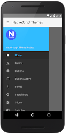
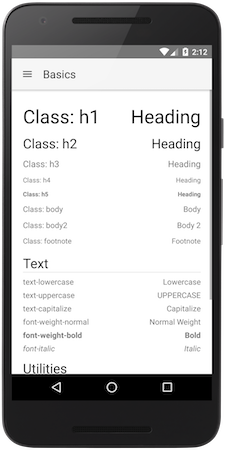
- Screenshots
- Contributing
- Publishing
- Breaking changes
- Awesome Contributors
- LICENSE
The core theme supports light and dark core styling and skins on top of that. To load the core theme styling, just load the core CSS and its default skin:
@import "@nativescript/theme/css/core.css";
@import "@nativescript/theme/css/default.css";
or alternatively SCSS:
@import "@nativescript/theme/core";
@import "@nativescript/theme/default";
If you want, you can choose from several different skins. To do that, you can change the second CSS/SCSS file to the preferred skin name:
@import "@nativescript/theme/css/core.css";
@import "@nativescript/theme/css/blue.css";
or
@import "@nativescript/theme/core";
@import "@nativescript/theme/blue";
In order to import just the Theme variables in one of your modules, use this:
@import "@nativescript/theme/scss/variables";It will import just the variables and mixins, without any additional styling.
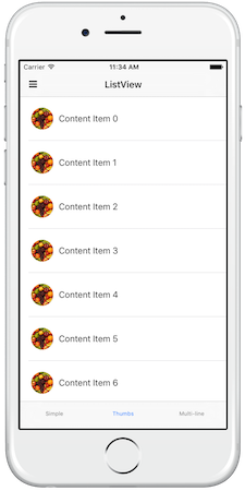
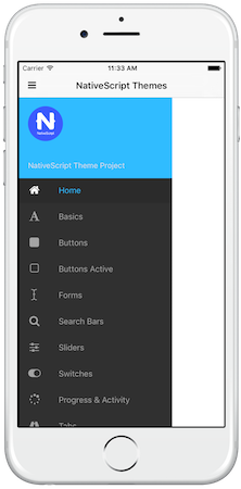
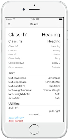
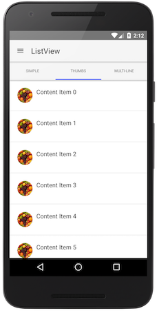
Here is the old list of Theme skins - the first two are now the Core default Light and Dark skins, the rest are all the Light skins available, listed by name.
The theme will style your application using Element selectors - you don't need to add CSS classes on every element you need to style.
Additionally, if you need to create you own skin, you can start just from the core theme - it includes the sizing and initial styling of the components.
In order to use Theme 2.0 before {N} 6.1, you will also need to include a small JS file in your project:
import "@nativescript/theme";This JS takes care of updating several classes on the app root elements, something that got included in tns-core-modules in {N} 6.1.
Setting the theme mode from light to dark is now easier - instead of loading a new file, just find the root view and
set .ns-dark class to it - this will change all colorization to dark tones. For instance, if your page root is
RadSideDrawer, just add a class to it, like this:
<drawer:RadSideDrawer class="ns-dark" xmlns:drawer="nativescript-ui-sidedrawer">
    ...
</drawer:RadSideDrawer>
If your root is a frame, you can do this
<Frame class="ns-dark" defaultPage="root"></Frame>For Angular, if your root is a page-router-outlet, you can set the .ns-dark class on it - it will pass it down to the
Frame it renders.
Setting the theme mode from JavaScript is also much easier now - just import the theme and call Theme.setMode() with your preferred mode - either Theme.Light or Theme.Dark, like this:
import Theme from "@nativescript/theme";

Theme.setMode(Theme.Dark); // Or Theme.Light
Keep in mind that in {N} 6.2 these changes will override the default system mode. To restore it, use Theme.Auto (available since Theme 2.3.0):
import Theme from "@nativescript/theme";

Theme.setMode(Theme.Auto);
Additionally there is another helper method - toggleMode, which can be used without parameters to just toggle the mode or with a boolean parameter to ensure light or dark mode is set:
import Theme from "@nativescript/theme";

Theme.toggleMode(); // to toggle between the modes

// or

Theme.toggleMode(true);  // to ensure dark mode
Theme.toggleMode(false); // to ensure light modeDue to limitation in Playground the JS Theme API cannot be imported like an ES6 module in a TS/Angular projects. You'll have to resort to requiring it:
const Theme = require("@nativescript/theme");

Theme.setMode(Theme.Dark); // Or Theme.LightIn addition to .ns-light and .ns-dark classes, the theme's little JavaScript file introduces .ns-root on the root element,
.ns-android/.ns-ios depending on the current platform (which the theme extensively uses) and additionally
.ns-portrait/.ns-landscape and .ns-phone/.ns-tablet, which should be self-explanatory.
Of course .ns-portrait/.ns-landscape get updated on orientation change, so you can use it to show a two pane layout
in landscape, for instance.
The newest addition is .ns-statusbar-transparent since 2.0.4 - add this class to your root element, if you have enabled
transparent status bar in the OS and your ActionBar gets underneath it.
Keep in mind that Android APIs before 21 don't support transparent status bars and this will result in an undesired top ActionBar padding!
There are several functions and mixins in the core theme, that can be used in your projects, as long as you're using SASS/SCSS.
If you need to access specific theme variables like simple colors or sizes, do it through the const function:
Button {
    background-color: const(forest);
    height: const(btn-height);
}
You can get light/dark colors:
Button {
    color: light(primary);

    .ns-dark & {
        color: dark(primary);
    }
}
or alternatively set them both in one go - this mixin does the same as the upper example:
Button {
    @include colorize($color: primary);
}
You can darken/lighten a color depending on its background (darken for light theme and lighten for dark theme):
Button {
    @include colorize($contrasted-border-color: accent background 20%);
}
The above example uses the contrasted function to check the contrast level of the background and adjust the lightness of the accent color according to it.
The Theme now exports all its internal variables to custom CSS ones in the .ns-root and .ns-modal classes. This is also done for Kendo based skins. You can use them to inherit your styles from the Theme, if using CSS. A list of the supported custom CSS variables follows:
| Simple Colors | Constants | Light Colors | Dark Colors |
|---|---|---|---|
| --color-black | --const-font-size | --light-primary | --dark-primary |
| --color-white | --const-background-alt-10 | --light-background | --dark-background |
| --color-grey | --const-btn-color-secondary | --light-accent | --dark-accent |
| --color-grey-light | --const-btn-color-disabled | --light-complementary-color | --dark-complementary-color |
| --color-charcoal | --const-btn-font-size | --light-complementary | --dark-complementary |
| --color-transparent | --const-btn-min-width | --light-background-alt-5 | --dark-background-alt-5 |
| --color-aqua | --const-btn-height | --light-background-alt-10 | --dark-background-alt-10 |
| --color-blue | --const-btn-padding-x | --light-background-alt-20 | --dark-background-alt-20 |
| --color-brown | --const-btn-padding-y | --light-secondary | --dark-secondary |
| --color-forest | --const-btn-margin-x | --light-disabled | --dark-disabled |
| --color-grey-dark | --const-btn-margin-y | --light-text-color | --dark-text-color |
| --color-purple | --const-btn-radius | --light-headings-color | --dark-headings-color |
| --color-lemon | --const-headings-margin-bottom | --light-tab-text-color | --dark-tab-text-color |
| --color-lime | --const-headings-font-weight | --light-accent-dark | --dark-accent-dark |
| --color-orange | --const-border-width | --light-accent-light | --dark-accent-light |
| --color-ruby | --const-border-radius | --light-accent-transparent | --dark-accent-transparent |
| --color-sky | --const-border-radius-sm | --light-primary-accent | --dark-primary-accent |
| --color-error | --const-border-radius-lg | --light-background-accent | --dark-background-accent |
| --const-disabled-opacity | --light-background-dark-accent | --dark-background-dark-accent | |
| --const-icon-font-size | --light-item-active-color | --dark-item-active-color | |
| --const-icon-font-size-lg | --light-item-active-background | --dark-item-active-background | |
| --light-btn-color | --dark-btn-color | ||
| --light-item-active-icon-color | --dark-item-active-icon-color | ||
| --light-btn-color-inverse | --dark-btn-color-inverse | ||
| --light-btn-color-secondary | --dark-btn-color-secondary |
Use them like this:
.my-accented-class {
    color: var(--light-accent);
}
For now these CSS variables are not used internally, so changing them won't change the look of your skin. This is planned for after HSL color support comes in NativeScript 6.2.
The theme now supports inheriting the Kendo UI ThemeBuilder theme variables. Just head
there, customize your Keno UI SASS theme and hit the Download button. You will get a ZIP with two files in it - the theme CSS
that you can use to style your web app, and variables.scss - the one you need for your NativeScript theme. It will look
something like this:
$base-theme:Default;
$skin-name:test;
$swatch-name:Default Purple;
$border-radius: 10px;
$accent: #bf70cc;
$info: #3e80ed;
$success: #5ec232;
$warning: #fdce3e;
$error: #d51923;
$text-color: #656565;
$bg-color: #ffffff;
$base-text: #656565;
$base-bg: #f6f6f6;
$hovered-text: #656565;
$hovered-bg: #ededed;
$selected-text: #ffffff;
$selected-bg: #bf70cc;
$series-a: #ff6358;
$series-b: #ffd246;
$series-c: #78d237;
$series-d: #28b4c8;
$series-e: #2d73f5;
$series-f: #aa46be;
Take this file, add the following under it:
// Uncomment this row, if you target compat styling:
// $compat: true;

@import '~@nativescript/theme/index';
And load the file after your core theme. It should just work™. If it doesn't - head for the issues section.
The old generic theme classes have been retired to avoid clashes with user code. They now live in the .compat world - if you want to use them, you should load them separately, like this:
@import "~@nativescript/theme/core.compat";
@import "~@nativescript/theme/blue.compat";
As of 2.0, the theme now utilizes a simplified BEM approach for the new element classes, that might be needed here or there.
For instance, the buttons need .-primary and .-outline modifiers, instead of the old .btn-primary and
.btn-outline classes. All element classes (which are not needed by default, except if you want to style a component
to look like another one) are namespaced, so for instance a button is .nt-button, an action bar is .nt-action-bar and a ListView is
.nt-list-view.
Theme 2.0 is developed using SASS. The NPM package used was sass (formerly dart-sass), however it can be used with either sass or node-sass. The difference between them is that sass doesn't depend on a native module (unless you add fibers) and is a little slower (30%) than node-sass, however it doesn't need recompilation if you change Node versions often. If you decide to use it, you should update your webpack config and change the sass-loader options to load sass instead (node-sass is the default sass-loader implementation), like this:
{
    loader: "sass-loader",
    options: {
        implementation: require("sass")
    }
}Clone this repo, and then use the tns run command to launch the demo app on your device or emulator of choice.
tns run ios

// or

tns run android
If you’d like to toggle the color scheme from light to dark, open the sidedrawer, scroll down to "Themes" at the bottom, and toggle away.
NOTE: Only authorized authors can publish updates.
IMPORTANT: Always make sure you have run the demo app in iOS or Android to verify any changes as well as ensure the latest css has been built before doing the following:
- Bump version in
package.json - Adjust
nativescript-theme-core.mdif any changes to the publishedREADMEare needed.
npm run builder
cd nativescript-theme-core
npm publish
IMPORTANT: Never modify the contents of nativescript-theme-core folder directly. The builder creates that everytime and any change you make there will be overwritten.
Setup changelog generation:
npm install -g conventional-changelog-cli
Generate changelog workflow:
- Make changes
- Commit those changes - using these conventions.
- Make sure Travis turns green
- Bump version in
package.jsonandnativescript-theme-core.json conventional-changelog -p angular -i CHANGELOG.md -s- Commit package.json and CHANGELOG.md files
- Tag
- Push
NOTE
NativeScript Theme 1.0 to 2.0 migration guide is available here.
- The theme requires 2 files to be loaded - the core theme and a skin on top of it. Read Usage for more info.
- The theme is now applied using Element selectors, if you need the old classes approach - it has moved to
.compat CSS/SCSS files, e.g.
core.compat.cssandblue.compat.css. - Theme 2.0 replaces node-sass with sass which is more up to date feature-wise and doesn't have a native dependency. It does still work with node-sass though.
| NathanWalker | TheOriginalJosh | tjvantoll | NathanaelA | triniwiz | sis0k0 |
| sitefinitysteve | vakrilov | bradmartin | firescript | valentinstoychev | enchev |
| bundyo |
Apache 2.0

