
Material Design 3 color theme generation and Home Assistant component modification. Redesign your Home Assistant frontend to look like any modern Material Expressive app.
A companion module for Material You Theme for Home Assistant. This module turns Material You theme into a complete Material Design 3 overhaul of Home Assistant. You'll be able to use generate wildly different color theme palettes and will be able to change the entirety of the Home Assistant user interface to look like a modern Material Design 3 app. This can all be configured from a configuration panel included with this module.
This module generates color themes using Material Color Utilities based on user defined inputs. It also injects custom styles into many Home Assistant custom components to follow the Material Design 3 specifications. The Material Design 3 specification is the source of truth for this module and Material You theme, and they will change over time to reflect updates to the specification. Custom color theme generation and style injection have minimal performance impact and work well even on low end devices.
First time setup and installation of this module is a multistep process as this module must be configured in configuration.yaml.
- Navigate to HACS (install from here if you do not have it yet).
- Search for
Material You Utilities. - Open this repository in HACS and click
Download.
This is not optional.
The component design upgrades performed by this module are very time sensitive, and must be run as soon as possible. Because of this you must install it as a frontend module in your configuration.yaml file.
- Open your
configuration.yaml.- Your
configuration.yamlfile is found in theconfigfolder. More information can be found here.
- Your
- Add the file URL to
frontendextra_module_url, adding thefrontendandextra_module_urlkeys if they do not exist, and adding to them if they do.- If you have links to any old versions of the JavaScript module here or in frontend resources, delete them.
frontend:
  themes: !include_dir_merge_named themes
  extra_module_url:
- /hacsfiles/material-you-utilities/material-you-utilities.min.js- Add the following to the
panel_customkey inconfiguration.yaml, creating it if it does not exist. This will allow you to access the Material You Utilities configuration panel.- More information about custom panels can be found here.
- While you can technically manually setup in the input helpers this module uses yourself, it is much easier to setup this panel and have it manage them for you. Remember - you can always re-order and hide your sidebar items.
panel_custom:
  - name: material-you-panel
    url_path: material-you-configuration
    sidebar_title: Material You Utilities
    sidebar_icon: mdi:material-design
module_url: /hacsfiles/material-you-utilities/material-you-utilities.min.js- Restart Home Assistant.
Once Home Assistant has finished restarting, you should see the upgraded Material Design 3 components and the Material You Utilities configuration panel in the sidebar. You may need to clear app/browser cache and refresh. You do not need to restart Home Assistant for subsequent updates.
While this module should be automatically updated through HACS after initial installation, you may run into issues with updates not loading due to sticky cache issues. See this thread for troubleshooting steps, help, and discussion.
This module comes with its own configuration panel! If you are the Home Assistant server administrator, you can use this panel to create and set input helper entities for all users, devices, and global defaults. If you are not the administrator you can set style options for yourself and your current device after an administrator creates them.
This module uses input helpers to store user inputs. You can see all of the input helpers generated by this module on the helpers page. They will have the label Material You.
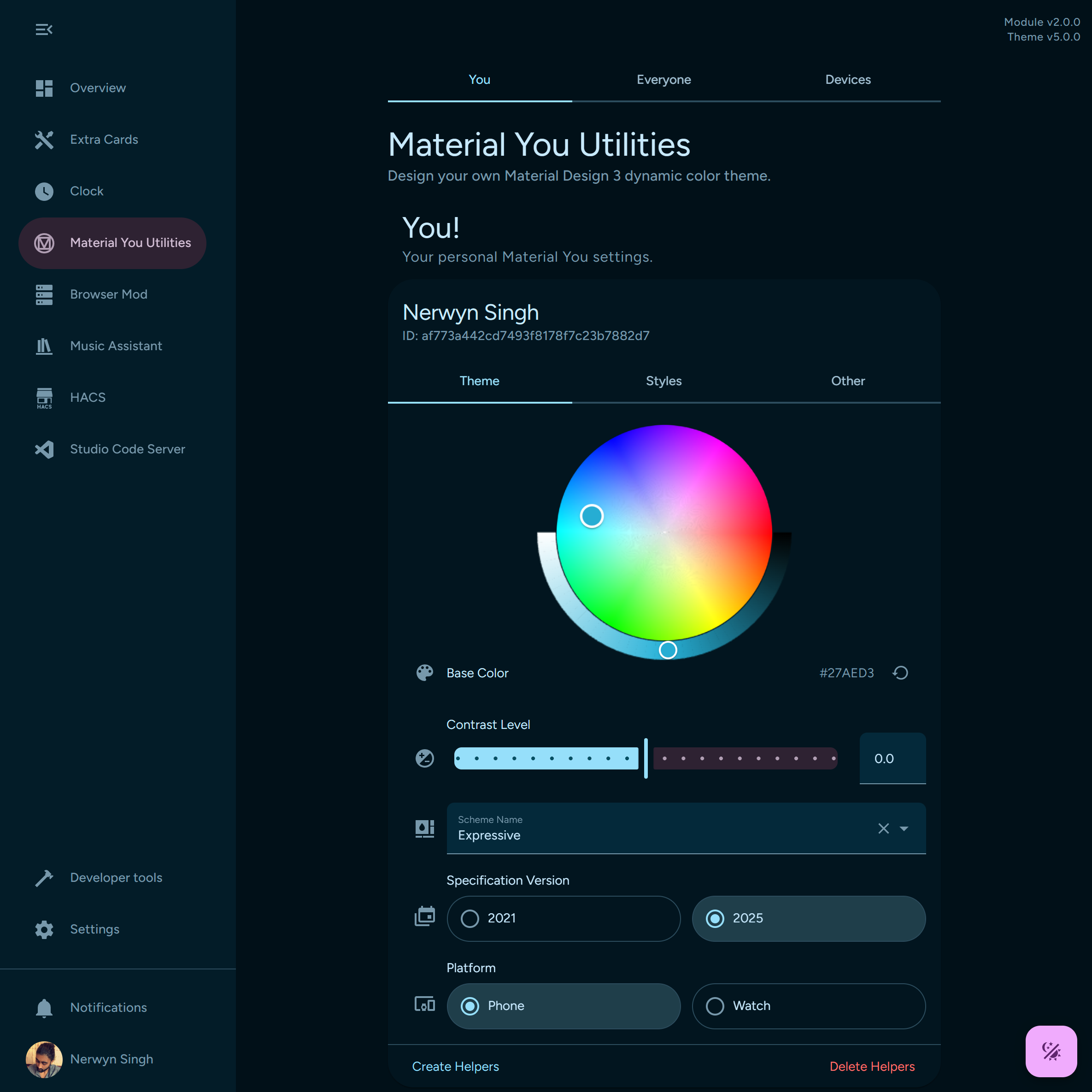
If you are an administrator you'll see three tabs at the top of the configuration panel - You, Everyone, and Devices.
The first tab is for you! These settings apply to any Home Assistant browser/device instance logged in to your profile.
The second tab is for everyone else. This includes all other users on the Home Assistant server, including other administrators. It also has the global settings, which apply when a user or device does not have their own input helpers setup.
The third tab is for device specific settings. You can setup input helpers specific to a user-browser-device combination. The current device settings appears at the top of this tab. These settings require Browser Mod to keep track of user-browser-device IDs.
Device settings are prioritized over all other settings, followed by user settings and then global settings.
If you are not an administrator, then you will not see any tabs at the top of the page. You should only see your settings card, and possibly the settings card for your current device.
Each settings card has the same fields for users, devices, and global settings. Setting are divided into three tabs - theme, styles, and other.
To create input helper entities for a user, device, or globally, click on Create Helpers in their settings card. Similarly, you can delete input helper entities for a user by clicking Delete Helpers. After creating helpers, you or the non-admin user can modify them from the configuration panel or open their more info dialog using the buttons to their left.
You can click on the icons to the left of each settings card row to open their more info dialogs, or hover over them for a brief description.
Material color themes are built around a base color, from which all other theme colors are derived depending on the scheme rules. This color defaults to #4C5C92 (a shade of blue), but can be set to any other color using the color wheel.
If you are using the Home Assistant Android companion app, you can enable the accent color sensor in the companion app settings to use your phones Material Design accent color as the theme base color:
- Navigate to
Settings>Companion app. - Click
Manage sensors. - Scroll down to the section titled
Dynamic colorand clickAccent color. - Toggle
Enable sensoron. It should now return your phone's Material Design base color as a hex code.
You can then create an automation to set your Material Design base color whenever the sensor changes.
description: ''
mode: single
triggers:
  - trigger: state
    entity_id:
      - sensor.pixel_fold_accent_color
conditions: []
actions:
  - action: input_text.set_value
    metadata: {}
    data:
      value: '{{ trigger.to_state.state }}'
    target:
entity_id: input_text.material_you_base_colorThe contrast level is a number from -1 to 1 which defines how much colors in the theme will differ and how bright they are.
The scheme defines the color palette used to generate your theme. By default, this theme will use the Tonal Spot color scheme. This scheme is the default color scheme used by Android 12.
In addition to the modern Android color scheme, Material Color Utilities offers several alternate schemes.
| Name | Description |
|---|---|
| Tonal Spot | Dynamic Color theme with low to medium colorfulness and a Tertiary TonalPalette with a hue related to the source color. The default Material You theme on Android 12. |
| Content | A scheme that places the source color in Scheme.primaryContainer.Primary Container is the source color, adjusted for color relativity. It maintains constant appearance in light mode and dark mode. This adds ~5 tone in light mode, and subtracts ~5 tone in dark mode. Tertiary Container is the complement to the source color, using TemperatureCache. It also maintains constant appearance. |
| Fidelity | A scheme that places the source color in Scheme.primaryContainer.Primary Container is the source color, adjusted for color relativity. It maintains constant appearance in light mode and dark mode. This adds ~5 tone in light mode, and subtracts ~5 tone in dark mode. Tertiary Container is the complement to the source color, using TemperatureCache. It also maintains constant appearance. |
| Expressive | A Dynamic Color theme that is intentionally detached from the source color. |
| Fruit Salad | A playful theme - the source color's hue does not appear in the theme. |
| Rainbow | A playful theme - the source color's hue does not appear in the theme. |
| Vibrant | A Dynamic Color theme that maxes out colorfulness at each position in the Primary Tonal Palette. |
| Neutral | A Dynamic Color theme that is near grayscale. |
| Monochrome | A Dynamic Color theme that is grayscale. |
With the Material Expressive update, Material Design 3 now has new specifications for color themes. You can choose between the original 2021 color specification, or the updated 2025 specification. Combine the 2025 specification with the Expressive scheme to use the new Material Expressive palette.
The 2025 color specification has two platform options - Phone and Watch. While you probably want to keep this at the default Phone setting, you have the ability to choose. Note that the Watch platform does not work well with light mode.
If you want to disable the Material Design 3 component upgrades, toggle Style Upgrades off. Doing so will still allow you to set most other options. A refresh is required for this to apply.
The Material Design 3 specification has three different card type style variations. You can choose which one will be used as the default card style here. You can also choose to make cards transparent.
Some cards, like those found in the configuration pages, already have the attribute outlined. This attribute will supersede the default elevated card style or user chosen card type.
You can choose to disable the navigation bar shown in views by toggling this setting off. This is useful if you want to use an alternate view navigation system such as Navbar Card. Note that this does not disable navigation bar styles or restore the default view tabs, it hides them entirely. Requires style upgrades to be enabled.
Semantic colors, such as red, orange, warning, info, etc., are normally static and can appear visually displeasing with certain theme palettes. Enabling this option will hue shift semantic colors towards the theme primary color, helping them better match the theme. You can see how this affects most of the Read more about color harmonization here.
Instead of explicitly defining your theme base color, you can instead provide the local path or external URL to an image in this input. This image can be hosted on your Home Assistant server in the config/www folder or be from an external website (with CORS approval). A set of up to four possible base colors will be derived from this image from you to choose from and set to the base color field. You can choose between the possible options by appending the query string ?i= to the end of your image path or URL, setting i to a number between 0 and 3 inclusive.
Note that changing image file by itself but not changing the name will not trigger a color theme update. A refresh or change in the input helper's value (file name) is required to retrigger this logic.
You can choose to provide your own CSS styles in a file and then provide the local path or external URL in this input. This CSS file can be hosted on your Home Assistant server in the config/www folder or be from an external website. This is useful for applying more in depth custom themes created using Material Theme Builder, or if you just want to override certain theme custom attributes. For maximum coverage use the selector :host, html, body for maximum effectiveness across Home Assistant, iframes, and configuration panel settings cards.
Similar to base color from source image, changing the CSS file contents is not enough to trigger an update. You must refresh the page or input helper's value (file name).
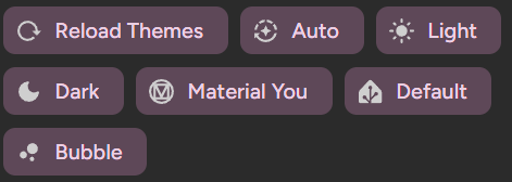
For your convenience, you can click on the floating action button on the bottom right of the configuration panel to switch to Material You theme and between light, dark, and auto modes for the current device.
In addition to generating custom material color themes, this module modifies the lifecycle methods styles of many Home Assistant component constructors to inject additional CSS styles to make the components follow the Material Design 3 specification.
Menu buttons at the top of the screen. For regular views the menu buttons remain will gain a background on scroll. For subviews the entire app bar remains but shifts to a surface container color.
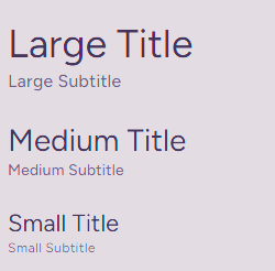
Large, medium, and small headline titles and subtitles can be added using Home Assistant sections view titles either using markdown or HTML headings as described below.
| Size | Type | Markdown | HTML |
|---|---|---|---|
| Large | Title | # Large Title | <h1>Large Title</h1> |
| Medium | Title | ## Medium Title | <h2>Medium Title</h2> |
| Small | Title | ### Small Title | <h3>Small Title</h3> |
| Large | Subtitle | #### Large Subtitle | <h4>Large Subtitle</h4> |
| Medium | Subtitle | ##### Medium Subtitle | <h5>Medium Subtitle</h5> |
| Small | Subtitle | ###### Small Subtitle | <h6>Small Subtitle</h6> |
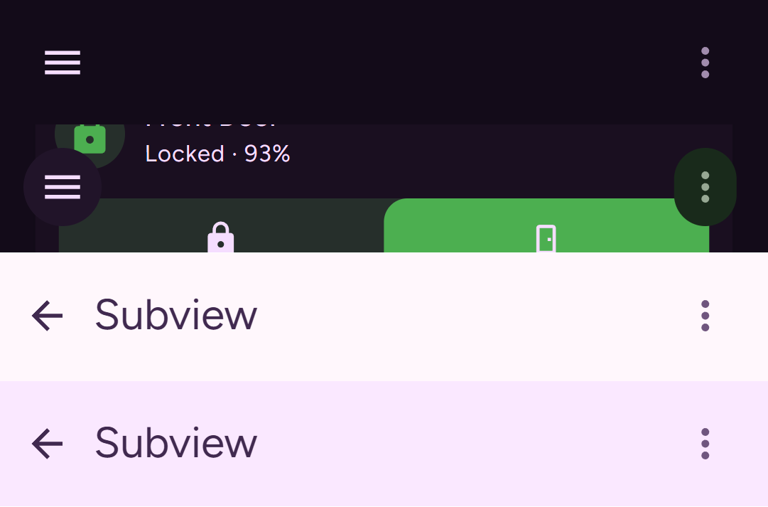
- Subviews use the small app bar specification and have only received minor margin adustments to match.
- The headline is now only present for subviews and hidden for single view dashboards by default. The fonts for these titles has been updated.
- Standard views no longer have a headline by default. This was added to this theme shortly before Home Assistant added its own more customizable view title system. Between the built in title option and the Material Expressive updates, I decided to remove this title in favor of user added titles instead. Home Assistants section view title system is more in line with the Material Expressive specification, and its fonts and colors have been updated to match.
- If you place a subtitle right after a title, the margins between them will be reduced like in the screenshot above.
- The margin above a view header area has been removed.
View tabs displayed at the bottom of the screen, dynamically scaling with page width. On wide (landscape or width greater than 870px) displays the view tabs are horizontal. On smaller displays the view tabs are vertical.
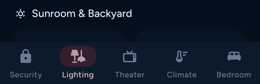
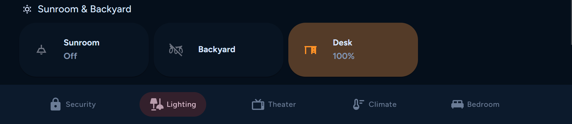
- The view tabs are more akin to Material Design 3 tabs, but I chose to restyle them as a navigation bar as doing so was one of the original purposes of this theme. View tabs as a navigation bar makes more sense within the context of how Home Assistant dashboards are used, and are much easier to use on tall phone displays.
- Displaying navigation bars alongside rails is not considered good practice, but is done so in this theme due to the increased accessability the bottom aligned navigation bar offers over top aligned tabs.
- Home Assistant itself uses bottom aligned tabs for mobile settings pages, which is similar to the navigation bar.
Desktop sidebar and mobile modal drawer.
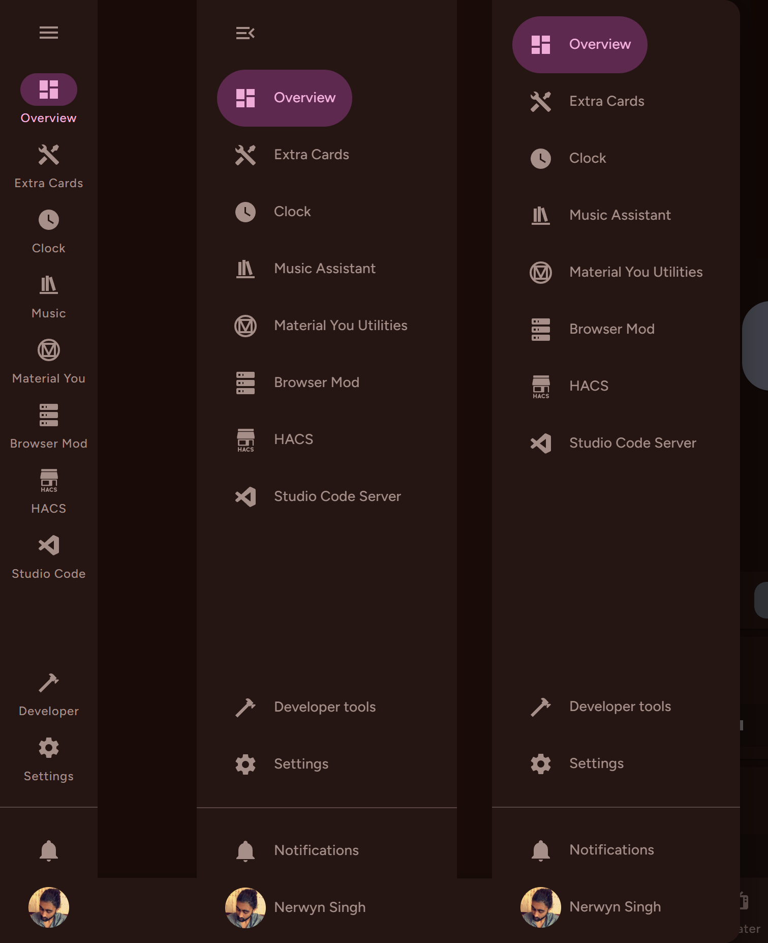
- The specification calls for the expanded and modal navigation rail to have variable width based on the width of the destination items, but making the width variable while expanded can cause it to cover the view. Therefore it uses the Home Assistant default fixed width for expanded drawers. The modal rail is variable width.
- Previously the expanded rail and modal dialog used the navigation drawer specification, which has been deprecated and merged into navigation rail.
- Expanding and collapsing the rail has been updated with expressive animations.
Alerts the user to notifications.
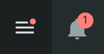
- Before Material Expressive, a third badge variant was available specific to the navigation drawer. This variant has been deprecated alongside the navigation drawer specification.
The ubiquitous container which most Home Assistant lovelace elements are built around.
A background color similar to the view background with elevation. The default card style.
A contrasting background color with no elevation.
An outlined card with the same background color as the view and no elevation.
- Cards will default to
elevatedunless they have a class or attribute that says otherwise. - Some cards such as those found in the settings pages already have the attribute
outlined, which will supersede the defaultelevatedstyle. - In order to use card styles other than elevated, you have to modify the class of the card using card-mod or set an alternate card type using the configuration panel as described above. The options are:
- elevated
- filled
- outlined
- transparent
- Card type classes set with card-mod will supersede card types set using the configuration panel. This way you can set an overall default card type but still modify the card types of individual cards.
card_mod:
class: 'filled'- The specification says to use border-radius shape
--md-sys-shape-corner-medium(12px), but I opted to instead use--md-sys-shape-corner-extra-large(28px). I had a few reasons for this.- Material Design 3 cards are containers for interactable elements and information, but cards in Home Assistant are mostly interactable elements themselves. Interactable elements in Material Design 3 tend to have much rounder corners.
- Material Design 3 specification website itself uses larger more rounded border radii for card elements.
- Material Design 3 apps like Google Home use larger border radii for card-like interactable elements.
- The round border radii cards was one of the original features of this theme, back when it was called Material Rounded.
Basic buttons that appear in many menus and some cards. They have rounded corners that expressively become more square when hovered over or pressed. All buttons follow the small size specification.
Uses secondary container colors. Modified from the accent appearance button in Home Assistant.
Uses primary colors.
Uses on surface variant colors.
- This variant does not seem to appear in Home Assistant anymore after the 2025.8.0 update, but it's styles haves been retained just in case it makes a comeback.
Uses primary colors with no background or outline.
- The Material Design specification has five variations, but Home Assistant's new
ha-buttonparent component only supports four. Home Assistant itself only uses three variants.
Floating action button with just an icon.
- Home Assistant doesn't normally use icon only FABs! The add view button in non-sections views has been transformed into a FAB as there isn't a good place for it on the transformed header or footer.
Extended floating action buttons which appear in legacy views, and the integrations, devices, and helpers pages.
Small button-like elements that can be used to display information or fire actions.
Follows the Assist Chip specification. Used in configuration menus and HACS.
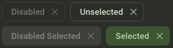
Follows the Filter Chip (selected) specification. Can be added to the header or footer of some cards to fire actions and used in add-ons pages.
- While it would make more sense to use the elevated assist chip specification for this as both this and outlined chips are the same
ha-assist-chipelement, when designed as one it blends in with card backgrounds, where it is usually found.
Follows the Input Chip specification. Used by list selectors found in configuration menus.
- Chips in Home Assistant do not function like chips in Material Design 3. Instead of being informational or for less important actions, they are generally equivalent to buttons.
- Badges in Home Assistant are not equivalent to Material Design 3 badges, they are instead like a hybrid between cards and chips. It doesn't make sense to style them as chips as it tends to make them look worse, especially when used with entity pictures.
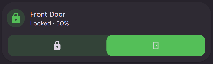
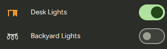
Toggle switches for setting boolean values.
Numerical inputs optimized for human interaction. Uses the small variant, which is still much larger than the default slider.
- The specification calls for the tooltip to appear and the handle to narrow when the slider is focused or pressed, but not hovered. The Home Assistant slider shows the tooltip on hover, and it is difficult to disable this behavior without breaking the tooltip and slider narrowing altogether. So instead the tooltip appears and handle narrows on hover.
- Home Assistant actually has its own implementation of a Material Design 3 slider (extra small variant), but it is only used for the card configuration layout grid size picker. The styles of this slider have been slightly modified to use theme colors, to modify the tooltip size, and to narrow the handle when pressed or focused.
Floating messages that appear on the bottom of the screen, also known as toasts.
- The bottom offset of snackbars has been increased to appear above the navigation bar, fixing it from preventing you from navigating your dashboard if a snackbar was in the way. I was not able to figure out a way to make this bottom offset change depending on whether the navigation bar was visible or not, as the navigation bar and snackbar are deep within different shadow roots.
Windows that appear to display information or ask for user input, like more-info and confirmation dialogs.
Lighter color and updated font.
Background color changes on scroll and updated font.
- Home Assistant has a more modern dialog used for confirmations and similar messages. This dialog mostly follows the Material Design 3 specification, but does not turn into a full-screen dialog on smaller displays.
- Dialogs have been updated with an expressive opening animation.
This repository requires npm and Node.js to develop. The JavaScript module is a minified file compiled using rspack. The source files are all written using TypeScript. After forking the repository and cloning to your machine, run the command npm run setup to setup the pre-commit hooks and install dependencies.
The styles used by the component style upgrade functions can be found in the src/css folder, where they are named after the custom elements they are applied to. They must also be added to the src/css/index.ts file elements object to be picked up by the component style upgrade functions.
The module is setup to use a global inputs config object found in src/models/constants/inputs.ts. Using this object, the module can setup listeners for each inputs helpers and the settings cards will automatically generate rows for inputs.
Helper methods can be found in src/utils/handlers. Not all handlers are triggered by inputs, as some are called within other helpers. Most helpers have paired set and unset methods. Handlers that inject styles do so using style tags with unified helper functions found in src/utils/handlers/styles.ts. Unset methods generally call a unified generic unset method which removes their corresponding style tags. Some helpers have to be separately configured to run on certain triggers within src/material-you-utilities.ts.
The configuration panel and settings card code can be found in src/classes. These generally do not have to be modified unless an input requires a custom user interface not provided by ha-selector, like for the base color picker wheel.
To build this module, either make a commit (to your own fork) or run the command npm run build. The compiled JavaScript module and a gzipped copy of it (which is ignored by git and is for local testing) can be found in the dist folder. Rspack can take a little bit of time to run, especially the first time you run it after opening the terminal. You can upload the gzipped file to your Home Assistant instance to overwrite the copy download from and created by HACS to test your changes. This file is located in your configuration folder at www/community/material-you-utilities.