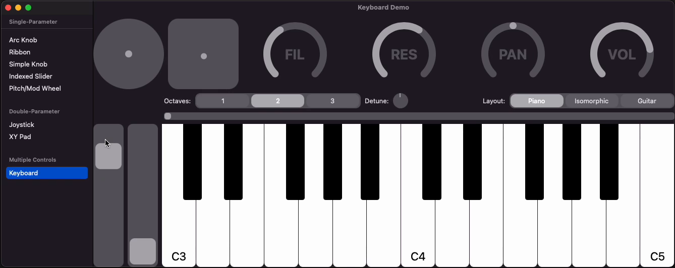
User interface elements including knobs, sliders, XYPads, and more, all built off the same generic controls.
Two types of controls allow you to drag on a UI element and control either one or two parameters.
- Control - draggable control that can affect one value by planar motion, either horizontally, vertically, or both.
- Two Parameter Control - draggable control that can affect two indepent paramters.
For both types of controls, there are a wide variety of ways to react to dragging, including rectilinear and polar coordinate variations. See the API for more details.
These are examples of how to use the generic controls. They are somewhat customizable, so you can easier use them directly or use them as a template for creating your own custom controls.
Single-parameter controls:
- ArcKnob - knob controled by dragging along a circular path
- IndexedSlider - slider that controls an integer parameter and snaps to increments
- PitchModWheel - vertical slider than can be a pitch wheel or mod wheel
- Ribbon - horizontal slider
- SmallKnob - a knob in which you start by tapping in its bound and change the value by either horizontal or vertical motion.
Two-parameter controls:
- Joystick - polar coordinate control
- XYPad - XY control that doesn't snap
Installation is done with Swift Package Manager. Be sure to tie your code to a version number and not just a branch, because the API for these controls will change as necessary.
Included with the package is a demo project (pictured above) and a playground to help you get up and running quickly.
The docs are hosted on the AudioKit.io website
Sponsor me on Github and I'll create a control for you.
