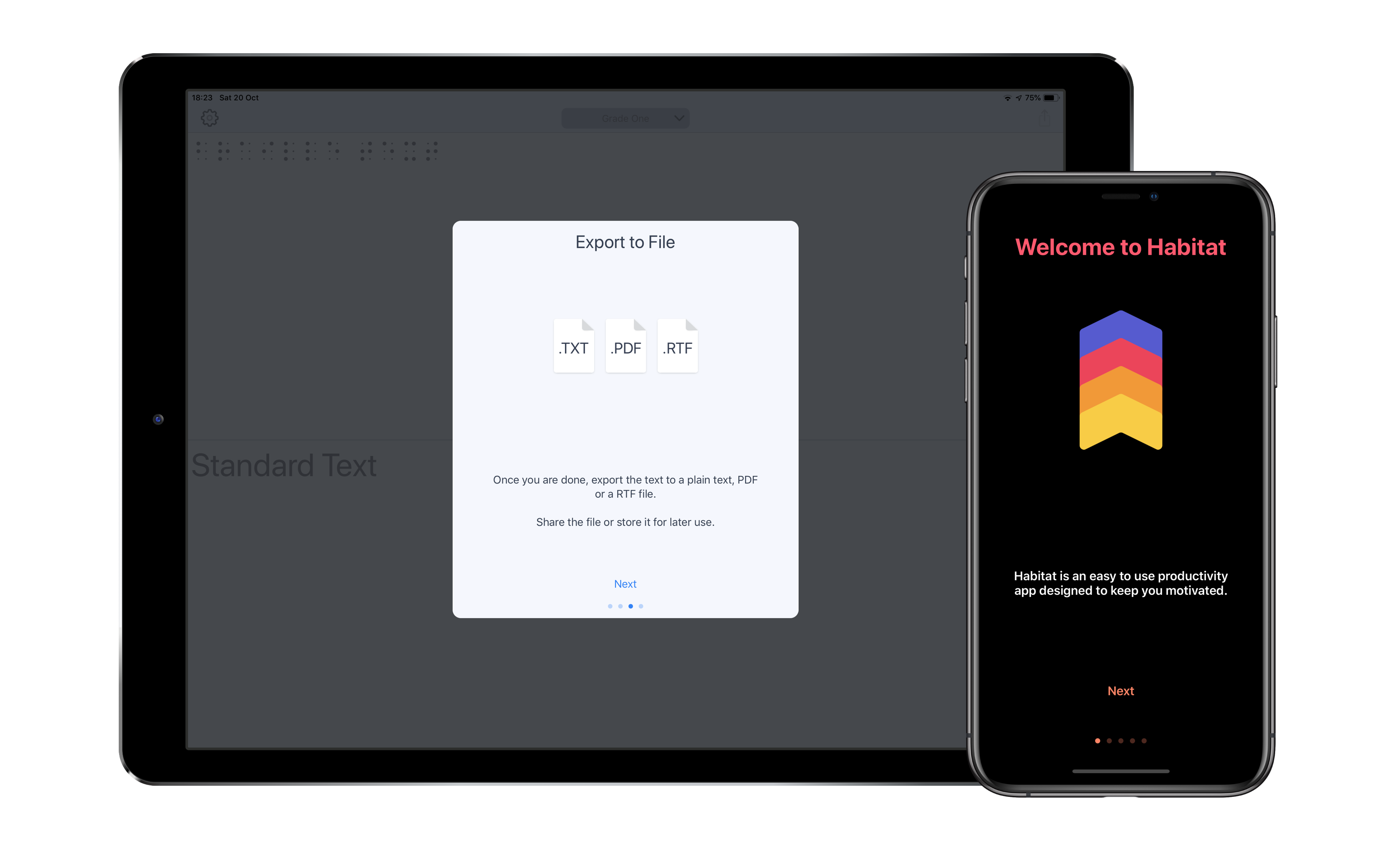
Customizable user onboarding for your UIKit app in Swift
- Swift 5.0
- Xcode 10
- iOS 11.0+
github "NikolaKirev/OnboardKit"use_frameworks!
# Latest release in CocoaPods
pod 'OnboardKit'
# Get the latest on master
pod 'OnboardKit', :git => 'https://github.com/NikolaKirev/OnboardKit.git', :branch => 'master'Don't forget to import OnboardKit in the file you intend to use it.
- Create and populate a bunch of
OnboardPageinstances
let page = OnboardPage(title: "Welcome to OnboardKit",
                       imageName: "Onboarding1",
description: "OnboardKit helps you add onboarding to your iOS app")- Create an
OnboardViewController
let onboardingViewController = OnboardViewController(pageItems: [pageOne, ...])- Present the view controller
onboardingViewController.presentFrom(self, animated: true)(use this convenience method to make sure you present it modally)
You can customize the look of your onboarding by changing the default colors and fonts.
- Initialize an
AppearanceConfigurationinstance with the desired custom style properties
let appearance = AppearanceConfiguration(tintColor: .orange,
                                         titleColor: .red,
                                         textColor: .white,
                                         backgroundColor: .black,
                                         imageContentMode: .scaleAspectFit,
                                         titleFont: UIFont.boldSystemFont(ofSize: 32.0),
textFont: UIFont.boldSystemFont(ofSize: 17.0))- Pass the
AppearanceConfigurationinstance as a parameter when initialising anOnboardViewController
let onboardingVC = OnboardViewController(pageItems: onboardingPages,
appearanceConfiguration: appearance)tintColor- used for tinting the advance and action buttonstitleColor- used to set title color (textColor is used if not specified)textColor- used to set description text colorbackgroundColor- used to set view background colorimageContentMode- used to set the content mode of page imageViewstitleFont- used to set the title font (used for the action button font as well)textFont- used to set the description text font (used for the advance button font as well)advanceButtonStyling- a block used to customize the advance buttonactionButtonStyling- a block used to customize the action button
To customize the style of the advance and action buttons on each page of the onboarding flow, you can use a ButtonStyling closure.
- Create the closure
let advanceButtonStyling: OnboardViewController.ButtonStyling = { button in
    button.setTitleColor(UIColor.lightGray, for: .normal)
    button.titleLabel?.font = UIFont.systemFont(ofSize: 16.0, weight: .semibold)
}- Pass the closure in the
AppearanceConfigurationinitializer
let appearance = OnboardViewController.AppearanceConfiguration(tintColor: .orange,
advanceButtonStyling: advanceButtonStyling)- Website: http://nikolakirev.com
- Twitter: @NikolaKirev
OnboardKit is available under the MIT license. See the LICENSE file for more info.


