Extracts of the World Inequality Database.
-
data/ The data folder
-
countries.tsv country codes (Provided)
-
income/ income share per country (Provided)
-
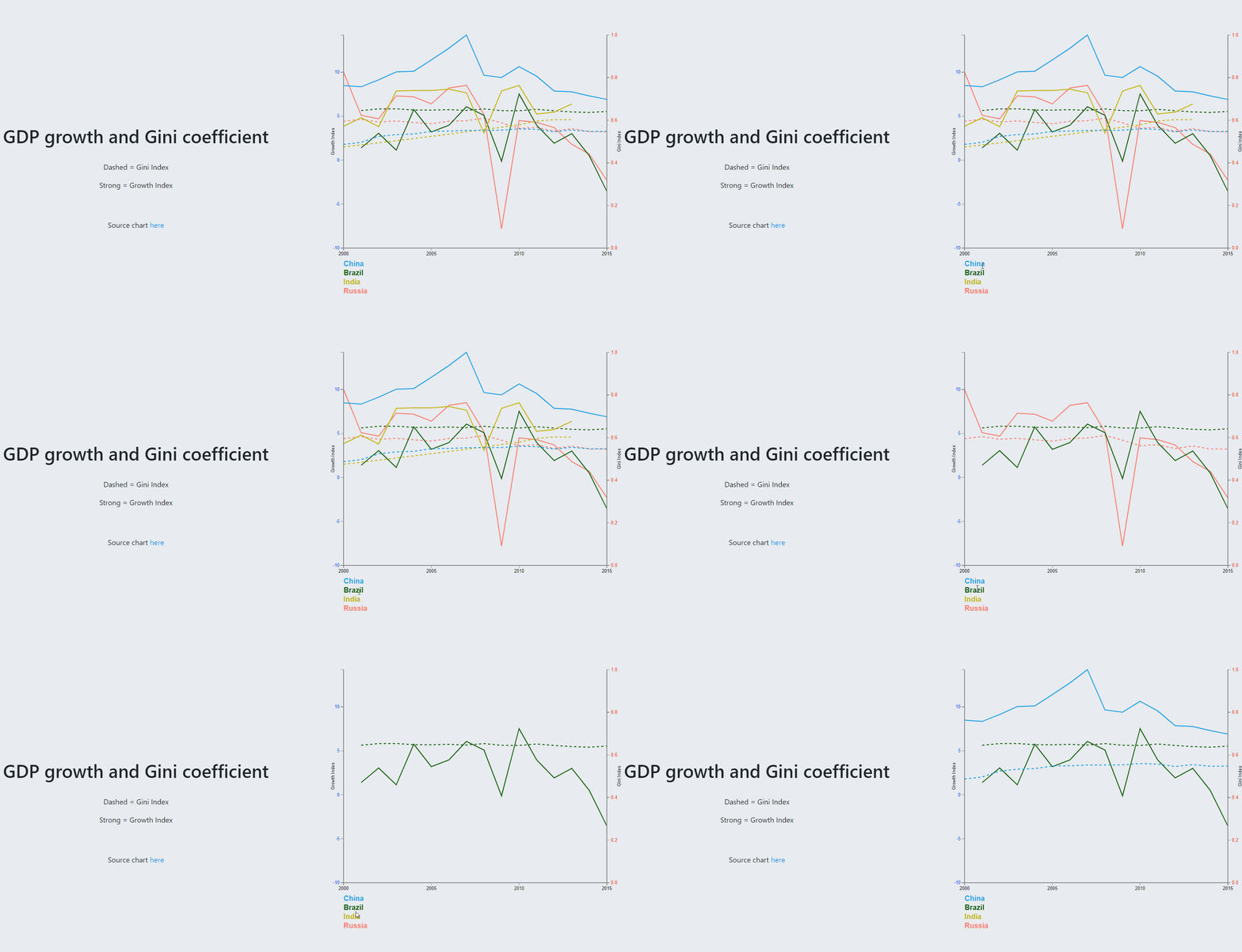
gdp_growth.tsv Growth of BRICS Countries
-
gini.tsv Gini of BRICS Countries
-
BRICS_growth_gini.csv Merged gdp_growth and gini files
-
income_averages.tsv Income Average of some countries
-
income_gini.tsv Gini Index of some countries
-
all_income_gini.csv Merged income_averages and income_gini.tsv
-
continents.csv Countries by country code, name and continent name
-
merged_gini_averageincome.csv Merged file for last data available for each country interms of Average Income and Gini Index
-
merged_income_quantiles.csv Merged file for all quantiles data by adding country name and continent name
-
merged_quantiles.csv Merged file for all countries with discretized quantiles
-
prep.py prep1.py prep2.py prep3.py Added scripts for aggregation and generation of csv files
-
-
vendor/ vendorized D3 and Bootstrap libraries
-
viz/ Visualisations
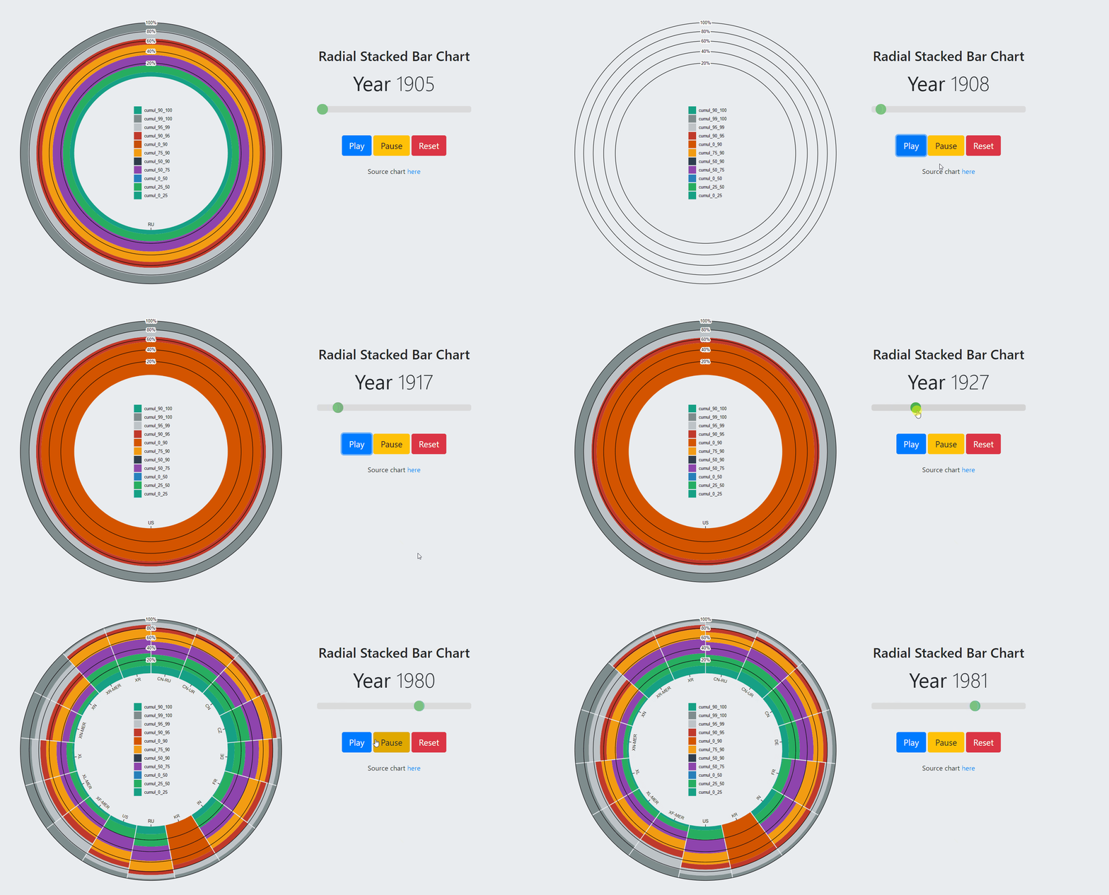
- Radial Stacked Bar Chart
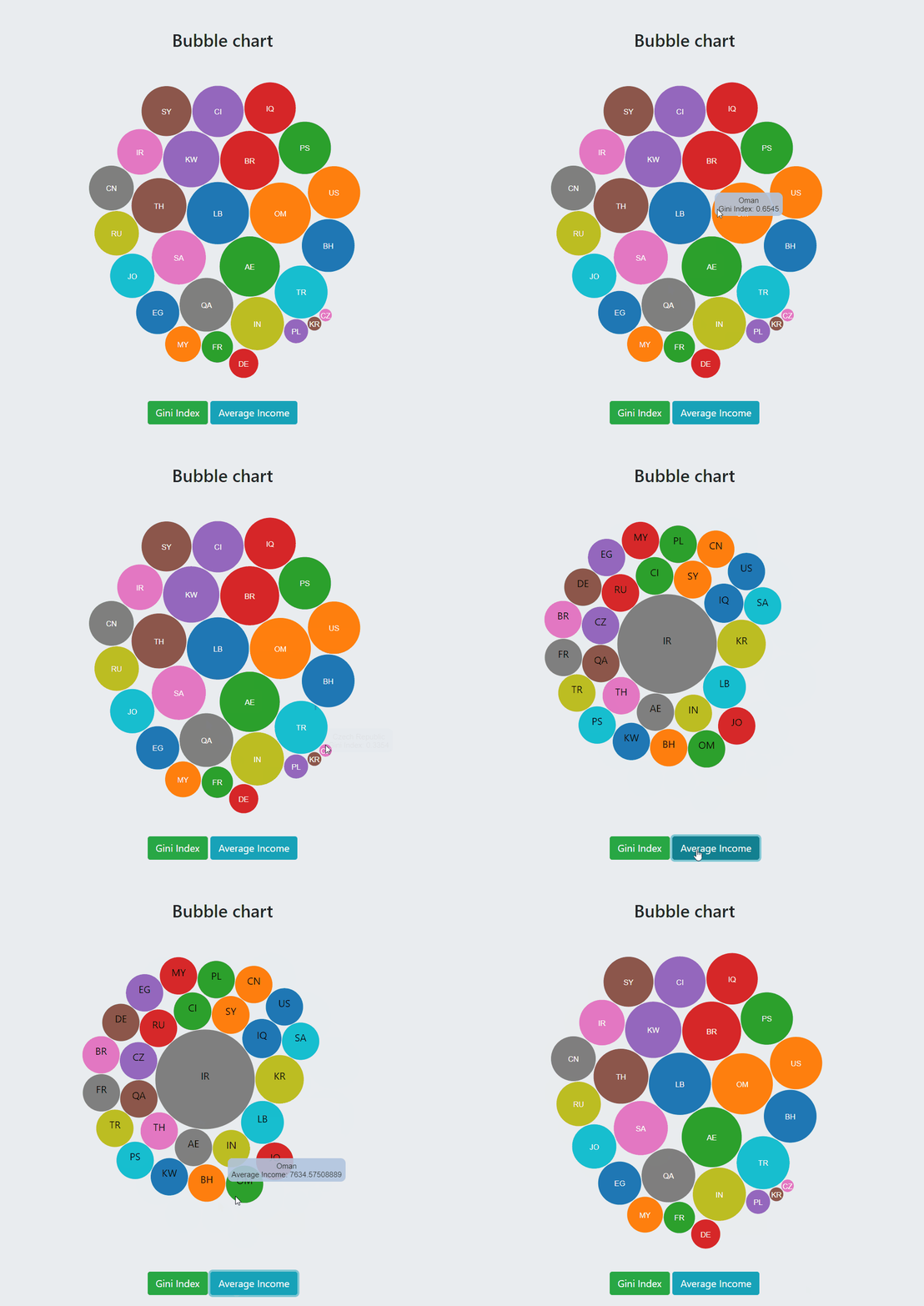
- Bubble Chart
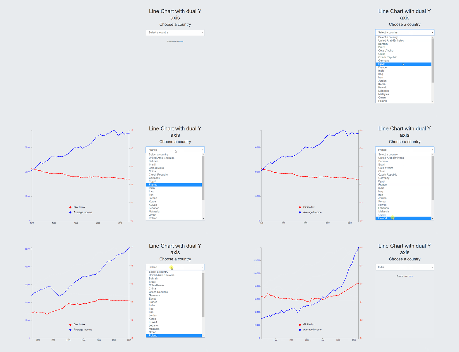
- Dual Y Axis Average Income Gini
- Dual Y Axis Growth BRICS Gini
Income data table are given per country. The attributes present in the tables are:
- year the year for the data
- low the lower bound of the population quantile (from 0. to 1.)
- high the upper bound of the population quantile (from 0. to 1.)
- width the width of the quntile (high-low)
- share the share of the total income captured by this [low, high] quantile
- cumul the cumulative share of the quantiles, i.e. the share of [0., high]
The slides for the presentation are available here and in Google slides here
The project report is available here
$ git clone https://github.com/Omaroid/InfoVisWorldInequality.git
$ cd ./InfoVisWorldInequality
$ ls
Mode LastWriteTime Length Name
d----- 06/02/2020 22:57 - data
d----- 05/02/2020 20:52 - vendor
d----- 06/02/2020 22:40 - viz
-a---- 07/02/2020 11:27 346945 BubbleChartAvgIncomeGini.gif
-a---- 07/02/2020 13:00 2068564 Info Visulization Presentation.pptx
-a---- 07/02/2020 12:38 93859 Project_Info_Visualization_Report.pdf
-a---- 07/02/2020 01:49 1028410 RadialStackedBar.gif
-a---- 07/02/2020 12:39 2438 README.md
-a---- 07/02/2020 11:26 270676 TwoAxisAvgIncomeGini.gif
-a---- 07/02/2020 11:24 150306 TwoAxisBRICSGini.gif
$ python(3) -m http.server
Serving HTTP on 0.0.0.0 port 8000 (http://0.0.0.0:8000/) ...
You can observe the result by pointing a browser to http://localhost:8000/viz/.


