Collection of Cocoa controls that look just right, offer modern Swift APIs, and nicely compose together.
CocoaCompose was built to make it easier to develop Proxygen Mac app, a HTTP proxy tool for testing apps and debugging remote API endpoints.
Add CocoaCompose in Xcode under Project > Package Dependencies.
Then import it as shown below:
import CocoaComposeCocoaCompose includes these components
- Box
- Button
- CalendarPicker
- Checkbox
- ClockPicker
- ColorWell
- DatePicker
- FontPicker
- Image
- Label
- Level
- PopUp
- Radio
- Separator
- Slider
- Switch
- Tabs
- TextField
- TextView
- TimePicker
The following two components help build preference window content
All of the components are configured to look right in a Mac app out of the box, and come with easy to use initialisers, and take a closure for value changes. All components are set to dynamic type NSFont.TextStyle.body by default.
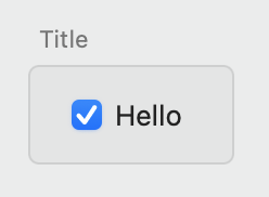
Box combines a title label and a gray colored wrapper view.
let box = Box(title: "Title", orientation: .vertical, views: [
    ...
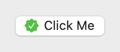
])Basic NSButton with bezelStyle set to .rounded. It can be configured with a title and an optional image with a symbol configuration.
let image = NSImage(systemSymbolName: "checkmark.seal.fill", accessibilityDescription: nil)
let configuration = NSImage.SymbolConfiguration(paletteColors: [.white, .systemGreen])

let button = Button(title: "Click Me", image: image, symbolConfiguration: configuration) {
    // do something here ...
}
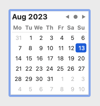
CalendarPicker is an NSDatePicker with datePickerStyle set to .clockAndCalendar and datePickerElements configured to either .yearMonthDay.
Configure it with a date, minDate and maxDate.
let picker = CalendarPicker(date: .now) { date in
    // do something here ...
}
Checkbox is an NSButton with buttonType set to .switch. It takes a title and simple boolean for checked state.
let checkbox = Checkbox(title: "Select something", isOn: true) { enabled in
    // do something here ...
}
Access its checked status using isOn property.
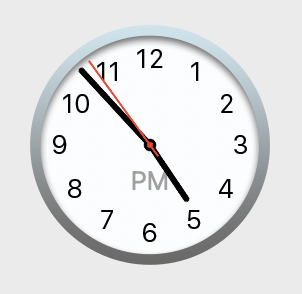
let checked = checkbox.isOnClockPicker is an NSDatePicker with datePickerStyle set to .clockAndCalendar and datePickerElements configured to either .hourMinuteSecond or .hourMinute. Initialise it with a date, minDate and maxDate.
let picker = ClockPicker(date: .now) { date in
    // do something here ...
}

picker.showSeconds = trueNSColorWell with colorWellStyle set to .default, .minimal or .expanded. Configure it with a color value. Note that the additional style options are only available in macOS 13.0 and later.
let colorWell = ColorWell(color: .blue) { color in
    // do something here ...
}
DatePicker is an NSDatePicker with datePickerStyle set to .textFieldAndStepper or .textField and datePickerElements configured to either .yearMonthDay or .yearMonth. Initialise it with a date, minDate and maxDate.
let picker = DatePicker(date: .now) { date in
    // do something here ...
}
Show stepper for the picker.
picker.showStepper = trueShow days for the picker.
picker.showDays = trueFontPicker is an NSButton that uses NSFontPanel and NSFontManager to show the font selection panel. Initialise it with a font and optional title.
If button title is not set, the current font display name will be shown using the currently selected font.
let picker = FontPicker(font: myFont) { font in
    // do something here ...
}
Update selected font.
picker.selectedFont = .preferredFont(forTextStyle: .body)Image is an NSImageView with an optional onClick handler and CGSize.
let view = Image(image: myImage)
let view = Image(named: "App Icon")
let view = Image(systemSymbolName: "tortoise")
Label is an NSTextField with background and border drawing disabled. It also takes an NSAttributedString as value.
let label = Label(string: "Hello")
label.stringValue = "Hello world!"
Level is an NSLevelIndicator with levelIndicatorStyle set to .continuousCapacity. Initialise it with a value, minValue and maxValue.
let level = Level(value: 0.3, minValue: 0, maxValue: 1) { value in
    // do something here ...
}
PopUp combines a NSPopUpButton and an optional trailing text label into one control. Set it up using an array of items, that have a title and an optional NSImage, and a currently selected index. For no selection use selectedIndex value -1.
let popup = PopUp(items: [PopUp.Item(title: "Orange", image: image)] }, selectedIndex: 0, trailingText: "flag") { item in
    // do something here ...
}
Set a callback for a changed selection.
popup.onChange = { item in
    // do something here ...
}
Configure its items and selected item.
popup.items = ["One", "Two", "Three"].map { .init(title: $0) }
popup.selectedIndex = 1
Radio is a vertical stack of NSButton controls with buttonType set to .radio. Initialise this component with an optional selectedIndex parameter, where -1 indicates no selection.
You can append a horizontal stack of views after the radio item, to combine this option with other controls, such as a TextField. These trailing views are automatically enabled for the currently selected item and disabled for other items.
let radio = Radio(items: [
    Radio.Item(title: "First"),
    Radio.Item(title: "Second", views: [
        TextField(value: "30", trailingText: "seconds") { text in
            // do something here ...
        },
    ])

], selectedIndex: 0) { index, previousIndex in
    // do something here ...
}
Configure its selected item.
radio.selectedIndex = 2Separator is an NSBox with its boxType set to .separator.
Use separators between sections of options in a preferences window.
let separator = Separator()Slider is an NSSlider with sliderType set to .linear. Initialise it with a value, minValue and maxValue.
let slider = Slider(value: 0.3, minValue: 0, maxValue: 1) { value in
    // do something here ...
}
Switch is an NSSwitch. Set it up using isOn value.
let switch = Switch(isOn: true) { isOn in
    // do something here ...
}
Tabs combines an NSSegmentedControl with a list of Tabs.Item. It automatically displays the item at the selected index.
let tabs = Tabs(selectedIndex: 0, items: [
    .init(title: "URI", views: [
        ...
    ]),
    .init(title: "Headers", views: [
        ...
    ]),
    .init(title: "Body", views: [
        ...
    ])
]) { index in
    ...
}
Access its selected index using the following property.
tabs.selectedIndex = 2TextField is an NSTextField with an optional trailing Label.
let textField = TextField(value: "30", trailingText: "seconds") { text in
    // do something here ...
}
Configure its value or placeholder string.
textField.stringValue = "50"
textField.placeholder = "Enter name"
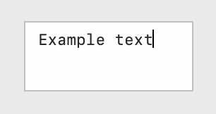
TextView is an NSScrollView with an NSTextView as a document view. It is set up with data detectors and spelling corrections disabled.
let textView = TextView(text: "Example text") { text in
    // do something here ...
}
Configure its text and font and control whether editing is allowed.
textField.text = "Another text"
textField.font = .monospacedSystemFont(ofSize: 12, weight: .regular)
textField.isEditable = false
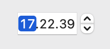
TimePicker is an NSDatePicker with datePickerStyle set to .textFieldAndStepper or .textField and datePickerElements configured to either .hourMinuteSecond or .hourMinute. Initialise it with a date, minDate and maxDate.
let picker = TimePicker(date: .now) { date in
    // do something here ...
}
Show stepper for the picker.
picker.showStepper = trueShow seconds for the picker.
picker.showSeconds = trueComponents can be composed together using compact code, that closely matches the hierarchy of the visual end result.
We use two more components to initialise the content for a Mac preference window.
PreferenceGroup takes in a list of items that each have a title and horizontal stack of views.
It is useful for creating a list of options that all have their own titles, such as PopUp or TextField components.
PreferenceGroup(items: [
    .init(title: "First:", views: [...]),
    .init(title: "Second:", views: [...]),
])
PreferenceList takes in a list of sections and takes care of appropriate spacing between them.
Basically the only special sauce in PreferenceList is that it looks for leading titles labels in its views, and constrains them all to same width. This results in the familiar clean look of a Mac app preferences window (before the horror of Settings in Ventura).
PreferenceList(views: [
    ...
])
PreferenceSection takes a title, a list of components, and shows an optional footer text below all of the components in that section. The section title is shown to the left from the section components, right aligned. The title text should end with a colon.
The views in the section can be places horizontally with orientation: .horizontal.
PreferenceSection(
    title: "Options:",
    footer: "This text appears below a section.",
    orientation: .vertical,
    views: [
        ...
    ]
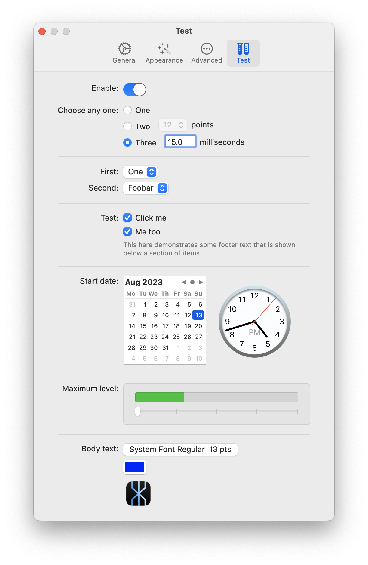
)The following example initialises a preferences window using PreferenceList containing multiple PreferenceSection that each have their own components.
override func loadView() {
    view = NSView()
    view.wantsLayer = true

    title = "Test"

        let list = PreferenceList(views: [
            PreferenceSection(title: "Enable:", views: [
                Switch(isOn: true) { isOn in

                },
            ]),
            PreferenceSection(title: "Choose any one:", views: [
                Radio(items: [
                    .init(title: "One"),
                    .init(title: "Two", views: [
                        PopUp(items: ["12", "13"].map { .init(title: $0) }, selectedIndex: 0, trailingText: "points") { index, title in

                        }
                    ]),
                    .init(title: "Three", views: [
                        TextField(value: "15.0", trailingText: "milliseconds", width: 50) { text in

                        }
                    ])], selectedIndex: 0) { index, previousIndex in

                    },
            ]),
            Separator(),
            PreferenceGroup(items: [
                .init(title: "First:", views: [
                    PopUp(items: ["One", "Two"].map { .init(title: $0) }, selectedIndex: 0) { index, title in

                    }
                ]),
                .init(title: "Second:", views: [
                    PopUp(items: ["Foobar", "Plop"].map { .init(title: $0) }, selectedIndex: 0) { index, title in

                    }
                ]),
            ]),
            Separator(),
            PreferenceSection(title: "Test:", footer: "This here demonstrates some footer text that is shown below a section of items.", views: [
                Checkbox(title: "Click me", isOn: true) { enabled in

                },
                Checkbox(title: "Me too", isOn: true) { enabled in

                },
            ]),
            Separator(),
            PreferenceSection(title: "Start date:", orientation: .horizontal, alignment: .centerY, spacing: 20, views: [
                CalendarPicker() { date in

                },
                ClockPicker() { date in

                },
            ]),
            Separator(),
            PreferenceSection(title: "Maximum level:", views: [
                Box(views: [
                    Level(value: 0.3) { value in

                    },
                    Slider() { value in
                        print("value changed to \(value)")
                    },
                ])
            ]),
            Separator(),
            PreferenceSection(title: "Body text:", views: [
                FontPicker() { font in

                },
                ColorWell(color: .blue, style: .default) { color in

                },
                Image(named: "AppIcon Mac", size: CGSize(width: 50, height: 50)) {

                },
            ]),
        ])

    view.addSubview(list)
    list.translatesAutoresizingMaskIntoConstraints = false
    view.addConstraints([
        list.topAnchor.constraint(equalTo: view.topAnchor, constant: 20),
        list.leadingAnchor.constraint(equalTo: view.leadingAnchor, constant: 40),
        list.trailingAnchor.constraint(equalTo: view.trailingAnchor, constant: -40),
        list.bottomAnchor.constraint(lessThanOrEqualTo: view.bottomAnchor, constant: -20)
    ])

    preferredContentSize = CGSize(width: 500, height: view.fittingSize.height)
}


