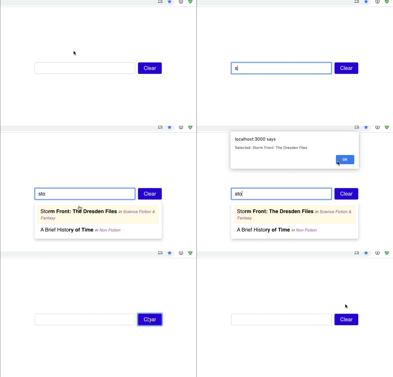
This workshop challenges you to build a common reusable component: The Typeahead.
Also called an Autocomplete, this component is designed to give users suggestions as they type, and allow the user to pick between the presented options.
Here's a finished working demo:
This workshop comes with some data - in particular, it's an array of books. Many of them are wonderful, and are worth checking out. Especially for folks who are into sci-fi/fantasy!
Inside our App.js, we're importing that data. Check out data.js to see what it looks like. We'll want to pass data.books down to a new Typeahead component, so that the user can filter through this big list of books and find the one they're looking for.
Start by creating a new Typeahead.js component. As props, it should take:
data- an array of objects representing all possible suggestions.handleSelect- a function that will be called when the user picks a suggestion.
Render it inside the main component, App:
import data from '../data';

+import Typeahead from './Typeahead';

const App = () => {
  return (
    <>
      <GlobalStyles />
      <Wrapper>
+       <Typeahead
+         suggestions={data.books}
+         handleSelect={(suggestion) => {
+           window.alert(suggestion)
+         }}
+       >
      </Wrapper>
    </>
  )
}
For now, our handleSelect function opens an alert dialog with the name of the book we've selected.
Inside our Typeahead component, let's start by creating an input. You should use React state to track the value the user has entered. You can also add a "Clear" button, which will reset this value.
When the user presses "enter" in this input, we'll submit the suggestion. For now, just return what the user has typed in, without checking anything.
Give this a shot, and then continue reading to see one approach.
HINT: you'll want to use an onKeyDown event, and take a look at ev.key to see which key the user pressed.
.
..
...
....
.....
......
.......
......
.....
....
...
..
.
Your code should look something like this:
const Typeahead = ({ suggestions, handleSelect }) => {
  const [value, setValue] = React.useState('');

  return (
    <>
      <input
        type="text"
        value={value}
        onChange={ev => setValue(ev.target.value)}
        onKeyDown={ev => {
          if (ev.key === 'Enter') {
            handleSelect(ev.target.value);
          }
        }}
      />

      <button onClick={() => setValue('')}>Clear</button>
    </>
  );
};
We're using the value / onChange combo we've seen to copy a form value into React state. We're also using the same setValue function to reset the state when the user clicks on the "clear" button.
When the user presses a key on their keyboard, we check and see if it's the "Enter" key; if so, we call the handle submit function. You should get an Alert with the first book's title.
While we're here, we should also style the input and button to match the designs:
When the user types in the input, we want to check and see if any of the suggestions match.
Here are some rules:
Given a title "The Girls":
✅ "The" ✅ "the"
Given a title "The Girls":
✅ "The" ✅ "the G" ✅ "irls" ⛔️ "The Guys"
Given a title "The Girls":
✅ "The" ✅ "Th" ⛔️ "T"
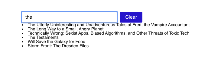
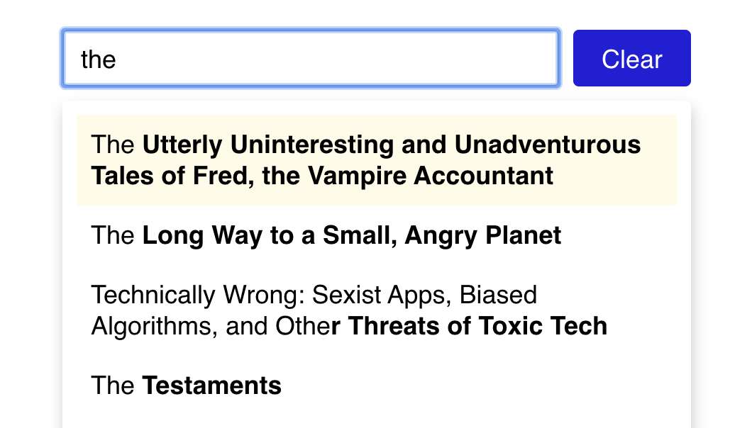
Start by trying to render a list of the matches below the input:
Most of these results have the word "the" in them explicitly. The third item, "Technically Wrong", has it hidden in the word "oTHEr".
You should use a <ul> and <li>.
HINT: You'll want to use
filterto winnow down the list of suggestions, and then usemapto render an<li>for each matched result.
Next, we'll need to be able to tell when the user selects one of the suggestions. There are two ways this can happen:
- The user can click on one of the suggestions
- The user can press "Enter" on their keyboard to select the currently selected suggestion.
We'll solve that second case a little further on. For now, let's add a hover state and an onClick event. This event should call the handleSelect prop with the current suggestion's title.
Give it a shot, and then check the solution below:
.
..
...
....
.....
......
.......
......
.....
....
...
..
.
const Typeahead = ({ suggestions, handleSelect }) => {
  const [value, setValue] = React.useState('');

  return (
    <Wrapper>
      <input
        type="text"
        value={value}
        onChange={ev => setValue(ev.target.value)}
        onKeyDown={ev => {
          /* unchanged */
        }}
      />
      <ul>
        {matchedSuggestions.map(suggestion => {
          return (
            <li
              key={suggestion.id}
              onClick={() => handleSelect(suggestion.title)}
            >
              {suggestion.title}
            </li>
          );
        })}
      </ul>
    </Wrapper>
  );
};
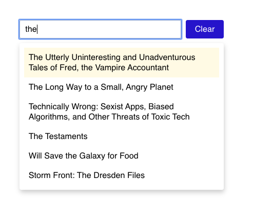
After you have the logic working, add some styles to match the mockup. You can add a subtle yellow background on hover to indicate which option is selected:
To do this, you'll want to use styled-components. You can create a new Suggestion component:
// Inside your component, replacing the `<li>`:
<Suggestion key={suggestion.id} onClick={() => handleSelect(suggestion.title)}>
  {suggestion.title}
</Suggestion>;

// further down:
const Suggestion = styled.li`
  // styles here, including hover styles.
`;You may have noticed, after adding some styling, that a weird artifact is shown when there are no suggestions:
This is because we're always rendering the list of results!
Figure out whether or not we have any matched suggestions, and use that to determine whether to render or not
HINT: You don't need a new piece of state to track this; you can use the # of results.
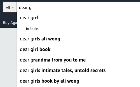
Amazon and other websites make it easy to find where your search term is within the suggestion. For example, see how Amazon bolds the rest of their suggestion?
Let's do the same thing. We'll need to split the matched suggestion's title into 2 pieces, to do something like this:
// Given a search term "Dea", and the suggestion "Dear girls":
<span>
  Dea
  <Prediction>r girls</Prediction>
</span>;

// And then, further down:
const Prediction = styled.span`
  font-weight: bold;
`;
In your app, both of these will be variables:
<span>
  {firstHalf}
  <Prediction>{secondHalf}</Prediction>
</span>
Your goal will be to find the index of that cross-over point (in this example, it's 3, since the first half includes indices 0 through 2).
We should see the "prediction" part of the string bolded:
HINT: there are a number of ways to solve this, but you can use
indexOfandsliceto create the two string segments
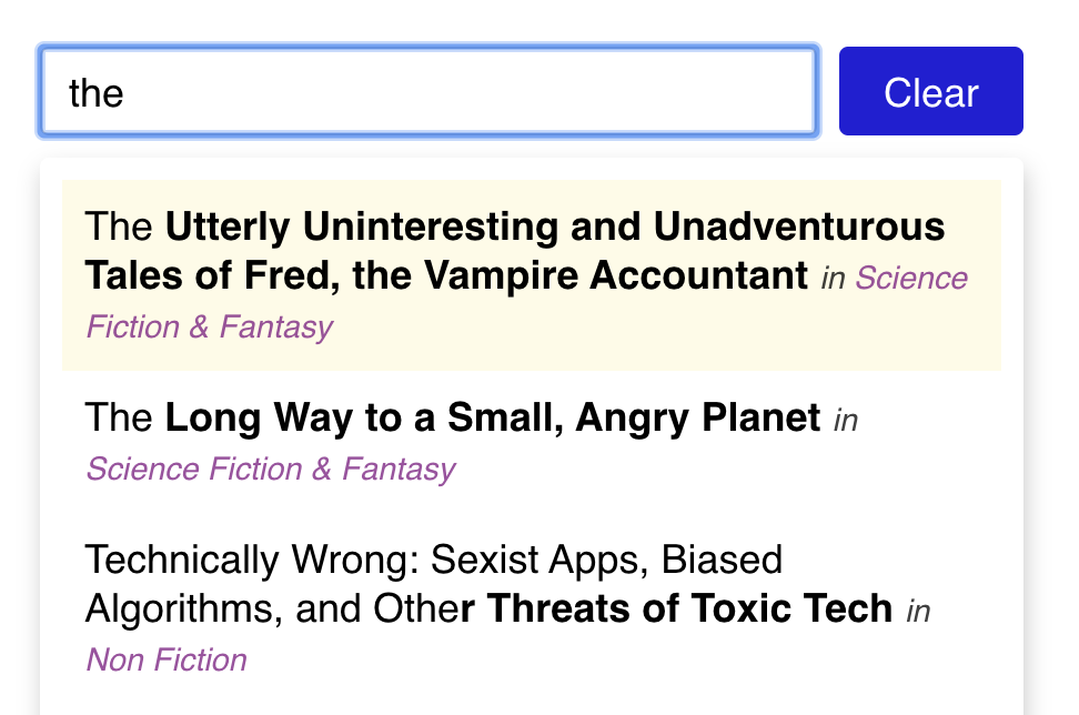
Finally, we also want to show the associated categories with each item:
We have all of the category data in our data.js file, imported in App.js. Pass the full set of categories as a prop to Typeahead.
While mapping through each matchedSuggestion, use the suggestion's categoryId to look up the relevant category object, and render its title, using purple italics.
Right now, our typeahead only works when using a mouse. This UI will not work for keyboard users, nor will it work for users who use a screen reader. It's important to make sure the stuff we build works well for users with disabilities.
Let's tackle keyboard navigation first.
The good news is, we get some of this for free. Browsers will fire the "onClick" event on buttons when you press "Enter" on them. Out of the box, we should be able to type a few letters, press "Tab" to move focus to the "Clear" button, and press "Enter" to clear the typed characters.
What should the ideal behaviour be? You might think that we should use the "Tab" key to move between every suggestion in the list, but this actually isn't the best practice. Instead, we want the user to be able to use the arrow keys. When the user is focused on the input, to move between suggestions. This is the best practice because it means that users don't have to tab through every single suggestion just to get on with their page navigation. For some users, keypresses are strenuous, so we should try and minimize them.
Here's our ideal behaviour:
We're already listening for keypresses, since we're calling the handler when the user presses "enter". Let's also add handlers for the up and down arrows:
<input
  onKeyDown={ev => {
    // Switching from if/else to a "switch" statement,
    // since now we're handling multiple different values for
    // ev.key. This is an optional change, though; we could
    // still do it with if/else-if.
    switch (ev.key) {
      case 'Enter': {
        handleSelect(ev.target.value);
        return;
      }
      case 'ArrowUp': {
        // TODO: Handle moving the selection up
      }
      case 'ArrowDown': {
        // TODO: Handle moving the selection down
      }
    }
  }}
/>
Right now, we don't really have a notion of which item is "selected"; we have a yellow hover state, but that's tracked in CSS.
We can think of the currently-selected item as some data that changes over time. And for dynamic data, we use React state.
Add a new state hook that manages the currently-selected index. Tweak that number when the user uses the arrow keys:
const Typeahead = (
  {
    /* snip */
  }
) => {
  const [value, setValue] = React.useState('');
  const [selectedSuggestionIndex, setSelectedSuggestionIndex] = React.useState(
    0
  );

  return (
    /* snip */
    <input
      onKeyDown={ev => {
        switch (ev.key) {
          case 'Enter': {
            handleSelect(ev.target.value);
            return;
          }
          case 'ArrowUp': {
            // TODO: Handle moving the selection up
            setSelectedSuggestionIndex(selectedSuggestionIndex - 1);
          }
          case 'ArrowDown': {
            // TODO: Handle moving the selection down
            setSelectedSuggestionIndex(selectedSuggestionIndex + 1);
          }
        }
      }}
    />
  );
};
Earlier, we suggested adding a hover state to each list item. Let's remove that; instead, the yellow background will be managed through React, based on the currently-selected index.
There is a way to set dynamic styles using the styled helper, but inline styles are a simpler strategy in these cases:
const isSelected = /*
  Figure this out, based on the React state
  and the current index in the array */;

<Suggestion
  key={suggestion.id}
  style={{
    background: isSelected ? 'hsla(50deg, 100%, 80%, 0.25)' : 'transparent',
  }}
We want to make it so that mousing over a list item causes it to be selected, replicating the hover state. Use an onMouseEnter event to set the React state.
Items should now be selectable both with a mouse as well as with a keyboard.
There's two more tasks we should complete, to call this component keyboard-usable:
- When there are no provided suggestions - either because the user hasn't typed anything yet, or they've typed a string that doesn't match any strings - we shouldn't tweak the selected index. Perform that check before updating the state
- On
Escape, close the typeahead dropdown. HINT: You'll need another piece of React state to manage this. - Clamp the selected index to the acceptable range of values; tapping "UpArrow" when you're on the first item shouldn't do anything.
Implement these enhancements.
We tackled keyboard navigation, but screen readers are a bit of a different ballgame.
Follow the example on this page:
https://haltersweb.github.io/Accessibility/autocomplete.html HINT: Use your browser's developer tools to inspect the different elements.
Try and use the Typeahead exclusively through your computer's screen reader. Your task will be complete when you can select items from the typeahead without looking at your screen.
Screen readers:
- Windows: NVDA, https://www.nvaccess.org/download/
- MacOS: VoiceOver, built into the computer
- Linux: Orca, https://help.gnome.org/users/orca/stable/
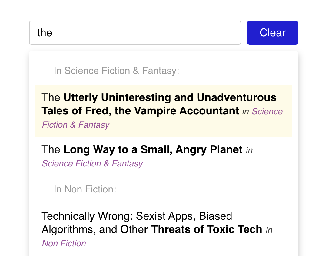
Some typeaheads will group by category, like this:
Notice how the first two books share a heading, "In Science Fiction & Fantasy". The challenging part of this stretch goal is to structure the rendered output in such a way that items sharing the same category are grouped.
HINT: One strategy is to create your own data structure, like this:
const groupedSuggestions = [
  {
    categoryName: 'Science Fiction & Fantasy',
    suggestions: [
      {
        /* Book 1 */
      },
      {
        /* Book 2 */
      },
    ],
  },
];
Then, you can use nested .map calls to iterate first through every group, and then through every suggestion in every group.
