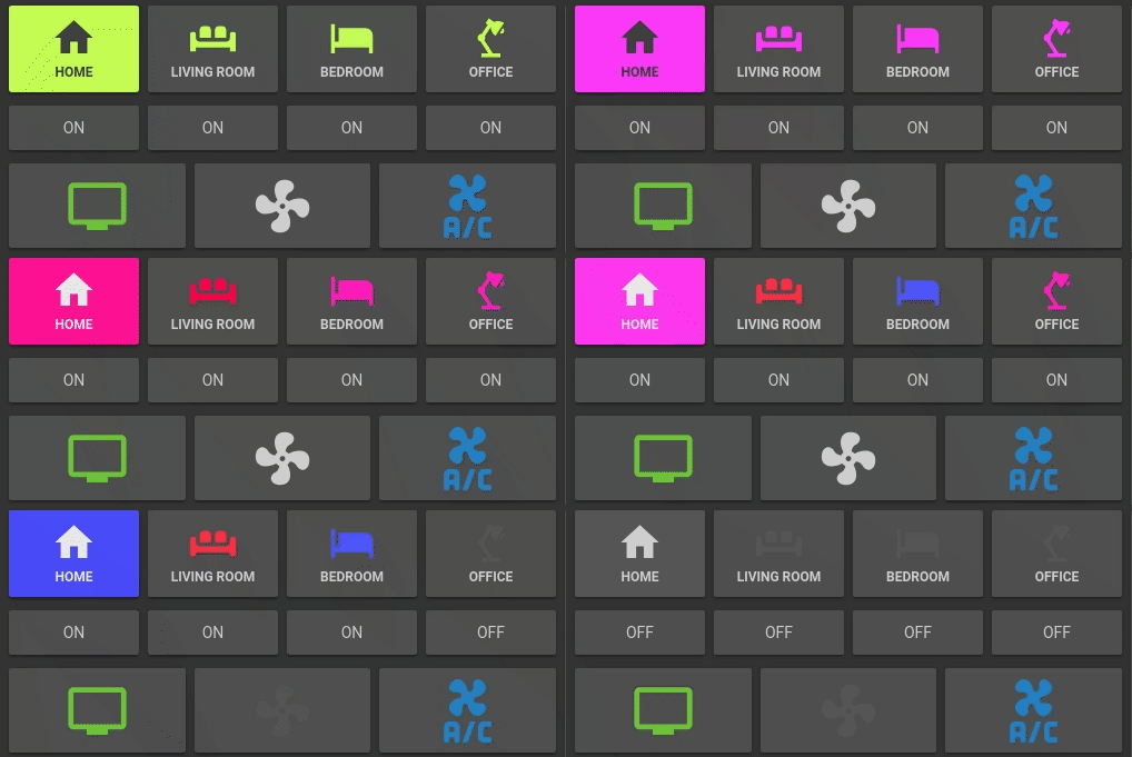
Button Card
Lovelace Button card for your entities.
Features
- works with any toggleable entity
- 3 actions on tap
toggle,more_infoandservice - state display (optional)
- custom color for
onandoffstate (optional) - custom state definition with customizable color (optional)
- custom size (optional)
- custom icon (optional)
- custom css style (optional)
- automatic color for light (optional)
- custom default color for lights (when color cannot be determined) (optional)
- 2 color types
icon: apply color settings to the icon onlycard: apply color settings to the card only
- automatic font color if color_type is set to
card - support unit of measurement
- blank card and label card (for organization)
- support for custom_updater
Options
| Name | Type | Default | Supported options | Description |
|---|---|---|---|---|
| type | string | Required | custom:button-card |
Type of the card |
| entity | string | Required | switch.ac |
entity_id |
| icon | string | optional | mdi:air-conditioner | attribute |
Icon to display in place of the state. Will be overriden by the icon defined defined in a state (if present). If you use keywork attribute it will fetch the icon configured on the entity (overrides all icons defined). |
| color_type | string | icon |
icon | card | blank-card | label-card |
Color either the background of the card or the icon inside the card. Setting this to card enable automatic font and icon color. This allows the text/icon to be readable even if the background color is bright/dark. Additional color-type options blank-card and label-card can be used for organisation (see examples). |
| color | string | var(--primary-text-color) |
auto | rgb(28, 128, 199) |
Color of the icon/card when state is on. auto sets the color based on the color of a light. |
| color_off | string | var(--disabled-text-color) |
rgb(28, 128, 199) |
Color of the icon/card when state is off. |
| size | string | 40% |
20px |
Size of the icon. Can be percentage or pixel |
| action | string | toggle |
toggle | more_info | service |
Define the type of action |
| service | Object | optional | See example section | Service to call and service data when action is set to service |
| name | string | optional | Air conditioner |
Define an optional text to show below the icon |
| show_state | boolean | false |
true | false |
Show the state on the card. defaults to false if not set |
| style | object | optional | - text-transform: none |
Define a list of css attribute and their value to apply to the card |
| state | list | optional | See state example section | State to use for the color of the button. Multiple states can be defined |
Installaion
Manual Installation
- Download the button-card
- Place the file in your
config/wwwfolder - Include the card code in your
ui-lovelace-card.yaml
title: Home
resources:
  - url: /local/button-card.js
type: module- Write configuration for the card in your
ui-lovelace.yaml
Installation and tracking with custom_updater
- Make sure the custom_updater component is installed and working.
- Configure Lovelace to load the card.
resources:
  - url: /customcards/github/custom-cards/button-card.js?track=true
type: module- Run the service
custom_updater.check_allor click the "CHECK" button if you use thetracker-card. - Refresh the website.
Examples
More examples in here
Show a button for the air conditioner (blue when on):
- type: "custom:button-card"
  entity: switch.ac
  icon: mdi:air-conditioner
  color: rgb(28, 128, 199)
Show an ON/OFF button for the home_lights group:
- type: "custom:button-card"
  entity: group.home_lights
  show_state: true
Light entity with custom icon and "more info" pop-in:
- type: "custom:button-card"
  entity: light.living_room_lights
  icon: mdi:sofa
  color: auto
  action: more_info
Light card with card color type, name, and automatic color:
- type: "custom:button-card"
  entity: light._
  icon: mdi:home
  color: auto
  color_type: card
  default_color: rgb(255, 233, 155)
  action: more_info
  name: Home
  style:
    - font-size: 12px
    - font-weight: bold
Horizontal stack with :
- 2x blank cards
- 1x volume up button with service call
- 1x volume down button with service call
- 2x blank cards
- type: horizontal-stack
  cards:
    - type: "custom:button-card"
      color_type: blank-card
    - type: "custom:button-card"
      color_type: blank-card
    - type: "custom:button-card"
      color_type: card
      color: rgb(223, 255, 97)
      icon: mdi:volume-plus
      action: service
      service:
        domain: media_player
        action: volume_up
        data:
          entity_id: media_player.livimg_room_speaker
    - type: "custom:button-card"
      color_type: card
      color: rgb(223, 255, 97)
      icon: mdi:volume-minus
      action: service
      service:
        domain: media_player
        action: volume_down
        data:
          entity_id: media_player.livimg_room_speaker
    - type: "custom:button-card"
      color_type: blank-card
    - type: "custom:button-card"
      color_type: blank-card
Vertical Stack with :
- 1x label card
- Horizontal Stack with :
- 1x Scene 1 Button
- 1x Scene 2 Button
- 1x Scene 3 Button
- 1x Scene 4 Button
- 1x Scene Off Button
- type: vertical-stack
  cards:
    - type: "custom:button-card"
      color_type: label-card
      color: rgb(44, 109, 214)
      name: Kitchen
    - type: horizontal-stack
      cards:
        - type: "custom:button-card"
          entity: switch.kitchen_scene_1
          color_type: card
          color: rgb(66, 134, 244)
          icon: mdi:numeric-1-box-outline
        - type: "custom:button-card"
          entity: switch.kitchen_scene_2
          color_type: card
          color: rgb(66, 134, 244)
          icon: mdi:numeric-2-box-outline
        - type: "custom:button-card"
          entity: switch.kitchen_scene_3
          color_type: card
          color: rgb(66, 134, 244)
          icon: mdi:numeric-3-box-outline
        - type: "custom:button-card"
          entity: switch.kitchen_scene_4
          color_type: card
          color: rgb(66, 134, 244)
          icon: mdi:numeric-4-box-outline
        - type: "custom:button-card"
          entity: switch.kitchen_off
          color_type: card
          color: rgb(66, 134, 244)
          icon: mdi:eye-off-outline
Configuration with states
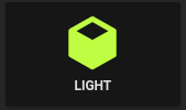
Input select card with select next service and custom color and icon for states. In the example below the icon mdi:cube-outline will be used when value is sleeping and mdi:cube in other cases.
              - type: "custom:button-card"
                entity: input_select.cube_mode
                icon: mdi:cube
                action: service
                show_state: true
                state:
                  - value: 'sleeping'
                    color: var(--disabled-text-color)
                    icon: mdi:cube-outline
                  - value: 'media'
                    color: rgb(5, 147, 255)
                  - value: 'light'
                    color: rgb(189, 255, 5)
Credits
- ciotlosm for the readme template and the awesome examples


