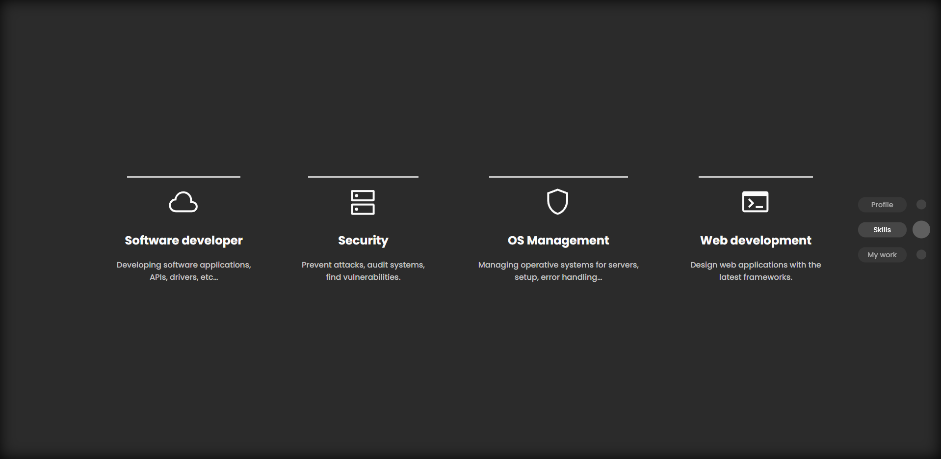
This tool allow the user to create a custom scrollbar for any site, the tool will remove the default scrollbar and it will be replaced with a fixed element placed at the right side of the screen with a TOC (Table Of Concepts).
- Easy tag selection by id
- Customizable style and decorations
- Auto sorting items by its order in page
- Automatic hiding after few seconds but prevent it when user hovers it
- Drag an item to scroll the page (scroll coordenate relative to the Y possition in the viewport)
Just clone the repo inside your project, import the BubbleScrollBar.js file add the component to your JSX code and the element will be positioned as fixed in the right side of the screen
Import library
import BubbleScrollBar from "./BubbleScrollBar/BubbleScrollBar"Add component
Its recommended to add it at the end of your page to ensure that every component is already rendered
<BubbleScrollBar sections={sectionsData}/>
sectionsTakes an array of objects as show herestyleTOCAdds custom styles to the TOC, takes an object with css propertiesstyleLabelAdds custom styles to the label of each item of the TOC, takes an object with css propertiesstyleDecorationAdds custom styles to the decoration bubble of each item of the TOC, takes an object with css propertiesdisableBubbleRemoves the bubble element from the TOC and leave just the label, takes a booleanhideHides all the injected HTMLsectionCallbackExecutes a function every time the section changes
{
    label: "Section name",
    id: "section--id"
}
In the followig example we create an array of objects where the object is the data of each item of the TOC (Table Of Concepts) of the scrollbar
const sectionsData = [
    {
        label: "Profile",
        id: "section--welcome"
    },
    {
        label: "Skills",
        id: "section--skills-wrap"
    },
    {
        label: "My work",
        id: "section--work"
    }
]The component can be customized with the style props but since the module is cloned, you can edit the css files
- Zoomed screenshot

