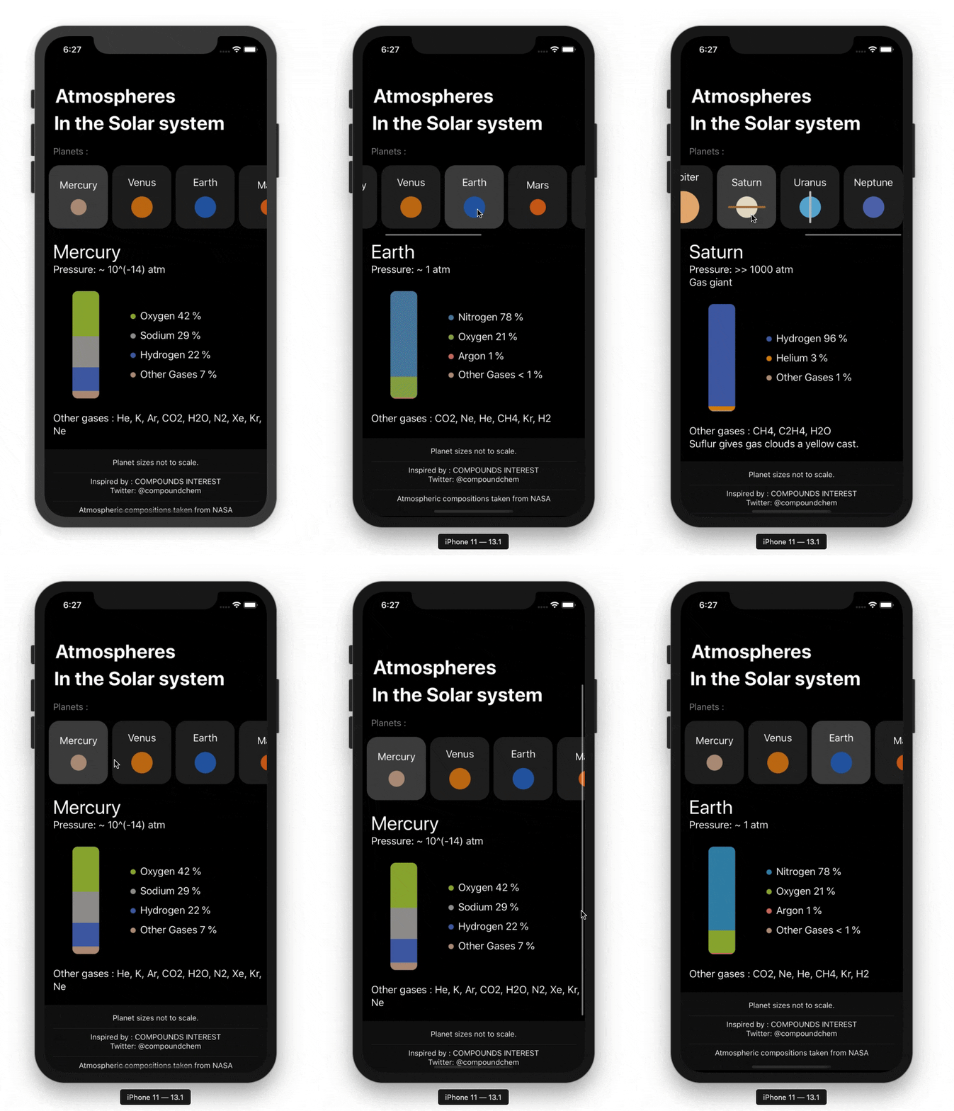
I recently stumbled upon this chart on r/coolguides about planets and their atmosphere and I wanted some quick and fun SwiftUI project to demo the framework to my friends. So I just adapted the chart in a simple SwiftUI app.
Here is how it looks :
Feel free to contribute :)
Chart by Compound Interest
Data by NASA
