
As the new lead analyst for the New York Citi Bike Program, you are now responsible for overseeing the largest bike sharing program in the United States. In your new role, you will be expected to generate regular reports for city officials looking to publicize and improve the city program.
Since 2013, the Citi Bike Program has implemented a robust infrastructure for collecting data on the program's utilization. Through the team's efforts, each month bike data is collected, organized, and made public on the Citi Bike Data webpage.
However, while the data has been regularly updated, the team has yet to implement a dashboard or sophisticated reporting process. City officials have a number of questions on the program, so your first task on the job is to build a set of data reports to provide the answers.
To Aggregate the data found in the Citi Bike Trip History Logs.
-
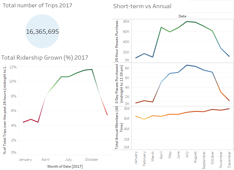
How many trips have been recorded total during the chosen period?
-
By what percentage has total ridership grown?
-
How has the proportion of short-term customers and annual subscribers changed?
-
What are the peak hours in which bikes are used during summer months?
-
What are the peak hours in which bikes are used during winter months?
-
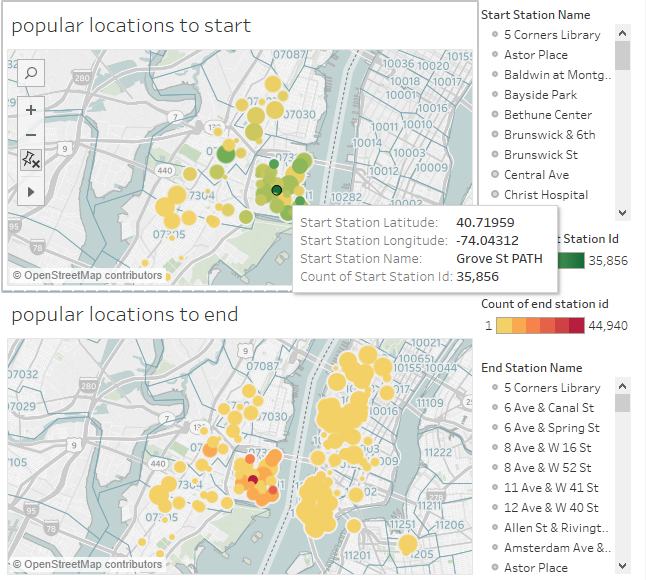
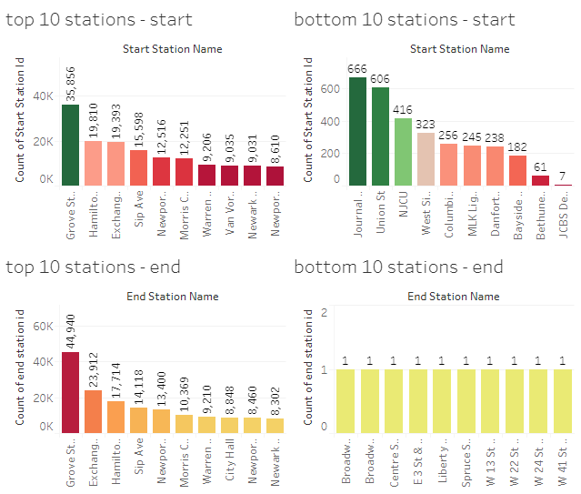
Today, what are the top 10 stations in the city for starting a journey? (Based on data, why do you hypothesize these are the top locations?)
-
Today, what are the top 10 stations in the city for ending a journey? (Based on data, why?)
-
Today, what are the bottom 10 stations in the city for starting a journey? (Based on data, why?)
-
Today, what are the bottom 10 stations in the city for ending a journey (Based on data, why?)
-
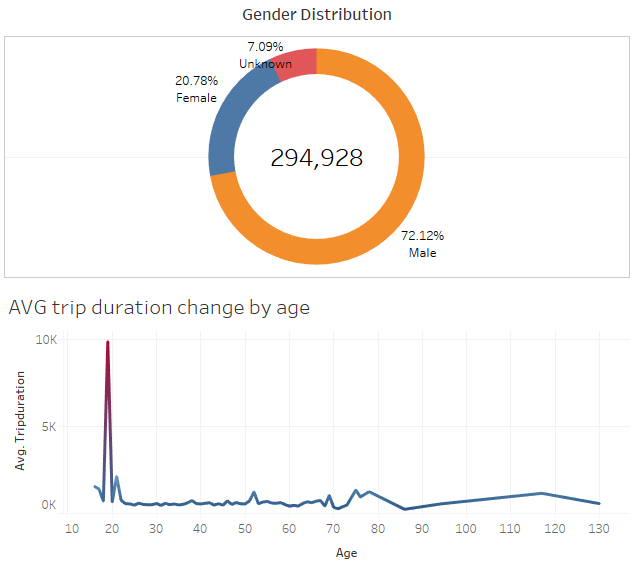
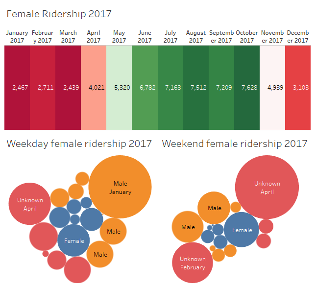
Today, what is the gender breakdown of active participants (Male v. Female)?
-
How effective has gender outreach been in increasing female ridership over the timespan?
-
How does the average trip duration change by age?
-
What is the average distance in miles that a bike is ridden?
-
Which bikes (by ID) are most likely due for repair or inspection in the timespan?
-
How variable is the utilization by bike ID?
City officials would also like to see one of the following visualizations:
- Basic: A static map that plots all bike stations with a visual indication of the most popular locations to start and end a journey with zip code data overlaid on top.
- Advanced: A dynamic map that shows how each station's popularity changes over time (by month and year). Again, with zip code data overlaid on the map.
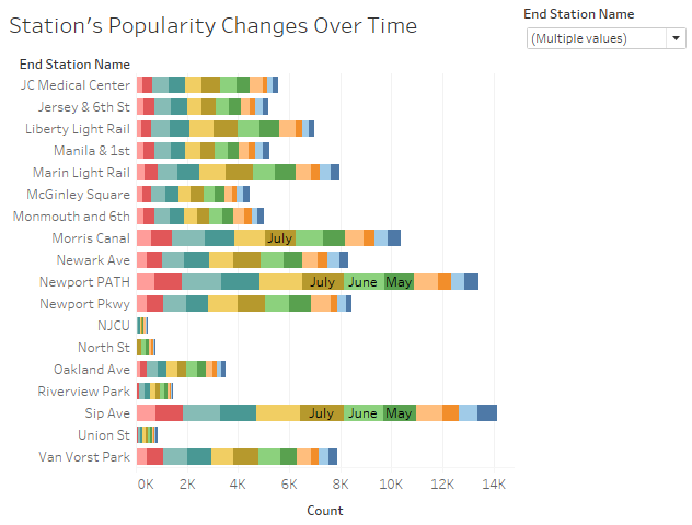
- The map you choose should also be accompanied by a write-up unveiling any trends that were noticed during your analysis.
(1) The current major citi bike riders fall into young male group between 18 -20 but number of female riders increases over time as they are showing interest to start riding during the weekend
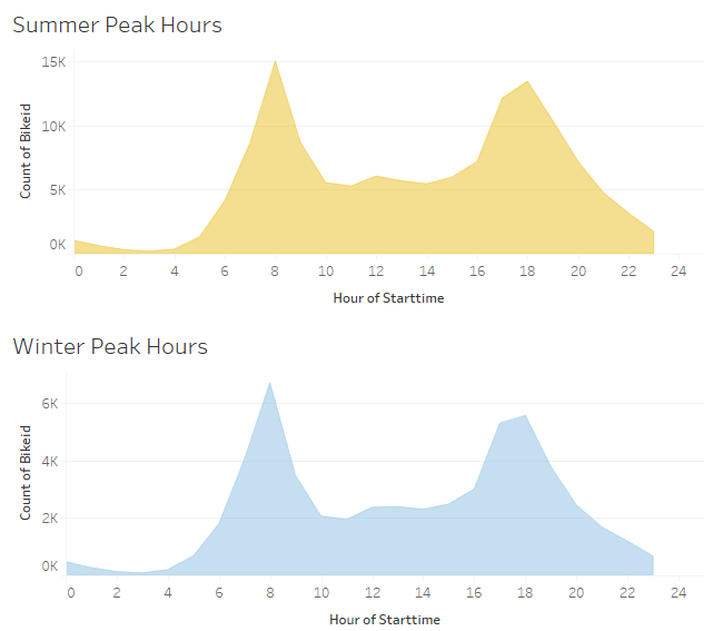
(3) As the temperature gets cold as winter begins, people tend not to ride as well because of the lack of comfort individuals face when riding in low temperatures. Therefore, at some point the ridership does not grow. However, the total amount of annual member have been kept increased over time in 2017
- More and more people choose to live in Jersey City and work in Manhathan