RentVisualiser
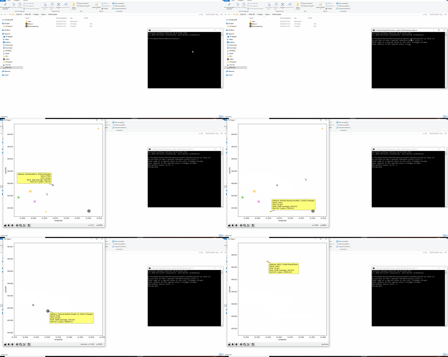
This is a python script that can produce an interactive matplotlib plot in order to visualize rental property in a city.
The properties are shown as dots of varied sizes and colors based on the average size and price form the given data.
The script takes a .csv file as an input. The file must contain 4 columns: Rent (the price for the property for a month), Area (the size of the property), Name (can be left out but must be present as a column => use ;; ... it can help to identify the property) and Address (exact address - use google maps or something)
At the start, the script will ask if you would like to provide one or more orientation points like in New York the Statue of Liberty or something like that. You also must add the exact address (google maps can help)
Prerequisites
pandas, geocoder, numpy, matplotlib
Example
I have provided a test file called data.csv which holds fictive information but can be used to see the script in action
