The Markdown Spoilers Plugin is for Grav CMS. It extends the Markdown parser to allow the rendering of spoiler elements through simple markdown shortcuts.
Installing the Markdown Spoilers plugin can be done in one of two ways. The GPM (Grav Package Manager) installation method enables you to quickly and easily install the plugin with a simple terminal command, while the manual method enables you to do so via a zip file.
The simplest way to install this plugin is via the Grav Package Manager (GPM) through your system's terminal (also called the command line). From the root of your Grav install type:
bin/gpm install markdown-spoilers
This will install the Markdown Spoilers plugin into your /user/plugins directory within Grav. Its files can be found under /your/site/grav/user/plugins/markdown-spoilers.
To install this plugin, just download the zip version of this repository and unzip it under /your/site/grav/user/plugins. Then, rename the folder to markdown-spoilers. You can find these files on GitHub or via GetGrav.org.
You should now have all the plugin files under
/your/site/grav/user/plugins/markdown-spoilers
NOTE: This plugin is a modular component for Grav which requires Grav and the Error and Problems to operate.
Before configuring this plugin, you should copy the user/plugins/markdown-spoilers/markdown-spoilers.yaml to user/config/plugins/markdown-spoilers.yaml and only edit that copy.
Here is the default configuration and an explanation of available options:
enabled: true
include_css: true
By default, the plugin includes its own CSS as the hiding/revealing of the text requires it. You can, of course, disable this and write your own custom CSS to suit your site's aesthetic.
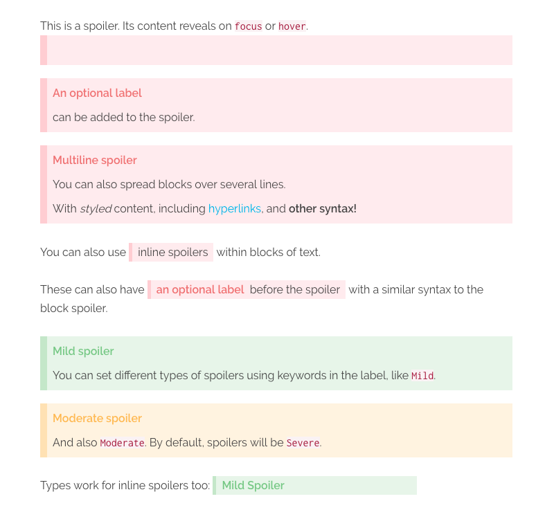
The plugin allows for both block and inline spoiler elements.
>? This is the spoiler textwhich will output
<div class="md-spoiler">
    <p class="md-spoiler__line">This is the spoiler text</p>
</div>
You can also pass in an optional label, wrapped in [], which will be added as an inline attribute and then rendered as a prefix to the spoiler (via the plugin's CSS):
>? [An optional label] This is the spoiler text<div class="md-spoiler" data-label="An optional label">
<p class="md-spoiler__line">This is the spoiler text</p>
</div>The block level spoiler also supports multiple lines within a single spoiler. Labels can only be given to the first line, as it applies to the whole block. However, you can use other inline markdown within the spoiler, such as hyperlinks, italics and bold. Each line will be wrapped in its own p tag, and spoiler lines with empty content will be ignored.
>? [Label here only] This is the _first_ line
>? The next line will be ignored, as it is empty
>?
>? [Subsequent labels will also be ignored] and output as part of the spoiler
>? but [hyperlinks work](#yay), as does **other syntax!**<div class="md-spoiler" data-label="Label here onlyl">
<p class="md-spoiler__line">This is the <em>first<em> line</p>
<p class="md-spoiler__line">The next line will be ignored, as it is empty</p>
<p class="md-spoiler__line">[Subsequent labels will also be ignored] and output as part of the spoiler</p>
<p class="md-spoiler__line">But <a href="#yay">hyperlinks work</a>, as does <strong>other syntax!<strong></p>
</div>Inline spoilers are achieved by wrapping ?? around some text, with no space before or after the ??.
You can also use ??inline spoilers?? within blocks of text.

These can also have ??[an optional label] before the juicy spoiler text?? with a similar syntax to the block spoiler.
NOTE: For improved readability, there is space allowed between the closing label bracket
]and the start of your spoiler text.
<p>
    You can also use <span class="md-spoiler md-spoiler--inline"><span class="md-spoiler__line">inline spoilers</span></span> within blocks of text.
</span>

<p>
    Similarly, these can also have <span class="md-spoiler md-spoiler--inline" data-label="an optional label"><span class="md-spoiler__line">before the juicy spoiler text</span></span> with a similar syntax to the block spoiler.
</span>
Inline spoilers also support other inline markdown styling within, such as hyperlinks, italics, bold, etc. However, you cannot start an inline style from within the spoiler and end it outside the spoiler, or vice versa. You can wrap an entire spoiler within an inline style though!
// These are valid
??a **bold** spoiler??
*an ??italicised?? spoiler*

// These are invalid
*an outside ??italicised* spoiler?? will break
as ??will *one?? like this*The default type of spoiler is considered Severe.
There are 2 additional types of spoilers included with the plugin: Mild, and Moderate. Including either of these keywords as part of the label will change the type of spoiler rendered.
With the plugin's included CSS, Mild will render as green and Moderate as yellow.
>! [Mild] This is a mild spoiler
>! [Mild Spoiler] This will also work

>! [Moderate] This is a moderate spoilerYou can also put inline spoilers within block spoilers, if desired. Perhaps you want to have a Mild spoiler block, which contains several Severe or Moderate spoilers inside it? Simple!
>? [Mild] This is a block spoiler with a ??[Moderate] nested inline spoiler!?? You can have multiple nested inline spoilers within a single block.
>?
>? ??[Severe] They can even be on different lines.?? Therefore, you can hide greater spoilers within lesser spoilers!
NOTE: You cannot nest
inlinespoilers within otherinlinespoilers.
You can easily extend the default CSS implementation to provide different types of spoilers. By utilising the attribute selector, you can style the spoiler based on a keyword given as one part of the label.
This is how a Mild spoiler is created:
.md-spoiler[data-label~="Mild"] {
    background-color: #e8f5e9;
    border-color: #c8e6c9;
}

.md-spoiler[data-label~="Mild"]::before {
    color: #81c784;
}