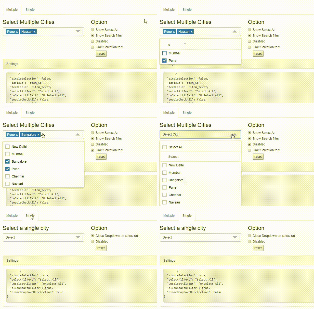
Angular multiselect dropdown component for web applications. Easy to integrate and use. It can be bind to any custom data source.
- dropdown with single/multiple selction option
- bind to any custom data source
- search item with custom placeholder text
- limit selection
- select/de-select all items
npm install ng-multiselect-dropdown
And then include it in your module (see app.module.ts):
import { NgMultiSelectDropDownModule } from 'ng-multiselect-dropdown';
// ...

@NgModule({
  imports: [
    NgMultiSelectDropDownModule.forRoot()
    // ...
  ]
  // ...
})
export class AppModule {}import { Component, OnInit } from '@angular/core';
export class AppComponent implements OnInit {
dropdownList = [];
selectedItems = [];
dropdownSettings = {};
ngOnInit() {
this.dropdownList = [
{ item_id: 1, item_text: 'Mumbai' },
{ item_id: 2, item_text: 'Bangaluru' },
{ item_id: 3, item_text: 'Pune' },
{ item_id: 4, item_text: 'Navsari' },
{ item_id: 5, item_text: 'New Delhi' }
];
this.selectedItems = [
{ item_id: 3, item_text: 'Pune' },
{ item_id: 4, item_text: 'Navsari' }
];
this.dropdownSettings = {
singleSelection: false,
idField: 'item_id',
textField: 'item_text',
selectAllText: 'Select All',
unSelectAllText: 'UnSelect All',
itemsShowLimit: 3,
allowSearchFilter: true
};
}
onItemSelect(item: any) {
console.log(item);
}
onSelectAll(items: any) {
console.log(items);
}
}<ng-multiselect-dropdown
[placeholder]="'custom placeholder'"
[data]="dropdownList"
[(ngModel)]="selectedItems"
[settings]="dropdownSettings"
(onSelect)="onItemSelect($event)"
(onSelectAll)="onSelectAll($event)"
>
</ng-multiselect-dropdown>| Setting | Type | Description | Default Value |
|---|---|---|---|
| singleSelection | Boolean | Mode of this component. If set true user can select more than one option. |
false |
| placeholder | String | Text to be show in the dropdown, when no items are selected. | 'Select' |
| disabled | Boolean | Disable the dropdown | false |
| data | Array | Array of items from which to select. Should be an array of objects with id and text properties. You can also use custom properties. In that case you need to map idField and textField properties. As convenience, you may also pass an array of strings, in which case the same string is used for both the ID and the text(no mapping is required) |
n/a |
| idField | String | map id field in case of custom array of object | 'id' |
| textField | String | map text field in case of custom array of object | 'text' |
| enableCheckAll | Boolean | Enable the option to select all items in list | false |
| selectAllText | String | Text to display as the label of select all option | Select All |
| unSelectAllText | String | Text to display as the label of unSelect option | UnSelect All |
| allowSearchFilter | Boolean | Enable filter option for the list. | false |
| searchPlaceholderText | String | custom search placeholder | Search |
| clearSearchFilter | Boolean | clear search filter on dropdown close | true |
| maxHeight | Number | Set maximum height of the dropdown list in px. | 197 |
| itemsShowLimit | Number | Limit the number of items to show in the input field. If not set will show all selected. | All |
| limitSelection | Number | Limit the selection of number of items from the dropdown list. Once the limit is reached, all unselected items gets disabled. | none |
| searchPlaceholderText | String | Custom text for the search placeholder text. Default value would be 'Search' | 'Search' |
| noDataAvailablePlaceholderText | String | Custom text when no data is available. | 'No data available' |
| closeDropDownOnSelection | Boolean | Closes the dropdown when item is selected. applicable only in cas of single selection | false |
| defaultOpen | Boolean | open state of dropdown | false |
onSelect- Return the selected item when an item is checked. Example : (onSelect)="onItemSelect($event)"onSelectAll- Return the all items. Example : (onSelectAll)="onSelectAll($event)".onDeSelect- Return the unselected item when an item is unchecked. Example : (onDeSelect)="onItemDeSelect($event)"onFilterChange- Return the key press. Example : (onFilterChange)="onFilterChange($event)"onDropDownClose- Example : (onDropDownClose)="onDropDownClose()"
- Clone the repository or downlod the .zip,.tar files.
- Run
npm install - Run
ng servefor a dev server - Navigate to
http://localhost:4200/
Run yarn build:lib to build the library and generate an NPM package. The build artifacts will be stored in the dist-lib/ folder.
Run yarn test to execute the unit tests.
This project was generated with Angular CLI version 1.7.1.
Contributions are welcome, please open an issue and preferrably file a pull request.
Please share sample code using codesandbox.com or stackblitz.com to help me re-produce the issue.
MIT License.


