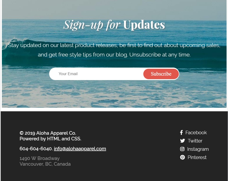
The Project Aloha homepage was created to demostrate effective use of HTML and CSS. It is a mobile-first responsive layout with flexbox and is optimized for three screen sizes - Mobile 480px, Tablet 768px, and desktop. The HTML is syntactically-valid HTML5 code, which the head includes linked stylesheets for CSS, stylized custom fonts, and a Flickity carousel. The HTML has been written with semantically-appropriate HTML elements, while the CSS demostrates effective use of flexbox properties, box model properties and appropriate CSS selectors. A list-based navigation menu has been incorporate which smooth scrolls to specific sub-headings within the page. A Flickity image slider has been implemented for an image slider. Javascript was used to display an alert box that says �Thanks for subscribing!� whenever a user successfully submits the newsletter form with a valid email address, otherwise the alert box asks for the user to enter a valid email address. As a first project, Project Aloha is important to me because it shows effective use of HTML and CSS fundamentals and some Javascript.
- Smooth-scroll to desired sections on the website by clicking on the navigation items.
- Image carousel for 'Most Loved Products'.
- Email alert box that checks for valid email syntax.
HTML5 doctype
- Mobile responsive layout
- Implements Product Type Categories layout with flexbox
- Incorporate custom fonts using @font-face
- Uses Font Awesome for icon fonts
- Incorporates a smooth scroll
- Checks for valid email syntax
- HTML
- CSS
- Flexbox
- Responsive Web Design
- Command Line Interface
- Git
- JavaScript
- jQuery


