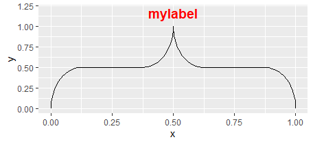
An R package that draws highly modifiable curly braces in ggplot2. The brace can easily be modified and added to an existing ggplot object. ggbrace vizualizes the brace using a ggplot2's geom_path layer.
Table of contents:
- Installation
- Single Brace
- Data-oriented Braces
- Outside of plotting area
- Brace Customization
- Label Customization
Install the package from the git repository:
devtools::install_github("nicolash2/ggbrace")Load the package, create a brace. You can also add a label.
library(ggbrace)
library(ggplot2)

ggplot() + geom_brace()
ggplot() + geom_brace(label="mylabel") + ylim(0,1.2)
Some basic brace adjustments:
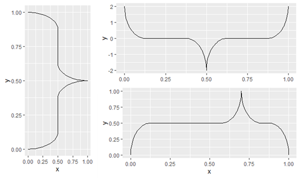
- For a brace pointing sideways, specify "pointing="side".
- To invert the brace, define x and y coordinates so that the start is a higher number than the end.
- To change the pointer position within the brace, change the mid parameter. This is always between 0.25 and 0.75.
ggplot() + geom_brace(pointing="side") #point sideways
ggplot() + geom_brace(ystart=2, yend= -2) #point down instead of up
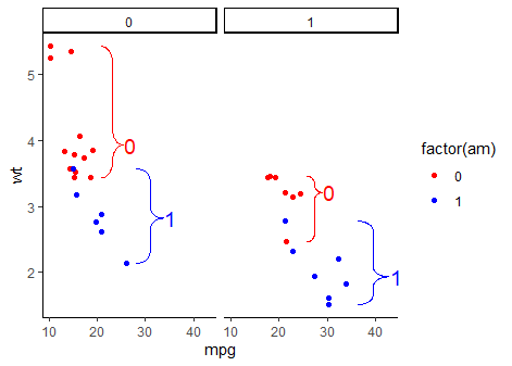
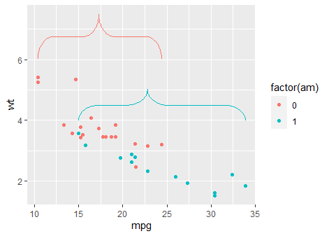
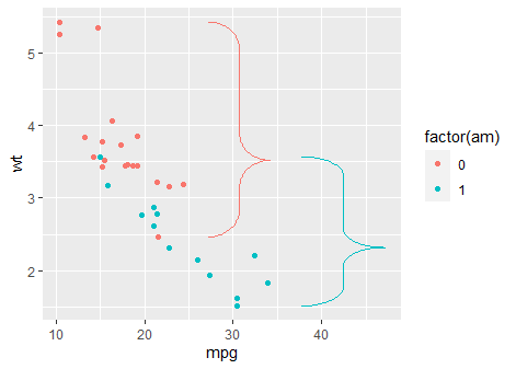
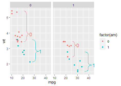
ggplot() + geom_brace(mid=0.7) #shift the brace pointerInstead of defining the brace location ourself, we can use the stat_brace function to generate braces that automatically indicate groups of data points. In these simple examples, we divide the mtcars dataset by the "am" column. The braces will automatically define the borders of the groups. With the rotate arguement we can get braces that point left, right or down. We can also add text, by specifying label in the mapping (aes) arguement.
Note that the brace pointer and the label will be at the data median, unless the user specifies the mid arguement (e.g. mid=0.5 to always be in the middle of the brace).
ggplot(mtcars, aes(mpg, wt, color=factor(am))) +
  geom_point() +
  stat_brace()

ggplot(mtcars, aes(mpg, wt, color=factor(am))) +
  geom_point() +
  stat_brace(rotate=90)

ggplot(mtcars, aes(mpg, wt, color=factor(am))) +
  geom_point() +
  facet_wrap(~vs) +
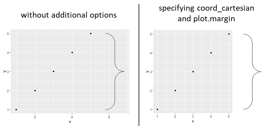
stat_brace(rotate=90, aes(label=factor(am)))To vizualize the brace outside of the plotting area, we can simply use two ggplot functions. coord_cartesian needs to be mentioned with x and/or y range of the plotting area and the parameter clip="off" to allow plotting of objects outside of that area. Secondly, within the theme function, plot.margin needs to be set to expand outside area. This happens with 4 numbers (above, right, below, below, left).
df <- data.frame(x = 1:5, y = 1:5)

ggplot(df, aes(x, y)) +
  geom_point() +
  stat_brace(rotate = 90, width=1)

ggplot(df, aes(x, y)) +
  geom_point() +
  stat_brace(rotate = 90, width=1) +
  coord_cartesian(x=range(data$x), clip = "off") +
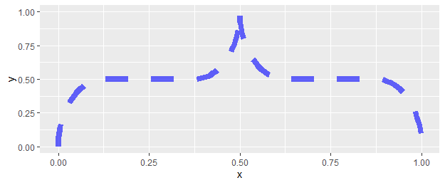
theme(plot.margin = unit(c(0.5, 7, 0.5, 0.5), units="lines")) #0.5 is roughly equal to the default. Most importantly, we set the space to the right to 7.To change how the brace looks like, simply provide the arguements needed by ggplot. This includes all arguements that could be given to geom_path: size, color, linetype, alpha (opacity), lineend and linejoin. The first 3 are examplified here.
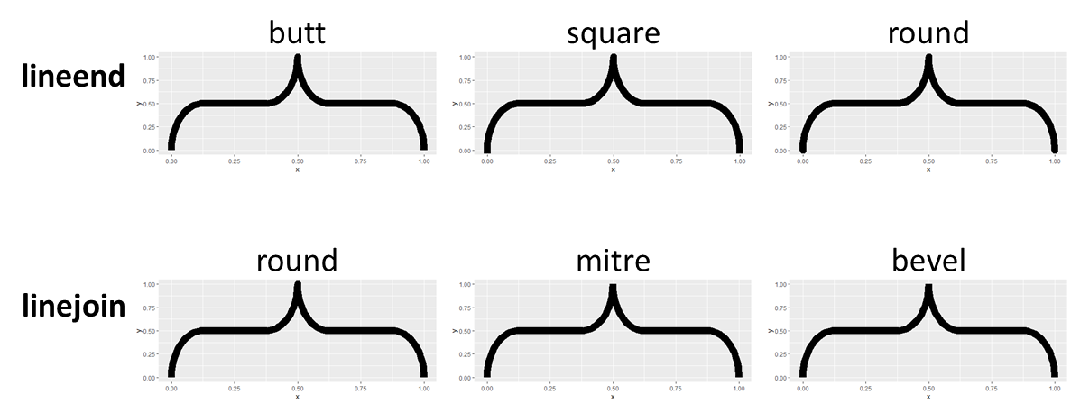
ggplot() + geom_brace(linetype="dashed", color="blue", size=3, alpha=0.6)If the size is bigger than usual, it might make sense to specify how the ends of the brace look like. This can be specified via the lineend and linejoin options (inherent to the ggplot2's geom_path object). They lead to subtle differences.
ggplot() + geom_brace(size=5, lineend="butt")
ggplot() + geom_brace(size=5, linejoin="mitre")
All possible options for:
- linetype: solid (default), dotted, dotdash, twodash, dashed, longdash, blank
- lineend: butt (default), square, round
- linejoin: round (default), mitre, bevel
The label can be customized with the arguement labelsize and labelcolor, as well as any arguements that could be used for ggplot's annotate function, such as fontface or family.
ggplot() +
  geom_brace(label="mylabel", labelcolor="red", fontface="bold") +
  ylim(0,1.2)