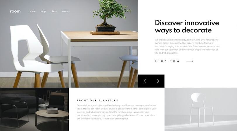
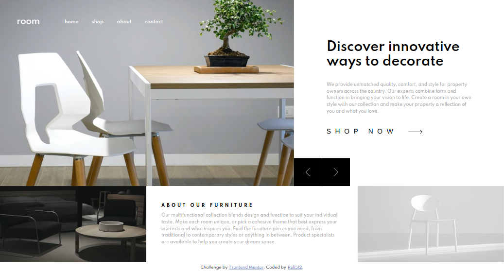
Hi everyone 👋 this is my first challenge that I do on this platform and I thought it would be fun to start with something in between (and it was) And well, in this challenge I wanted to try using only html, css and javascript nothing else but thinking about it a bit I decided to also use webpack to facilitate the import of resources in cases I get to use it and also to put together a small work area to continue making small web pages 😛
Users should be able to:
- View the optimal layout for the site depending on their device's screen size
- See hover states for all interactive elements on the page
- Navigate the slider using either their mouse/trackpad or keyboard
(375px - 1440px) Width
| Mobile Design | Mobile Solution |
|---|---|
 |
 |
| Desktop Design | Desktop Solution |
|---|---|
 |
 |
-
Solution URL: FrontendMentor Solution
-
Live Site URL: https://rufi512.github.io/room-homepage/
- HTML (Lifelong)
- CSS - Flexbox - Grid
- Javascript
- Webpack (To manage packages and more)
- Flickity (To help me with the carrousel)