A simple flash cards app to be used for the GDG Stillwater Android Codelabs.
This tutorial will be assume that you have installed
- Java SDK >= 1.7
- AndroiD Studio beta >= 0.8.2
- Android Built Tools 19.1.0
- It will also asume that you have a working android device to debug or an emulator. I personally recommend genymotion emulator.
Recommended Website to get dependencies: Gradle Please
Open Android Studio and select New Project
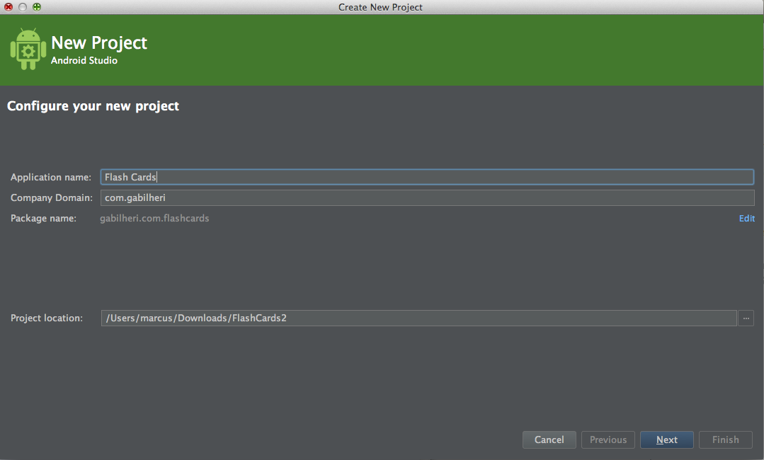 Type in the name of the project and your default Package name as a reverse URL.
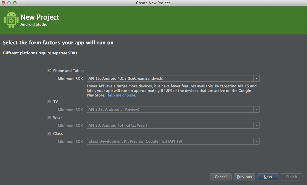 For this project we will use Ice Cream Sandwich (API 15) As our Default SDK.
We only select the Phone and Tablet module as for now those are the only one we use. In a later version of this series of tutorial we will be covering other modules such as the App Engine module for online storage and the Android Wear for integration with Android Wear Watches.
For this project we will use Ice Cream Sandwich (API 15) As our Default SDK.
We only select the Phone and Tablet module as for now those are the only one we use. In a later version of this series of tutorial we will be covering other modules such as the App Engine module for online storage and the Android Wear for integration with Android Wear Watches.
With the SDK 15 we will cover about 86% of all Android Devices.
Tip: To see the coverage of an particular SDK version click on "help me choose"
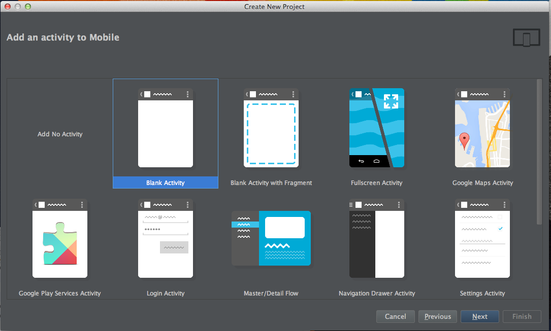 Select blank activty as we want to start this project clean without too much boylerplate.
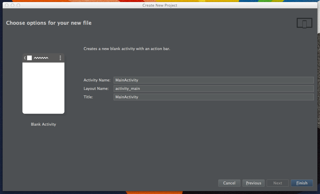 Name the activity, give it a title and select Finish.
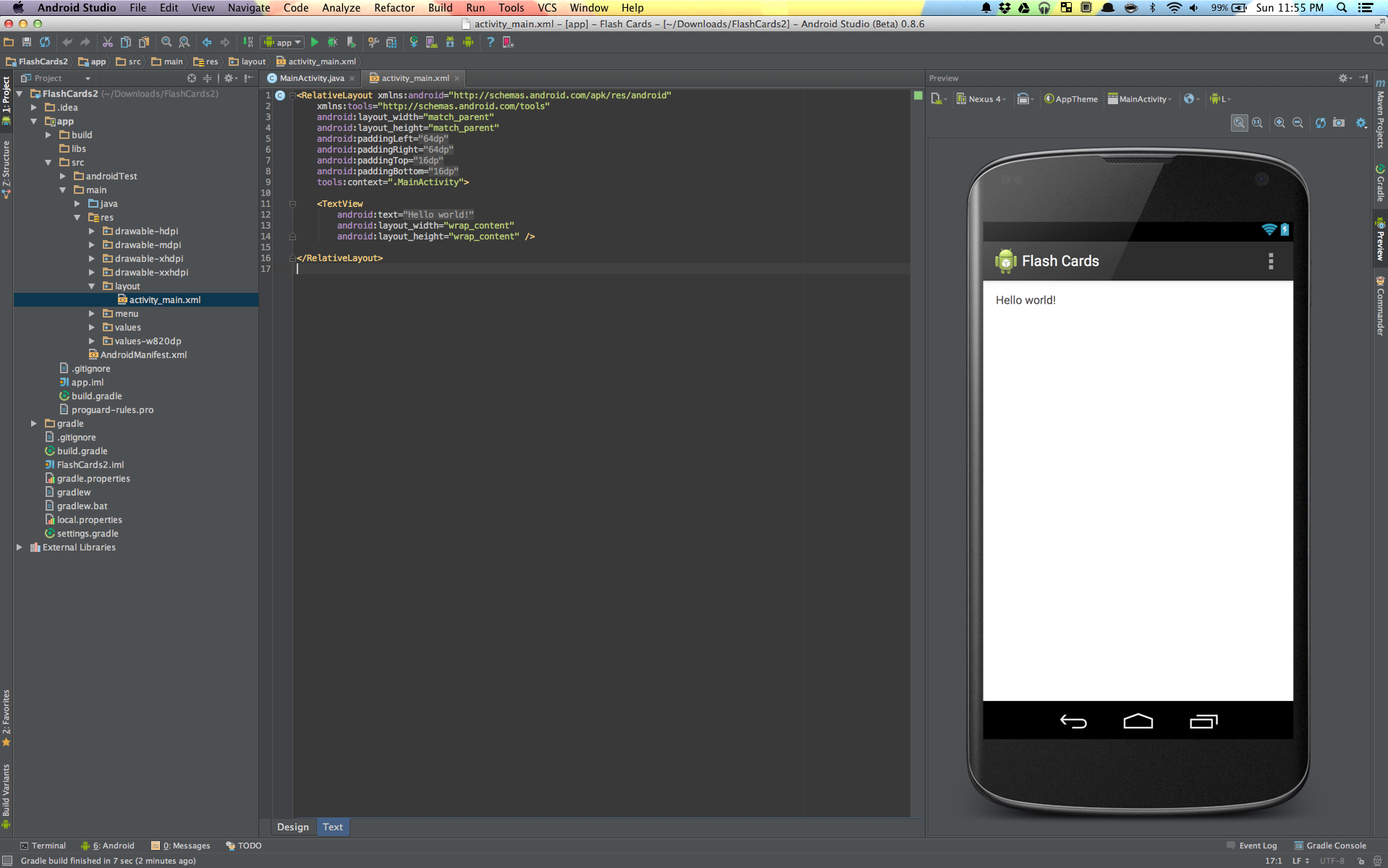 If everything went well the project will now be created and you should be seeing something like this.
Android studio uses the Gradle with the Android plugin to manage it's dependencies and build system. Each of the modules has it's own build.gradle file to manage specific dependencies necessary for each module.
With the newest version of Android Studio sometimes Gradle makes the mistake of setting the app to target SDK 20 which is current the Android Wear SDK so let's change it a little bit.
In the build.gradle file inside the module :app app/build.gradle
apply plugin: 'com.android.application'

android {
    compileSdkVersion 19 // The SDK that we want to compile for
    buildToolsVersion "19.1.0" // The build tools that should be installed in the SDK.

    defaultConfig {
        applicationId "gabilheri.com.flashcards" // This should your application ID do not copy mine.
        minSdkVersion 15 // Here is where we change the  minimum SDK
        targetSdkVersion 19 // The target SDK version. SDK 19 = 4.4 Kit kat
        versionCode 1 // The version Code is used by the Play Store. Every time an update is pushed to the play store the version code should be updated as well.
        versionName "1.0" // Visible version name for the users on the Play Store
    }
    buildTypes {
        release {
            runProguard false
            proguardFiles getDefaultProguardFile('proguard-android.txt'), 'proguard-rules.pro'
        }
    }
}

dependencies {
    compile fileTree(dir: 'libs', include: ['*.jar']) // Will compile all the Libraries inside the 'libs' folder
    compile 'com.android.support:support-v4:19.1.0' // We will be using the support library for the Drawer layout
    compile 'com.github.gabrielemariotti.cards:library:1.6.0' // Very good library to use cards
}
For this app We will be using the standard navigation drawer for the App Navigation and fragments to display the content of each section/card.
If you understand android XML you can copy and paste the following snippet otherwise I recommend that you type it paying attention to each line for a better understanding of what is going on.
<?xml version="1.0" encoding="utf-8"?>
<android.support.v4.widget.DrawerLayout
    xmlns:android="http://schemas.android.com/apk/res/android"
    android:id="@+id/drawer_layout"
    android:layout_height="match_parent"
    android:layout_width="match_parent"
    >

    <!-- Framelayout to display Fragments -->
    <FrameLayout
        android:id="@+id/frame_container"
        android:layout_width="match_parent"
        android:layout_height="match_parent"
        />

    <!-- Listview to display drawer list menu menu -->
    <ListView
        android:id="@+id/list_slidermenu"
        android:layout_width="240dp"
        android:layout_height="match_parent"
        android:layout_gravity="start|bottom"
        android:choiceMode="singleChoice"
        android:divider="@color/drawer_background"
        android:dividerHeight="1dp"
        android:clipToPadding="false"
        android:fitsSystemWindows="true"
        android:listSelector="@drawable/drawer_selector"
        android:background="@color/drawer_background"/>
</android.support.v4.widget.DrawerLayout>
Now we need to create the drawer_selector. A selector is an drawable element, can have different shapes, square, circle, etc.. and can have different states, pressed, selected, etc..
What we will be doing is determining 2 different states for pressed and non pressed so we get a feedback when the user selects something in the Drawer.
Inside main/res/ create a new folder called drawable and make a new element called drawer_background.
<?xml version="1.0" encoding="utf-8"?>
<selector xmlns:android="http://schemas.android.com/apk/res/android">

    <item android:state_selected="true">
        <shape>
            <solid android:color="@color/drawer_selected" />
        </shape>
    </item>

    <item android:state_pressed="true">
        <shape>
            <solid android:color="@color/drawer_selected" />
        </shape>
    </item>

    <item>
        <shape>
            <solid android:color="@color/drawer_background" />
        </shape>
    </item>
</selector>
We also need to provide some Colors Resources for our App. Inside the folder values create a file called Colors. The file will have as it's root element. Add the following colors: (Feel free to use any color scheme you may want)
<!-- Inside colors.xml -->
<?xml version="1.0" encoding="utf-8"?>
<resources>
    <color name="action_bar_color">#0277bd</color>
    <color name="action_bar_text_color">#fafafa</color>
    <color name="drawer_background">#fafafa</color>
    <color name="drawer_selected">#ff9100</color>
</resources>As an Android Developer you might find yourself in the situation of not being able to use fragments or you may want to use different activities with a Drawer Layout. It can also be tedious every time you start a project to code the Nav Drawer boylerplate.
For those reasons we will extend Activity to create a Default DrawerLayoutActivity for our App.
Hint: Read the code carefully and make sure you understand every single aspect before going to the next step. If you don't understand something raise your hand and someone will explain it to you.
public abstract class DrawerLayoutActivity extends Activity {

    private final String LOG_TAG = getLogTag();

    /**
     * Nav Drawer stuff
     */
    private DrawerLayout mDrawerLayout;
    private ListView mDrawerList;
    private ActionBarDrawerToggle mDrawerToggle;
    private CharSequence mDrawerTitle, mTitle;

    @Override
    protected void onCreate(Bundle savedInstanceState) {
        super.onCreate(savedInstanceState);
        setContentView(getLayout());

        // Enabling action bar app and Icon , and behaving it as a toggle button.
        getActionBar().setDisplayHomeAsUpEnabled(true);
        getActionBar().setHomeButtonEnabled(true);

        /**
         * Drawer Layout stuff
         */
        mTitle = mDrawerTitle = getTitle();
        mDrawerList = (ListView) findViewById(R.id.list_slidermenu);
        mDrawerLayout = (DrawerLayout) findViewById(R.id.drawer_layout);
        mDrawerList.setOnItemClickListener(new DrawerListener());

        init();

        mDrawerList.setAdapter(getAdapter());

        mDrawerToggle = new ActionBarDrawerToggle(this, mDrawerLayout,
                R.drawable.ic_navigation_drawer, // Nav drawer Icon
                R.string.app_name, // Nav drawer open - description for accessibility
                R.string.app_name // Nav drawer close
        ) {
            @Override
            public void onDrawerOpened(View drawerView) {
                getActionBar().setTitle(mTitle);
                invalidateOptionsMenu();
            }

            @Override
            public void onDrawerClosed(View drawerView) {
                getActionBar().setTitle(mTitle);
                invalidateOptionsMenu();
            }
        };
        mDrawerLayout.setDrawerListener(mDrawerToggle);

        if(savedInstanceState == null) {
            displayView(0, null);
        }
    }

    @Override
    public boolean onOptionsItemSelected(MenuItem item) {
        if(mDrawerToggle.onOptionsItemSelected(item)) {
            return true;
        }
        return super.onOptionsItemSelected(item);
    }

    @Override
    public void setTitle(CharSequence title) {
        mTitle = title;
        getActionBar().setTitle(mTitle);
    }

    @Override
    protected void onPostCreate(Bundle savedInstanceState) {
        super.onPostCreate(savedInstanceState);
        // Sync the toggle state after onRestoreInstance has occurred
        mDrawerToggle.syncState();
    }

    @Override
    public void onConfigurationChanged(Configuration newConfig) {
        super.onConfigurationChanged(newConfig);
        // Pass any configuration change to the drawer
        mDrawerToggle.onConfigurationChanged(newConfig);
    }

    /**
     * Drawer listener.
     */
    private class DrawerListener implements ListView.OnItemClickListener {
        @Override
        public void onItemClick(AdapterView<?> parent, View view, final int position, long id) {
            /**
             * A handler with a postDelayed is used so it only changes fragments once the drawer is
             * already closed. This can be adjusted if the timing is not right.
             * Similar behavior that most Google apps offers.
             */
            mDrawerLayout.closeDrawer(mDrawerList);
            new Handler().postDelayed(new Runnable() {
                @Override
                public void run() {
                    displayView(position, null);
                }
            }, 300);
        }
    }

    /**
     * Method to define what clicking on the drawer will do.
     *
     * @param position
     *          The position of the clicked item
     * @param fragmentBundle
     *          A bundle in case something needs to be passed to a specific fragment
     */
    public abstract void displayView(int position, Bundle fragmentBundle);

    /**
     * Any specific initializations should go here.
     */
    public abstract void init();

    /**
     * Override this method to change the log tag string;
     * @return
     */
    public String getLogTag() {
        return "DrawerActivity";
    }

    /**
     * Override this method in case of need for a different list colors, etc..
     * Should use same Id's to avoid confusion
     * @return
     *      The Activity layout for this drawer activity
     */
    private int getLayout() {
       return R.layout.drawer_activity;
    }

    /**
     * Getter for the drawer toggle
     * @return
     *      The drawer toggle for this activity
     */
    public ActionBarDrawerToggle getDrawerToggle() {
        return mDrawerToggle;
    }

    /**
     *
     * @return
     *      The List used by the drawer
     */
    public ListView getDrawerList() {
        return mDrawerList;
    }

    /**
     *
     * @return
     *      The Drawer Layout used by this activity
     */
    public DrawerLayout getDrawerLayout() {
        return mDrawerLayout;
    }

    /**
     *
     * Method to be Overriden that will return an Adapter that extends Base Adapter
     * The adapter will them be used by the Drawer Layout
     *
     * @return
     */
    protected abstract BaseAdapter getAdapter();
}The default fragment is where we gonna put the Default Functions that will be true for all fragments.
For now let's just override onInflate() so we avoid errors when inflating an fragment that has already been inflated. We will also override some of the default methods and add some abstract methods so we don't forget to add them later on when creating fragments.
NOTE: Do not copy all the Comments/Javadoc. The javadoc is there just for reading purposes.
If you wan't the javadoc also the easiest way is to generate those methods through Android Studio using the generate menu. (ctrl + N on windows) and (cmd + N on Macs)
/**
* The Default Fragment will be used to set up common behavior features common to all fragments.
 * The default fragment will also enforce us to implement common methods necessary to all fragments.
 * The default Fragment is also used so we avoid errors when trying to inflate a fragment that has already been inflated.
 * All our other Fragments will extend DefaultFragment
 */
public abstract class DefaultFragment extends Fragment {


    @Override
    public void onInflate(Activity activity, AttributeSet attrs, Bundle savedInstanceState) {
        FragmentManager fm = getFragmentManager();
        if (fm != null) {
            fm.beginTransaction().remove(this).commit();
        }
        super.onInflate(activity, attrs, savedInstanceState);
    }


    /**
     * Called to have the fragment instantiate its user interface view.
     * This is optional, and non-graphical fragments can return null (which
     * is the default implementation).  This will be called between
     * {@link #onCreate(android.os.Bundle)} and {@link #onActivityCreated(android.os.Bundle)}.
     * <p/>
     * <p>If you return a View from here, you will later be called in
     * {@link #onDestroyView} when the view is being released.
     *
     * @param inflater           The LayoutInflater object that can be used to inflate
     *                           any views in the fragment,
     * @param container          If non-null, this is the parent view that the fragment's
     *                           UI should be attached to.  The fragment should not add the view itself,
     *                           but this can be used to generate the LayoutParams of the view.
     * @param savedInstanceState If non-null, this fragment is being re-constructed
     *                           from a previous saved state as given here.
     * @return Return the View for the fragment's UI, or null.
     */
    @Override
    public abstract View onCreateView(LayoutInflater inflater, ViewGroup container, Bundle savedInstanceState);

    /**
     * Called immediately after {@link #onCreateView(android.view.LayoutInflater, android.view.ViewGroup, android.os.Bundle)}
     * has returned, but before any saved state has been restored in to the view.
     * This gives subclasses a chance to initialize themselves once
     * they know their view hierarchy has been completely created.  The fragment's
     * view hierarchy is not however attached to its parent at this point.
     *
     * @param view               The View returned by {@link #onCreateView(android.view.LayoutInflater, android.view.ViewGroup, android.os.Bundle)}.
     * @param savedInstanceState If non-null, this fragment is being re-constructed
     */
    @Override
    public abstract void onViewCreated(View view, Bundle savedInstanceState);

    /**
     * @param savedInstanceState
     *         If the fragment is being re-created from
     *         a previous saved state, this is the state.
     */
    @Override
    public void onCreate(Bundle savedInstanceState) {
        super.onCreate(savedInstanceState);
    }

    /**
     * @param menu
     *         The options menu in which you place your items.
     * @param inflater
     *         The inflater for this menu
     * @see #setHasOptionsMenu
     * @see #onPrepareOptionsMenu
     * @see #onOptionsItemSelected
     */
    @Override
    public void onCreateOptionsMenu(Menu menu, MenuInflater inflater) {
        super.onCreateOptionsMenu(menu, inflater);
    }

    /**
     *
     * @param item
     *         The menu item that was selected.
     * @return boolean Return false to allow normal menu processing to
     * proceed, true to consume it here.
     *
     * @see #onCreateOptionsMenu
     */
    @Override
    public boolean onOptionsItemSelected(MenuItem item) {
        switch (item.getItemId()) {
            default:
                return super.onOptionsItemSelected(item);
        }
    }
}Our navigation drawer will have the following format: Icon + Title
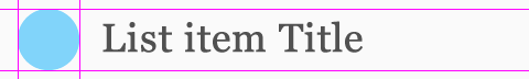
The top and Bottom padding are both 8dp. From the beginning to the end of the Thumbnail there is 72dp. The text is centered. We follow those guidelines to match the new UI Design guidelines established by google. For more metrics guidelines check the google design website.
Now let's translate that picture above to see how it will look like in code. Nav Drawer Item XML:
<?xml version="1.0" encoding="utf-8"?>
<RelativeLayout
    xmlns:android="http://schemas.android.com/apk/res/android"
    android:layout_width="match_parent"
    android:layout_height="72dip"
    android:paddingLeft="@dimen/activity_horizontal_margin"
    android:paddingRight="@dimen/activity_vertical_margin"
    android:paddingBottom="8dip"
    android:paddingTop="8dip"
    android:gravity="center_vertical"
    android:background="@drawable/drawer_selector">

    <ImageView
        android:id="@+id/navDrawerIcon"
        android:layout_width="48dip"
        android:layout_height="48dip"
        android:layout_alignParentLeft="true"
        android:layout_alignParentStart="true"
        android:layout_centerVertical="true" />

    <TextView
        android:id="@+id/navDrawerTitle"
        android:layout_width="wrap_content"
        android:layout_height="match_parent"
        android:layout_toRightOf="@id/navDrawerIcon"
        android:layout_toEndOf="@id/navDrawerIcon"
        android:minHeight="?android:attr/listPreferredItemHeightSmall"
        android:textAppearance="?android:attr/listPreferredItemHeightLarge"
        android:gravity="center_vertical"
    />
</RelativeLayout>
Now we need an Object that will represent the layout we just create. It will be a simple object with just the title of the item and the thumbnail Icon.
public class NavDrawerItem  {

    private String title;
    private Drawable icon;

    public NavDrawerItem(String title, Drawable icon) {
        this.title = title;
        this.icon = icon;
    }

    public String getTitle() {
        return title;
    }

    public void setTitle(String title) {
        this.title = title;
    }

    public Drawable getIcon() {
        return icon;
    }

    public void setIcon(Drawable icon) {
        this.icon = icon;
    }
}
####### Creating the Adapter.
When I just started programming for Android creating Adapters was always one of the scariest things for me. They are an odd structure if you are used to other platformms. We gona create a very simple Base Adapter that will use the Layout and the object we just created to populate a ListView.
NavDrawerAdapter:
public class NavDrawerAdapter extends BaseAdapter {

    private Context context;
    private ArrayList<NavDrawerItem> navDrawerItems;

    /**
     * Default Constructor
     */
    public NavDrawerAdapter() {
    }

    /**
     *
     * @param context
     *      The Context on which this NavDrawer is being created
     * @param navDrawerItems
     *      The ArrayList containing the DrawersItems for the Adapter.
     */
    public NavDrawerAdapter(Context context, ArrayList<NavDrawerItem> navDrawerItems) {
        this.context = context;
        this.navDrawerItems = navDrawerItems;
    }

    public Context getContext() {
        return context;
    }

    public void setContext(Context context) {
        this.context = context;
    }

    public ArrayList<NavDrawerItem> getNavDrawerItems() {
        return navDrawerItems;
    }

    public void setNavDrawerItems(ArrayList<NavDrawerItem> navDrawerItems) {
        this.navDrawerItems = navDrawerItems;
    }

    /**
     * Internally used by the framework.
     * @return
     *      The number of elements on this adapter
     */
    @Override
    public int getCount() {
        return navDrawerItems.size();
    }

    /**
     * The getItem is also necessary. Will be used by the onItemClickListener on the ListView for this adapter
     *
     * @param position
     *      The clicked position
     * @return
     *      The object for the position
     */
    @Override
    public Object getItem(int position) {
        return navDrawerItems.get(position);
    }


    @Override
    public long getItemId(int position) {
        return position;
    }

    /**
     * The GetView is responsible for inflating and creating the View for each one of the items on the ListView
     * To get different behavior on the Items on a List you can do them so on the getView
     * By Example, for a list with alternate colors we could do.
     * if(position % 2 == 0) {
     *     convertView.setBackgroundColor(Color.BLUE);
     * } else {
     *      convertView.setBackgroundColor(Color.RED);
     * }
     * Other Layouts can also be inflated based on the position.
     */
    @Override
    public View getView(int position, View convertView, ViewGroup parent) {

        if(convertView == null) {
            LayoutInflater mInflater = (LayoutInflater) context.getSystemService(Activity.LAYOUT_INFLATER_SERVICE);
            convertView = mInflater.inflate(R.layout.drawer_list_item, null);
        }
        ImageView imageIcon = (ImageView) convertView.findViewById(R.id.navDrawerIcon);
        TextView title = (TextView) convertView.findViewById(R.id.navDrawerTitle);
        title.setText(navDrawerItems.get(position).getTitle());
        imageIcon.setImageDrawable(navDrawerItems.get(position).getIcon());
        return convertView;
    }
}Every great app has resources. Text, icons, etc.. Android devices vary in size so adding icons and assets for your app can be a little tricky. Luckely Android Studio has a nice way of adding image assets. Android studio will them generate the correct size for mdpi, hdpi, xhdpi, and xxhdpi screens.
To add an asset right click on the assets folder and select New > Image Asset
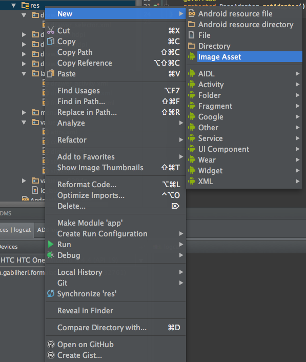
You should now see something like this. We will be creating an asset from an image. Click on the little 3 dots after the image patch.
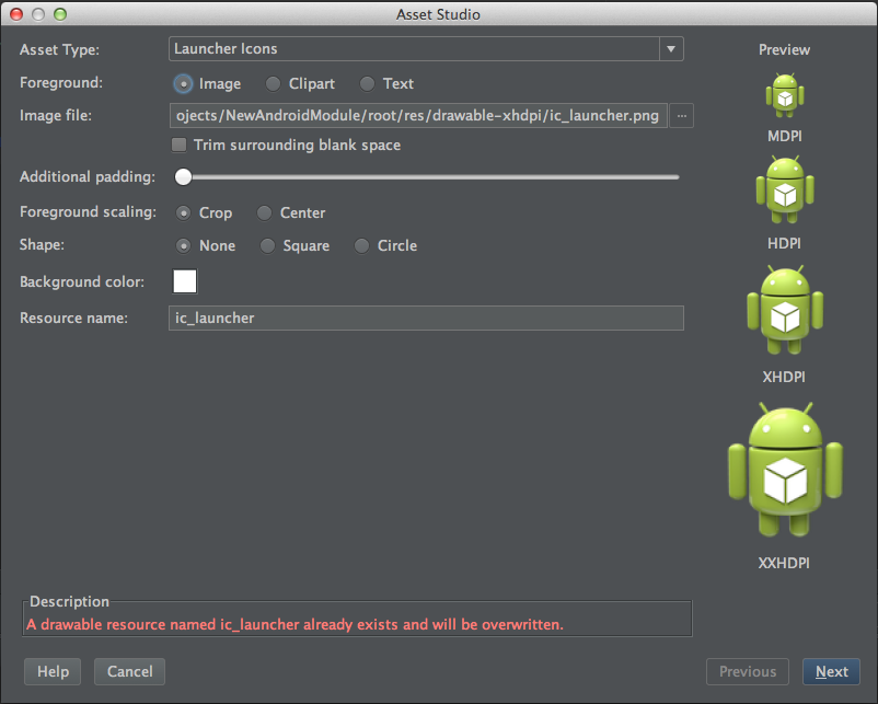
Select an Image. The asset's I'm using can be found on the folder Assets @ this repository. Now you should be seeing something like this. Change the name so we don't override the default app Icon. Keep the App Icon to be called ic_launcher so it is easier to change at anypoint.
hint: A good practice is start your icons with ic_ as the Android framework does not allow subfolders to organize assets
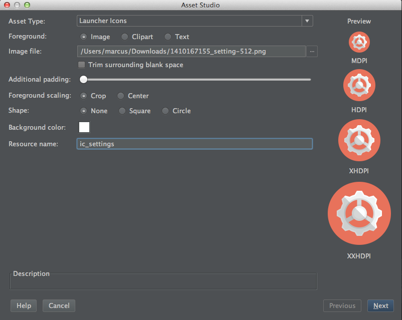
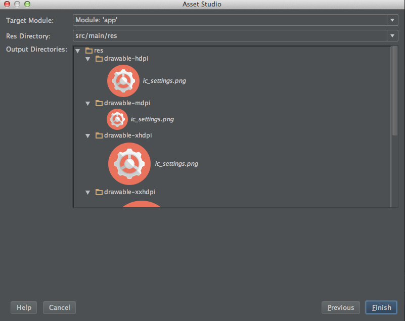
Click on Finish and the icons will be created. Repeat this process to add more icons or change the App Icon
The android framework provides a very nice way of organizing Strings and arrays that will be used across the application. The strings.xml file also helps localizing an app for different languages easily. Strings can be found inside values > strings.xml Open strings.xml and add the following:
    <!-- Navigation Drawer Stuff! -->
    <!-- Nav drawer titles. Can be accessed programaticaly using a String[] -->
    <string-array name="nav_drawer_titles">
        <item>Categories</item>
        <item>Settings</item>
    </string-array>
    <!-- Nav drawer icons. Can be accessed pragmatically using a TypedArray[] -->
    <array name="nav_drawer_icons">
        <item>@drawable/ic_categories</item>
        <item>@drawable/ic_settings</item>
    </array>
<!-- End nav drawer stuff -->We can now delete the code that is inside MainActivity as we already added that inside DrawerLayoutActivity. We will them extend DrawerLayoutActivity and implement the required methods. Now our MainActivity should look like this:
public class MainActivity extends DrawerLayoutActivity {

    @Override
    public void init() {

    }

    @Override
    public void displayView(int position, Bundle fragmentBundle) {

    }

    @Override
    protected BaseAdapter getAdapter() {
        return null;
    }
}Add the following instance variables.
    private NavDrawerAdapter mNavDrawerAdapter;
    private ArrayList<NavDrawerItem> navDrawerItems;
    private String[] navMenuTitles;
Now inside the init() function let's add the code to initialize the adapter:
// inside init();
// Retrieve the typedArray from the XML. Notice the weird Syntax "obtain"
TypedArray navIcons = getResources().obtainTypedArray(R.array.nav_drawer_icons);
navMenuTitles = getResources().getStringArray(R.array.nav_drawer_titles); // Retrieve the titles
navDrawerItems = new ArrayList<NavDrawerItem>(); // Initialize the ArrayList

// Now let's add add items to the ArrayList of NavDrawer items.
for(int i = 0; i < navMenuTitles.length; i++) {
    navDrawerItems.add(new NavDrawerItem(navMenuTitles[i], navIcons.getDrawable(i)));
}
// An typed array can be recycled to avoid waste of System Resources. In our case it wouldn't matter because we only have 2 items.. but is still a good practice.
navIcons.recycle();

mNavDrawerAdapter = new NavDrawerAdapter(this, navDrawerItems);
Not finally we return the created adapter inside getAdapter();
@Override
protected BaseAdapter getAdapter() {
    return mNavDrawerAdapter;
}To match the Android L guidelines we will increase the size of the action bar to 56dp. First open the file dimens.xml and add the following dimension resource.
<dimen name="action_bar_size">56dip</dimen>Now we open styles.xml and add the following styles:
<style name="ActionBarStyle" parent="android:Widget.Holo.Light.ActionBar">
    <item name="android:height">@dimen/action_bar_size</item>
    <item name="android:background">@color/action_bar_color</item>
    <item name="android:titleTextStyle">@style/ActionBarStyleTitle</item>
</style>
<style name="ActionBarStyleTitle" parent="android:TextAppearance.Holo.Widget.ActionBar.Title">
    <item name="android:textColor">@color/action_bar_text_color</item>
</style>
Now inside the AppTheme style we add the register our ActionBarStyle to our AppTheme Style:
<item name="android:actionBarStyle">@style/ActionBarStyle</item>Now if you choose the same colors/Icon as me your app should look something like this. Otherwise it may be slightly different.
For this part of the tutorial I've provided a Floating Action Button class for us to use. Download the Fab Class from this projecr repository. Feel free to take a look at the code. IF you are a Java developer familiar with the Canvas object you will find this very useful as you will see that you can create custom elements using the canvas object.
Once the Fab is Download inside the folder main/res/values create a new XML file and name it attrs and add the following code.
<?xml version="1.0" encoding="utf-8"?>
<resources>
<declare-styleable name="FloatingActionButton">
<attr name="drawable" format="integer"/>
<attr name="color" format="color"/>
<attr name="shadowRadius" format="float"/>
<attr name="shadowDx" format="float"/>
<attr name="shadowDy" format="float"/>
<attr name="shadowColor" format="integer"/>
</declare-styleable>
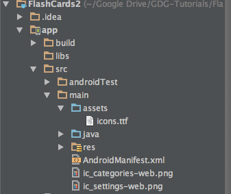
</resources>For this part of the tutorial we will be using the Android Developer Font Icons from SpiderFly Studios: Download Link This handy font file allows us to use Icons as text. By example the letter R is the Delete icon.
Once you have download the ttf file (text type format) put it inside the assets folder. If the folder does not exist create it inside the package main. Your folder structure with the font will look like this:
We also be using the Cards Lib library. CardsLib is a handy library to create UI using Card Elements. Many google apps use card elements for it's layouts. Ex: Google Now, Google+, Google Play Music, etc.. CardsLib documentation can be found here: Cards Lib Docs
The Outer FrameLayout is necessary for the Undo layout used by the CardsLib and is also used by the Floating Button. As you can see we referenced the FloatingActionButton from XML as a normal XML element.
<?xml version="1.0" encoding="utf-8"?>
<FrameLayout
    xmlns:android="http://schemas.android.com/apk/res/android"
    xmlns:card="http://schemas.android.com/apk/res-auto"
    android:layout_width="match_parent"
    android:layout_height="match_parent"
    android:id="@+id/themesFrag" >

    <RelativeLayout
        android:layout_width="match_parent"
        android:layout_height="match_parent">
        <!-- You can customize this layout.
         You need to have in your layout a `CardView` with the ID `list_cardId` -->
        <it.gmariotti.cardslib.library.view.CardListView
            android:paddingTop="@dimen/activity_vertical_margin"
            android:id="@+id/categoriesList"
            android:layout_width="match_parent"
            android:layout_height="match_parent"
            android:clipToPadding="false"
            android:fadingEdge="none"
            card:list_card_layout_resourceID="@layout/list_card_thumbnail_layout"
            style="@style/list_card.thumbnail"/>

    </RelativeLayout>

    <gabilheri.com.flashcards.fab.FloatingActionButton
        android:id="@+id/addNewCategory"
        android:layout_gravity="bottom|end"
        android:text="j"
        android:shadowRadius="40"
        android:shadowDx="5"
        android:shadowDy="7"
        android:textColor="@color/action_bar_text_color"
        android:layout_marginBottom="@dimen/activity_horizontal_margin"
        android:layout_marginRight="@dimen/activity_vertical_margin"
        android:layout_width="72dip"
        android:layout_height="72dip" />

    <!-- Include undo message layout -->
    <include layout="@layout/list_card_undo_message"/>
</FrameLayout>This fragment will be specially long as there is detailed Javadocs for each one of the overriden methods.
public class FragmentCategories extends DefaultFragment {

    /**
     * Declare the Instance variables that will be used by this fragment
     */
    private List<Card> mCardsList;
    private CardListView mCategoriesList;
    private CardArrayAdapter mCardAdapter;
    private FloatingActionButton buttonFab;


    @Override
    public View onCreateView(LayoutInflater inflater, ViewGroup container, Bundle savedInstanceState) {
        this.setHasOptionsMenu(true); // We use this so we can have specific ActionBar actions/icons for this fragment
        // We return the inflated view to be used by onViewCreated.
        // The first argument is the XML layout to be inflated
        // The second argument is the root to which this layout is being attached.
        // The third argument we specify if we want the fragment to be attached to it's root.
        return inflater.inflate(R.layout.fragment_categories, container, false);
    }

    @Override
    public void onViewCreated(View view, Bundle savedInstanceState) {
        super.onActivityCreated(savedInstanceState);

        // Initialize the FloatingActionButton and set it's colors
        buttonFab = (FloatingActionButton) view.findViewById(R.id.addNewCategory);
        buttonFab.setColor(getResources().getColor(R.color.action_bar_color));
        buttonFab.setTextColor(getResources().getColor(R.color.action_bar_text_color));

        // We initialize the CardsList and add some Dummy Data for now.
        // We will come back to this point to add our Custom Card matching our App UI as well with real data from a Database.
        mCategoriesList = (CardListView) view.findViewById(R.id.categoriesList);
        mCardsList = new ArrayList<Card>();
        for (int i = 0; i < 10; i++) {
            Card card = new Card(getActivity());
            card.setTitle("Category " + i);
            mCardsList.add(card);
        }
        mCardAdapter = new CardArrayAdapter(getActivity(), mCardsList);
        mCardAdapter.setEnableUndo(true);
        mCategoriesList.setAdapter(mCardAdapter);
    }
}We are going to provide some animations for the Fragments. We will be using some really simple fade in and fade out animations to switch in between fragments.
- Create a folder for the animation resourses inside res called
animator - Create 2 animations inside animator,
alpha_in.xmlandalpha_out.xml - For more Information about ObjectAnimator see the documentation
Code for alpha_in:
<?xml version="1.0" encoding="utf-8"?>
<set xmlns:android="http://schemas.android.com/apk/res/android">
    <objectAnimator xmlns:android="http://schemas.android.com/apk/res/android"
        android:interpolator="@android:interpolator/accelerate_quad"
        android:valueFrom="0"
        android:valueTo="1"
        android:propertyName="alpha"
        android:duration="@android:integer/config_longAnimTime" />
</set>
Code for alpha_out:
<?xml version="1.0" encoding="utf-8"?>
<set xmlns:android="http://schemas.android.com/apk/res/android">
    <objectAnimator xmlns:android="http://schemas.android.com/apk/res/android"
        android:interpolator="@android:interpolator/accelerate_quad"
        android:valueFrom="1"
        android:valueTo="0"
        android:propertyName="alpha"
        android:duration="@android:integer/config_longAnimTime" />
</set>We will be using fragments for this app. Fragments allow us great flexibility. Fragments is also a preferred way of dealing with interface than Activities. Our fragments will be put on the position of the FrameLayout that is inside our Acitvity.
To do this let's change some code in our activity. We will now put some code inside displayView() to change which fragment is being loaded.
First add the following instance variable and constants to our activity:
// We use this to know which of the items has been selected.
// We name the items so we know which one is which.
public static final int CATEGORIES_FRAG = 0;
public static final int SETTINGS_FRAG = 1;
private DefaultFragment activeFragment = null;
The constants are a good way of representing which position has been clicked. The position is basically the position of the MenuItem inside the navDrawerTitles array. We also declare a DefaultFragment as null. This will allow us to reference the active fragment on the activity easily.
Now let's add some code to our displayView():
// Inside Display View...
switch (position) {
    case CATEGORIES_FRAG:
        activeFragment = new FragmentCategories(); // Set the ActiveFragment to our selected item on the list
        break;
    case SETTINGS_FRAG:
        break;
    default:
        break;
}
if(activeFragment != null) {
    FragmentManager fragmentManager = getFragmentManager(); // Get the fragmentManager for this activity
    fragmentManager.beginTransaction() // Start the transaction of fragment change
            .setCustomAnimations(R.animator.alpha_in, R.animator.alpha_out, // Animations for the fragment in...
                    R.animator.alpha_in, R.animator.alpha_out) // Animations for the fragment out...
            .replace(R.id.frame_container, activeFragment) // We then replace whatever is inside FrameLayout to our activeFragment
            .commit(); // Commit the change
    // update selected item and title
    getDrawerList().setItemChecked(position, true); // We now set the item on the drawer that has been cliced as active
    getDrawerList().setSelection(position); // Same concept as above...
    setTitle(navMenuTitles[position]); // We not change the title of the Action Bar to match our fragment.
} else {
    Log.i(getLogTag(), "Error creating fragment"); // if the fragment does not create we Log an error.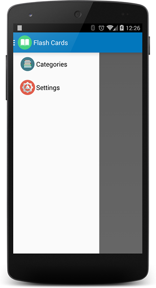
}Now our categories should look something like this....
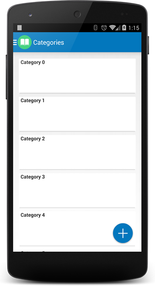
I known is not very exciting yet.. but it is a start :) The next part of the tutorial will be thinking more on our overall structure of the app and the DataStructures that we will be using. Some things that we wish to have to start with are: Categories, Decks, FlashCards.