Updated: Release 2.0 went live on 20 Sep 2022 (see release notes below)
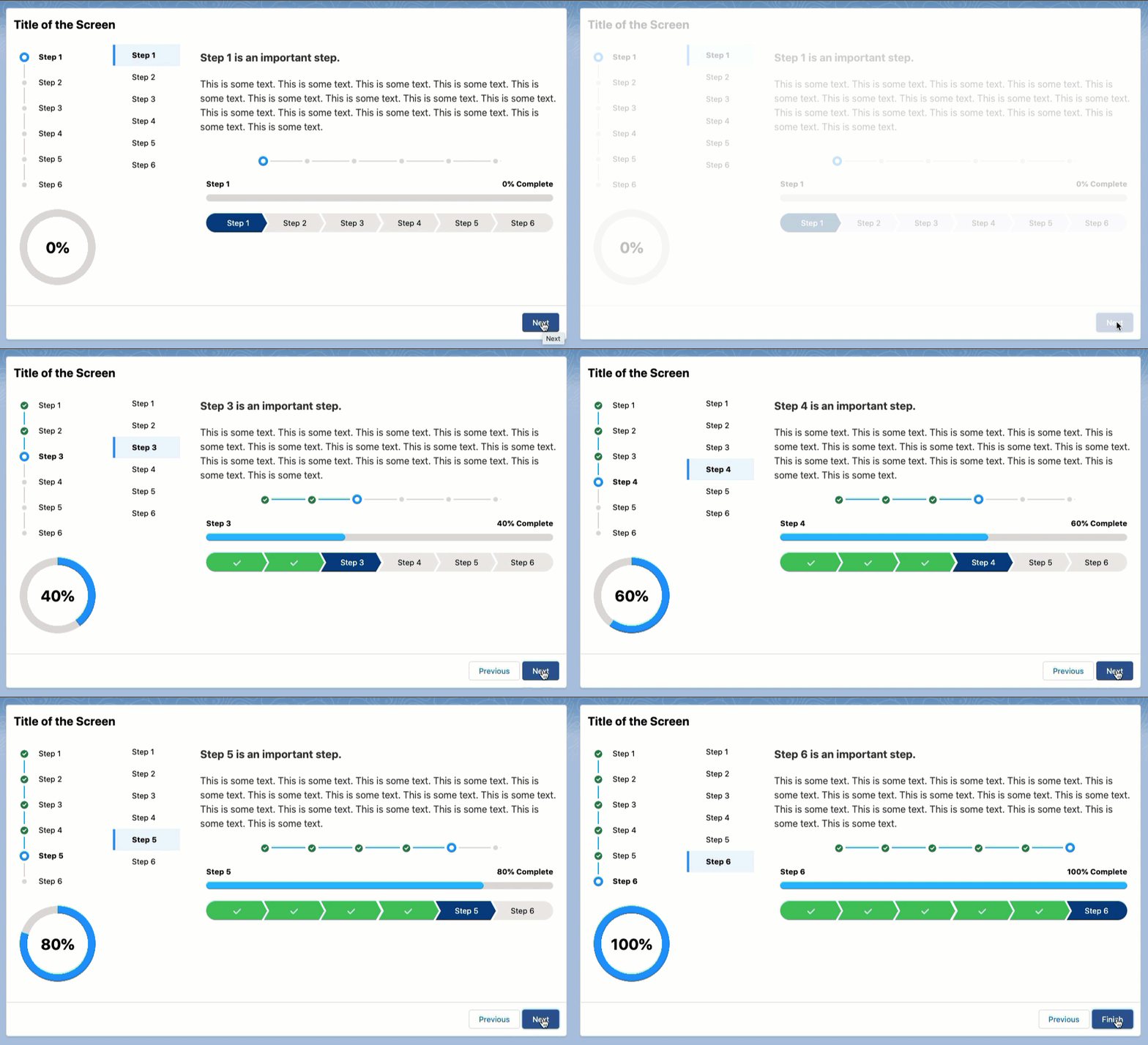
This package includes an LWC component that displays 6 different kinds of progress indicators on your Flow screens, to provide your users with easy-to-understand, guided screen flows.
Please note: this is not a navigation component; it provides a visual representation of which step a user is on in a multi-step process.
This component can be used on a Flow screen to indicate the steps in a flow and the progress made by the user:
- New LWC version just in time for Dreamforce '22!
- 6 different indicator types (see below for list and screenshots)
- Override completion % value with your own flow variable (Progress Bar and Progress Ring only)
- Additionally, it uses Custom Labels for display and assistive text, making it friendly for translation into other languages.
- This is not a navigation component; it provides a visual representation of which step a user is on in a multi-step process.
This single component can display one of six indicator types:
| Indicator Type | Screenshot |
|---|---|
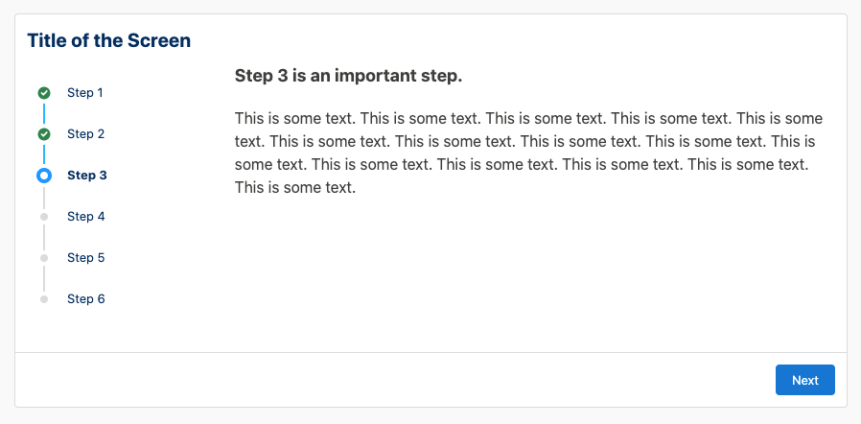
| “Vertical” To use, enter Vertical as your Indicator Type.Based on the vertical variant of the SLDS Progress Indicator component blueprint. |
 |
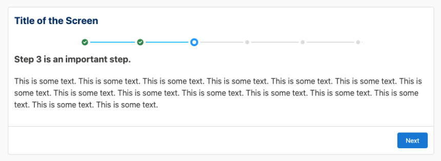
| “Horizontal” To use, enter Horizontal as your Indicator Type.Based on the base variant of the SLDS Progress Indicator component blueprint. |
 |
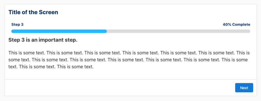
| “Bar” To use, enter Bar as your Indicator Type.Based on the descriptive variant of the SLDS Progress Bar component blueprint. The percentage is auto-calculated based on the current number of completed steps, but it can be overridden if you want to show a different number. See the Setup section above. |
 |
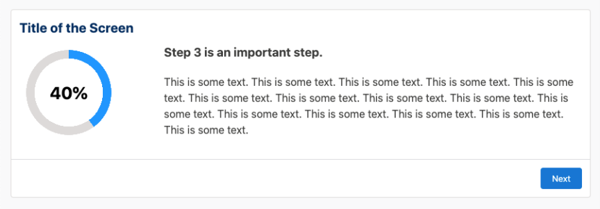
| “Ring” To use, enter Ring as your Indicator Type.A generic progress ring that mimics SLDS styles. The percentage is auto-calculated based on the current number of completed steps, but it can be overridden if you want to show a different number. See the Setup section above. |
 |
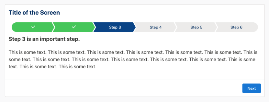
| “Path” To use, enter Path as your Indicator Type.Based on the traditional SLDS Path component blueprint. |
 |
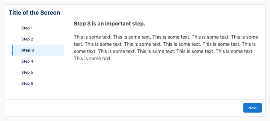
| “VertNav” To use, enter VertNav as your Indicator Type.Based on the list variant of the SLDS Vertical Navigation component blueprint. |
 |
Please see the Disclaimer (below)
- Install from the AppExchange: https://appexchange.salesforce.com/appxListingDetail?listingId=a0N3u00000Pt7yzEAB
- Add the Dynamic Flow Progress component to a screen element.
- Configure the component’s properties (see below).
- Rinse and repeat on other screens in your flow.
- View the "Dynamic Flow Progress LWC - Sampler" flow for configuration examples.
When you add this component to a Flow screen, there are a few properties to configure:
| Attribute | Description |
|---|---|
| Comma-Separated List of Steps | Add the full list of steps that will make up the indicator. To save yourself from accurately configuring this list across multiple screens, create a text constant with that comma-separated list of steps in it, and then reference that constant in this property. Now, when there are changes to your list of steps, you only have to update the value of your constant - not each and every instance of this component. |
| Current Step | Add the value of the current step. Make sure this value exactly matches the spelling of the step found in the comma-separated list. |
| Indicator Type | You can add one of the following values: Vertical, Horizontal, Bar, Ring, Path, or VertNav. These are explained below. |
| Current Step Percentage Completion | OPTIONAL. The percentage shown in the Bar and Ring indicator types is auto-calculated based on the current number of completed steps, but it can be overridden if you want to show a different number. To use the auto-calculated %: Do nothing - just leave the this property blank. To override: In the component’s configuration, add a value to this property. The value needs to be an integer between 0 and 100 and it can be a static value or a variable that you’ve calculated. |
Text and assistive text that displays in the component uses Custom Labels so that you can translate it into languages other than English. I include the translations themselves but my apologies if I've butchered your mother tongue (start a discussion if you have better translations for these labels or if you want me to add support for your language):
- DFP_Complete – In the Bar indicator type, this is the text that follows the current % (e.g. 20% Complete). It is also used for assistive text to designate previously completed steps in the indicator.
- DFP_Current – used for assistive text only to designate the current step in the indicator.
- DFP_Upcoming – used for assistive text only to designate an upcoming step in the indicator.
Once you have enabled Translation Workbench and added supported languages in your org, you can create translations that will override the default English values (from Setup, visit Custom Labels; see this help article).
Q: Is there an easier way to create a reusable list of steps to use in the Comma-Separated List of Steps property? It’s tedious to have to enter the list on every screen where I’m using the component.
A: Yes! Create a Constant resource (Type = Text) that contains your comma-separated list of steps. Then, just reference that constant in this property every time you use the component. Now, when there are changes to your list, you only have to manage the value of your constant and it takes effect across all instances of the component.
Q: Can I easily customize the colors/branding?
A: This solution focuses on delivering a component that’s on-brand for the Salesforce Lightning Design System (SLDS). As such, the component is mildly influenced by branding/theming when deployed in an Experience Cloud site. You may use the source code in this repository to develop your own branded progress indicators or CSS overrides in Experience Builder to affect the coloring/branding.
Q: Can I easily customize translate text that's part of the component?
A: Yes! See the section (above) about the Custom Labels available for translation.
- Not intended for use with screen flows embedded in Visualforce. Not even tested. Users have reported issues by using the Aura version this way, so it is not at all recommended.
- The Aura version is deprecated as of v2.0 and will no longer be supported, even if it remains in the package to support existing use. Replace it with the new LWC version of the component in your existing flows to receive the best experience. As an Aura component, you will not be able to use it in flows presented in LWR Experience Cloud templates (please see Salesforce documentation for Considerations for Using Flows in LWR).
- The Ring indicator type is known to be finnicky when it exists on a Lightning or Experience page where more than one instance of the Ring indicator is present. Its UI currently depends on overriding styles at a root level, so multiple instances of a Ring on the same page will display identically, even when they are embedded in separate screen flows on the page.
2.0 Dreamforce Release (20 Sep 2022)
- Dynamic Flow Progress is now available as an LWC with proven support for internal and external facing screen Flows. The new LWC version is meant to replace the original Aura component.
- New LWC version has been fully tested in standard Aura and LWR Experience Cloud templates (Issue #3) and resolves Issue #5.
- New finish behavior! When you are viewing the component on the final screen, the indicator will appear with the final step showing as completed. Previously, the final step for some indicator types showed as the current step.
- Now includes the missing Translation metadata to provide the rough label translations for English, French, German, Italian, and Spanish (if you are a native speaker and have better translations for the custom labels, or want me to add support for your language, please start a discussion).
- Legacy Aura version has been left in the package to support existing use, but is considered deprecated as of this release. It is has been relabeled "zDynamic Flow Progress (Old)" to reduce confusion when viewing components in Flow Builder. Final updates before deprecation: received the fix to Issue #5 and it was tested in standard Aura and LWR Experience Cloud templates to help avoid Issue #3.
1.2 Initial release (24 Nov 2021) - Initial version of the package published to the AppExchange.
Mitch Lynch (egyptguy), Salesforce
v2.0 would not have been possible without my beta testers! Many thanks to Salesforce's own Ruchita Gathani (ruchitagathani), Ibrahim Khokhar, David Nava (navafit), Nicole Peters, Robyn Rowley, and Don Tennant for their steadfast help in preparing this app for our customers.
Many thanks to John Meyer (johnsfdemo) and the Salesforce Global Public Sector's Platform Blackbelts for their encouragement and feedback on this component!
THIS APPLICATION IS PROVIDED BY THE COPYRIGHT HOLDERS AND CONTRIBUTORS "AS IS" AND ANY EXPRESS OR IMPLIED WARRANTIES, INCLUDING, BUT NOT LIMITED TO, THE IMPLIED WARRANTIES OF MERCHANTABILITY AND FITNESS FOR A PARTICULAR PURPOSE ARE DISCLAIMED. IN NO EVENT SHALL THE COPYRIGHT OWNER OR CONTRIBUTORS BE LIABLE FOR ANY DIRECT, INDIRECT, INCIDENTAL, SPECIAL, EXEMPLARY, CONSEQUENTIAL OR SIMILAR DAMAGES (INCLUDING, BUT NOT LIMITED TO, PROCUREMENT OF SUBSTITUTE GOODS OR SERVICES; LOSS OF USE, DATA, OR PROFITS; OR BUSINESS INTERRUPTION) HOWEVER CAUSED AND ON ANY THEORY OF LIABILITY, WHETHER IN CONTRACT, STRICT LIABILITY, OR TORT (INCLUDING NEGLIGENCE OR OTHERWISE) ARISING IN ANY WAY OUT OF THE USE OF THIS APPLICATION, EVEN IF ADVISED OF THE POSSIBILITY OF SUCH DAMAGE.
SUBJECT TO THE FOREGOING, THIS APPLICATION MAY BE FREELY REPRODUCED, DISTRIBUTED, TRANSMITTED, USED, MODIFIED, BUILT UPON, OR OTHERWISE EXPLOITED BY OR ON BEHALF OF SALESFORCE.COM OR ITS AFFILIATES, ANY CUSTOMER OR PARTNER OF SALESFORCE.COM OR ITS AFFILIATES, OR ANY DEVELOPER OF APPLICATIONS THAT INTERFACE WITH THE SALESFORCE.COM APPLICATION, FOR ANY PURPOSE, COMMERCIAL OR NON-COMMERCIAL, RELATED TO USE OF THE SALESFORCE.COM APPLICATION, AND IN ANY WAY, INCLUDING BY METHODS THAT HAVE NOT YET BEEN INVENTED OR CONCEIVED.

