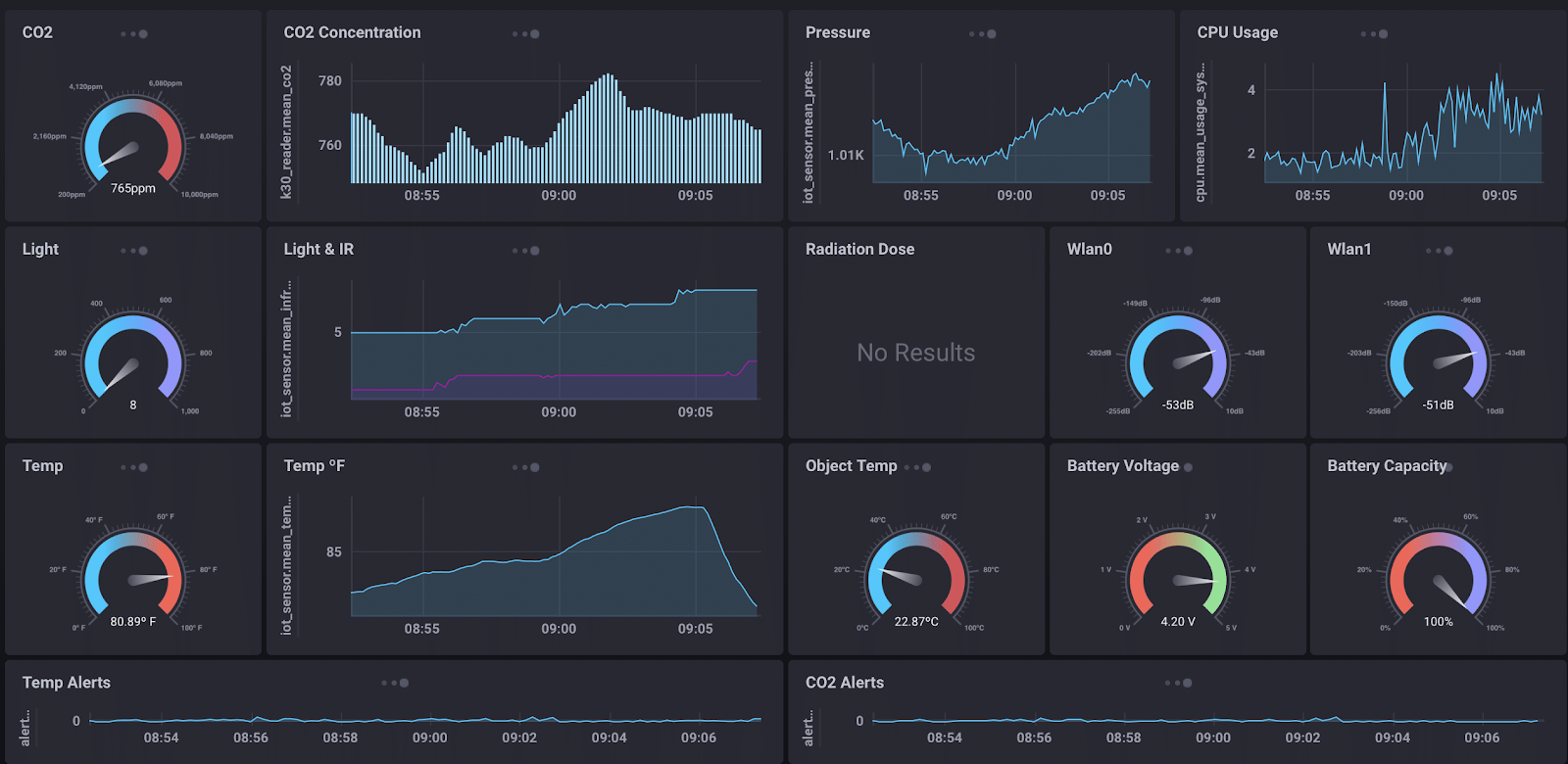
Chronograf is a web application that allows you to build dashboard style data widgets from a variety of source such as InfluxDB for alerts from Kapacitor. Chronograph is an example of a human machine interface (HMI). Human machine interfaces are flexible software programs that allow people to control and receive analytics from different network enabled industry 4.0 machines.
With chronograph you can do the following:
- Infrastructure monitoring
- Alert management
- Data visualization
- Database management
- Multi-organizational or multi-user support
Pre-created dashboards
Chronograph has a large number of precreated dashboards to help you jumpstart your HMI.
- apache
- consul
- docker
- elasticsearch
- haproxy
- iis
- influxdb
- kubernetes
- memcached
- mesos
- mysql
- nginx
- nsq
- phpfpm
- ping
- postgresql
- rabbitmq
- redis
- riak
- system
- varnish
- win_system
cd ~/Downloads
wget https://dl.influxdata.com/chronograf/releases/chronograf_1.7.14_amd64.deb
sudo dpkg -i chronograf_1.7.14_amd64.deb
chronograf
Go to the docker_setup directory and open the config/telegraf.conf file
Go to the INPUT PLUGINS section of the configuration file. This section begins at line 1277. If you are using vim type :1277 to jump to the line.
remove all the # comments to match the above image, hit "esc", type :wq, and hit "Enter"
Then rebuild and restart the Intel Edge Insights Software services
cd /home/eis/Workshop/IEdgeInsights-v1.5LTS/docker_setup
sudo make build run
Now open a browser and go to http://localhost:8888
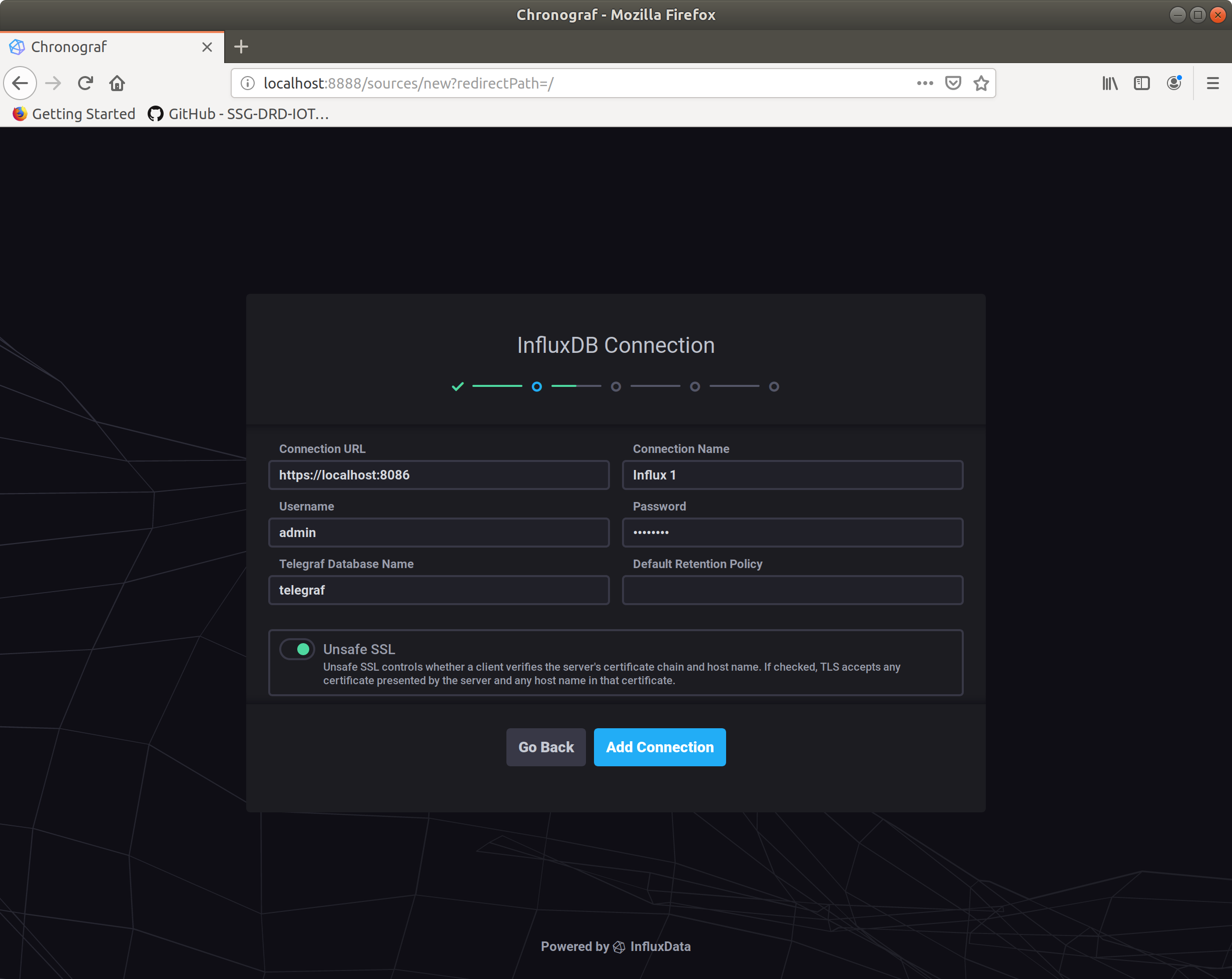
You will have to connect to the InfluxDB database that is running as part of EIS.
Use the following settings:
- connection URL: https://localhost:8086
- Connection Name: Influx 1
- Username: admin
- Password: admin123
Select the "Unsafe SSL" switch
When asked to create dashboard select the InfluxDB option.
You can skip the rest of the settings and connections for this lab.
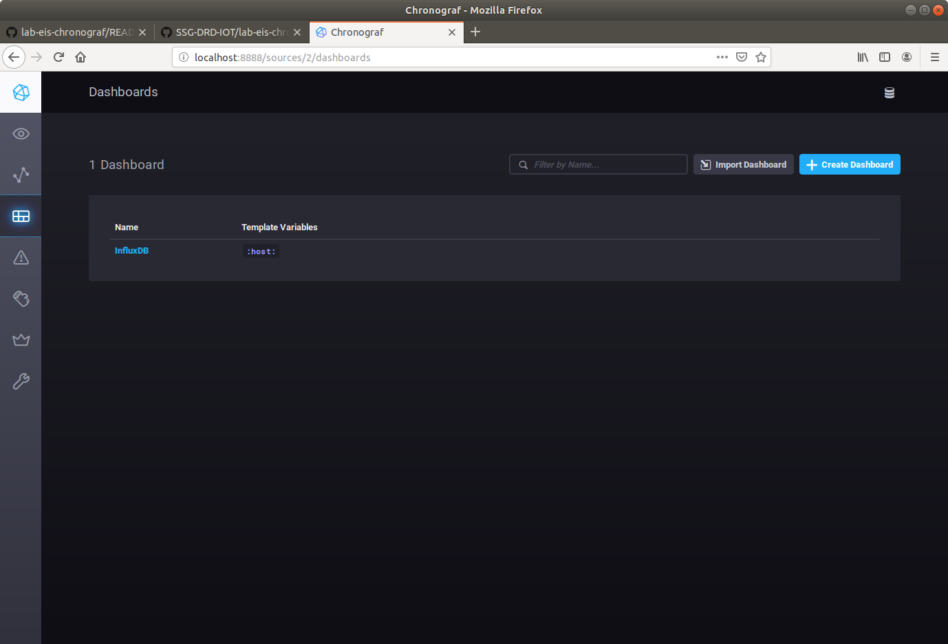
On the left, you will see a menu bar. Click on the Dashboards link and select the InfluxDB dashboard.
You will be presented with chronograf's initial interface.
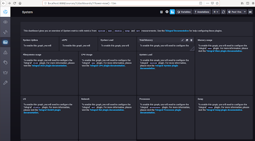 Here you see links to instructions on how to configure Telegrah to capture different system metrics.
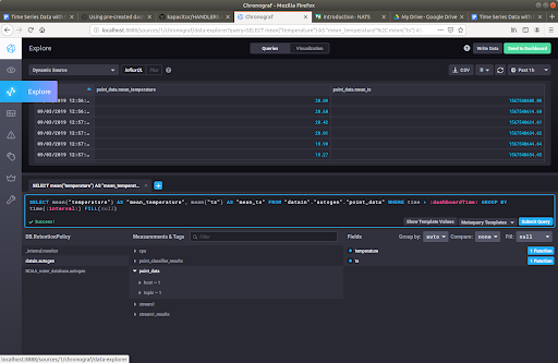
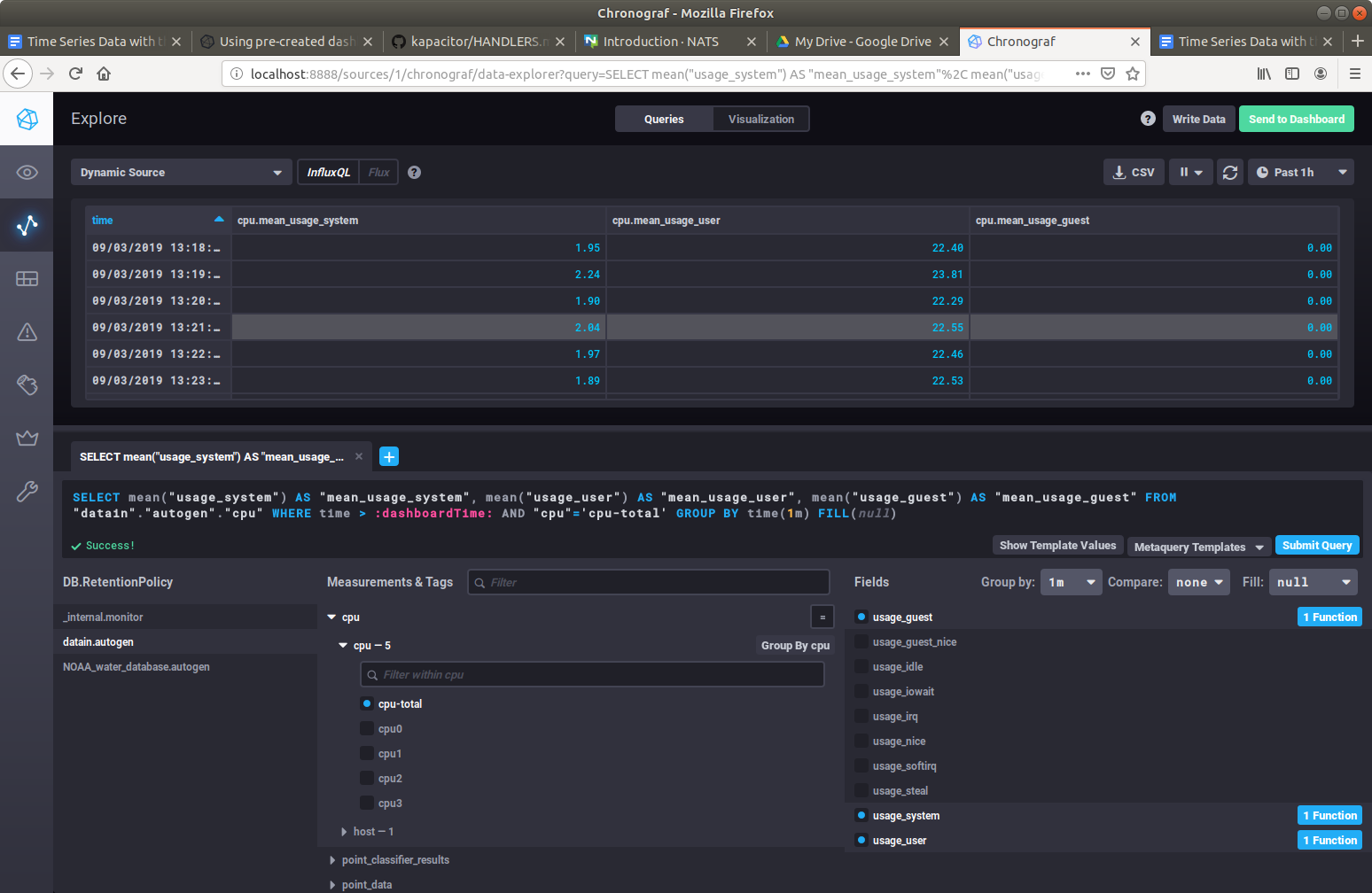
Next go to the left menu bar and click on the Explore menu item. This will bring you to a screen that let's you explore the measurements that are being recorded by InfluxDB.
Let's type a query and display the results. This query will select the cpu system utilization and the cpu user utilization measurements averaged over a 1 minute intervals.
SELECT mean("usage_system") AS "mean_usage_system", mean("usage_user") AS "mean_usage_user", mean("usage_guest") AS "mean_usage_guest" FROM "datain"."autogen"."cpu" WHERE time > :dashboardTime: AND "cpu"='cpu-total' GROUP BY time(1m) FILL(null)Now go to the upper right side of Chronograf and select the button that says Send to Dashboard
Give your dashboard the name Intel Edge Insights Software and label the cell name as CPU Total: 1 Min Avg
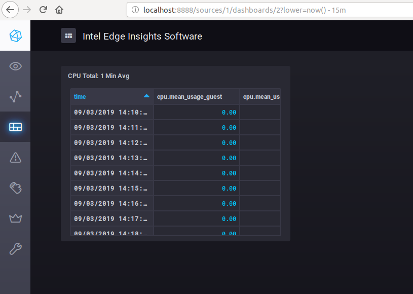
Now if you go back to the dashboard screen, you will see a new dashboard named, Intel Edge Insights Software. The dashboard contains the CPU Total: 1 Min Avg data cell.
To convert this table of measurements into a chart, go to the dashboard and click on the edit icon and select configure in the top right of the cell.
Now at the top select Visualization. The visualization options are easy to use and quite extensive.
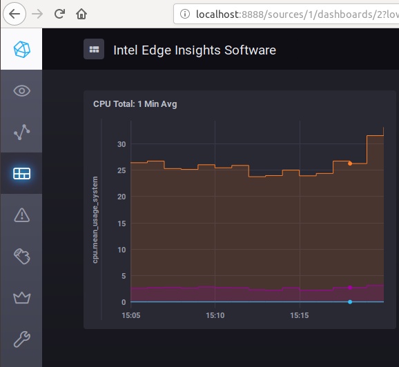
Select Step Plot chart in the lower left.
** You now have a Step-Plot of your systems CPU Utilization **
Now that you've add the CPU utilization over 1 minute intervals to the dashboard, let repeat the process for our simulated data that we configured in the time series lab.
Here are the steps:
- Go to the Explore Page and enter the following query:
SELECT mean("temperature") AS "mean_temperature" FROM "datain"."autogen"."point_data" WHERE time > :dashboardTime: AND "topic"='temperature/simulated/0' GROUP BY time(1m) FILL(null)- Click on the Visualization button at the top center of the screen
- Choose the Bar graph.
- Click on the Send to Dashboard button in the top right of the screen.
- Choose the Intel Edge Insights Software dashboard and give it the cell name of Temperature: 1 Min Avg
You should now have a dashboard with two cells displaying the CPU Utilization and Temperature: 1 Min Avg graphs.
Congratulations! You have successfully configured telegraph to collect CPU and temperature data, entered queries for both the CPU and the simulated temperature data, and converted those into cells that can be displayed on a HMI dashboard.
Spend a little bit of time setting up your own data cells. Try to be creative and show your information in an interesting way.
