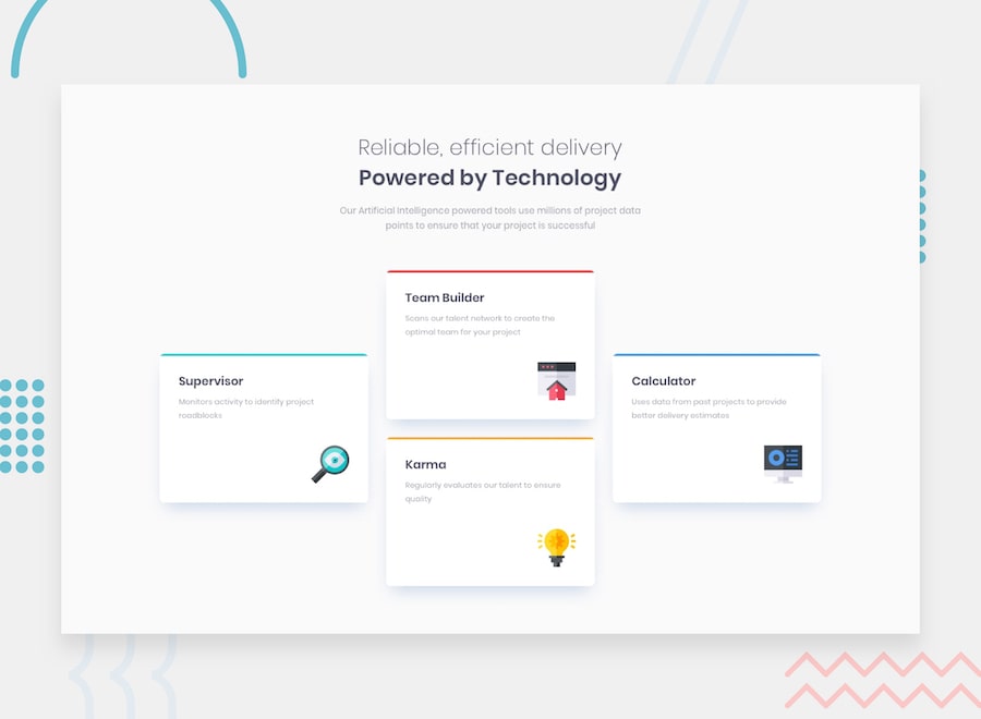
This is a solution to the Four card feature section challenge on Frontend Mentor. Frontend Mentor challenges help you improve your coding skills by building realistic projects.
Users should be able to:
- View the optimal layout for the site depending on their device's screen size
- Solution URL: (https://github.com/Honko-o/FEM-Four-Card-Feature-Section-Master)
- Live Site URL: (https://honko-o.github.io/FEM-Four-Card-Feature-Section-Master/)
I Started on Phone Design and I worked my way up nothing too fancy I Added Container to contain all the design and that's it.
- Semantic HTML5
- CSS Flexbox
- CSS BEM Naming Convention
- Mobile-first Approach
I Applied what I learnt recently about BEM css naming convention and I think this BEM made my css more readable and made me understand the power of utilities classes much more.
- BEM - This Helped me understand BEM idea it's very useful.
- Frontend Mentor - @Honko-o
