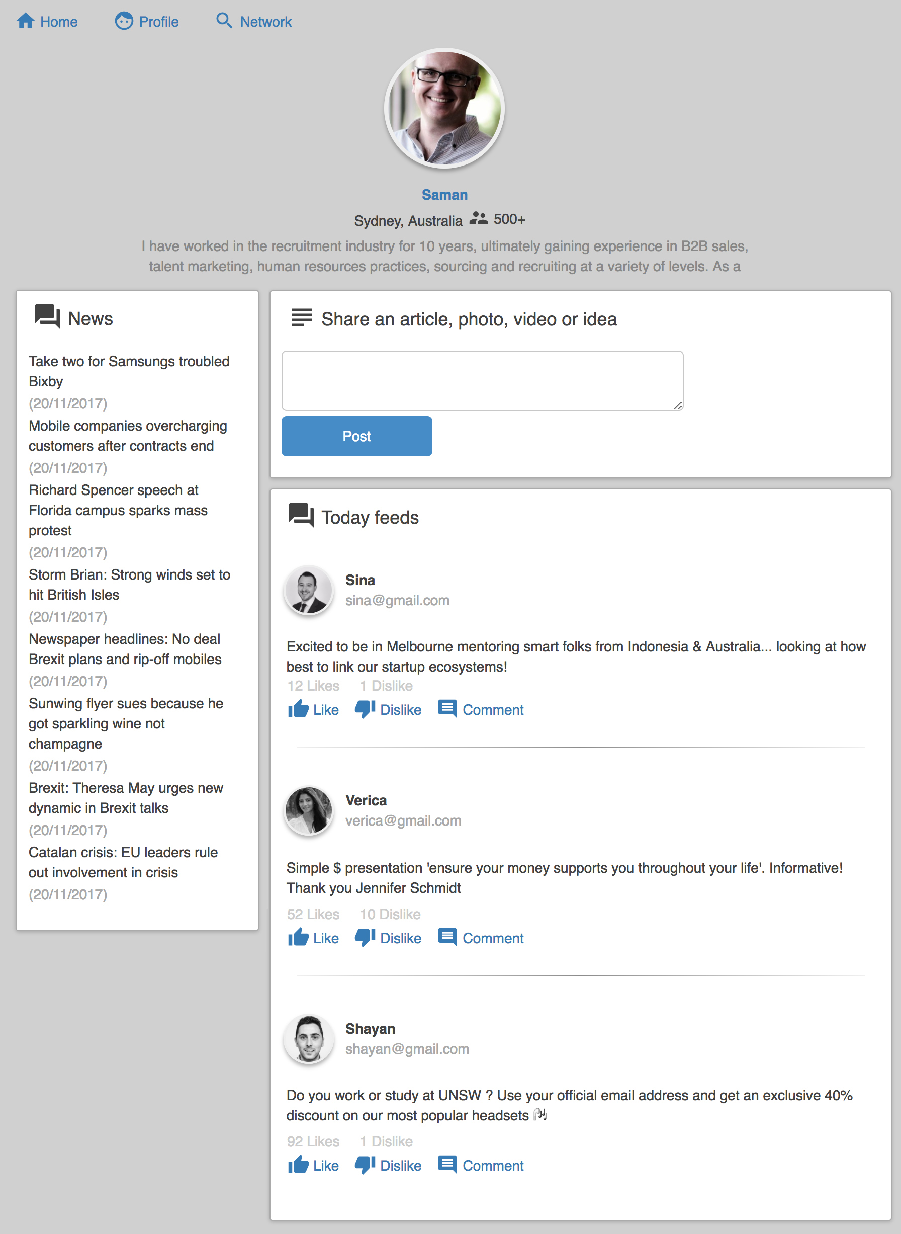
Note: In this repo I was trying to play with the concept of atomic design (https://codeburst.io/atomic-design-with-react-e7aea8152957). The concept is about separation of components into folders called atoms, molecules, and organisms. I think the disadvantage of this approach is that your team will sometimes face the question such as: "Is this component an atom or a molecule?".
The aim of this repository is to demonstrate some of the concepts and patterns like container/component, atomic components and state management like redux. You should use this repository only as a learning material to get onboard with React/Redux.
Just clone it and then run
yarn install
yarn start
Even implementing a logic-less app that only displays some data could be challenging when it becomes big. One of the practices that is used for implanting a complex react application is to divide components into 2 groups that we call them containers and components
https://medium.com/@dan_abramov/smart-and-dumb-components-7ca2f9a7c7d0
https://jaketrent.com/post/smart-dumb-components-react/
https://preact.gitbooks.io/react-book/content/jsx/dumb.html
The first group is called containers (it is also called State-full, smart or class based component). If we are not using Redux This containers are the places that we define the state of application and all the functionality that modifies this state. That is why we call them state-full or smart. However if we use Redux this components provide the connection to Redux action dispatchers and states by simply mapping actions and sates to props. Note that when we use Redux even the containers are relatively logicless.
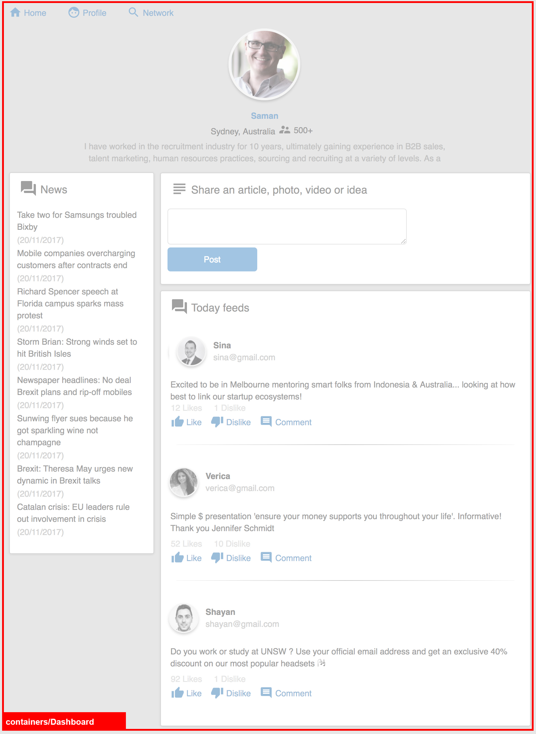
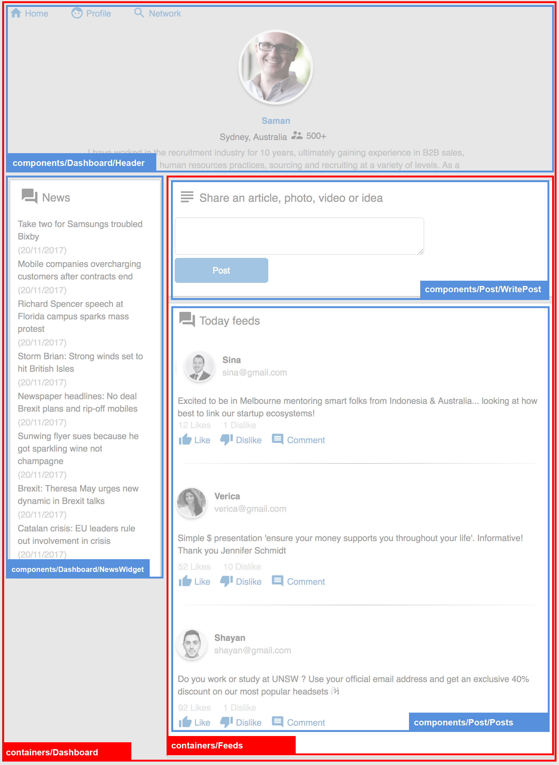
For example in our sample app we have one container component called Dashboard and it is located inside src/containers folder
This is the implementation of this container. You can see we use ES6 class to define it and that is why we call them class-based components.
class Dashboard extends React.Component {
  render() {
    return <div></div>;
  }
}
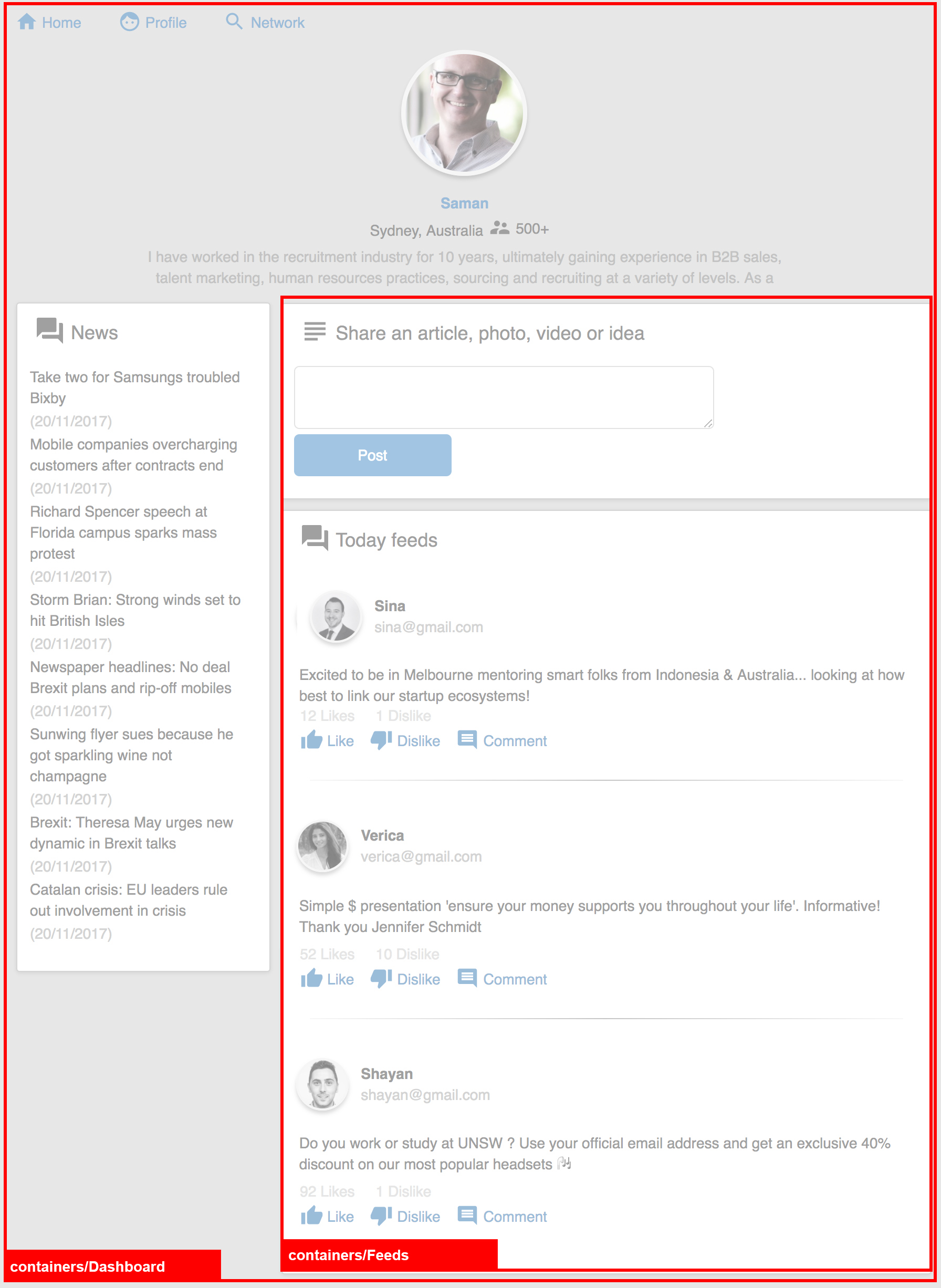
A container can also be consist of some other containers for example in our case we have another container called Feeds inside Dashboard container
class Dashboard extends React.Component {
  render() {
    return (
      <div>
        <Feeds />
      </div>
    );
  }
}The second group is called components (it is also called State-less, dumb or function based component). The only one concern of these components is to how represent the UI and call an action when user interact with them. They don't know anything about the logic of application. They don't implement any API call or any logic. All the functionality that needed for user interactions (for example liking a post) and all data that need to be display (for example post data) are pass to these components as props.
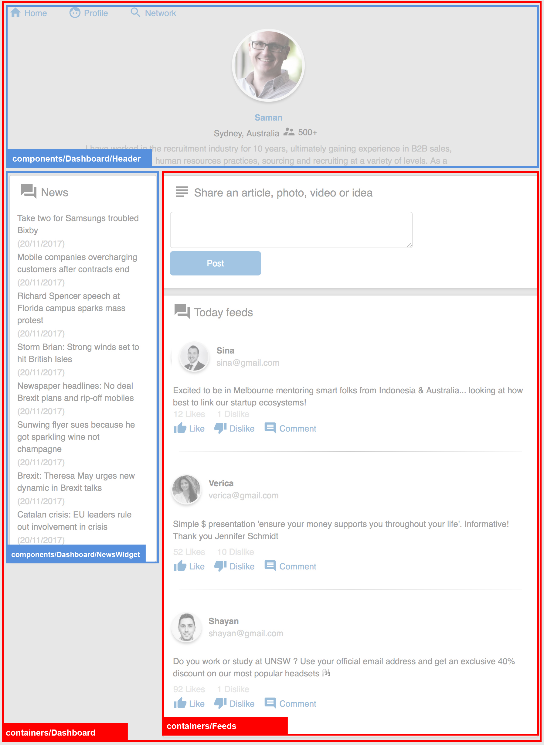
For example in our app the Dashboard container is also consist of 2 dumb components. One is Header and one is NewsWidget
class Dashboard extends React.Component {
  render() {
    return (
      <div>
        <Header user={this.props.profile} />
        <NewsWidget news={this.props.news} />
        <Feeds />
      </div>
    );
  }
}
The Feeds container is also consist of 2 dumb components. One is Posts and one is WritePost
This is the implementation of our Feeds container (Note: the connection to Redux is removed for simplicity)
class Feeds extends React.Component {
  render() {
    return (
      <div>
        <WritePost user={this.props.profile} addPost={this.props.addPost} />
        <Posts posts={this.props.posts} likePost={this.props.likePost} />
      </div>
    );
  }
}
And this is the implementation of our dumb or function based component. You can see we are not using ES6 class to define the component. The necessarily data (posts) and the functionality (likePost) is pass to this component as a prop.
const Posts = ({ posts, likePost }) => (
  <Panel title="Today feeds" icon="ic_question_answer">
    {posts.map(post => (
      <Post post={post} key={post.id} likePost={likePost} />
    ))}
  </Panel>
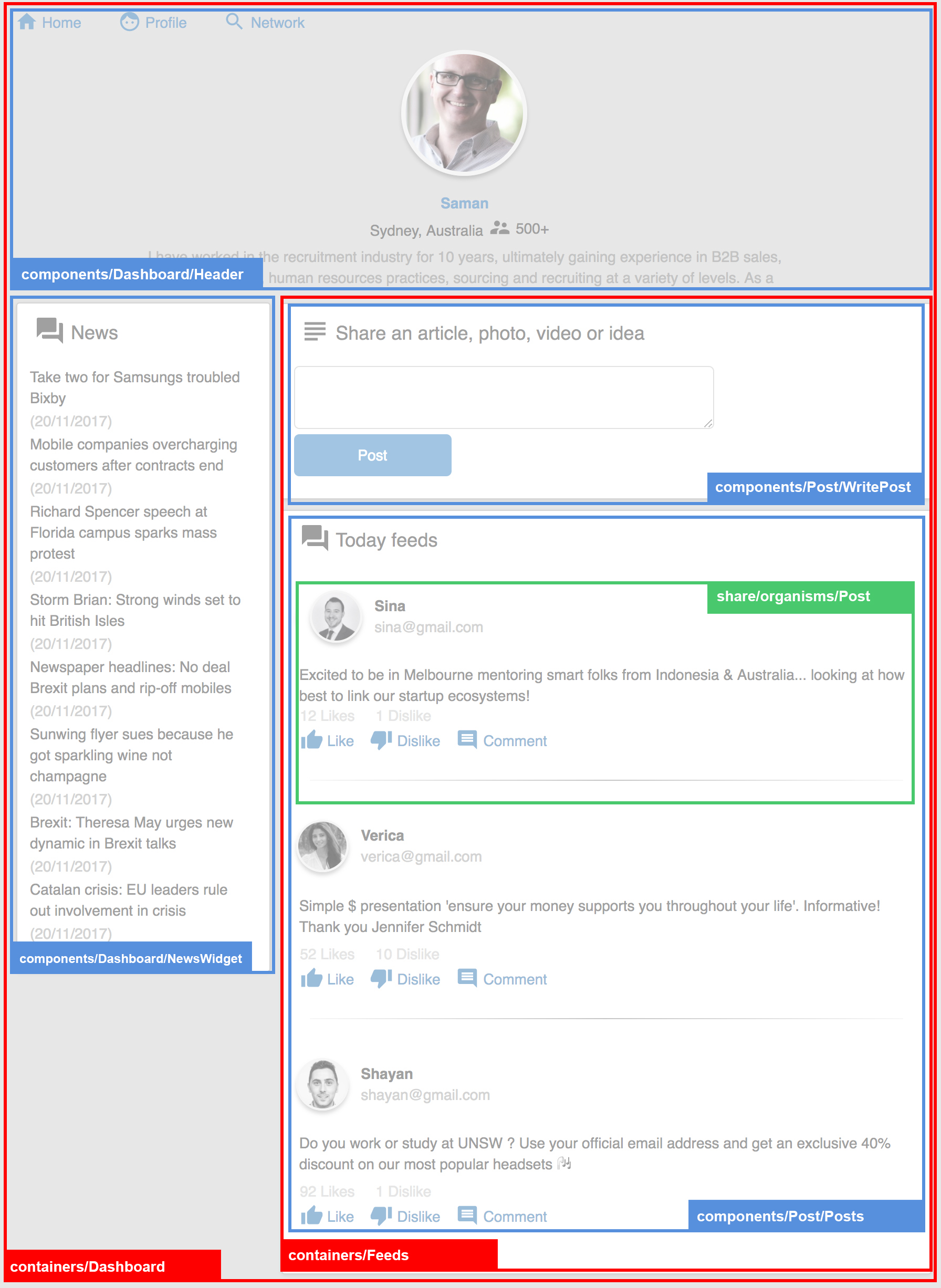
);We can continue and break our app to smaller dumb, logic less, and state less components. For example each Post can be implemented as a component. Even you can break a Post component to smaller reusable components like Icon, Button and ...
However we can see some of these components are much more smaller and reusable than others. For example a Button or Icon component can be implemented as a share library component and can be used by many single page application project across our company. We use a concept called Atomic Design to break the components to more reusable smaller components.
http://bradfrost.com/blog/post/atomic-web-design/
"We’re not designing pages, we’re designing systems of components.—Stephen Hay"
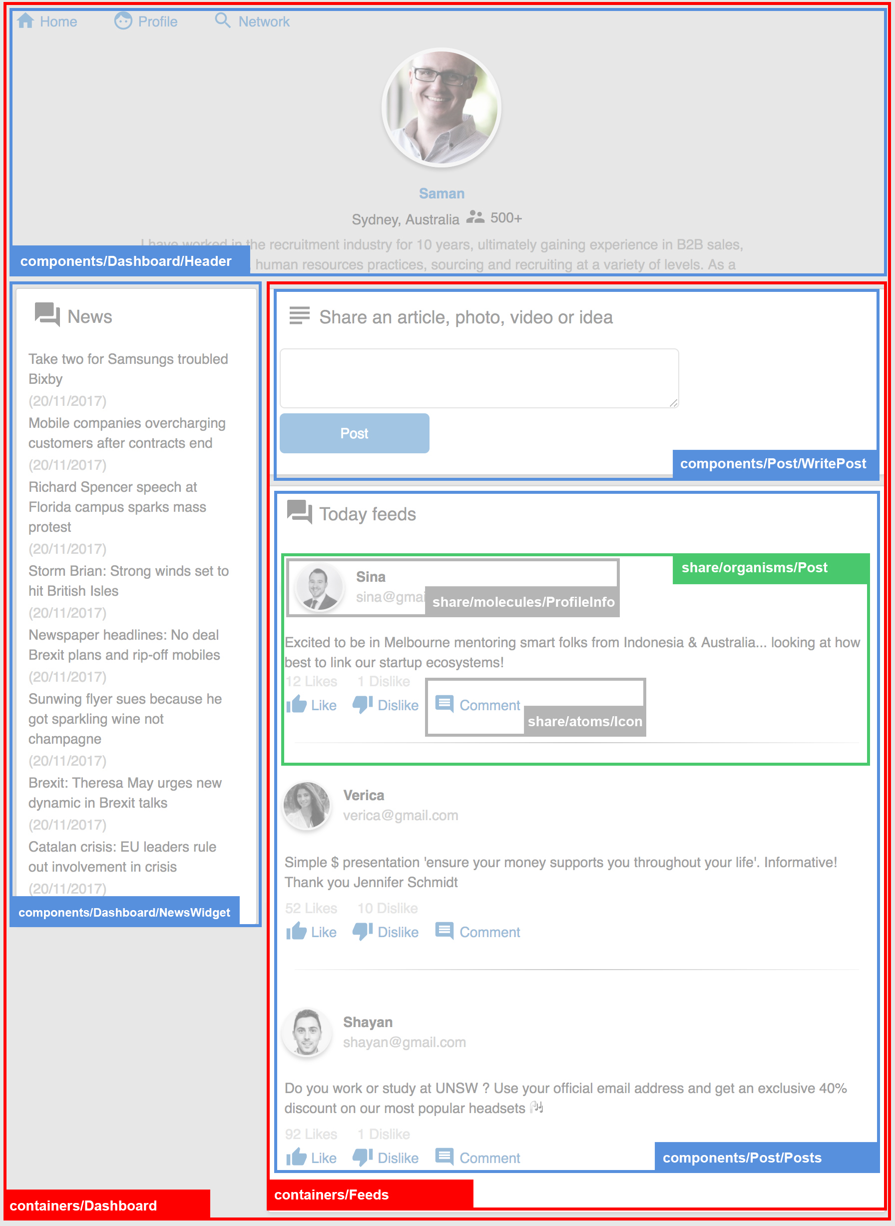
For example you can see for this application we implemented the building blocks of our components as atoms, molecules and organisms. An atom component is the final small and reusable pieces of UI element that can not be divided into smaller part. For example a Button or Icon.
share
  |-atoms
  |  |--Button
  |  |--Cell
  |  |--Checkbox
  |  |--Divider
  |  |--Grid
  |  |--Icon
  |  |--Input
  |  |--Loading
  |  |--Textarea
  |
  |-molecules
  |  |--Connection
  |  |--Modal
  |  |--Panel
  |  |--ProfileImage
  |  |--ProfileInfo
  |  |--Table
  |  |--User
  |
  |--organisms
     |--Experience
     |--News
     |--Post
     |--PostComment
     |--ProfileInfo
     |--Recommendation
Each atoms encapsulates its dependencies in one place for example styles or test cases.
share
  |-atoms
     |--Button
          |--index.js
          |--Button.story.js
          |--Button.test.js
          |--style.js
So for example we have the following UI elements
Button atom
Icon atom
[Profile image molecules]
This is how the implementation of button atom component looks like. Note that in this project I have not used any CSS library. Each component implements its style with java script. We used a library called Glamor https://github.com/threepointone/glamor which allow us to define css in javascript. You can read more about it on the web
const Button = ({ onClick, children, type, size, disabled = false }) => (
  <button type={type} onClick={onClick} className={getStyle(size, disabled)}>
    {children}
  </button>
);
A more complex UI element for example in our project is single Post and this is how we implemented it. You can see the function for liking is pass to this component as props and the only thing this component will do is to handle the user click interaction on the Like icon "onClick={() => likePost(post.id)}". You can see this component does not know anything about how the likePost function is implemented or even what exactly it will do.
import Grid from "../../atoms/Grid";
import Cell from "../../atoms/Cell";
import ProfileInfo from "../../molecules/ProfileInfo";
import Icon from "../../atoms/Icon";

const Post = ({ post, likePost, dislikePost }) => (
  <div>
    <Grid>
      <Cell>
        <ProfileInfo
          name={post.user.name}
          img={post.user.img}
          email={post.user.email}
        />
      </Cell>
    </Grid>
    <Grid>
      <Cell>{post.summary}</Cell>
    </Grid>
    <Grid>
      <Cell>{post.likes} Likes</Cell>
      <Cell>{post.dislike} Dislike</Cell>
    </Grid>
    <Grid>
      <Cell>
        <a onClick={() => likePost(post.id)}>
          <Icon name="ic_thumb_up">Like</Icon>
        </a>
        <a onClick={() => dislikePost(post.id)}>
          <Icon name="ic_thumb_down">Dislike</Icon>
        </a>
      </Cell>
    </Grid>
  </div>
);
After we build all of these UI components we can easily use them inside our app or across other projects.
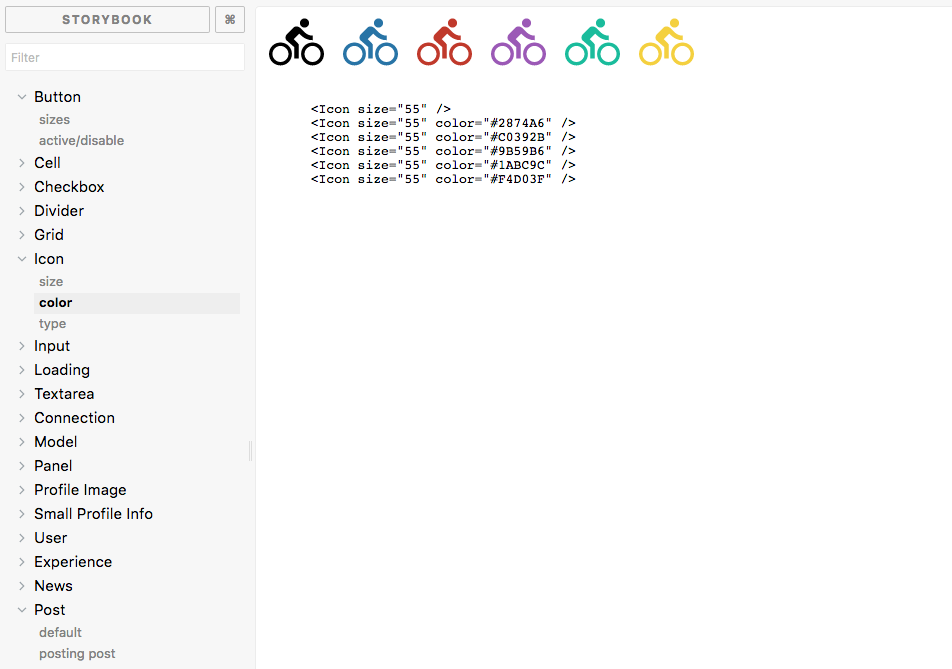
Storybook is a development environment for UI components. It allows you to browse a component library, view the different states of each component, and interactively develop and test components.
https://github.com/storybooks/storybook
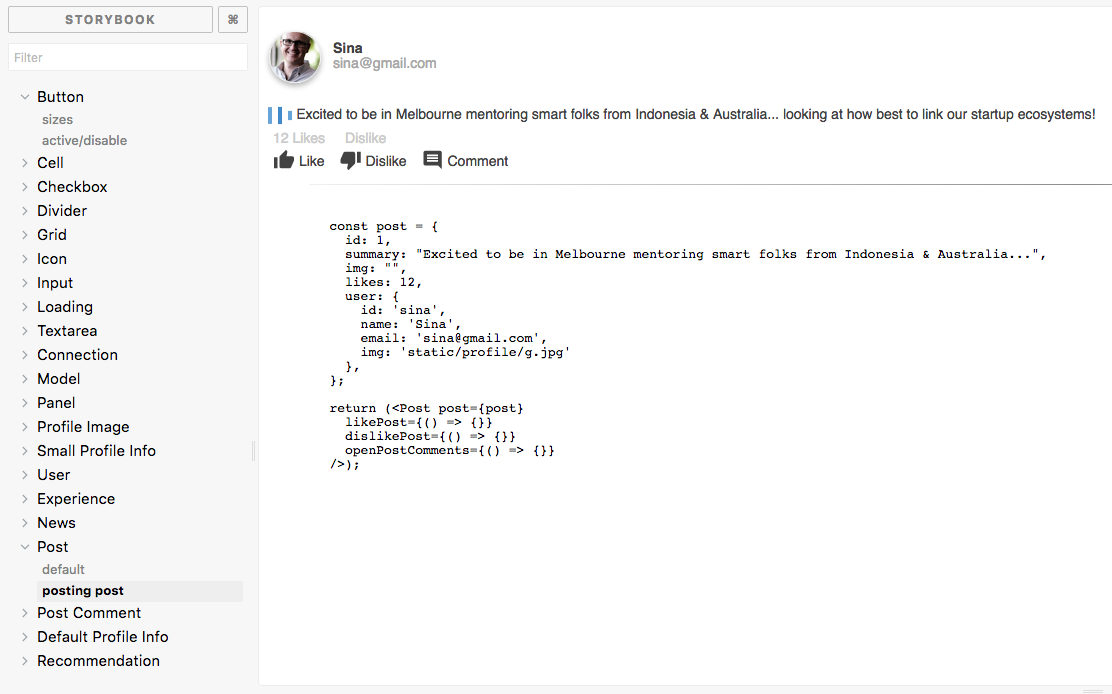
In our example app I have created a story for each atomic component. For example the story of a Icon atom or Post organisms is like this
import React from "react";
import { storiesOf } from "@storybook/react";
import Button from "./";

const story = storiesOf("Button", module);

story.add("sizes", () => (
  <div>
    <Button onClick={() => {}}>Default</Button>

    <Button type="primary" size="small" onClick={() => {}}>
      Small
    </Button>

    <Button type="primary" size="large" onClick={() => {}}>
      Large
    </Button>
  </div>
));

story.add("active/disable", () => (
  <div>
    <Button type="primary" onClick={() => {}}>
      Active Button
    </Button>

    <Button type="primary" disabled onClick={() => {}}>
      Disable Button
    </Button>
  </div>
));
The story book can be run by start-storybook -p 9009 -s public and it looks like this.
or just yarn storybook
No open-source CSS library is used and I used a library called glamor to do the styling of my UI components in javascript.
https://github.com/threepointone/glamor
import { css } from 'glamor'

// make css rules
let rule = css({
  color: 'red',
  ':hover': {
    color: 'pink'
  },
  '@media(min-width: 300px)': {
    color: 'green',
    ':hover': {
      color: 'yellow'
    }
  }
})

// add as data attributes
<div {...rule} {...another}>
  zomg
</div>

// or as classes
<div className={`${rule} ${another}`}>
  zomg
</div>

// merge rules for great justice
let mono = css({
  fontFamily: 'monospace'
})

let bolder = css({
  fontWeight: 'bolder'
})

<div {...css(mono, bolder)}>
  bold code!
</div>